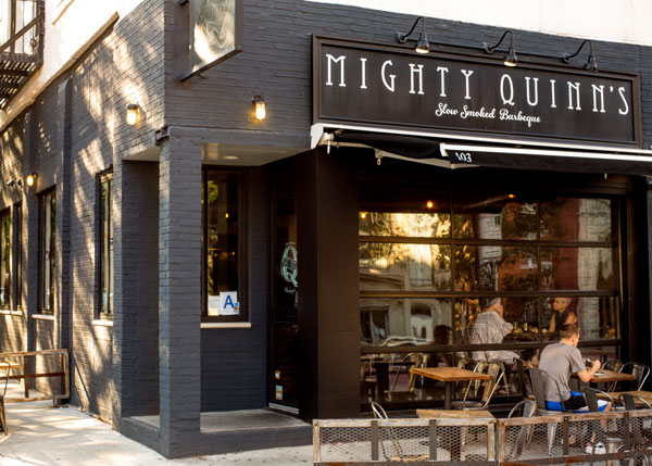
Mighty Quinn's Barbecue, which has 12 U.S. locations in New York and New Jersey, has a new look. But it’s a look with a purpose. The New York City-based six-year-old chain has updated its interior design to accommodate both a better flow of service and a secondary area to run delivery, take-out and catering orders, which are becoming a larger contributor to the company’s total sales.
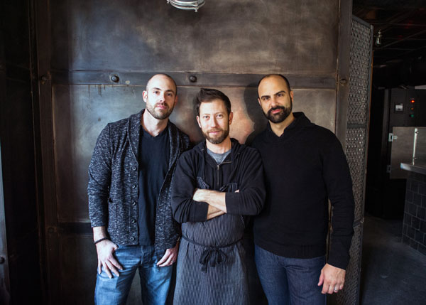
 Mighty Quinn's Barbecue founders, from left to right: Micha Magid, Hugh Mangum, Christos Gourmos
New lighting fixtures and interior materials have also created a more differentiated atmosphere and stronger brand identity versus the original model.
Co-founder Micha Magid discusses the change below.
How did you change your interior design to make for a better flow of service?
MM: We never liked the traditional barricades that are used to segment the guest line from the dining room, so our new design has a natural flow that creates this separation without an actual physical barrier.
How did you beef up your delivery/takeout?
MM: We set up a separate delivery/takeout station, which allows our restaurants to operate two businesses simultaneously without getting in each other’s way.
Keeping these stations separate increases the speed of service for both businesses, which allows us to drive higher throughput, or sales per hour, without sacrificing order accuracy. The efficiency also comes into play as both service areas work from the same prepared inventory of BBQ and sides, which removes the need to maintain higher prepared inventories, which cuts food waste.
Why did you introduce slate and “gator burn” wood inside?
MM: We like the bright, clean look of some of the newer buildouts you see from brands that compete in some of the “lighter” food categories such as salad, juice and Mediterranean — fast-casual restaurants where a brighter design complements the food. They have a very welcoming look but don’t exactly gel with our brand or feel like a BBQ restaurant. To bridge this gap, we used some lighter materials at the entrance to highlight the restaurant and create a welcoming vibe while using darker tones as you move toward the back of the restaurant where the smoker sits. The gator burn wood is used throughout the space, including in this darker area. It has an amazing look, so we also used it on the exterior. The beauty of these changes is the buildout will actually be less expensive than our prior model.
What details have you added to the interior of your restaurants to create a stronger brand identity? Why was that important?
MM: We were much more thoughtful about all elements of this new design, from guest traffic flow to using BBQ-related inspiration for the design of elements like our central lighting fixture that hangs over our communal table. These elements come together more cohesively so the look is now easier to replicate and, more importantly, has an identity. When you walk into any Mighty Quinn’s BBQ you should know where you are without seeing the sign.
Why do you have two different types of seating and why are they both important?
MM: We’re a bit unusual in the world of fast-casual restaurants as we have both a large lunch and dinner daypart in addition to serving beer and wine. We wanted casual seating up front, which we accomplished through the use of dining counters, and we also wanted more intimate booth seating, which is recessed into the wall. We needed a seating plan that felt natural for lunch and dinner.
Tell me about the lighting designs in Mighty Quinn’s.
MM: Our central light fixture is modeled after Francis Mallmann’s famous meat cooking structure. We use caged lighting throughout the dining room and some industrial pendant lights over the service area. Similar to the color transition from light to dark, we seek to accomplish the same feel with our lighting.
What is key — unchangeable — to Mighty Quinn’s that must remain identical in all restaurants?
MM: The cutting board is the star of the show. Every entree is sliced to order in front of the guest so the first interaction with what Mighty Quinn’s is all about happens at this station. We want this focal point to remain a central aspect to the service line. It’s also where our crew first interacts with our guests and makes that Instagrammable moment happen when an eight-pound brisket hits the maple board.


