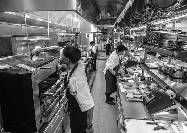
Gemini, Chicago
Designer: 555 International
Highlights: Space-saving seating, service stations
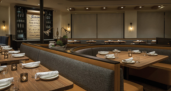 Gemini Dining photos courtesy of Erick Leinberg for 555 International
Eight years after opening Gemini Bistro in Chicago’s Lincoln Park neighborhood, owners Ryan O’Donnell and Pauly Graves felt both the space and the concept were due for a refresh. They brought in James Geier and his team at 555 International to lead the redesign effort and assist with concept reprogramming. That included dropping Bistro from the name, expanding the bar and reconfiguring seating for better space utilization. It also included giving the formerly dark, traditional restaurant a brighter, more modern aesthetic without sacrificing its comfortable neighborhood vibe. The building’s unique shape — somewhat triangular, as it sits on a corner lot flanked by two diagonal streets — made creative space utilization paramount.
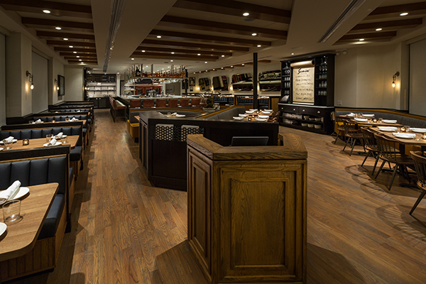 Gemini Dining1 555 Credit Erick Leinberg
Seating: “It’s a uniquely shaped building, so you can’t just fit what you want into some areas,” Geier says. “We went around and around on the best approach to seating and settled on a combination of booths and loose table seating in the main dining area.”
The arrangement includes a cluster in the center of the room, positioned behind the host stand. It’s comprised of a U-shaped booth with seating for six flanked by two angled banquettes. To provide some separation between that center cluster of seating and the entry/host stand area, 555 fabricated a cabinetry-style millwork half wall that includes built-in storage recepticles for menus and other hosting materials.
While the design works visually and helps to maximize seating capacity, flow was a major consideration. “We had to be very conscious of leaving enough space for traffic in the aisles to the left and right,” Geier says. “We did a lot of testing to make sure guests, staff and food could move in and out smoothly once people were seated at those banquettes.”
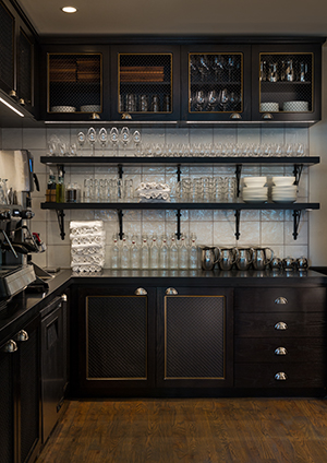 Service Stations: Gemini has two designated service stations that aesthetically play off the concept’s original bistro roots. The larger of the two is positioned along the back wall of the dining room, near the bar and hallway to the restrooms.
“It’s beautiful and gives the staff their own area, visible through open shelving to the dining room but out of the way of general guest traffic,” Geier says. “The cabinetry has woven wire mesh door inserts, coffered details, and the whole area, upper and lower, features great materials. It could be a butler’s pantry in a beautiful home, so you don’t mind walking by it, but it’s also highly functional and well organized to ensure that staff has easy access to everything they need.”
A second, smaller service station is positioned in the main dining room along an angled wall. It, too, cleverly marries form and function. “There’s an interesting junction point between the angled wall and the flat wall, and it’s a point that we knew could be too congested for seating,” Geier says. “We felt it was the perfect place for a piece of millwork — not a full service or bus station but a simple, hutch-style piece where servers can pick up water glasses, flatware, napkins or B&B plates right on the floor.”
Built into that hutch is a center rod that holds a large, bistro-style butcher paper roll that’s used for communicating menu specials. “As we thought about what to put there, it seemed an excellent place for that type of messaging opportunity,” Geier says. “It’s highly visible, looks great and makes it easy for the chef to change out the specials from day to day.”
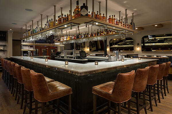 Gemini Bar 555 Credit Erick Leinberg for 555 International
Bonus web content
FBD Bar: One of the biggest changes and design challenges in the Gemini space was expanding the bar from the previous straight-line along the back wall of the restaurant to a larger, engaging, peninsula bar. “We didn’t have the width of space to do it properly and we couldn’t have a traditional back bar, which we really needed for bottle storage and glassware, etc.” says Geier.
To get maximum functionality out of the new, marble-topped bar, the designers suspended shelving and glass racks from the ceiling above it. At the back side only, those shelving units extend all the way down to the bar, creating a service bar/drink pick-up area and also providing a screen to restroom and kitchen traffic behind it. On the bar side of that back shelving unit, a large TV is positioned. “It’s strategically placed so it’s not really visible from the dining room, but you can see it if you’re at the bar and there’s a big game on or something,” Geier notes. “If not, they just keep it off so TV isn’t a part of the experience.”

.jpg)
