Just as U.S. craft brewers have taken European beer styles and given them uniquely American twists, so have designers adapted the European beer hall for an American audience. As the thirst for beer, both foreign and domestic, has grown, so has the rise of these beer-centric gathering spots.
The design hallmarks of the European beer hall are a vast open and airy space and long communal tables. Both are meant to encourage socializing and create an impromptu party atmosphere. Of course, American designers have added their own spins.
Funkenhausen
Chicago
“German Heritage, Southern Hospitality” is emblazoned in gilt on the mirror above the bar. At Funkenhausen, well-known Chicagoan Chef Mark Steuer draws culinary inspiration from his German heritage and his Charleston, S.C., upbringing. That motto also conveys Funkenhausen’s funky mash-up of design styles, which riffs on Bavarian beer halls as well as the Chicago dining scene.
“The casual, festive and, most importantly, communal atmosphere at European halls/gardens is more needed than ever in U.S. cities,” says Daniel Boyd, Funkenhausen partner and founder/principal of Mercurius Design-Development. “The information/email/social media age has made it more difficult than ever to connect on a human level, and humans require it.”
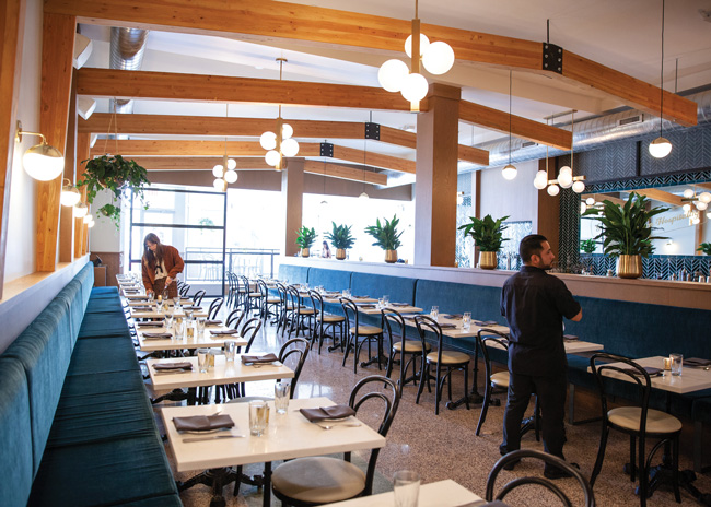
Located in Chicago’s West Town neighborhood, the 1920s building this restaurant calls home was redesigned by Boyd into a bright and airy modern beer hall. On the dining room side of the 4,000-square-foot space, two long banquettes and tables provide seating for 78 guests.
On the lounge side is a 40-foot-long marble-topped bar and some marble-topped deuces. Bar seating is upholstered in magenta-colored leather. To create a communal beer-hall experience, the bar is freestanding with seating on both sides. Total seating in the restaurant and bar is 128.
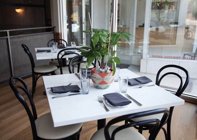
On draft are 10 German beers, and another tap dispenses Spatburgunder red wine. A curated list of imported and local craft beers in bottles and cans as well as a selection of food-friendly German and Austrian wines are also offered. Bartenders shake up creative fusion cocktails with fanciful names. For example, a drink called German Vacation in Mexico combines Kummel liqueur and tequila. “Bar schnacks” are available in the lounge.
At the front of the restaurant, near the floor-to-ceiling windows, is a raised dining area that can be used for semiprivate events. At the rear is Steuer’s open kitchen, bright with white glazed-tile walls. Nearby is the chef’s table, presided over by Ernest Hemingway, a stuffed boar’s head mounted on the wall.
Other fanciful and funky design details include cuckoo clocks, handcrafted ceramic beer steins, a hand-cranked sausage grinder and vintage travel posters. The kitschy knickknacks are a combination of Steuer family keepsakes, travel souvenirs and online finds.
Most reminiscent of an old-world beer hall is the high arched ceiling set off with curved wood beams, which transformed the storefront location. “The beam structure defines and connects the space and allows the room to remain open and airy yet still promotes a sense of intimacy,” says Boyd. The space is illuminated by playful brass and glass-globe clustered light fixtures.
During demolition, the team uncovered the original 100-year-old terrazzo floors, which were refinished and provided the basis for much of the space’s color palette, says Boyd.
Inside, funk music plays, and outside, Funkenhausen gets its funk on with a 14-foot-long yellow neon sign.
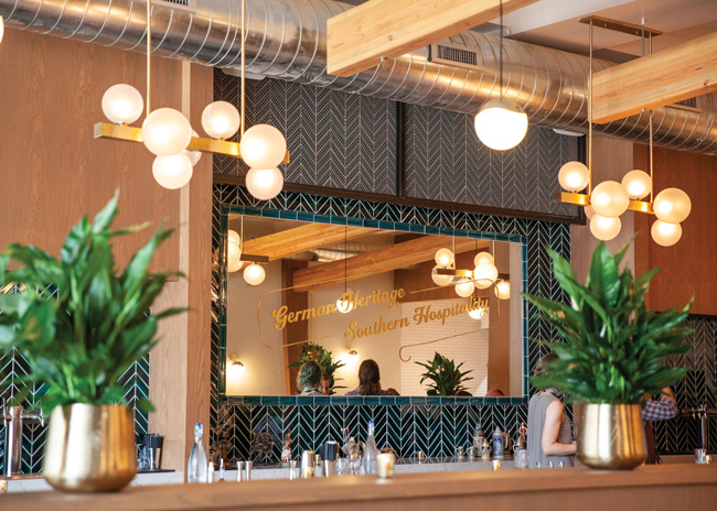 The discovery and resurrection of 100-year-old terrazzo flooring inspired the space’s color palette. Image courtesy of Funkenhausen
Wursthall Restaurant & Bierhaus
San Mateo, Calif.
“Beyond craft beer, travel and nostalgia for those experiences are playing into the European beer hall trend,” says Brooke Taylor, director of interiors for Oakland, Calif.-based architecture firm Arcsine. She cites younger consumers like Gen Xers and Millennials who have studied or traveled abroad. “They had a chance to experience that beer-garden culture, which is quite different from the beer scene in the U.S.” And they want to recreate the European beer hall experience in America.
An open and airy feeling is an important aspect of the beer-hall style, says Taylor. Wursthall is sited in a corner building with clerestory industrial windows. Uncovering those windows, which previous owners had painted over, allowed light to flow into the space. The interior color palette was kept light as well. String lights were installed over the communal tables, which is typically what you would see in an outdoor application, says the designer. “The effect is somewhat tongue in cheek, a play on the indoor/outdoor beer garden aspect.”
“For Wursthall, we weren’t trying to create a replica. We were filtering a German beer hall atmosphere through a Bay Area lens,” says Taylor. “We decided to abstract some aspects.” The starting point was the classic Bavarian harlequin, a traditional blue-and-white diamond pattern. “We tweaked the blue to make it more modern.” The motif shows up in the blue harlequin tiles on the draft tap walls. There are 28 taps with German, Belgian and some local craft beers on draft. The wood tap handles are lathe-turned abstract profiles.
Tone-on-tone harlequin patterns are painted on the walls in a few spots. Along the kitchen die wall, they took that idea to a different plane, literally, says Taylor. “The die wall projects at diagonal angles, subtly, so we took that geometry, that pattern, and played with that and our blue.”
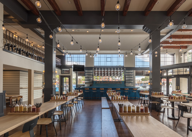 The bar, painted a shade of Bavarian blue, is the focus of the bierhaus. This is echoed by the blue harlequin pattern on the tiles surrounding the beer taps. Image courtesy of Arcsine
The bar and tap walls are a focus of the room. The bar stands out because, taking its cue from the tiles, the panel and the top are painted with the signature Bavarian blue. And the barstools’ metal frames are powder coated a custom color to match.
Long communal tables are another key design aspect of European beer halls, says Taylor, because they foster sociability. However, typical Oktoberfest tables are folding and rickety. “For Wursthall, we designed a version that is more substantial and modern-looking,” she says. Constructed with thick wooden tops and steel bases, the tables were crafted by Peter Doolittle, a San Francisco-based artist.
True to its name, the hall’s German- and Austrian-inspired menu offers a variety of wursts and bratkartoffeln (crispy fried potatoes). A choice of mustards, other condiments and flatware are available in custom-made holders, which do double duty as space dividers to allow for privacy at the communal tables.
The building is 9,800 square feet, split over the main floor and a mezzanine. And there’s a basement, where restrooms and a secondary prep area are located. Soon, the subterranean space will also house a speakeasy.
“Stretching our budget across that square footage meant we had to be really smart about how we designed,” says Taylor. For example, they kept the wood-burning oven, a holdover from when the place was an Italian restaurant — just adding a coat of paint. “It works.”
So far, the beer hall concept has been very successful, says Taylor. “It was exactly the kind of venue downtown San Mateo needed because it offers a sense of community and connection,” she says. Already, Wursthall is looking to open a second location.
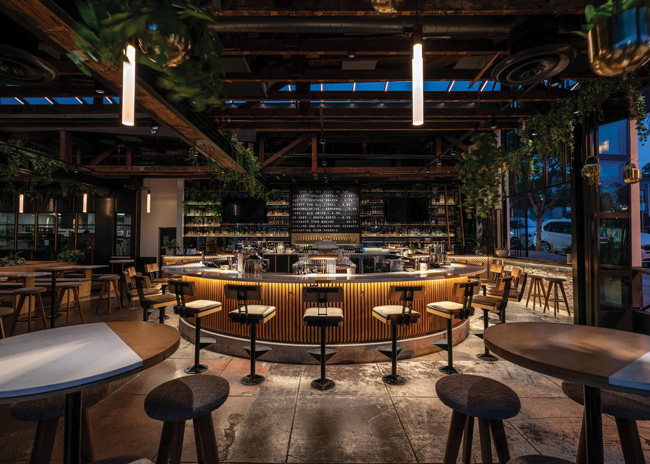 To create an airy and open feeling, exterior folding doors open the space to the outside, and the roof was ripped open to install a massive skylight. Images courtesy of Nolita Hall
Nolita Hall
San Diego
“European beer halls are timeless — and awesome,” says Douglas Hamm, president and founder of Creative House/Black Swan Hospitality and owner of Nolita Hall. “They hit the right elements with respect to what the public is looking for: a socially dynamic, casual experience that gives a sense of comfort but still feels somewhat elevated given the historical context of the concept.”
“We didn’t hold too closely to any specific beer hall style but used it as a foundation for our design,” says designer David Michael, principal at San Diego-based Tecture Design & Fabrication. “The idea of Nolita as an elevated-style beer hall allowed us to take our materials and processes a step further than a typical beer hall. Our use of natural materials (heavy wood and stone) coupled with the steel structure provides a strong yet comfortable backdrop for some of the other moments in the space, such as the fireplace, the split-flap bar menu system, brass and glass bar shelving, and extensive reflective surfaces.”
“Our goal was to accentuate the beauty and age of the building by exposing as much imperfect concrete and weathered redwood as we could whilst providing custom accents and design details that would let people know this is a beer hall, but this isn’t your average beer hall,” says Hamm. He believes that what separates a true European-style beer hall from just a bar or gastropub is the volume: a large space with high, exposed ceilings.
Nolita Hall took this a step further by opening up the exterior to the outside and installing a huge skylight.
Expansive 12- and 13-foot-tall quad-fold doors allow the space to fully open to the San Diego streets. Passersby can view the entire 6,000-square-foot, 200-seat interior. “From that point of view, it is an extremely open restaurant that really pushes the vibrant communal aspect of the beer hall concept,” says Michael.
The massive 10-foot-by-65-foot skylight was created by essentially ripping off a good portion of the roof, says Hamm, which involved a lot of work.
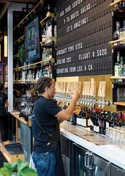 “The waterfall skylight splits the entire restaurant in half,” notes Michael. “This was a very strong visual move, but lots of structural changes had to be made to accomplish it.”
Ten columns were removed to open up the sight lines. “This creates visual connection throughout the entire space, which we think is vital to the experience here,” says Hamm. “Most operators would’ve foregone this due to cost; we saw it as an essential element worth the expense.”
Perhaps the coolest design motif — and a departure from the beer hall theme — is the retro split-flap sign above the bar that is reminiscent of the electromechanical displays found in 1960s transportation hubs. “The split-flap display at Nolita Hall is black with white letters, the classic style we all know and love from the ’60s and ’70s,” says Mark D. Kuhn IV, co-founder and CEO of Oat Foundry, which fabricated it. The display not only serves as a beer menu but also shows real-time flight information on arrivals as they fly over the bar’s skylight.
Another departure is the elements that create some separation and intimate spots beyond the requisite communal tables. That includes the horseshoe-shaped bar, the custom-made moveable planters in between tables, a fireplace lounge area off the main dining room and large leather booths for bigger parties. “It’s not just a beer hall with a bunch of communal tables,” says Hamm.
Nolita Hall is located in San Diego’s Little Italy, and the local community has been receptive, says Hamm: “We have been profitable since day one.”

