When veteran restaurateur John Resnick brought Campfire, his first solo project, to Carlsbad, Calif., in 2016, he went big, rustic and bold. Measuring 6,000 square feet and paying culinary and cultural homage to camping and live-fire cooking, the community- and family-friendly restaurant added serious sizzle to the San Diego suburb’s dining landscape.
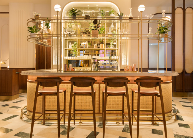
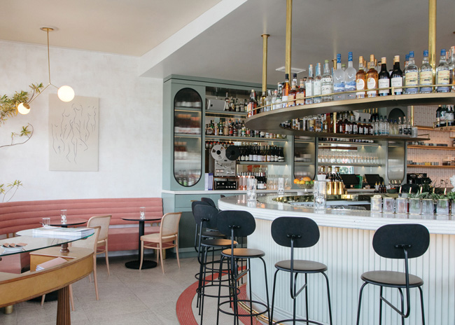 The 17-seat bar is centrally located and carries the pill-style arched shape of the windows and back-bar cabinetry. It’s topped in custom terrazzo and features an absinthe tower within and brass-trimmed radius shelving above. Images courtesy of Lily Glass
Last December, Resnick struck again, opening Jeune et Jolie just down the street. As sibling restaurants go, it’s as distinct from Campfire as can be. Inspired by classic French bistros, the 2,000-square-foot restaurant is charming and fresh, sophisticated and modern. Its kitchen, led by Chef Andrew Bachelier, leans on traditional French culinary foundations but blends in global flavors and SoCal sensibilities to cook signature dishes such as Coquille (scallops with sunchoke, abalone mushroom and vin jaune) and Grenouille (frog legs with fermented chili and tamari).
Its name, Jeune et Jolie, pays homage to Resnick’s and Bachelier’s young daughters, whose middle names are June and Jolie. Translating from French to “young and beautiful,” the name also serves as an apt descriptor of Jeune et Jolie’s design, for which Resnick turned to Los Angeles-based studio Bells + Whistles. He credits its principals, Jason St. John and Barbara Rourke, with not only developing great designs but also having a knack for reading his mind.
“They designed Campfire and really created the environment and the experience that I was after,” Resnick says. “I knew that if I told them about what I was thinking for Jeune et Jolie and the vibe that I wanted, they’d be able to design the restaurant that I had in my head but couldn’t picture. Once they started showing me ideas, I knew they completely understood.”
The vision in Resnick’s head was that of a modern French cocktail bar and restaurant with a subtle feminine-punk attitude. It would give equal weight to hospitality, experience and theater. And it would be a “transportive” space. “When you walk in, I wanted it to feel like you’re not in Carlsbad, like you’ve been transported somewhere different for a very distinct and unique experience,” Resnick says. “But at the same time, I wanted it to feel like it belongs here, in a surf town two blocks from the beach.”
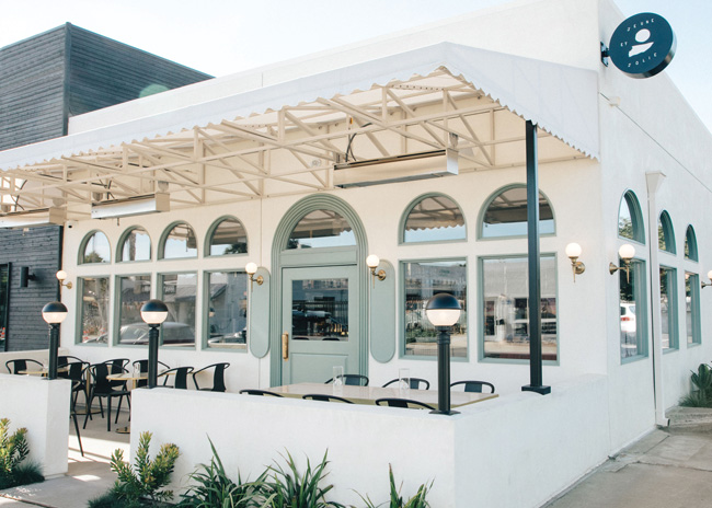 The original, nondescript building was taken down to studs and reimagined with a parapet enclosing patio seating, simple white stucco walls and distinctive arched windows that lend a jewel-box effect.
Space First, Concept Second
With those seemingly opposing marching orders in mind, Rourke and St. John had to first focus on transforming what he says was a completely nondescript space both inside and out. “It was awful, like a 1970s office building,” St. John recalls. “There was nothing to capture the imagination. When you first visit a site, you always have your fingers crossed for some character, something to work with, but there really was none here.”
Just down the street from Campfire, the single-story corner space became available when friends of Resnick purchased the building in Carlsbad Village, a downtown neighborhood that’s home to antique shops, a farmers market, diverse local restaurants, art shops and boutiques. Used for many years as a secondhand furniture store and, most recently, a jujitsu studio, it spoke to Resnick for its location and size but also because, like Campfire, it would be an adaptive reuse project.
Unlike Campfire, which Resnick had begun planning long before finding a space, Jeune et Jolie was a case of space first, concept second. “When my friends bought the building and approached me, I started thinking about what we should do there,” he says. “For us, the question when we’re developing a concept isn’t just ‘What are we excited about doing?’ It’s also ‘What would fill a gap in the market?’ We then try to match those two things up to create something unique. That’s what happened with Jeune et Jolie.”
While the building lacked character, its simplicity — open rectangle, concrete floor, one bathroom — made it a blank slate for design. Beginning with the exterior, the team took the building down to studs, redid framing, built a three-foot parapet around a patio seating area in front and clad the exterior in simple off-white stucco. Original windows were replaced with large, arched windows framed in pale laurel green along the facade and dining room side of the building.
“The windows are pill-shaped, which is a theme that runs throughout the space,” Resnick says. “They’re very charming and have an older character, but they also feel modern and fresh. We specifically wanted to make sure that the glass is very clear and beautiful, so we spent quite a bit on the windows, but the net effect is that the restaurant looks like a little jewel box.”
A Fresh Translation
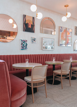 A long banquette is covered in rose-colored velvet, a signature hue that is picked up again in border tiles around the bar, in a small lounge seating area and in the open kitchen’s ceiling paint. The juxtaposition of charming and traditional against modern and sophisticated continues inside, where a carefully crafted narrative guides Bells + Whistles’ design.
“During our initial brainstorming sessions, we write down all ideas, good and bad, about what we do and don’t want the end result to be,” says St. John. “Then, we start challenging ourselves and our assumptions. What’s a French restaurant? We all know what that typically looks like. They’re all very predictable, and that’s what we didn’t want Jeune et Jolie to be. We knew that we’d honor the archetypal language of the French restaurant — brass, tile floors, oyster bar, etc. — but we wanted to reinterpret that language into a young, feminine aesthetic with an edgy, vibrant blush to it.”
To that end, rose-colored velvet covers a long banquette in the dining room. The rose color and pale green that frames the exterior windows are the dominant colors throughout the space. While the rose hue is most striking in the seating, border tiles around the bar and the open kitchen’s ceiling paint pick up the color again. There’s a hint of blush mixed into the Venetian plaster covering the dining room walls, and the grout between white tiles on the kitchen walls is a pale blush.
Modern visual elements range from the black-and-white hatch-pattern tile flooring to bistro-inspired lighting, from eclectic artwork and custom wallpaper in the restrooms to open kitchen shelving and simple, unfussy furnishings. All were carefully designed and selected to carry the well-defined narrative, Rourke notes. “It’s important in restaurants to have that kind of narrative,” she says. “It’s almost invisible to customers, but it’s there, and it makes a place feel very pulled together. If we ever feel like we’re going off track or bringing different things in, we regroup and refer back to our original vision. It helps to keep us focused and to direct the whole process.”
The process for Jeune et Jolie’s interior began with space planning. In addition to Bells + Whistles’ design narrative, Resnick’s vision for creating a space in which hospitality, experience and theater comfortably coexist drove initial decisions for layout and positioning of key elements.
The 18-seat pill-shaped bar, for instance, is centrally located just to the left of the entry. “It’s the first thing you see when you walk in,” Resnick says. “It adds a lot of energy to the room, and also, if the maître d' isn’t right there, the bartenders are just four or five feet away and can greet guests. That’s really important to us on the hospitality side.”
The main stage — a fully open kitchen with a large custom cooking suite — sits directly behind the bar. The only real separation between the two spaces is a six- to eight-seat chef’s table, with one side facing directly into the kitchen and the other directly into the bar.
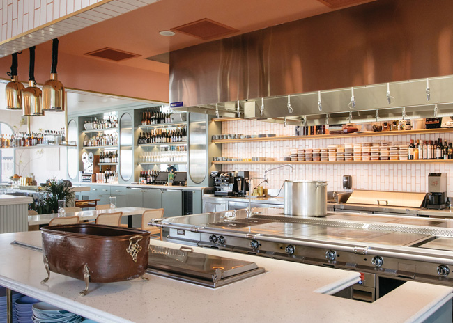 The restaurant was strategically designed to give every guest a view of the fully open kitchen, where a large custom cooking suite is the focal point.
The idea for that table sprang from the designers’ creative effort to pass inspection. “California has very strict ADA (Americans with Disabilities Act) rules,” Rourke says. “You have to have a section of the bar that’s wheelchair accessible, but because our bar footprint was so small and because of the shape of it, there was no logical place to drop it down. We created the chef’s table instead as a way to satisfy that requirement.”
The balance of Jeune et Jolie’s interior layout was driven by the desire to ensure clear sight lines into the kitchen from every seat, both at the bar and at dining tables, most of which line the room’s street-side wall. To that end, and in part because of space limitations, Rourke and St. John took an unconventional approach to one aspect of the bar’s design.
“We needed to keep the bar footprint tight and not block any views, so we ultimately decided to move the back bar to the interior side wall,” Rourke says. “It’s a little over 17 feet long and includes the entire beer and wine program. The servers pour their own, freeing up the bartenders to focus on the extensive cocktail program and enabling us to keep the bar to two wells versus three. As such, the bar is occupied by two bartenders, a barback and two employees working the oyster bar station.”
With shelving for bottles and glassware above and coolers and storage below, the back-bar cabinetry uses the same pale green hue as the exterior window frames. Three upper cabinet doors feature large, pill-shaped glass inserts, making it a signature design feature as well as an effective operational solution.
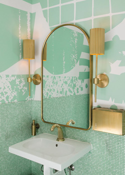 Custom graphic restroom wallpaper adds a modern, globally inspired vibe and picks up on the restaurant’s dominant colors: rose in the ladies’ room and pale laurel green in the men’s room.Another bar-related element at Jeune et Jolie helps check the “transportive” experience box. Centered within the bar is a custom brass-and-pink marble absinthe tower. While it’s a bit of a pièce de résistance for the concept, it was also one of the toughest things to get right during the course of the project, according to Resnick.
Designed to slowly drip very cold water over sugar cubes set in slotted spoons atop glasses of absinthe, the tower holds glycol-chilled water lines kept just above freezing. “It was something that hasn’t been done before, and so many hours have gone into trying to design and build it,” Resnick says. “The biggest challenge was getting the water as cold as we want it without freezing the taps.”
The bar itself is finished with a radius brass shelf above and painted wood dowels along its face. Custom, poured-in-place terrazzo with a quadruple bullnose serves as the bar top, as well as the top for the chef’s table, back bar and expediter’s counter.
All told, the bar and open kitchen spaces take up roughly 80 percent of the total footprint, with most of the seating on the periphery. It’s the perfect setting, says Resnick, for bringing his vision of dining as theater to life.
“I love the idea that people used to go out for dinner and a show, but now dinner is the show. We wanted to channel that in this restaurant, and we take it to the extreme,” Resnick says. “Our kitchen is enormous, relatively speaking, for the space. We have a beautiful custom cooking suite. And there are no walls — nothing separating it from the rest of the restaurant. When we’re cooking, it’s like the audience is on one side of the room and the stage is on the other.”
Project Team
- Owner: John Resnick
- Executive chef: Andrew Bachelier
- Design: Bells + Whistles
- Foodservice consultant: Orness Design Group
- General contractor: Hawkins Construction
Snapshot
- Concept: Modern French cocktail bar and restaurant
- Opened: December 2018
- Location: Carlsbad, Calif.
- Real estate: Single-story corner storefront
- Project type: Adaptive reuse
- Dayparts: Dinner daily, brunch Saturday and Sunday
- Average check: Dinner, $75 per person; brunch, $30
- Size: 2,000 square feet
- Seats: 56 dining room, 17 bar, 16 patio
- Design highlights: Arched windows, back-bar wall, rose-colored velvet banquettes, open kitchen with chef’s table, eclectic artwork, pill-shaped bar, brass accents, custom tile flooring, bold restroom wallpapers
- Project duration: 14 months

