Auburn is a new 105-seat restaurant that opened in Los Angeles in March. The restaurant, designed by Klein Agency, is the first stand-alone venture for co-owner and Chef Eric Bost. In this Q&A with Klein Agency partner Jon Kleinhample, he gives a rundown of the new fine dining space.

What was the overall design concept for the space?
Auburn stands as an homage to both craftsmanship and natural materials. As if stepping into a friend’s home, the space is conceived as a warm, domestic shell with the fine-tuned operations of an internationally-driven kitchen at its hearth. Working closely with a small team of craftsmen locally, we also worked to design and fabricate a custom range of furniture and hardware tailored specifically for Chef Bost’s dining concept.

What is the layout of the space?
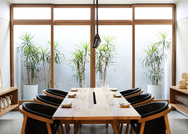
My partner Maša Kleinhample and I looked to strike a delicate balance between old and new in defining the entry sequence into the space. Entering the restaurant along an original clerestory signifies the division between what was original and what was added over the years. The main dining space opens up to the sky through five large incisions in the wooden ceiling structure of the patio. With generous planters below each cut, the diners feel as if they are seated within a wild, rural landscape set in the city. Through a large wall of solid oak windows, the main dinning space continues inside directly adjacent to the open kitchen. This room also maintains the most intimate relationship to the chef through an exposed kitchen. The final, most exclusive dining space is a room set for 10 guests equipped with its own private garden. Two large oak sliding doors allow the dinners to connect to the garden and the cool evening breezes of the city of angels.
Were there any challenges with the development of the restaurant and how did you overcome them?
Like with any old building, Auburn’s bones were as much of a joy to the design team to work with as they were a hurdle for the construction crew to overcome. The process of discoveries during the period of construction was certainly a drill that all newly-built buildings put you through. But our team persevered and pushed to execute the design vision.

What are the floors/walls/ceilings like?
We choose a neutral palette with natural greenery throughout the space. The floors are custom died wide plank white oak floors from Vermont at the entry and poured concrete with exposed sand granules through the rest of the space. Every time materials meet throughout the space, we tried to give attention to that joint, either through a shadow reveal on the walls or with a brass strip on the floors. We also included a haptic band with a top and bottom shadow line to connect the space and offer another layer of texture through a hand application of lime-clay wash paint. The ceiling at the entry has been preserved from the old dentist’s office days, while the main patio dining area received an all new Douglas Fir suspended ceiling construction. Carefully spaced out overhanging planters on the patio and continuous skylight at the bar were planned to allow for an entrance of natural light in as many locations as possible throughout the space.

What are the furnishings like?
We developed a custom-made, bespoke dining collection for Auburn that’s built around a premise of well-aging materiality. Solid white oak, blue limestone slabs and vegetable tanned leather are three main materials used throughout the restaurant space. We also designed three different dining chairs and two dining tables as well as a new line of bar seating and lounge seating. In addition, we brought in a variation of our staple Klein Home Bar, which was adjusted and transformed into a mobile gueridon for chef’s needs. Banquettes were designed and fabricated with laser-cut, steel frames to be able to float off the walls, without any support, and we purposely mismatched leather cushions to expose the beauty of the naturally-occurring slight color variations. Finally, for the private dining room, we used a mix of vintage white oak planks salvaged from an 1875 old paper mill in Northern California and fresh wide plank white oak boards to create a long dining table placed for the private dining room.

What is the lighting like?
Our agency designed a custom collection of wall sconces in turned blackened brass, which welcome the visitor at the entry bar area. Cast concrete pendants by Foscarini hang over the bar, and a 10-foot-long custom brass light, designed by us, hangs in the private dining room with its sister placed at the common restroom vestibule area.
Did you source any artwork or custom pieces?
Our agency and the chef worked closely together to identify a few remarkable artists that have been introduced in the space. We placed organic vases made by Zhu Ohmu, an Australian ceramicist, throughout the space and worked with Luke Hope, who hand carved a collection of walnut and sycamore vessels for service. Eike Koenig and Ronan Bouroullec’s prints hang in the private dining room. The team also introduced Olson Kundig’s hardware collection and equipped all white oak doors and windows with it. For the kitchen, we included some suspended shelving as well as placed variating Heath Ceramic tiles on the walls, domesticating the kitchen and breaking down the barriers between different spaces inside the restaurant.
The bathrooms are pretty cool, what was the thinking there?
The chef and design team spoke the same language when starting a conversation about the restrooms and focused on breaking down the gender barriers. Rather than forgetting about the space, which almost every guest in the restaurant will end up visiting, the team focused to create another beautiful experience and designed a custom center sink unit inside a communal vestibule area with floor-to ceiling restroom stall doors and equally as delicate level of finishes on the walls, floors and furnishings as in the rest of the dining rooms.


