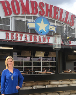
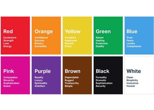
The right hue can make all the difference in how customers behave.
 Wendy’s uses red on stools to highlight a customer touch point. Image courtesy of Wendy’s
“Color can psychologically affect us and goes into a part of our brain that can stimulate or make us tranquil, or be social,” says Jennifer Guerin, interior designer and color expert and owner of JG Color Studios in San Diego. Restaurants, she points out, “have the power to manage their clients and give them the ambience they’re wanting. It’s not just branding but getting guests to order more, talk more.”
Color used outside your restaurant communicates immediately what type of restaurant customers will encounter, and the interior color scheme encourages behavior the restaurant wants like lingering and feelings of happiness.
Guerin’s not a fan of restaurants that are too white. “Color is something we can add to make things unexpected. I want a feel of drama and something unique in a space.” Steer clear of grays, she says, which depress the appetite, as does blue because there aren’t a lot of naturally occurring blues in food. Browns and greens give vibes of cleanliness, health and the outdoors.
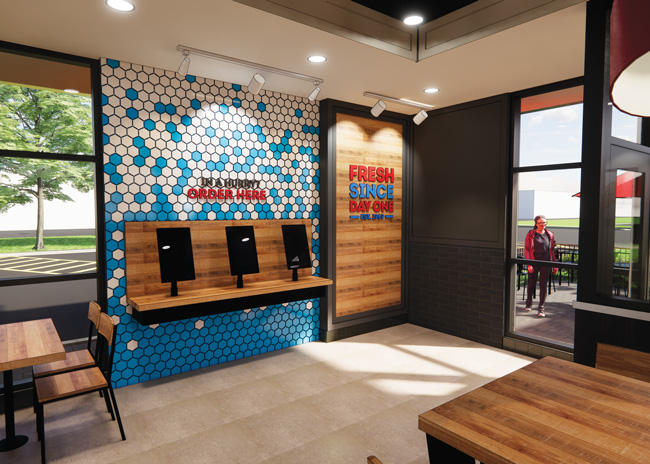 Wendy’s use of red on the interiors of stores is subtle and employed at important consumer touch points. Image courtesy of Wendy’s
She recently designed a brewery, Hidden Craft in San Diego, that combines bright yellows and bright greens for high energy with a faded blue that brings down the energy of the other two colors. “It’s light, it’s bright, but they don’t want people to stay for hours on end,” she points out. She compares this to McDonald’s classic colors — bright red and yellow — that encourage customers to eat and leave quickly.
By contrast, Guerin also recently designed a speakeasy, Oculto 477 in San Diego, that wanted to encourage guests to stay for a long time. The ambience is comfortable but offers some drama, so Guerin employed terra-cotta, jade, deep jewel-toned blues and bright gold as an accent to denote opulence.
At Tahona, a Mexican restaurant Guerin recently worked on, she used mostly neutral whites and wood tones with some high contrast black and pops of bright colors — pink, jade greens, blues and yellows. “You’re peppering them in small amounts that’s not over-stimulating, but still fun,” she explains. “We wanted the color story to replicate the food and culture.”
When selecting colors for a restaurant, not only do they have to fit the brand but also the demographic and the psychological profile of the people you’re hoping to serve, Guerin says. Once you understand the customer and the design goal, you can work toward creating the experience you want your customer to have through the the use of color.
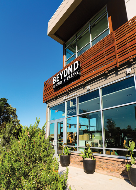
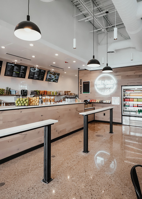 Neutral tones dominate the interior of Beyond Juicery as way to draw more attention to the colorful fresh fruit and vegetables. Image courtesy of Beyond Juicery.
Colors for Energy
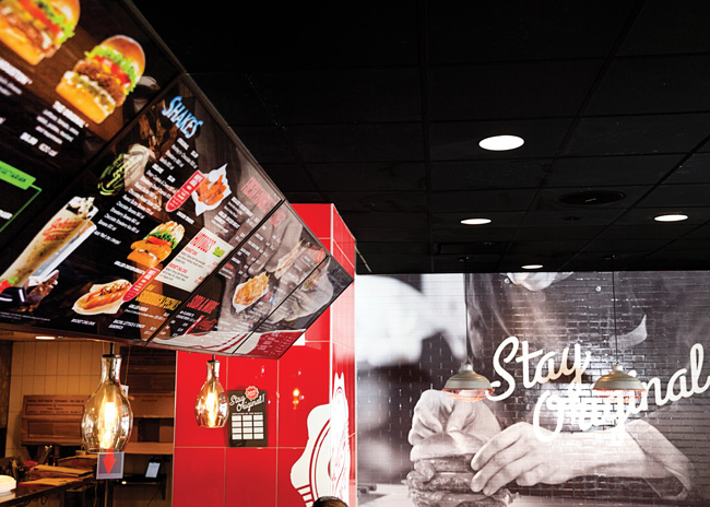
Red has been a core color of brands like Wendy’s, McDonald’s and Jack in the Box for more than 50 years.
“Color is very powerful. Consumers associate Wendy’s with red, and we’ve used it since day one,” says Barry Baugham, manager of design for Wendy’s.
The Dublin, Ohio-based brand uses a lot of red on restaurant exteriors, often with an entire wall of color. “You’re trying to define quickly to customers driving by who you are. Outside the restaurants are very bold to highlight key features of our experience, especially the pickup window. We want our customers to understand how to navigate the site.” And, of course, red ties in with the chain’s namesake Wendy, whose red pigtails are core iconography of the brand.
However, inside the stores the use of red is far more nuanced, says Baugham. Here, the chain uses red to celebrate the customer, he says. There’s red at every customer touch point — red chairs, food packaging and key art pieces. “Our customer already knows they’re in a Wendy’s. We don’t have to reinforce that once they’re in the space, so we can be more subtle.”
Wendy’s has added bar stools at the front counter, where guests can interact with employees. “These stools are so fun that we made the seat of them red,” Baugham says, adding that the brand “wanted to focus on the joy of receiving food.” All other seating in the restaurant is black, so these seats are designated as a special element with the addition of color.
The red stools are employed at another new element, freestanding communal tables. These have 8 to 10 stools with the brand’s new W table (the legs form a W). The W table is sometimes placed as a bar along the front window as “a clever brand cue to pedestrians walking by, without having to add overt signage,” Baugham notes. This is especially important in urban in-line locations that are heavily reliant on foot traffic.
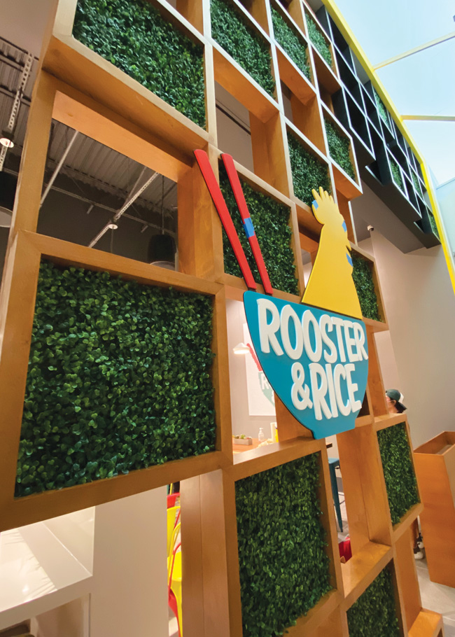
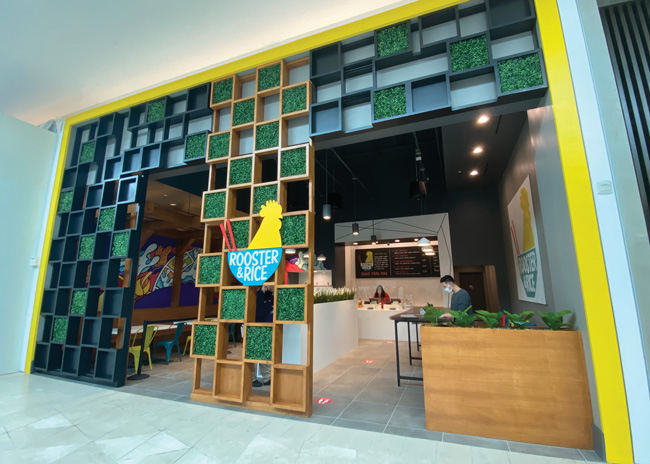 The red chopsticks in the Rooster & Rice logo create a connection with those familiar with street food in Thailand. Image courtesy of Rooster & Rice
Every new and newly renovated store features an outline of the state that store’s located in, and the restaurant’s location is highlighted with a red star. “The brand is the star, and we recognize that the environment around it is not Wendy’s, that’s not our brand, so that’s not red,” says Baugham.
Wendy’s is also using more blue, black and white in newer stores to make the pops of red really stand out. The use of white plays into the messaging, signaling transparency, and cleanliness and offering a nice contrast to the black. “The blue from Wendy’s pigtail ribbons is paired with clean white finishes and crisp black accents to create a calming respite for our customers,” Baugham says.
Finding the balance between energy and calm is key in many dining room color schemes. “When Wendy’s creates an environment, we want one that customers will choose to visit time and time again,” Baugham says. “We’re trying to create a respite but also a more residential feel.”
 Rooster & Rice reflects the street food of Thailand through the colors it uses in its 11 fast-casual restaurants. Image courtesy of Rooster & Rice
Like feel-good red, orange and yellow can be stimulating, says Amy Wax, a color consultant in Montclair, N.J. “They can make us feel adventurous and we may feel less guilty if we indulge. They’re playful and are a feel-good combination with food, but operators should avoid these colors if they’re trying to attract customers for a relaxing experience.”
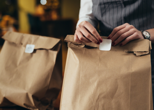
Most restaurants tend to incorporate some red, even if they want customers to linger, Wax says, because of its positive psychological impact. In a fine-dining restaurant the use of red might be as simple as in napkins alongside otherwise muted colors or a vase of red roses.
Instead, when it comes to fine dining, soothing greens, khakis and whites encourage relaxation and a lingering dining experience. Dark, saturated colors can create a cozy atmosphere, Wax points out. But if you use too many, turnover may be faster because most people can’t sit in that environment for long.
In general, Wax says, it’s best to not overdo color. “You don’t want colors to distract from what’s on the table, so it’s better to have suggestions of color.”
Healthful Connotations
Beyond Juicery + Eatery is a 32-location quick-serve with stores in Michigan and Ohio. The color it leans on most heavily is green to connote “an organic feel that’s contemporary and fresh,” says Creative Director Elliott Disner.
 The Detroit-based brand, which debuted in 2005, features two greens “for more contrasting, complex design opportunities in our stores, packaging and promotion materials,” Disner points out.
“We felt [incorporating] two greens was important,” he explains. “The contrast between them gave us a lot of flexibility and the lighter green can pop. We didn’t want to seem boring and having two allows us to be more playful. “
The colors are incorporated into the exteriors of the stores in different ways depending on their locations.
Beige is the third color Beyond Juicery includes to break up the greens and because it also connotes naturalness. These colors are included in the chain’s branding materials, especially when launching a new store. “We want everything to be cohesive,” says Disner.
Neutral tones dominate the stores’ interiors “because we want the fresh fruit and vegetables to really pop,” Disner explains. The color scheme includes white walls, white countertops and natural light wood elements “that allow the food to be the showcase.” Inside, the stores also incorporate white neon to brighten up the spaces, often with a white neon logo.
The company’s green logo pops out against the grey and black staff aprons and shirts. Because it’s so difficult to get accurate colors when screen printing, Beyond Juicery has started using a rubber patch for its logo on uniforms. “We get the most accurate and vibrant color that resists fading; we also love the dimension it adds,” Disner says.
Rooster & Rice reflects the street food of Thailand through the colors it uses in its 11 fast-casual restaurants.
“We picked our colors to reflect the street food stalls of Thailand and the cheap plastic chairs often used by the vendors,” says Bryan Lew, founder of the San Francisco-based chain. “The teal, yellow and red were specifically chosen to echo those aspects.” These are fun, energetic colors, he adds.
The red chopsticks in the logo’s bowl are synonymous with the cheap red plastic chopsticks found at street food stalls; the yellow reflects the chicken and the teal is the color of the cheap plastic furniture in Thailand, he says.
Rooster & Rice uses its three colors everywhere. “It’s important to have them present on any materials “as much as possible and in some way, shape, or form,” says Lew.
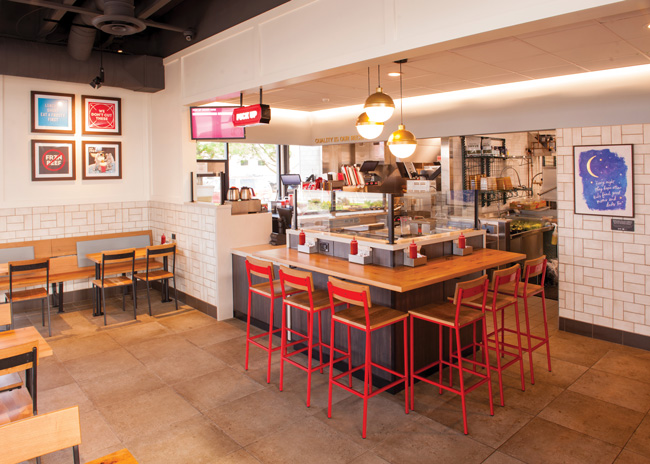
 The interiors of Rooster & Rice are painted in various shades of gray and white with chalkboard menus on the walls. “We like very clean spaces, and the furniture does the talking and usually it’s just the colored chairs,” says Lew. “It’s pops of color just used as an accent.” Employee uniforms are black T-shirts and black pants with a gray apron featuring the concept’s logo.
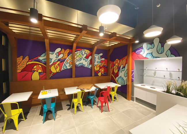
“With the hustle and bustle of the restaurant it could be too much; we don’t want to oversaturate. We want to create a feeling of calm, too,” says Lew. Adding to this calm are succulents dotted through the stores, introducing a mellow green. In the newest store, a flagship in Westfield Valley Fair Mall in San Jose, Calif., a succulent planter runs down the middle of the store and a large wood trellis at the front is also filled with succulents. “We incorporate greenery to add a natural element to the hard lines and otherwise cool gray and white palette,” Lew says.
Several stores also feature a striking, colorful mural created by artist Aaron Kai. “As our stores started getting bigger, we couldn’t have big old walls of gray,” says Lew, who’s incorporated Kai’s art in five stores and plans to include murals going forward. Each mural is designed to reflect a wave, which has become a signature item of Rooster & Rice.
Breaking Fast-Food Traditions
When Ophelia Weiss and her partners launched Honeybee Burger, a vegan quick-serve restaurant in 2019, she wanted it to look and feel different from other QSRs.
“We wanted to be more 3.0 and break the mold and disrupt that space. Most QSRs use red and a lot of primary colors and it’s very masculine, so we wanted to bring it into 2021,” says Weiss, the brand’s design and customer experience partner. “We wanted to appeal to the decision makers of the future — younger generations, family-oriented consumers — and I wanted a color that linked with the honeybee. We looked at Pantone and after much experimentation found the yellow.”
It was also important, she says, to incorporate design elements not usually seen in QSRs. A prominent design aspect in the first store was a 3D vinyl floor covering featuring daisies. And while this will be incorporated into all future restaurants, it was expensive, so it will be included in different ways, she says, so all restaurants “have a cohesive flavor.”’ It will likely be used on floors, walls or ceilings.
The vinyl element was ideal for this tiny store because it really made it distinctive, Weiss says. “I wanted to bring in a real pop of color and it’s like you’re standing on a photo floor of daisies.”
Otherwise, Honeybee Burger locations are saturated with yellow paint inside and out along with some white and gray to contrast. Tables and chairs are colored yellow, white, gray and turquoise. “It’s important to know where to stop,” Weiss says. Interestingly, in her first location she inherited some turquoise chairs, which were a design element she hadn’t planned on “but it worked quite well as a contrasting pop of color.”
Weiss also employed an artist who came up with a Lego sculpture of the Honeybee logo, which is now featured in each store. “We bring a lot of bright, fun color into the restaurant space,” says Weiss. “You’ll always see the bright yellows and the Lego and the daisies. And some wood elements.”
Sometimes you have to know all of the traditions before you find ways to break them.
Color Tips
Consider the light — natural and artificial — in your restaurant because it can change the colors, says Jennifer Guerin, interior designer, color expert and owner of JG Color Studios in San Diego, Calif. “You’re transporting people into your space, so if you don’t get lighting right, it doesn’t matter what colors you use. And you have to think of light changing throughout the day.”
Use color to draw attention to certain areas of the restaurant — a pickup point in a QSR, a private dining room or a bar in a high-end venue, Guerin says. To mark these areas out, use a different color, which can affect where customers’ eyes are drawn when they enter, so if you want them to grab their food and leave, or visit the bar for a drink, color choices can encourage those behaviors. Standout areas still have to connect with the rest of your space, says Guerin, which could be accomplished by changing the color of the chairs but keeping the walls the same, for example.
Use color for directional purposes, suggests Amy Wax, a color consultant in Montclair, N.J. Color can direct customers to a pickup line with reds and lime greens; it can single out a private dining space and hold customers there; it can even create exclusive booths and desirable seating areas.