Barely four years old, this fast-casual pizza chain has a new look that embodies its unique food and special corporate culture.
Starting a restaurant is hard and expensive work. That’s not news to anyone reading this. There are all sorts of major costs, in terms of both time and dollars, from finding the right location and getting permits to purchasing kitchen equipment, overseeing construction and, of course, developing a design.
It should come as no surprise, then, that some operators just starting out might not develop an interior look and feel that is fully on brand. Instead of a design that encompasses what the restaurant is about and what it can offer to its guests and its community, they create something that’s pleasant and functional but not specific to their business.
Can you blame someone, after all, for not spending a week doing a deep dive into the heart of their concept when they’re just trying to get started? At that point, they might not even fully realize who their concept most appeals to.
That, essentially, was the situation Oath Pizza found itself in.
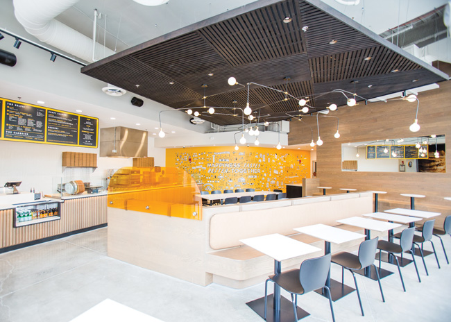
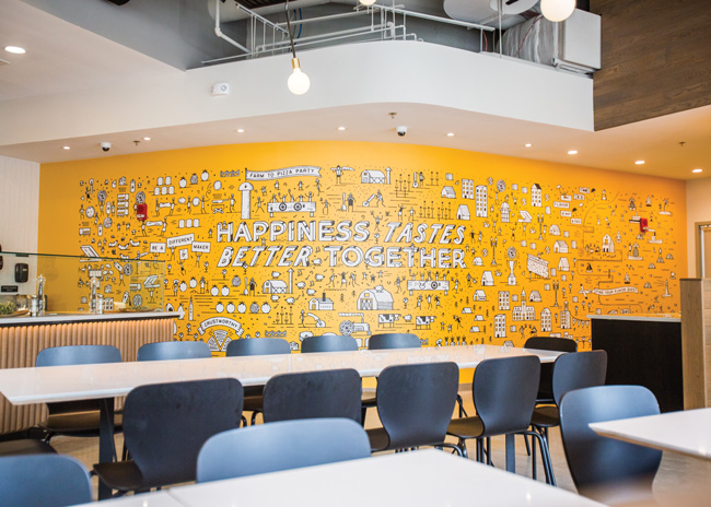 Oath’s mural wall in the Cambridge, Mass., prototype unit uses sketches of singing pigs and happy farmers to suggest the quality of its ingredients.
A Special Crust
Based in Boston, Oath is a fast-casual pizza concept with 12 company-owned locations and another dozen licensed stores.
The concept got its start with a single seaside location on Nantucket Island that opened in 2015. The star of the show at Oath was — and still is — a unique crust. Instead of topping then baking, Oath hand-stretches its dough, brushes it with avocado oil, then grills it to a crisp. The result, says marketing manager Tianna Tarquinio, is a light, crisp crust that pairs perfectly with fresh, locally sourced ingredients.
“It makes a very light pizza experience,” Tarquinio says. “Everyone who walks out says, ‘First, I’ve never tried a crust like that before,’ and then they say, ‘I don’t feel weighed down, like I just ate an entire pizza. I can go on with my day. I don’t feel like I need a nap now.’”
The restaurant was a hit among the island’s summer vacationers, and soon Oath began to expand, moving initially into Boston. Those first locations did well and showed particular strength with women and families.
Here’s where Oath noticed a disconnect. While the company offered a product that brought in women and families, it didn’t have a design to match. The original Oath look was defined by dark woods and metal finishes. It just wasn’t as welcoming to those the company actually served as it could be.
What’s more, it didn’t do well communicating what makes the brand special, either for its products or principles. In addition to being locally sourced whenever possible, the company’s ingredients are chemical- and preservative-free, while its proteins are certified humane — the first pizza company in the country to earn that distinction, says Tarquinio. On top of that, the chain strives for an employee-friendly culture that trickles down to the guest experience. Several restaurants within the chain frequently partner with local charities.
None of this was communicated in the old design.
In 2016, Oath hired Revamp Interior Design out of New York to create a new look and feel. Leading this effort for Revamp was partner Cece Stelljes.
According to Stelljes, work on the interior started with a deep examination of the company and its food, along with stops at other concepts that operate in similar spaces, from fast-casual chains that specialize in fresh food to one-off pizza places where guests can just grab a slice.
In the end, says Stelljes, the team hit on four key ideas the new brand should communicate.
One is freshness. With the chain’s dedication to local, healthy ingredients, this clearly had to be integrated into the new design.
The second idea is tactility. Oath pizza is a craft product, something made by hand. The new design would communicate that with tactile materials and looks like textured tiles and the chain’s hand-painted-style logo.
The third idea: curvature. By creating a space with softer edge, Oath restaurants would be more welcoming to women and families.
Finally, there’s the idea of distinction. With its unique crust and fresh certified-humane ingredients, Oath isn’t the typical pizza place.
These ideas all came together with the first redesigned Oath location, which opened in Cambridge, Mass., near the MIT campus, during the
summer of 2017.
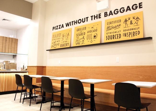 Instead of relying on guests to accurately interpret its mural wall, newer Oath locations also use more direct branding messages like the one above, featured in a New York City location.
On-Brand Design
The design developed by Revamp aimed to make an impression from the outside of the restaurant.
With its location near a college campus, the designers anticipated this first store with the new design would have several solo guests grabbing a meal between classes. Instead of filling the restaurant with two-tops that would often be used by just one person, then, Stelljes created several one-top seats against the exterior glass wall facing the sidewalk.
“This setup allows guests to people-watch,” Stelljes says. “It’s much more engaging and interesting than sitting at a bar where you’re facing the wall and your back is to everyone. Also [with these seats], the people coming in can see what everyone is eating and say, ‘That looks delicious.’”
Once those guests enter, they encounter a restaurant that’s much lighter, brighter and more welcoming than the original Oath design.
The color palette is made up of light gray and cornmeal yellow, along with colors from natural materials, such as a light-stained concrete and white oak furnishings and design touches.
One standout element in this space is the mural wall, a yellow vinyl wall covering with sketched-out images that communicate elements of the brand, such as happy pigs, symbolizing Oath’s humane certification, and farms, emphasizing local and fresh ingredients.
“By using these illustrations, it was a way to tell a story and let the customers know, or at least be intrigued, about the company without being in their face,” says Stelljes.
Some of those sketches were incorporated into other design elements as well. The sneeze guard, protecting displayed ingredients, for instance, has a sketch decal of a pizza. When guests ask about the size of Oath’s pizzas, staffers point to the decal.
The space around the assembly line reflects the brand in other ways, too, such as half-round dowels in white oak, a lighter-colored wood reflecting the chain’s light, fresh pizzas.
That white oak was also used for the custom banquette in the middle of the room. This piece has seating on two sides and is angled to match the restaurant’s unusual footprint, helping guide guests to the ordering line. It’s also rounded at the ends, echoing the soft curvature that helps make Oath more welcoming to a broader customer base.
The banquette wasn’t the only piece developed to match the space’s footprint. The ceilings in this initial restaurant are “cavernous,” says Stelljes, so the design team created a five-sided cloud element to bring the scale down to something more intimate.
Instead of designing a costly custom millwork cloud, though, Oath’s cloud is made of prefabricated fence panels stained by the contractor. These panels were set at opposing angles, notes Stelljes, since placing them parallel could accidentally turn the cloud into a way-finding element.
“It ended up still being quite a bit of work to get those up there. It was definitely less expensive than if we had the whole thing custom fabricated, but it still wasn’t a cheap solution,” says Stelljes.
The banquette and cloud are far from the only custom elements in the restaurant. Installed through the slats of the cloud are custom-designed light fixtures featuring long, thin metal rods meant to subtly reinforce and call back to Oath’s delicate pizza crust.
The tables, meanwhile, are made of plywood covered in a solid surface material. This approach was put to use with the featured community table, where the Revamp team was able to design patterns with different shapes and colors into the table’s surface.
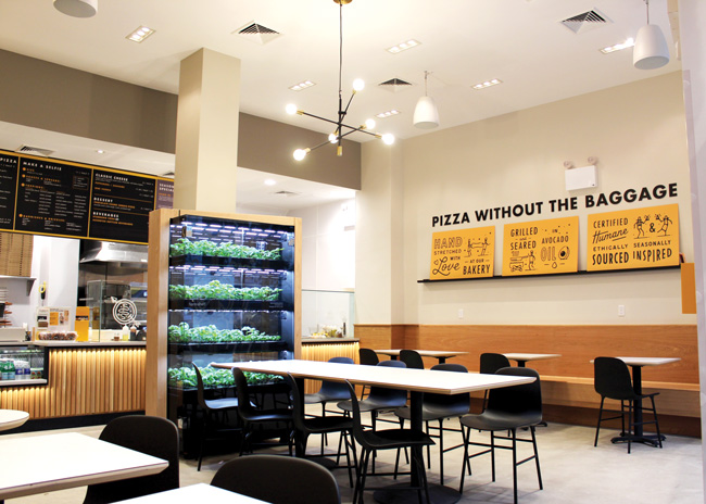 Another change introduced after the completion of the original prototype was the addition of a hydroponic garden used to grow herbs for the chain’s pizzas.
Engineered for Expansion
While the Cambridge store has been successful, Oath and Revamp made several changes in subsequent restaurants designed to lower costs, improve operations or better communicate the brand.
As a growing chain, the custom light fixtures not only added to build-out costs, but they also slowed down the construction of new stores. The designers, then, found a stock fixture with a similar look and feel to take their place.
Oath also dropped the solid surface tables. Not only were they more expensive items with a longer lead time, but they had durability issues as well. In their place, Oath is now using sturdy laminate units that can be ordered from a catalog.
Not all changes were about saving money. Oath has also introduced a self-contained hydroponic garden to its restaurants, where it grows herbs used for its pizzas. This serves as a compelling design element and also supports the Oath ethos of using fresh, natural ingredients.
The garden isn’t the only new element Oath has introduced following its redesign. In newer stores, the company has gotten more explicit with its messaging, adding various elements that directly tout features like Oath’s hand-stretched dough and ethical sourcing.
“When we first developed the mural with the singing pigs and farmers, we thought, ‘This is perfect; it’s going to tell our brand story. They’ll see the singing pigs and know that’s because we’re certified humane.’ With us being so close to the brand, that made perfect sense to us,” says Tarquinio. “We were getting customer feedback, and we realized that not everybody knows we’re certified humane, not everybody knows that all of our ingredients are fresh and free from chemicals and artificial preservatives. We knew we needed to be a little bit more explicit and be a little bit more direct with these messages.”
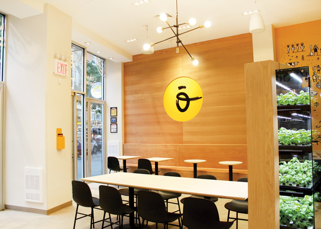 A number of custom elements in the prototype restaurant have since been replaced by stock items, including a stock light fixture and laminate tables as seen here in a New York City restaurant.
Growth Through Licensing
With Oath’s short-term growth strategy, these more explicit branding elements are definitely coming in handy.
For at least the first half of 2019, says Tarquinio, Oath isn’t actively pursuing new company-owned stores. Instead, it is focusing on a partnership with contract foodservice operator Aramark, which invested in the brand last year. The partners have since opened more than a dozen licensed locations including universities, office parks and hospitals and have plans to open another 50 licensed locations this year, Tarquinio says.
These nontraditional restaurants naturally have smaller footprints than most in-line units. With limited space, the concept isn’t being subtle with its branding for these stores. It is using some of the more explicit brand elements developed following the prototype rollout. Aramark-owned Oath locations, for example, feature a “crust story” graphic showing an Oath pizza under a series of brand messages.
The chain has worked some other key brand elements into these Aramark-owned restaurants. The mural graphic, for example, is typically placed on a section of wall or wrapped around a nearby column, while the wooden dowels on the face of the order line are utilized at each of these restaurants as well.
Even with the Aramark deal, Oath isn’t positioning itself to be solely a licenser. In the medium to long term, the chain will continue adding company-owned stores and is likely to franchise, says Tarquinio. When it takes up traditional growth again, it will target many of the same types of markets where it currently operates, including city centers and more affluent inner-ring suburbs, reflecting the higher quality — and matching price point — of the chain.
The performance of locations will no doubt benefit from the new look and feel of the brand — and how that look meshes with the food itself.
“Through our stores, we’re trying to create an environment where guests feel happy and create positive memories with their families or coworkers,” says Tarquinio. “We want to provide that environment and reflect that with a great pizza and a friendly and welcoming team.”
Snapshot
- Architect: QSR&R
- Kitchen supplier: TriMark USA
- Interior design: Revamp Interior Design
- Kitchen design: QSR&R
- Company headquarters: Boston
- Concept owner: Privately owned
- Concept description: Choose from a selection of signature “highly decorated” pizzas, classics, or make your own “selfie” pizza.
- Segment: Fast casual
- Unit count: 12, plus another dozen licensed locations through Aramark
- Location of new prototype:
Cambridge, Mass. - Opened: August 2017
- Size: 2,400 square feet (half front of the house, half back); 42 seats
- Design highlights: Lighter, brighter palette; built-in seating in white oak; illustrated wall mural; custom chandeliers; suspended wood ceiling
- Build-out time: 14 weeks
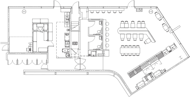
Floor Plan
Click on image for more detail.

