Get ready for a new season of Bonanza. Not the 1960s TV show featuring Ben Cartwright and his sons' adventures on the Ponderosa Ranch, but the steakhouse chain whose concept was inspired by the show 50 years ago. Along with sister chain Ponderosa Steakhouse, which hits the 50-year milestone next year, Bonanza is being rebranded and refreshed for a new generation — one increasingly less likely to know or identify with the TV show, its characters or the Old West themes on which it and Ponderosa were built.
Plano, Texas-based Homestyle Dining LLC owns, operates and franchises 223 restaurants throughout the United States and internationally — 80 percent under the Ponderosa Steakhouse grill and buffet-style restaurant brand and the balance as full-service Bonanza Steakhouses that feature large salad bars. While the service formats differ somewhat, both brands feature similar menus. And both concepts will implement key elements of the company's newly launched culinary and design refresh. On the design side, those elements include new colors, lighting, wall coverings, graphics, menu boards and updated styles of presentation on the all-important cold- and hot-food bars.
President and CEO Tom Sacco, who re-joined the company in 2012, leads the refresh campaign. He headed up operations for Bonanza back in the late 1980s, before the two brands merged under Metromedia Steakhouse Co. That company filed for Chapter 11 bankruptcy protection in 2008 and reemerged in 2009 as Homestyle Dining LLC.
Vowing to preserve the brands' legacies but bring them back to relevancy and profitability, Sacco and his team spent more than a year developing the change strategy, which made its debut at a test unit in Massena, N.Y., last fall. As Sacco describes it, the challenge was twofold: to increase the appeal of the aging brands to younger guests without alienating their older, loyal clientele and to devise a refresh plan that would be financially palatable for the heavily franchised system in a still lackluster economy.
"We had to be very smart economically to make sure the franchisees are successful and could afford to do this, because to convert just one or two stores isn't going to help the system or provide the brand refresh impact that's needed," Sacco says. "We had to build consensus because it's not just offering something to the 25-year-old guest; it's also about making sure that our 55-year-old guests don't feel like we're leaving them behind in this transition. We had to figure out how to move the covered wagon out of the equation without losing the heritage that the covered wagon stood for."
Updated Menu Marketing
One of the most immediate changes guests notice in the new design is the menu boards. "In the old design, we had two menu boards; one when you first walked in, which we called a preview board, and another over the counter where orders are taken. They were old-school boards with a photo of the product and a price," he says. "We replaced the preview board with a couple of large, wireless digital flat-screen TVs that show promotions and menu items and that are easily customizable. If someone is coming in for a 50th birthday or if a family is having a welcome home party for a service member, we're able to put that on the screens and use them as a dynamic communication tool that guests see right when they walk in. Operators that really want to display a great product can take that whole 48-inch screen, whereas before they were limited to an 8-by-14-inch panel on the menu board."
Once guests pass those initial "pre-sell" video screens, they proceed to the newly re-designed menu board. While the old version featured photos of products and prices, as it had for the past 25 years, the new version represents a dramatic departure. The new boards eliminate the photos and group menu items by category, much like customers find in a fast-casual or casual dining restaurant, according to Sacco. "By organizing the menu by category, the new design enables us to market a lot more of what we sell," he notes. "It's a much better and more productive use of our menu-board real estate. It costs 35 percent to 40 percent less than our old boards and highlights at least 50 percent more products."
An eclectic mix of residential/gallery-style frames separates and highlights the various menu categories. Reflecting updates made on the culinary side, these include Light 'N' Healthy; Gold Label and Reserve Steaks; hand-crafted sandwiches, including Black Angus burgers; a section with kids' and specially priced seniors' menu items; "Best of the Rest" (i.e., pizza, giant stuffed baked potatoes, ribs and chicken dishes); buffet; and a featured event section that includes special steak and seafood entrees and highlights new appetizer/side selections such as brisket nachos, cheese fries and chili cheese fries.
Overnight Makeover
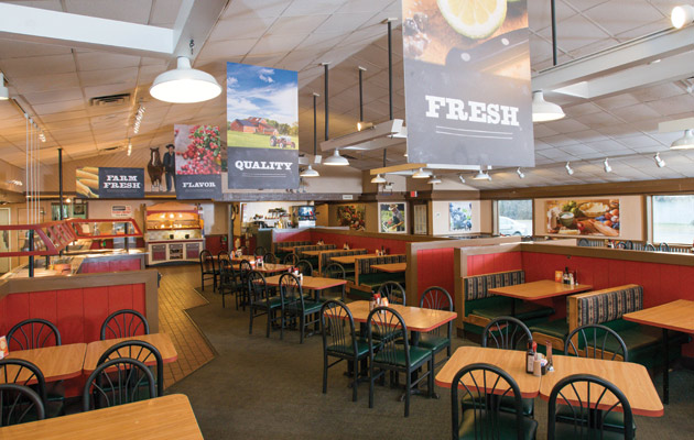
While in the planning stages for more than a year, the new look was literally achieved overnight in almost "Restaurant: Impossible" fashion at the Massena Ponderosa unit. Within a matter of hours, the crew removed most of the old Western-themed artwork, gave the dark wood paneling and walls a fresh coat of paint, put up sheets of corrugated tin to serve as distinctive wall coverings in some areas and installed bold, fresh new graphic elements throughout. Servers also came back to work in updated uniforms with more vibrant colors.
"All of the design changes were fast, relatively simple and very cost-effective," notes Dave McDonald, senior vice president of purchasing, distribution and quality assurance, who served along with Sacco and chief marketing officer Jon Rice on the internal design team. "And they all support and promote the three key words that form our new strategic mission: fresh, quality and flavor."


