While traveling through Japan, Jeff King and Sharon LaVoisne, co-owners of Metro Detroit restaurant group Working Class Outlaws, became enamored with izakayas, informal bar/restaurants where businesspeople meet at the end of the day and enjoy drinks and small plates.
While most people in the United States think of Asian restaurants as subdued, izakayas, says LaVoisne, are casual and fun. Working Class Outlaws’ new concept, Antihero, is an izakaya-inspired operation that recently opened its doors in Ferndale, Mich.
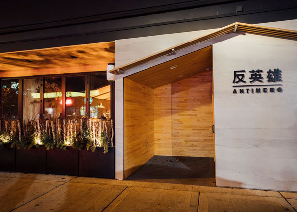
From its exterior, Antiheroʼs Japanese influence is clear. The facade features a peaked roof and Japanese characters on its signage. A planter box features seasonal greenery — bamboo shoots in the summer and birch sticks and evergreen branches in the winter.
Thereʼs more to the exterior than these elements, though. The designers installed accordion windows that open up to the outdoor space and set these windows back five feet from the sidewalk. This, says LaVoisne, better connects the inside with the outside.
“A lot of people want to have an outdoor space. They put the patio on the sidewalk and it almost gives you the feeling that you’re not really part of the restaurant when you’re sitting there. That’s why we stepped the windows in. You feel like you’re actually in the restaurant instead of sitting on the sidewalk.”
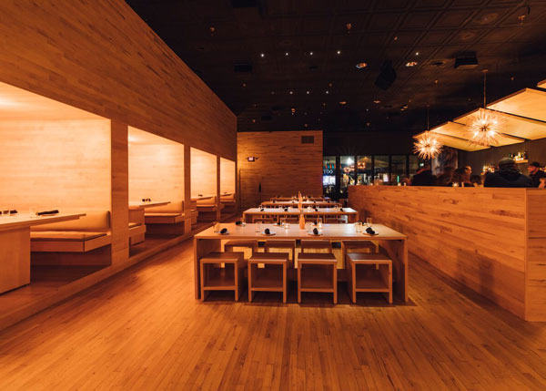
On the interior, Antihero features a clean and modern look with straight lines and 90-degree angles. Its color palette is simple, featuring real maple wood flooring and furniture, walls covered in maple or painted graphite, and amber light fixtures. These warm tones, says King, were all chosen to balance out the cold of the modern elements.
Detroit artist Glenn Barr, was asked to create Blade Runner-meets-Tokyo style murals for the interior but with colors that complement the warm tones created by material choices throughout.
“The mood is somewhat futuristic,” says King. “The color palette [Barr] normally uses is a little bit muted. It’s not about really bold colors. It's about blending some muted tones. You feel the depth in the paintings.”
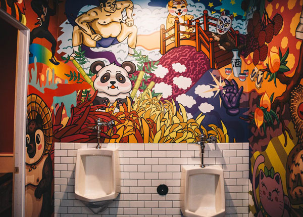
While the dining area and bar are muted, Antiheroʼs bathrooms are anything but. These spaces feature anime-inspired art by Kadee Spangler and Shaina Kasztelan and are designed with Instagram in mind.
“When we were walking around Japan, you would open a door to go into a building or a bathroom or a different space and you were hit with something that would make you say, ‘What the hell is that?ʼ We wanted to convey that here,” says LaVoisne.
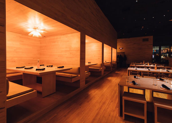
Back in the dining area, Antihero’s booths serve as one of the restaurant’s highlights.
According to LaVoisne, the cube-shaped spaces are meant to give the feel of tatmi rooms, private dining spaces separated by rice paper doors. These booths have seating on three side and can easily seat 10. The booths are placed one small step up, giving the impression that they’re floating in space, says King.
Antiheroʼs bar area features a few floating shelves and a set of wooden cloud panels that help bring intimacy to the space. As opposed to more traditional back bars with dozens upon dozens of bottles, this design matches the clean, modern look of the operation. The limited shelving, noted King, also works with Antihero’s focused cocktail program.
While the shelving and wood cloud are clean, the bar’s light fixtures are practically the only design touches that aren’t crisp and angular. “Everything is straight line and modern and clean. Those lights above the bar are just a pop of something that brings a little more nature into the space,” says LaVoisne.

