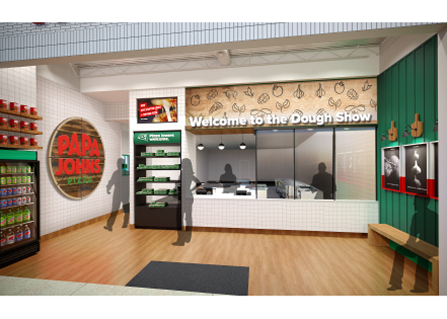
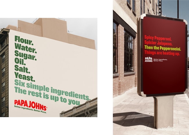
 Images courtesy of Papa JohnsAs part of a comprehensive rebranding effort, Papa Johns has developed a restaurant design and visual identity, including an updated logo.
Papa Johns’ new streamlined design features an open floor plan that will provide seamless purchasing and pick-up experiences for customers and make food prep more efficient for the staff, per a company release. Notably, the new design will feature a drive-thru. The restaurant’s pick-up counter now includes a self-service option that allows customers to grab their orders without waiting in line.
In the kitchen, Papa Johns team members will prepare orders at modular stations that allow the same space to be used for assorted products at different times. For example, from one station they will be able to cut pizzas and place the chain’s trademark pepperoncini pepper and Papa Johns Garlic Sauce cup inside each box.
 “Part of making it easier to say yes to Papa Johns development is having a smart and seamless design,” says Amanda Clark, Papa Johns’ chief development officer. “We worked with customers and our operations team to understand how we can have our stores be a true reflection of our brand while delivering an efficient operational experience, and this design delivers on that.”
Papa Johns new logo is a visual reflection of the updated tone the brand seeks to set: bold, simple, fun and clean. This “Better by Design” logo features updated hues of Papa Johns signature red and green colors.
 The pizza chain’s new visual identity draws inspiration from and brings to life the ingredients Papa Johns uses in its pizzas. The color palette, for example, features ingredient-inspired hues like Tangy tomato (red), Fresh basil (green), Fluffy dough (off-white), Punchy garlic (light purple) and Pickled pepperoncini (bright yellow-green) that provide bold pops and playful accents. Papa Johns also has a custom font and uses photos celebrating what the company describes as “the best pizza moments – the ones shared with others – and showcasing the passion, pride and craft that goes into each of Papa Johns products.” A “hand drawn happiness” illustration style will offer helpful information – and a bit of playfulness along the way.
To bring this new restaurant design, logo and visual identity to life, Papa Johns has begun implementing a phased approach that will gradually roll out this new experience to customers and team members.


