KFC unveiled its newest inline urban restaurant prototype in the Bronx neighborhood of New York City. The quick-serve chicken chain also unveiled its first drive-thru-only location in Australia.
 Images courtesy of KFC
New Inline Urban Prototype
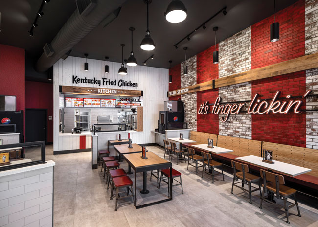
The new inline urban prototype, designed by FRCH NELSON, evolved from the brand’s traditional American Showman restaurant design, which is the most prominent KFC restaurant design in the United States.
“The Bronx neighborhood has a rich history and has seen a great deal of urban renewal in recent years,” says Lauren Moorehead, associate design manager of KFC. “It is important for us to reach our customers where they are, and through our work with FRCH NELSON, we’ve been able to create our first urban inline design that makes our brand more accessible for residents of the Bronx community and nearby Fordham University.”
Upon arrival, a larger-than-life Colonel Harland Sanders wood focal wall and lively signage featuring the brand’s iconic “it’s finger-lickin’ good” tagline greet guests. A brick accent wall brings in an element of the Bronx’s grit and serves as a backdrop for KFC’s signature bold red stripes, a colorful beacon visible from both inside and outside. The restaurant offers bar seating for solo diners and a designated pickup area for mobile and to-go orders.
The overall aesthetic reflects a playful juxtaposition between KFC’s traditional style and the energetic hustle and bustle of the Bronx. Balancing this idea throughout the space is the mix of materials and finishes, including the combination of warm wood accents and the wear and tear of exposed brick. In other moments throughout the environment, crisp kitchen tile balances with metal trim and exposed welds to contribute to an overall handmade craftsmanship aesthetic.
“For this new KFC, we had to evaluate the neighborhood to determine how to amplify our traditional American Showman KFC design. We looked to go bigger and bolder to match the personality of the Bronx,” says Marty McCauley, design director at FRCH NELSON. “Working with a brand historically known for its southern hospitality, we created a design that maintained the iconic experience but also looked to fold in a distinctly edgier attitude to deliver on the feistiness of what guests see from KFC in commercials and on social media.”
FRCH NELSON’s long-standing partnership with KFC also includes the collaboration and development of the American Showman restaurant design, which celebrates the legacy of Colonel Sanders. The design gives the restaurant chain a modern appearance that captures the Colonel’s vintage flavor while marking a stark departure from the chain’s early decor, modeled on Sanders’ first restaurant, which opened in 1952.
The new urban prototype marks a continued strategy to create more alternate and nontraditional formats that connect KFC with its consumers in differentiated markets.

Drive-Thru Only Down Under
FRCH NELSON also worked with KFC to open the chain’s first drive-thru only restaurant in Newcastle, Australia. With a growing number of consumers ordering through online channels, the goal of the new concept was to develop a more efficient operating model that celebrated this change in consumer behavior.
The new concept includes five drive-thru lanes that allow for both kinds of on-the-go customers. Some lanes cater to those who order and pay for a meal through the brand’s app or website, while the design designates the other lanes for more traditional, on-the-spot ordering. Customers ordering via the app receive a four-digit code they then enter into the touch screen at the KFC location. The screen sends the order directly to the kitchen, where staff freshly prepare and package the food.
Not having a public-facing interior meant the branding had to be prominent and clear on the exterior. “With traditional restaurants, the building is the experience, but with this new concept, it became a fixture — one element supporting the overall experience. We had to utilize every exterior touchpoint from the landscaping, to the signage, to the architecture of the drive-thru portal, to create a holistic experience for guests,” says McCauley.
The goal of the new design was to create a holistic drive- thru experience, leveraging architecture, communication, service and landscape to create an elevated guest experience.

Like the inline location, a larger-than-life halo-lit Colonel Sanders greets guests. In this instance, though, Colonel Sanders sits atop the building’s wood-clad exterior walls. The exterior also features a KFC sign.
Once guests pull around, they encounter the drive-thru portal. “The portal architecture was an opportunity to create an ownable element for the brand. We needed a bold moment that dialed up the scale since the entire guest journey is taking place within a car,” says McCauley.
The repetition of red stripes reinforces the brand, while the outline serves as a wink toward the restaurant’s signature chicken bucket. The subtle slope of both the building and the drive-thru portal provides gentle encouragement of guest direction, moving and queuing drivers from order to pickup.
The result of both designs are branded environments that leverage contrast and vibrancy through architecture, color and communication to drive home the message of service and convenience.


