Two concepts under the same roof bring design challenges and serendipitous advantages
Parents of twins know all too well that their children come as a pair but must be treated separately, on their own terms. So, too, do restaurateurs or franchisors that run dual-concept operations with two businesses under one roof.
There’s of course the ease of operation, since many such concepts have one staff of cross-trained employees, and management doubles up too. There’s paperwork, which is halved for operators, and pre-opening, only one location to scout out.
But dual concepts are more difficult to initially find a home for since any potential location has to be checked for nearby competition for two concepts, not just one, thus halving the chances of success.
But across the country, restauranteurs and franchisors continue to turn to dual concepts for a variety of reasons, as rd+d found out.
DRNK coffee + tea and Qwench Juice Bar, Hollywood, California
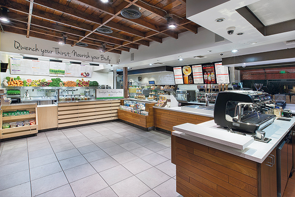 Using an L-shaped setup allows both DRNK and Qwench to maintain separate identities yet function well together under the same roof.Last April, DRNK coffee + tea and Qwench Juice Bar opened in Hollywood, Calif., in a former juice/coffee shop space.
These two brands are ideal to operate as a dual concept, says Ed Viser, director of design and construction for the brands, and principal design director for Café Design & Architecture in Los Angeles. “Coffee is a morning drink and juice is all day. They go naturally together,” he explains.
These concepts can offer more in a smaller area because they share so much, including sinks, the walk-in refrigerator, the back of the house, staff and management. While each operation has its own POS system, staff can ring up orders from each concept on the same ticket.
When designing dual concepts, maintaining a flow between the brands becomes important “so it doesn’t feel absurd or uncomfortable to the customer or employee,” Viser says. To create this flow with DRNK and Qwench, he separated them, with the juice concept to one side and the coffee to the front in an L-shaped configuration.
Despite both being beverage-based concepts, DRNK and Qwench have their operational differences. DRNK is higher-end and more sophisticated. It uses cherry wood and white stone tops to showcase its product. The design also features some rustic elements. The barista’s backline features a burn-in logo, now a trademark design element that will be part of all DRNK shops.
Qwench is an edgier concept featuring a wood look in porcelain tiles “that not so much ties the brands together but complements this fresh idea of a new juice bar concept,” Viser explains. It also has banana-yellow composite counters, gray steel decking, and black and dark gray trim and flooring to further emphasize the brand’s edgy aesthetic. “Getting away from the sherbet colors in so many other retail juice bars allows us to tie into a more relevant coffee bar aesthetic,” says Viser.
On the operations side, DRNK serves coffee and tea with some food, namely sandwiches, salads and parfaits. Qwench offers juices, smoothies and other health-oriented food items. In this location, Qwench keeps its menu limited to avoid duplication with DRNK. Both concepts serve food items from the DRNK-branded area.
The two concepts may operate under one roof, but they remain distinct operations to maintain the integrity of each brand. “Otherwise we’d be a coffee bar with juice,” says Viser. “It’s not a combination of the two design styles; each can stand alone and is complementary to the other.” In fact, they do stand side by side but operate separate spaces in other locations. “It has a feel and flow that makes neither one concept overshadow the other,” he adds.
To manage that, Viser kept the brands’ separate looks but created a third area — the common entry and seating area. This area doesn’t necessarily unify them. “We decided the public area and seating should be more of a third character,” he explains. To create this third space, he says, customers flow from the front door to the POS counters that feature retail displays for both brands.
This Hollywood dual-brand location measures around 1,500 square feet, including 300 square feet dedicated to the third area. There’s also around 400 square feet of covered seating in the back parking lot and three two-top tables on the sidewalk patio. DRNK takes up about 25 percent more space than Qwench.
Using an L-shaped setup allows both DRNK and Qwench to maintain separate identities yet function well together under the same roof.
Bar Oso and The Cellar by Araxi, Whistler, B.C.
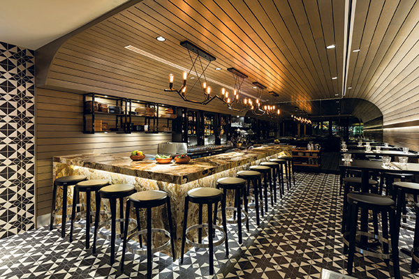 Bar Oso is a small, intimate space. By paying attention to aspects like table height and lighting, the room achieves a very social ambiance.Thirty-four years after fine dining restaurant Araxi opened in Whistler Village, B.C., the Vancouver company that owns it, Toptable Group, has opened a dual concept at the opposite end of the building.
At just above street level, there’s Bar Oso, serving Spanish-inspired small plates such as lamb meatballs, Spanish anchovies, skewers (pintxos) and charcuterie, as well as a menu heavy on Spanish wines. Downstairs is The Cellar by Araxi, a private dining and event space with an open kitchen that can seat up to 60 but can also be divided into a larger and smaller room. Below ground, there’s also a glass-enclosed, climate-controlled wine room. The menus here serve as an extension of Araxi, a farm-to-table restaurant with an emphasis on seafood.
Customers enter both locations through the same door, but two sets of stairs direct patrons to the right space. “The entry is interesting,” says Cynthia Penner, partner and designer of Vancouver-based BOX Interior Design, which created both venues. “One can see the Bar Oso experience directly from the entry. Even from the approach to the restaurant, one can see into the space and get excited about the offerings. The Cellar is hidden, so we upgraded the finishes and added evocative light effects to intrigue and offer comfort to the guest that their lower-level experience will be potentially even better than what they see upon entry.”
Bar Oso is small — 600 square feet including the kitchen — and that proved challenging from a design perspective. “We were able to achieve a great social feel through thinking about table heights, how the room was lit, softening hard edges and other tiny details,” Penner says.
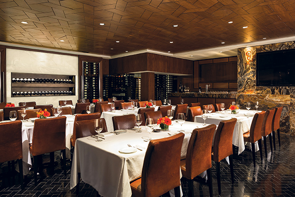 The Cellar’s design features a European/Spanish influence paired with a local vibe. Design elements contributing to this include boldly patterned tiles for the floor and walls, featuring a snowflake-inspired pattern.Downstairs, The Cellar measures 1,500 square feet, of which dining constitutes about 1,000 square feet and the kitchen another 300 square feet. Storage and the wine room consume the balance of the space. All prep and mise en place for both locations take place downstairs. The storage space also resides downstairs.
Penner strove to make the design feel local with a European/Spanish influence, she explains. Elements helping accomplish this goal include boldly patterned tiles for the floor and walls featuring a snowflake-inspired design. “We also took a more European approach and installed a wildly patterned stone bar,” Penner says. “In North America, we tend to not mix patterns, so this deliberate bold mix gives the space a unique vibe. We think the intimate scale of Bar Oso also contributes to a European feel, which we have played up by mirroring the back wall and writing the menu on it.”
While the spaces had to have their own separate identities, they also needed to blend so moving between them would feel natural. “We accomplished this through the materiality coloration and lighting levels,” Penner says. “The goal was to have Bar Oso self-sufficient during service. That said, every effort was made to offer the largest possible kitchen and back-of-house area in The Cellar to support the two businesses.”
A dual concept was ideal for the Bar Oso/The Cellar blend. “These two spaces are unique in the Whistler market, and each offers a special experience that if combined would not be as good,” Penner says. “To have a tiny wine bar that feels like an amazing step into another world is perfect. It would not be improved by having another floor — its charm and authenticity comes from the intimacy.
“The Cellar feels private and elite,” she adds. “The discrete entry adds to its mystique and again would not be improved by being bigger. So, having two distinct and evocative locations under one roof allows this operator to take advantage of two potentially difficult spaces.”
Bar Oso is a small, intimate space. By paying attention to aspects like table height and lighting, the room achieves a very social ambiance.
The Cellar’s design features a European/Spanish influence paired with a local vibe. Design elements contributing to this include boldly patterned tiles for the floor and walls, featuring a snowflake-inspired pattern.
Au Cochon/Arthur Avenue, Birmingham, Michigan
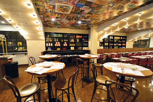 Arthur Avenue is a casual Italian concept sharing a roof with a more upscale French restaurant.A fine dining French restaurant and a family-friendly casual Italian restaurant sharing a space is not a typical scenario and has its challenges, but it’s expected to work well for Peas and Carrots Hospitality.
In September, the Michigan-based restaurant group opened Au Cochon, a French concept in downtown Birmingham, then followed it with Italian eatery Arthur Avenue, which opened on December 1. This timing was deliberate, so operations of the first could be perfected before the second was launched.
The two venues share the entire back of house as well as the prep kitchen, bathrooms and patio, but each has its own entrance. The same general manager and executive chef, Mark Barbarich, runs both restaurants.
Having two restaurants under one roof brings a lot of advantages, says Zack Sklar, primary partner of Peas and Carrots. It keeps costs down to have one person serving as general manager for both concepts, he says. In addition, mid-level managers also serve both concepts. Hourly staff are dedicated to each restaurant, however.
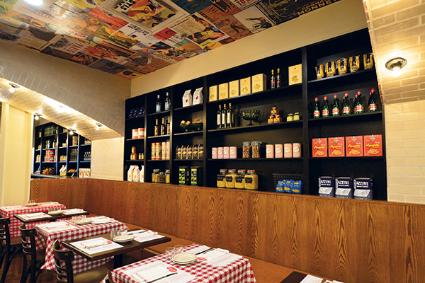 Food-wise, the two operations are very different. Au Cochon is more upscale and offers French staples like skate meunière and steak frites. It seats 112. Arthur Avenue seats 120 and serves up dishes like pasta, veal Marsala and cannoli.
This dual concept uses two kitchens, but they’re not exclusive. There’s a back-of-house prep and service kitchen for Au Cochon, as well as a front-of-house service kitchen for Arthur Avenue, which has more of a diner feel, Sklar explains.
The concepts share plenty of equipment — such as the walk-in and dishwasher — and several back-of-the-house areas, including the storage area, utility room, bathroom and employee area.
On the paperwork side, having both operations in the same space allows the company to compile just one P&L statement, file one tax return and buy one liquor license. In fact, liquor licenses are hard to come by in Birmingham, Sklar says, and he was lucky to get one, never mind two.
The challenge was in the design, and there were two significant issues. The first was the patio. “There’s a lot of common area between the two restaurants, but you’re not going to put a wall down the patio,” says Sklar. “How do you combine a casual Italian and higher-end French restaurant in this common patio setting?”
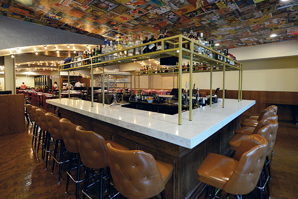 Au Cochon is an upscale French bistro concept. It shares a general manager with its sister concept, Arthur Avenue.The patio features a stained concrete floor, red network chairs and rustic benches commissioned from a local company and made from old truck tailgates. Peas and Carrots installed velvet curtains to warm the space up for winter.
Visual cues delineated the two sides to some degree, however. Arthur Avenue has an awning, and Au Cochon has French bistro lights, making each somewhat distinctive from the street. “But the outside can’t be overdone so it flows together; the inside is where the delineation happens,” Sklar says.
Along with the bathroom and kitchen, the two restaurants share, of course, a wall — only this wall offers a peek at the other side. Within it are two windows (slightly smoked to dilute the lighting from each side), each around 16 feet long, reaching from waist height to the ceiling, set in black iron framework, so diners can see from one side to the other. “The windows were about energy and a sense of uniqueness,” says Sklar.


