You only get one chance to make a first impression. Typically, a patron’s first take of a restaurant centers on the entry area, both inside and outside. The entrance’s design from signage to door to hostess station gives signals about the type of food, ambience and service the establishment provides.
Align entryway elements, including the door material, the layout of the area immediately inside the door and the first point of contact with staff, from a design standpoint to attract target customers, says Dana Foley, design director, Gensler. These features and areas are exposed to the weather and heavy foot traffic, so designs also need to emphasize durability.
Indeed, a lot hinges on the application of a restaurant’s design in its entry areas. Consider customers walking or driving by a restaurant. If unfamiliar with it, they will make snap judgments based on cues that indicate the service style — fast, fast casual, fine dining or luxury — the restaurant offers. What patrons see at the entrance to the restaurant could also shape their expectations on the quality of the experience.
Signs and Doors Give Clues
The font type and color of the restaurant’s sign and logo, for example, indicate whether the ambience inside is formal or informal. Fonts with serifs signal formality, while sans-serif fonts suggest informality. Bright, highly saturated colors typically indicate casual, fun brands, while muted hues indicate a more formal experience.
A glass door, common in the fastfood segment, tends to indicate a casual vibe, while wood doors, especially those with ornate flourishes, herald fine dining inside. “A solid wood door also adds an element of surprise,” Foley says. Because patrons can’t see through it, a heavy, rustic door could indicate that a hidden gem of an eatery lies within.
The entry should be approachable, says Joel Schultz, design division lead, Great Lakes Culinary Designs. “Our first sense for interaction is sight,” he says. “If it doesn’t look friendly, warm and inviting, then we risk not having a customer come in.” Peeling paint, cracked glass or other defects will give customers pause.
Try to make it easy to find the restaurant’s point of entry. When designing the exterior entry, consider from which direction(s) customers will approach. Signs should be easily visible from those directions. Will signs from other businesses or building features obscure the view of the sign? If so, bumping out the doorway to make the entry more prominent might counteract this, or a larger sign with sharply contrasting graphics could help. To distinguish the main entry from an exit, pop it out or recess it, Foley says.
Some locations make establishing an entry particularly challenging. If located in a narrow alley, a freestanding sign such as a blackboard located at the end of the alley might be necessary to draw attention.
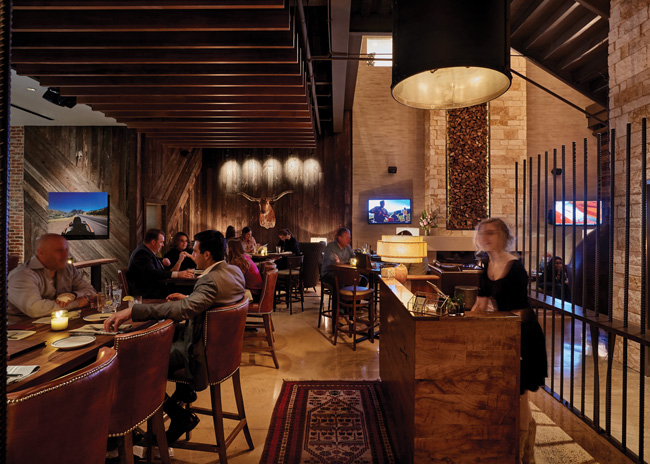 Gensler's design of Haywire in Plano, Texas, sets the tone for the entire space. Images courtesy of Garrett Rowland
Distinctive Features Make Entries Pop
Tuscan Kitchen in the Seaport area of Boston posed a tough challenge for designers with Prellwitz Chilinski Associates, Inc. (PCA). The restaurant’s third location operates from the second floor of a modern, glassy building in a densely built neighborhood. The site would not benefit from easy visibility from street level, so it was critical to make the two entries visible and welcoming. Two signs, one with lettering only above the doorway, sit parallel to the street, and another, featuring the restaurant’s sun logo jutting out from the second floor, faces perpendicular to the street. The main entry of the building leads to a grand two-story lobby capped by a large chandelier. This immediately establishes the fine-dining atmosphere to be experienced on the floor above.
Some entry designs include eye-catching artwork. Distinctive features such as sculptures, mosaics, murals or plantings make a strong statement and set expectations about the customer experience. Legal Seafood’s location at Boston’s Logan Airport Terminal C, for example, features a 10-foot fish sculpture on the side of the entry. The prominent feature catches the eyes of passengers in the security queue.
Well-tended plants can add a touch of class. In a location where customers’ attention can be diverted by a lot of activity or many potential focal points, such flourishes help an entry stand out.
Appropriately bright lighting that makes signs, logos and artwork clearly visible after dark is also crucial. To create an upscale appearance, use uplighting. To conceal light fixtures, consider using planters in walkways or garden beds. Low-voltage LED lights offer warm lighting with low energy costs. For some casual establishments, neon lighting — LEDs can mimic this effect, too — offers a distinctive way to express a brand or culinary style.
A posted menu can also draw the attention of pedestrians. Common in urban restaurant rows, glass-enclosed boxes containing the bill of fare function as marketing collateral, distinguishing the establishment from neighboring competitors. This element is not used as commonly as it used to be, though, Foley says. Many people are drawn to restaurants from social media and access menus online before setting out for a meal.
Offer Protection from Harsh Weather
Functionally, entries should protect patrons and the doorway from the elements. Canopies and overhangs serve that purpose, and they can be printed or embossed with the name and/or logo of the establishment. “Canopies and awnings also help distinguish the architecture from the rest of the storefront,” Foley points out.
On the ground, it’s crucial to protect customers from slipping on wet surfaces due to rain, snow and ice. “Most owners put out supplementary mats in winter,” says Karen Dubrovsky, principal, PCA. Restaurant staff can place these under an awning or just inside the front door. “We’ve added branded walk-off mats for some clients,” adds Jillian D’Amato, associate, PCA.
Energy codes in many localities require vestibules inside of the main entrance to create an air lock that keeps harsh winds and extreme heat and cold out. About 50 square feet of space between the exterior and interior doors is common for these features, Foley says. Within this area, some establishments add benches for customers to wait for their table during busy periods. Some vestibules include a generous amount of glass so that diners have an expansive view of what’s going on inside, making it easy to monitor the queue.
Sizing Host Stations
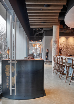 At Musume in Dallas, Gensler put the restaurant's logo on the hostess stand. In full-service eateries, the host station often sits directly in front of the main entry and thus captures attention. These areas typically total about 50 square feet of space, though this can be reduced, especially in small, tightly packed restaurants.
The size of the podium and counter space depends partly on how many items the host or hostess will keep here. Bulky menus, place settings and electronic devices that inform patrons when their table is ready must be easily accessible. Some restaurants choose to replace the latter devices with smartphone apps that can perform the same function via text messaging.
Size the top of the station so that it holds the electronic tablet or workstation that records reservations and seating availability and a charging station or electrical outlet. “Electronics are not that elaborate,” says Dubrovsky. “You can make the host station quite small.”
Tuscan Kitchen went in another direction, opting for a large host station resembling a hotel check-in counter that makes a strong statement. The area’s mahogany wood casework helps establish a formal, elegant ambience.
Sizing Waiting Areas
In many establishments, a bar close to the host station provides temporary guest seating for those waiting for a table. When the bar is full, though, patrons may have to stand as they wait. Providing benches or seats for this overflow within the interior entryway is a decision that weighs guest comfort against profits. Space dedicated to wait seating reduces the area where the restaurant can place revenue-generating tables. “We’ve never had a client that wanted to dedicate much space for waiting,” D’Amato says.
On the other hand, too little waiting space can create gridlock, making it difficult for staff and customers to traverse the entry area. If an establishment offers takeout and delivery service, this can become especially problematic. To resolve these challenges, clearly delineate space for pickup from waiting space and establish separate queues for takeout and dining on premise. Many new restaurants also add an extra exit for takeout and third-party delivery services to streamline flow. “We try to keep straight line paths where possible,” Schultz adds.
For those restaurants that do not offer takeout, a crowded entry can be positive — even if the queue spills out to the sidewalk, Schultz points out. “We want a jammed-up lobby to give the idea that this must be an amazing place if it’s so packed, everyone wants in,” he says.
Coat Check Dilemma
Whether to provide space for patrons to hang coats and jackets represents another comfort versus profits issue. “What to do with coats is probably the biggest challenge with an entry,” Dubrovsky says. For an upscale establishment, bulky winter coats draped over chairs clashes with a formal-dining experience. Some fine-dining restaurants provide a coat closet and coat check services or a coatrack hidden behind a movable partition.
Most customers won’t mind draping their coats on the back of their chairs, particularly when the promise of the experience set by an attractive, welcoming entryway turns out to be fulfilled by the food, drinks and service. That first impression quickly creates expectations, so make sure that the entry area accurately represents the brand.