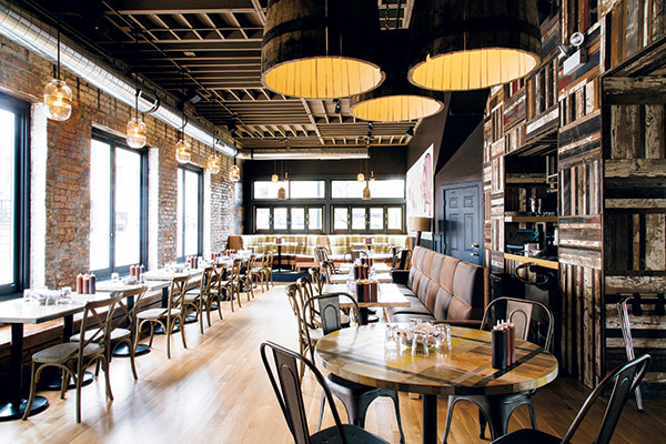
A certain aesthetic springs to mind with traditional barbecue restaurants, where design often receives far less attention than smoke, sauce and brisket. The same does not apply at the new Pork Shoppe in Chicago's eclectic Andersonville neighborhood. The owners of this two-unit restaurant set out to prove that serious barbecue and sophisticated design need not be mutually exclusive.
Opened in late April of this year, the restaurant is comfortably rustic, befitting its genre, but it's also bright, fresh and design forward in regard to both structure and theatrics. "Barbecue gets a bad rap for atmosphere and service," says co-owner Steven Ford. "My partners and I all have a fine-dining background, and we wanted to do something more elevated in terms of atmosphere — whimsical, edgy and 'street' but with unexpected design touches for a barbecue place."
Ford and partner Mike Schimmel opened the original, award-winning Pork Shoppe five years ago in the city's Avondale neighborhood with just enough money to get the doors open. It's a small, counter service operation that Ford describes as having "three stools, three beers and three bourbons. It has character, and it's clean, but it's a joint," he says. Design highlights include an old billboard covered in license plates and a few antique mirrors.
At 3,600 square feet, the new Pork Shoppe not only introduces design upgrades, it also takes the concept from its fast-casual, takeout-heavy roots into full table and bar service. "Initially, we wanted to do fast-casual — no servers, easier operations, etc. — but we quickly felt the impact that not having a full bar has on profitability," Ford says. "I also quickly realized that I missed the action and buzz of full-service dining. I wanted back in the game."
Intent on expansion, Ford and Schimmel recruited Joe King, a fine-dining veteran and successful entrepreneur in Chicago's restaurant scene, to sign on as a third partner in the new venture. The trio spent two years searching for the right location, ultimately settling on a corner space in Andersonville. "This is my first restaurant outside of the downtown area, and it's kind of cool," says King, who co-owns Le Colonial and Rockit Bar & Grill and who founded King Café Gourmet and Go. "People in Chicago are very much in love with their neighborhoods, and you get to be part of that. We looked at a number of neighborhoods, but this one just felt right. It's very diverse and has been very welcoming."
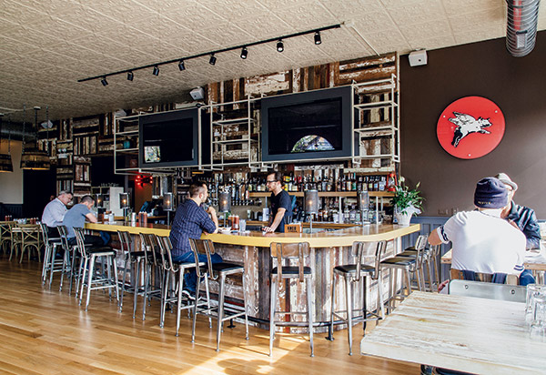 Positioned just inside the main entrance, the bar is a focal point. Its wood top is trimmed in yellow, coordinating with the plaid fabric used in three large booths. A white pressed tin ceiling honors the building’s character and helps to create a light, open feel.The location, which previously housed the Kingfisher seafood restaurant, had been empty for five years. It was dark, largely windowless and divided into two separate areas with a small bar at the back. While initial plans called for a more restrained approach to renovation, ultimately all of the public areas were gutted. Only the original brick exterior walls and white oak floor, which was refinished, were salvaged.
"We had initially applied for a repair and replace permit, but once we were in and realized what we were up against, we had to go back and get a full permit," King says. "We basically had to rip out the entire side of the building that is now the main dining area. There were structural issues, and a lot of drywall had to be removed, as did the ceilings. We uncovered the brick, cleaned it up and added large windows to the side dining room. We also extended existing windows in the bar area. Those were nice arched windows, but we added about two feet to them at the bottom so that people sitting in booths along that wall can actually see outside. We also thought we wouldn't have to do much in the existing kitchen, but it turned out that the hood system wasn't up to code. With two big barbecue smokers going in, we ended up having to replace and expand that, too."
Ditching Dark and Dingy
The extent of work required set the project off the rails in terms of budget and schedule — it opened more than four months later than planned — but it also allowed the partners to configure the space just how they wanted it. In particular, changes were made to convert the once dark and dingy space into an open, airy environment.
In addition to adding lots of windows for natural light and traffic-generating inside-out views, the bar was expanded and relocated from the back to the front, just inside the main entrance. The wall that had previously divided the long, rectangular space was opened up to enable flow of people, sight lines and energy between the bar area and main dining room. An elevated platform was added at the back of the bar side of the restaurant, creating another dining area and a space that can accommodate groups of about 20 guests.
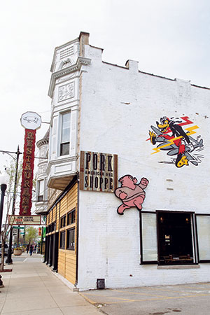 Interior branding elements, such as reclaimed barn wood and cartoon murals, were extended to the exterior as well. The large, vertical “Restaurant” sign is a budget-friendly holdover from the previous establishment — simply crowned with Pork Shoppe’s pig logo."The previous restaurant had a very small bar. It was like a lot of Chicago restaurants — a divided space that usually has one area, typically the bar, that's more energetic than the other," says Bill Ewers of Esyn Design Architecture, who spearheaded the design. "We wanted to open it up, so we created a large opening in the wall that separated the two spaces. We played around with the location of the bar, made it considerably larger and moved it up front so it would be comfortable and easily visible from the street. We also had to get it right in terms of traffic flow and to optimize service to the dining areas [and] access to the kitchen and, eventually, to the outdoor patio."
The design of the restaurant positions the bar as the focal point. With seating for 17, it's angled and curved and positioned just inside the main corner entrance, sharing wall and window space on both the front façade and a side wall. High-top tables with antique iron bases and floor-to-ceiling windows line the front wall, while slightly elevated, reclaimed wood booths and arched
windows line the side brick wall.
"There's a lot of space between the bar and the booths," King notes. "We designed it so we can keep that open for when we've got a three-deep bar crowd. But when we need additional seating, we have some two-tops downstairs that we can bring up and use in that space."
A Fresh Take on Plaid
Converting the physical space from dark and dingy to open, light and airy set the stage for bringing Ewers' interior design vision to life. That vision, he says, was inspired by plaid.
"We wanted to play with multiple design concepts involving plaid, which I think lends itself to the barbecue vernacular. The classic plaid flannel shirt is very comfortable and accessible. But we wanted to interpret it in different ways. That was our guiding formula for a lot of the design decisions we made, some of it being very subtle and some being more front-forward."
Indeed, plaid motifs appear throughout the restaurant. Three large, circular booths — one at the back of the bar side of the restaurant and two on the dining side — are upholstered in plaid fabric. A few wooden tabletops are painted in a complimentary plaid pattern. While most of the restaurant has white oak flooring, the platform dining area at the back of the bar side has bold, plaid-patterned linoleum.
Less obvious but nonetheless inspired by plaid are the ceilings above the dining areas, which were created with wood arranged in a cross-check pattern. Yet another variation on the plaid theme shows up on the base of the bar, on the back bar and on both sides of the wall that separates the bar and main dining area. There, reclaimed Wisconsin barn wood slats are arranged in a plaid-like pattern.
Ewers also took some unexpected turns with color, introducing a largely pastel palette instead of the more dark reds and greens often associated with classic plaid.
"We talked a lot about color and how we didn't want it to look like what you would think your typical barbecue place would look like, which is more masculine and with darker colors," he says. "We have a lot of natural colors with the wood and the brick, but we also wanted some pops of color. We found this plaid fabric, which has yellows and blues. And even though it's not what you would normally think of for barbecue, one of the colors that the partners wanted to use was pink because part of the Pork Shoppe's logo is a pink pig. The blue, yellow and pink worked well together so we settled on that sort of pastel palette, along with grays and browns, which looked nice with the wood and brick."
Large, playful cartoon murals add additional splashes of color and a bit of attitude to the interior. One lines the back wall of the bar side's dining area, while a second is a focal point in the main dining area.
While the color scheme clicked easily with the partners, who wanted a light, fresh look for the restaurant, Ewers had to push a bit harder to get them on board with plaid. Ford, in particular, resisted.
"Bill was absolutely mad for plaid on this project, but my initial reaction was, 'Man, I just can't do plaid,'" says Ford. "Originally, he wanted to do all of the booths in the plaid fabric, but when the dust settled, we ended up with three. I'm happy we did, and I love them now, but I love three of them. More would have been too much. Same for the plaid painted tables. Three is brilliant. I hated that idea at first, too, but that's why we had a designer as a consultant and not me. There was give and take, but we're all really happy with the look and feel we ended up with — the windows, the materials, the colors, the art, lighting, even the plaid all come together to create an eclectic space that feels fresh, organic and not overdone."
Project Team
- Owners: Steven Ford, Joe King, Mike Schimmel
- Design: William Ewers, Esyn Design Architecture, Ltd.
- Woodwork: Ver.De Builders
- Mural artist: Eric DeBat
- Contractor: Ver.De Builders
Snapshot
- Pork Shoppe — Andersonville, Chicago
- Concept: Barbecue
- Segment: Casual dining
- Footprint: 3,600 square feet
- Seats: 150 total, 17 bar
- Design highlights: Whisky barrel lights, multiple plaid motifs, reclaimed barn wood-clad walls, original brick, natural light, pastel colors, edgy cartoon murals
- Project cost: Approximately $800,000
- Build out: 8 months

