Chain restaurants are consistent in both their food and their design, which is a huge part of their appeal to consumers, who know exactly what to expect on subsequent visits, even to new locations.
But, with a few bright ideas, chains can add a little something unexpected to delight and entertain guests while still staying true to their brand.
Here are 10 lessons chain operators can learn from the design of independent restaurants with one-off flair.
Use Local Artists
Erik Bergman, director of restaurants and bars with B. F. Saul Company Hospitality Group in Bethesda, Md., commissioned art from local artists for Wren restaurant in Tysons, Va., “to reflect their vision of the world,” he says. Most pieces are striking and add flair to the space.
He selected up-and-coming local artists, and some of the pictures are local too — one shows a peach orchard that once stood where the restaurant now is. “These pieces were created deliberately for this place and people feel there’s representation from their immediate surroundings,” Bergman says. To ensure the local connection is made, each piece of art has a small plaque showing the artist’s name.
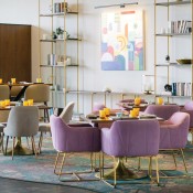

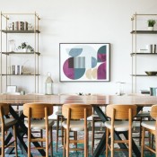
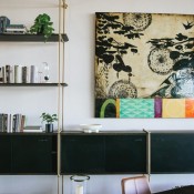
An amazing chandelier at Wren is a standout piece. Images courtesy of Wren
Delight Guests with Light
At Wren, Bergman included two amazing chandeliers — one over the front desk that resembles a bunch of floating gold popcorn and another over the staircase featuring small shimmering, hanging gold flowers. “Lighting really catches your eye, and can add to the ambiance immeasurably and be really striking,” he says.
Strategic use of light, both natural and artificial, helps transform a space by influencing the mood, says Lisa Haude, senior vice president and director of interiors at LK Architecture, interiors division, Wichita, Kansas. “Playing with how light creates shadows or vibrancy helps set the mood of the space, from cozy and intimate to vibrant and bright.”
At The Rose Garden, Phoenix, Ariz., a stuffed peacock hangs from the ceiling surrounded by old school fringed lights that create the feeling of a cage around the bird. The fixtures contain color-changing LEDs so that different moods can be created depending on the desired ambiance.
Draw On Lived Experiences
It’s not unusual for independent restaurants to highlight the story of the chef or the owner in the design. Telling a personal story is a way to connect the guests to the people who run the restaurant. This past spring Kevin Gillespie opened Nadair in Atlanta, Ga., with a design inspired by his time in Atlanta, the Pacific Northwest, New England, Scotland and the American South.
The carpeting in the dining room of this Atlanta restaurant is a Scottish custom-woven design inspired by Gillespie’s great-grandfather’s regimental tartan; the furniture is a combination of contemporary Scottish and handmade classic Shaker-inspired pieces from near Gillespie’s second home.
Nadair’s art hails from Georgia, Maine and Scotland — one piece from each location, all of which are personally dear to Gillespie. “Too often people put up art that they feel fits the mood, but you shouldn’t put up art you have no connection to,” Gillespie says. Art is a great place to splurge, he adds.
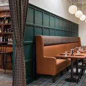
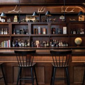
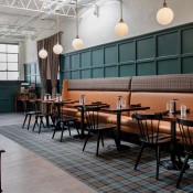
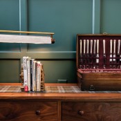
Nadair was designed to really reflect the life experience of owner Kevin Gillespie and make it a personal experience with a connection. Images courtesy of Nadair
Embrace Authenticity
“If there’s a single virtue that defines great restaurants over mediocre restaurants, it’s authenticity,” Gillespie explains. “I am not interested in owning a restaurant that doesn’t have that personal touch.”
Windom Kimsey opened Azzurra Cucina Italiana last year in Henderson, Nev., and is its owner and architect. He hired an artist in Italy to paint three pictures with his dogs as models. “People love that it’s unique and they ask about it and learn the dogs live here.”
Farmers Restaurant Group in Washington, DC, has nine restaurants but is “intentionally trying to not be a chain,” says Founder and Co-Owner Dan Simons.
To ensure each restaurant is authentic, when Farmers opens a new restaurant it does a deep dive. “We study the location and take the best lessons and ideas and do [the design] in our own contemporary, future-looking way,” Simons explains.
Simons looks into the history of the location, the building, the neighborhood, and goes as far back as makes sense. “Every time we’ve found inspiration that’s unique to a location,” he says.
Tell a Subtle Story
David Shove-Brown, partner of Washington D.C.-based architecture and design firm //3877, points to the subtlety in two restaurants he’s worked on.
Nighthawk Brewery & Pizza in Arlington, Va., features giant stripes painted — and accented with lighting – across the ceiling. The lines are a design element that tells a subtle story by pointing to three key places: One line goes from the kitchen to the direction of the chef’s first restaurant; one goes from the center of the space to Shove-Brown’s office; the third goes from the brewery to the direction of the company’s main brewery.
“For most guests, the stripes will be cool, funky decor,” Shove-Brown points out. “There will be some folks that want to know more and will ask [and] that will hopefully provoke conversation.”
Shove-Brown also worked on Mi Vida at the Wharf in Washington, DC, whose design tells the life of a day in Mexico City, thereby expressing the story of Chef Roberto Santibañez growing up and developing his food style.
Having these details gives customers a richer experience. “They might notice nothing on their first visit, but the restaurant might gain more meaning every time they come.,” says Shove-Brown. And if it’s done well, he says, “it can be a nice surprise.”
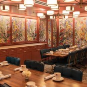
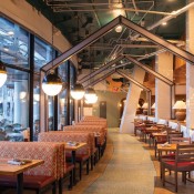
To ensure its restaurants are authentic, Farmers Restaurant Group studies the history of the location and then reinterprets ideas in its own style.
Make the Bar Stand Out
Last December, ZURI opened in Miami with a striking bar designed to drive home the brand’s authenticity and to deliver a “wow” factor.
Made of wood and drywall covered with layers of clay and polish, the bar glows orange at night and has multiple irregular cut-outs containing interesting bottles and glassware, all lit from behind. This exotic back bar attracts eyes and works as a centerpiece for the entire space.
Bars are not only a focal point but also a major generator of income, since margins are higher on beverages than on food. “So, you should highlight that product,” says Julia Petiprin, founder and designer, PRN Interior Design, Cincinnati, Ohio. “Bars should be on display and look enticing.”
Bars should also ideally be visible from the entrance, says Joy Dayaw, associate, MG2 Design, Seattle, to create an immediate impression and to attract early arrivals.
Design for Energy
In November 2022 Josh Rossmeisl opened Your 3rd Spot, a dining and games venue in Atlanta. He wanted it to be an experience for guests in a space with no walls and no dead ends (except for the kitchen and bathrooms). He added central cabanas and created circular flow, along with the addition of a mezzanine level to maximize the vertical space.
The location holds a lot of corporate events but even those guests don’t want to be put into a separate room, Rossmeisl says. “It’s not a traditional restaurant; it’s where energy begets energy. It’s really continuous throughout.”
Include Surprising Moments
At Your 3rd Spot, the bathrooms provide an experience. “They feel like you’re walking into another universe,” says Rossmeisl. “They’re the most Instagrammed bathrooms in Atlanta because we have all these Easter eggs and a selfie couch and a secret button where a beer ball goes off and the music changes. We even have a haze machine in there. They’re uniquely designed in ways that make people remember them,” he adds.
“Independent restaurants are especially fun to play with elements of surprise because there is so much opportunity for customization,” says Julie Babcock, design manager, Chipman Design Architecture (CDA), Des Plaines, Ill. This can range from subtle millwork detailing to more obvious artwork connections throughout the collection.
One example is Swift & Sons Tavern in Chicago, which CDA designed in collaboration with AvroKO, where playful, bold baseball terms were layered over midwestern farm-style paintings.
These subtle findings have the most impact when they’re placed in specific spots where it’s only visible in the moment, or from a particular angle, “It feels like a little secret only you’ve been let in on,” Babcock says.
Guests might not notice these tiny touches on their first or even third visit, Babcock points out. “Imagine finding a new surprise on your second or third visit — that would be intriguing enough to draw me back again to seek out something new.”
The Rose Garden features a gallery wall above the bar, though there’s a small photo of a little boy — an internet meme — hidden among the pictures, bringing in a playful modern element. And, on each side of the bar are modern pictures “to create a moment of pause so people question their environment and to add a modern touch,” explains Dala Al-Fuwaires, MFA, principal, owner and designer, House of Form, Scottsdale, Ariz.
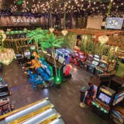
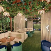
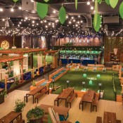
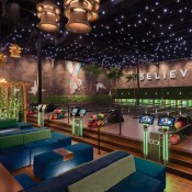
Your 3rd Spot was designed for flow so guests can move around at their will and energy begets energy.
Include Unique Furniture
Vicki Nutter, co-founder and chief development officer of Crown Restaurant Group, Cincinnati, Ohio, likes to find unique furniture at venues such as flea markets, antique malls, Facebook Marketplace, and resale shops like Goodwill, “which allow you to be creative and stay within budget,” she says. She finds pieces for the restaurants ranging from decorative mirrors to furniture she adapts to hostess stands.
Nutter says she’s careful to not turn the restaurants into museums. “Any vintage or thrift items we integrate into our design are to create a statement or conversation starter.” Of course, to replicate at scale for chain restaurants, it’s possible to spec furniture inspired by one-off finds.
When buying online, she cautions that it’s important to have established “to the trade” accounts when possible and to use those vendors so items can be returned without consequences.
Nutter both searches for specific pieces of furniture, and the reverse — sometimes she’ll find something she likes then finds a space for it in a restaurant.
Pay Attention to Materials
The materials used in restaurant design should add to the restaurant’s story, says LK Architecture’s Haude. They should be authentic, practical and provide visual interest.
Materials should add texture, depth, and character to the space and should be both visually appealing and tactile, as well as durable and easy to maintain, she says.
Careful consideration should be given when selecting any material. “In a fast-casual dining environment, one would tend to merge rugged materials that are easy to maintain and allow guests to quickly move in and out of the space, yet still be comfortable and inviting,” Haude explains. “In a fine dining setup, include furniture that’s formal yet inviting, incorporating comfortable seating, cozy interiors, and moody lighting that feels sophisticated, cozy and warm.”
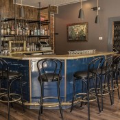
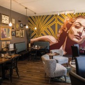
Unusual furniture found in antique shops, flea markets and online bring a unique element to the restaurants in Crown Restaurant Group.


