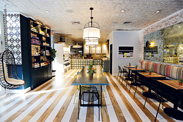
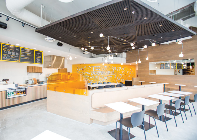
 The entryway at Allora introduces the arches that carry guests throughout the space.
Every restaurant design or renovation project starts with the same basic objectives in mind: reflect and support the concept and menu, create operational efficiencies and ensure a seamless, comfortable guest experience. Meeting code requirements is mixed in as well. But from there, designers and architects are challenged to work their magic in ways that pack a visual punch, generating buzz and further enhancing the guest experience with aesthetics that surprise and delight.
Approaches to doing so are as varied as can be, limited only by imagination (and, of course, budget and schedule). Doing so, however, has become nonnegotiable in this age of high consumer expectations and social media sharing. Here’s how two firms worked to pack a visual punch in recent projects, one a new build in which architecture plays a starring role; the other, a renovation/refresh that shows the power of clever, brand-supporting decor strategies.
 The mural above the bar was inspired by a mural in the House of the Golden Bracelet in Pompeii. It really pops and it captures the sun-faded feeling of the Amalfi Coast. Image courtesy of Allora/Maverick Restaurant Group
Architecture Grounds Allora’s Allure
On its own, the building that houses Allora, a coastal Italian restaurant opened by Maverick Restaurant Group in San Antonio in March 2022, packs a punch. Sustainably constructed as the new corporate home to Credit Human credit union, the 12-story tower sits on the edge of the city’s Pearl Brewery district, an urban revitalization project renowned for its mix of chef-developed restaurants, vibrant retail, cultural and office spaces.
The Credit Human building’s ground-floor architecture, which features a large loggia and tall, arched windows, inspired Allora’s concept and its design, according to Chris Sanders, principal at Austin, Texas-based Sanders Architecture. “The building was designed in the same spirit of Pearl, which is directly adjacent. Maverick’s owner, Peter Selig, had watched it going up and felt the loggia provided a distinctive covered space for outdoor dining, which really fit the Amalfi Coast-inspired concept he had in mind,” Sanders notes. “The windows and the details in the loggia were inspirational to us, as well, as we started the design process.”
Leaning into the building’s existing arches, the Sanders team added more inside. “The arches were a jumping off point for us,” says Jena Hammond Nichols, AIA, Sanders Architecture’s hospitality segment specialist. “We brought the interior walls up and curved the inside of the walls at the top to match the windows. We wanted to extend or underscore the visual impact by really emphasizing the beautiful architecture that was already there and the verticality of the space, which has 23-foot-high ceilings.”
 Playing off the building’s architecture, curved wall segments were added along Allora’s back bar, around its tall, arched windows, and on the mezzanine. Allora images courtesy of Allora/Maverick Restaurant Group
Carrying the design language throughout the building, deep curved wall segments were also added along the restaurant’s back bar, beneath the bar’s overhang, creating insets for shelving. The overhang itself, by virtue of its architecture and the fact that it spans nearly half the length of the restaurant, created an opportunity to add another signature design feature. “We knew we had to have something to cover the bar for health code, and as we got to a certain point with the architectural design we engaged an interior designer, who suggested we could put a mural on the face of that overhang. Inspired by a mural in the House of the Golden Bracelet in Pompeii, it really pops. Along with the overall color palette, which captures the saturated, sun-faded feeling of the Amalfi Coast, it helps to bring the concept to life.”
 Arches were a jumping-off point for the design team. Interior walls were brought up and curved at the top to match and extend the visual impact of the windows.
Strategically, bars offer great opportunities for packing creative design punches, Sanders adds. From the moment guests enter Allora — even before, through the massive arched window surrounding the entry door — they’re greeted with a direct view of the bar, its arches and mural, all positioned to anchor the space and create energy. “It’s a big architectural moment, but it doesn’t just end there,” he says. “To create a really effective, cohesive design, you also need to think about the edges of a space. What do guests see when they look right and left and from different angles in the restaurant?”
To that end at Allora, the team carried the architectural energy of the bar to the adjacent interior wall, where a curved staircase leads up to a mezzanine. Used as a space for private dining, it includes wine storage visible behind a wall constructed with arched openings.
“People talk about Instagram-worthy moments. We don’t necessarily design to that, but I think it translates to moments of surprise or moments of beauty,” says Sanders. “They’ve always been important aspects of every project, and we think about them from arrival sequence on. What’s the look and feel of the entry door and door hardware? What impression is made when the door is opened? What are you greeted with visually on entry, and then at every step of the journey all the way through to the restrooms? You don’t want to give it all away when you first walk in the door; there should be moments of discovery all along the way. They don’t all have to pack a big punch; subtle, thoughtfully designed discoveries can have just as much of an impact.”
 The English Rose Tea Room was redesigned for its 20th anniversary. The redesign focused on better organizing of seating and retail displays and doubled down on bold brand-supporting decor.
Tea Room Blooms Anew with Fresh, Fun Decor
Maxed out, dated and overstuffed with memorabilia and cluttered retail displays, the English Rose Tea Room in Carefree, Az., was long overdue for a refresh. Its 20th anniversary, celebrated last summer, provided the impetus for owner Jo Gemmill to embark on what turned out to be a major update, one that proves the power of creative decor strategies to transform a space and reinvigorate a brand.
 “Initially, Jo just wanted help with some new flooring. But after our conversation, during which we talked about the 20th anniversary and what she was trying to accomplish, the scope of the project changed to pretty much a full renovation,” says Davina Griffis, principal at Phoenix-based Type-X Design Studio.
Griffis’ redesign of the English Rose packs a one-two punch. She focused first on better organizing seating and retail displays to improve capacity and operational flow. Second, she doubled down on bold, brand-supporting decor designed to surprise and delight guests and offer all-important Instagram-worthy moments.
“One of the main issues with the space was that there was just stuff everywhere. Over the course of 20 years in business, the owner had accumulated a lot in what is a small space — just about 970 square feet in the front of the house — and items were merchandised for sale everywhere,” Griffis notes.
Beginning with new flooring inset near the entry with a custom-designed brand emblem, and with fresh pink paint all around, retail displays were consolidated and organized. A tufted banquette with Queen Anne-style legs was installed along the back wall, increasing seating capacity and improving flow. Budget-friendly, oval-back chairs adorned with simple, low-cost teapot decals and rosy table linens further support visual branding. Cherished collections amassed by Gemmill over the years were kept, but decluttered and reimagined as more intentional design features.

Decorative plates, for example, previously mounted hither and dither around the walls, now neatly surround oval wall mirrors. Similarly, a teapot collection was consolidated and used to create a whimsical half-wall screen separating the banquette from the restroom area. “We tried to keep Jo’s favorite pieces but incorporated them more strategically into the refreshed design,” Griffis notes.
 Appropriately for an English tea room, Queen Elizabeth provided design inspiration, as well. A collection of framed photos and memorabilia of the queen amassed over the years was organized onto one portion of the dining room wall, where guests now sit at what’s dubbed The Queen’s Table. She inspired an Instagram-worthy moment near the register, as well. There, Griffis set a smiling image of Queen Elizabeth against a rose-blossom wallcovering with lit “Taking time for tea” signage.
The room’s biggest visual moment, however, is its new rose tree, which vines up to camouflage a structural column and extends out to create a dynamic ceiling feature. “Whenever trying to pack a design punch, a lot depends on the size of the restaurant,” Griffis notes. “But the idea is to create strong focal points. Here, my main focus was the tree. Everything else is comparatively minimal. We wanted to evoke the feeling of dining in a beautiful English garden, to bring that inside and have a very unexpected visual element greet guests the moment they enter.”
Designed by Griffis and created in collaboration with a local floral artist, the tree is covered in silk rose blossoms and tiny twinkling lights. “When Jo started out 20 years ago, I think her vision was very traditional,” she notes. “She was a bit fearful of making a big change, worrying how regular customers might react. But it’s important to refresh and stay up with trends, particularly to take advantage of the power of Instagram and other social media opportunities. On a very tight budget and even tighter schedule, we were able to transform the space from cluttered and dated to quaint, organized and modern. The design packs a punch, thanks in large part to the tree, but it also helps to establish strong branding for The English Rose Tea Room moving forward.”


