Located on the ground floor of a skyscraper in Atlanta, Mission + Market is an upscale operation with an extremely polished casual design that attracts everyone from power lunch goers to nearby residents.

The restaurant is owned by partners Chef Ian Winslade, Jonathan Akly and Tony Akly of Restaurants Consulting Group (RCG), the design/build firm behind the restaurant.
According to RCG President Tony Akly, Mission + Market was designed to be bright, comfortable and energetic all at once. It’s the type of space he says, where guests tend to linger.
Much of this is achieved through a mid-century modern/cubist approach that emphasizes elegance and comfort.
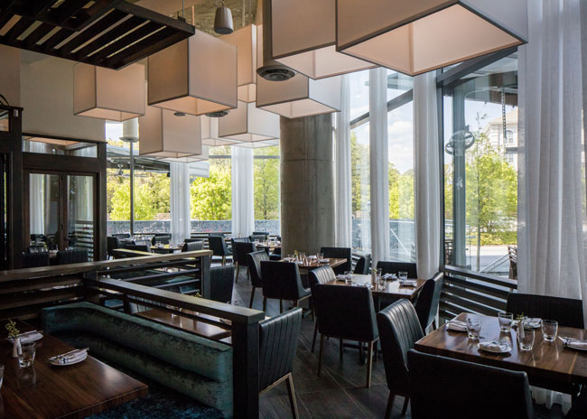
The restaurant’s lounge, for instance, features a blue velvet banquette paired with brass-framed black leather chairs. Overhead, black metal framed cubes help bring intimacy to a space with 20-foot ceilings.
Offsetting the angular nature of this design is a living moss wall, the most photographed element in the restaurant, says Akly. “With the browns and blacks and blue velvet, the wall really brings the mid-century design elements to life. There’s just enough contrast to be comfortable with.”
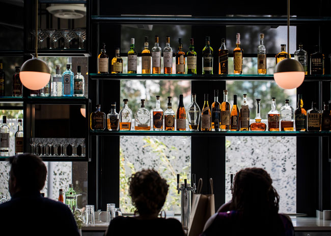
The restaurant’s cubist feel can be seen further at the bar itself, where metal cubes are used to hold bottles of spirits. Glass walls, meanwhile, let in plenty of light, adding to the energy of the space.

The restaurant’s glass walls, however, were a challenge in other ways. With nearly 140 feet of floor-to-ceiling windows, the space has an inherent fishbowl effect. To counteract this, long, elegant sheer white window treatments were hung to break up the view.
A similar structural challenge was presented in the form of the restaurant’s nearly 20-foot ceilings. To help create a more intimate atmosphere in the dining room, RCG created custom canvas cube light fixtures. These cubes range in size from three feet to five feet across and are hung at differing heights.
Different drop ceiling elements can be found over the booths and in the restaurant’s private dining area, where the soffit actually hides the AC system and other mechanical components that are hung from the ceiling, added Akly.
The shape of the restaurant — narrow and 150 feet long — presented another challenge. To help, the restaurant is designed with an open kitchen that helps create the feeling of depth and energy, says Akly. It’s also a major attraction.
“The open kitchen is our biggest asset. It has a chef’s counter that will seat up to eight people. One night a week the chef does a special menu with wine pairings,” Akly says.
In addition, the kitchen and the booths are set at 45-degree angles relative to the space. This feature is in keeping with the cubist approach and makes the restaurant feel more approachable instead of a relatively unwelcoming long, narrow space, he noted.
The welcoming layout is matched by the comfort of the furnishings in the dining room. The booths are blue velvet upholstery and have extra high dividers, providing visitors with a greater sense of privacy. They also measure 60 inches compared to the standard 48. That extra space, Akly says, “is for comfort. You go to restaurants with 48-inch booths and if you have a big client you end up bumping shoulders. We draw a power lunch crowd so we wanted to provide extra space.”


