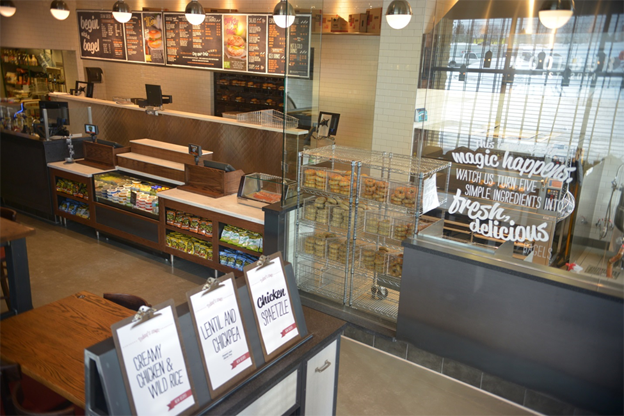
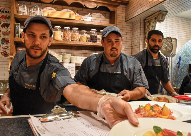
 The assortment of condiments and garnishes at some restaurants can be extensive. Some have found that repositioning wells is necessary to accommodate separate to-go expo stations. Images courtesy of Think.ShopLike most restaurateurs during the COVID-19 pandemic, Lisabet Summa, co-owner of Big Time Restaurant Group, had to scramble to cope with a sharp spike in to-go orders. One of the most pressing challenges was to adapt expediting stations to make order fulfilment as efficient as possible.
Major space alterations to sites were impractical, so it was critical to optimize space utilization at existing expo stations. She devised a simple but highly effective tactic: Mark out space within the expo line for specific functions with colored tape. Thus, each step of the expediting process had a designated zone. This delineation of space helped to keep the area well organized for efficiency.
Restaurant designers have had to come up with inspired organizational design tweaks to expediting stations to keep pace with an explosion in the pickup and delivery business. “Most restaurants didn’t have an appropriate expo area for COVID,” says Matt Schuler, director of culinary development, SCOPOS Hospitality Group. Most adjusted on the fly within existing space constraints. Some modifications were as simple as Summa’s solution, and others took a bigger investment and some power tools. While these alterations do not need to transform physical space that much, they are crucial to ensuring that to-go orders are assembled and packaged accurately and efficiently.
Indeed, making smart adjustments to expo stations is critical to supporting takeout and delivery. Even after COVID fades, most owners believe to-go business will continue to be a significant revenue source. So, expo station design for existing and new sites will be more essential to success than it has ever been. Here’s a look at how designers and operators are adjusting to the new environment.
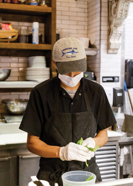
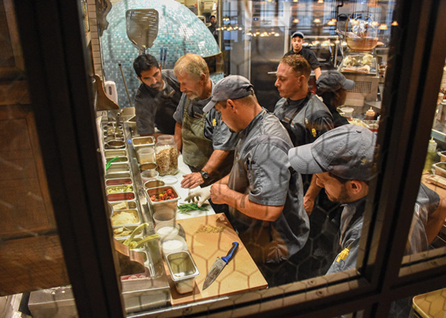 After one more inspection at the expo station, these entrees are ready for guests.
Space Flexibility is A Must
“We design for maximum flexibility,” says Schuler. “COVID only made us think more about why this is so important.” Being able to quickly adjust the configuration of the expo station by making even small adjustments has a real impact on efficiency, he stresses.
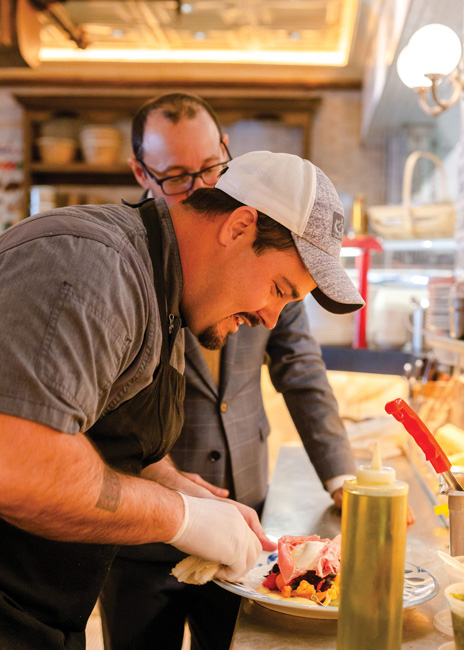 Quality control is an important function of the expo station. Paul Macaluso, president and CEO of Another Broken Egg Cafe, a 75-unit breakfast and lunch chain, says his organization was unprepared for the COVID-induced burst of to-go orders. “Before COVID, only 2% of our business was to-go,” he says. “Now it is 10 to 12% — as much as 20% in some locations.” To meet the challenge, Another Broken Egg added a new to-go specialist position. That means more bodies in the back of the house, making smart space utilization even more critical.
When Another Broken Egg ramped up its to-go business, it found that staff in the expo area were frequently getting in each other’s way when reaching for sauces and garnishes. To reduce those occurrences, the layout of those items was reorganized with the addition of a separate holding area for to-go use. Macaluso added in-counter wells in the to-go area for sauces and garnishes. When you can’t expand the expo station, such reorganization sometimes requires certain areas to pull double duty. For example, the capability to switch hot wells used for breakfast to cold wells at lunch to support increased demand for salads saves some precious counter space.
During COVID, many restaurants have made makeshift cold wells out of pans of ice. A more efficient option is to use the latest hot and cold well products that can be easily switched, Schuler points out. “There are four-pan units that you can make any one hot or cold,” he says. “Before, you had to pull out the hot undercounter unit. Now, you just have to flip a switch.”
Add Storage Wherever Practical
Another outcome of the to-go boom, an increase in the number and types of to-go containers needed in the expo area, has increased demand for storage space. Another Broken Egg, for instance, found that its popular eggs Benedict dish continued to cook in the delivery containers the chain was using, sometimes arriving overcooked at the customer’s home. So, Macaluso specified new souffle cups that prevented this from happening. It solved one problem but created a need to store more to-go orders.
 In such a space-challenged environment, Macaluso says, “we have to use every square inch that we can.” Good expo design depends on being creative with space, Summa emphasizes. You can draw inspiration from RV and tiny house design, in which designers find clever ways to use every square inch of space. For example, replace a long, unbroken shelf that invites a haphazard aggregation of food containers, tableware, and other essentials with individual cubbies for specific containers or condiments.
One useful strategy, Summa says, is to think outside the traditional confines of the space. You may be able to add small cubbies or hang pouches in a small nook between a shelf and a wall to hold key tools of the to-go trade such as markers and pens. Another tip: Hang to-go bags on hooks affixed to the wall at the back of the counter.
Small metal shelving commonly found in office supply and home renovation big box stores can be precious assets for organizing materials. Summa recommends labeling every shelf and cubby with the description of what it should hold — stapler, large entree containers, soup dishes, or what have you. This spurs staff to put things in their proper places so items are not misplaced and can always be quickly located.
You can repurpose space for other uses to gain efficiency. If expo staff have to walk halfway around the back of the house to wash their hands, you could replace a shelf with a mini 8-inch hand sink commonly used in RVs, Summa says.
Consider Custom Solutions
Consider custom fabrication for key storage space. For instance, Summa has installed 9-inch shelves in space-constrained areas. She specified a ship rail in the front of each of these “skinny shelves” to prevent items from being knocked over.
Sometimes makeshift strategies for the busiest periods make all the difference. Summa installed a hinged counter extension at one location to create more assembly space for the busiest periods of the day. The counter, in this case, extended into the area in front of a passageway when the extension was raised. “Sometimes I have to duck under it,” she says. For safety, the shelf must be visible from both sides of the doorway. It isn’t an ideal arrangement, but it works in a pinch.
Add Storage in the Front of the House
When you’re using all the storage area at the expo station, another option is to look to the front of the house for a little more space. Having set up a pickup area in the bar for drivers to grab delivery orders, this was a logical area for Another Broken Egg to add storage for supplies such as bags and food containers. To-go specialists continually walk from the expo station to this area, so grabbing items from the bar to resupply the back of the house is within their normal course of activity.
Upgrade Technology
New ordering technology can also aid efficiency and accuracy. Jim Fay, senior director of architecture and real estate for Brinker International, the owner of Chili’s Grill and Bar and Maggiano’s Little Italy brands, replaced receipt and order printers with new ones that accommodated paper with self-adhesive backing. These tags are affixed to to-go containers, making it easier to track orders as they are assembled. “Staff checks accuracy at this stage, then they go through the order again when it is bagged,” Fay says. “So, they are confirming the correct order contents twice.” Sticky labels also eliminate the need to staple paper to containers and bags.
Macaluso added a second kitchen display monitor exclusively for to-go orders. Cooks and to-go specialists can both now easily see whether the order is meant for a dine-in plate or for to-go packaging. Before, when a single monitor displayed both on-site and to-go orders, there had been more opportunity for mistakes.

Consider Ergonomics and Staff Safety
Expo area design should take the safety and well-being of staff into account. For example, the height of back-of-the-house workers can vary widely. “I started my career working at a salad station,” Schuler says. Schuler is 6 foot, 3 inches tall — considerably taller than average. Counters, set for people of average height, were too low for the budding chef. “So, I was constantly bending,” he says. “That destroyed my back.” Today, some vendors offer adjustable tables so that surface heights can be raised or lowered as needed.
Big Time Restaurant Group has the opposite challenge at its eight south Florida locations. “A lot of our employees are shorter than average height,” Summa says. With the addition of shelving above counters, shorter workers cannot reach items perched on the highest levels. Summa used two solutions at different venues: adding a built-in riser in front of the counter toe kick area, and/or buying lightweight, high-quality step ladders. She affixed bright yellow tape to permanent steps to make the features easier to see. She advises spending a little more for sturdy, durable step ladders with non-slip steps. Don’t cheap out on these items, she stresses. Saving a few bucks may backfire if an employee suffers a fall as a result.
3D Modeling Improves Efficiency
When designing a new restaurant or a major renovation of an existing one, 3D modeling combined with virtual reality is hugely beneficial, Schuler says. This technology produces virtual models that you can walk through in a digital environment, providing a way to experience what the actual space will look like and gain insight into operational efficiency.
You can get an accurate approximation of how work in the expo space will flow based on how you size counters and where you place elements such as hot and cold wells, shelves, etc. As this exercise unfolds, your chef can provide feedback on how the design can be adjusted for better efficiency. Schuler recommends including equipment specification early in the design process to capture a better picture about how the back of the house will perform after construction is completed.
It’s well worth it to spend extra time planning the layout and functionality of the expo area. “To-go customers are a large, repeat dining group,” Summa says. “We consider them a special group of diners.” They are not shy about expressing their satisfaction or lack thereof on social media sites, she adds. Preparing and distributing meals promptly and accurately is critical to keeping this cohort satisfied, and a well-designed expo station greatly aids that goal.


