Moving a flagship location while at the same time introducing a bold new look isn’t without stress for the team involved or without risk for the concept. But when that flagship’s original trade area starts shifting, when its first-generation look begins to feel dated, and when a stellar piece of real estate beckons from across town, the case for making such a move can be compelling.
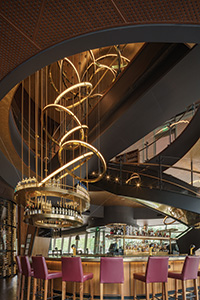 Signature design elements, including a 1,500-bottle glass wine tower, the grand staircase, and a custom brass chandelier that provides visual connection and energy between the two floors, are all in view from the main bar area. Photos by Kevin MarpleSuch were the circumstances that spurred Southlake, Texas-based Del Frisco’s Restaurant Group (DFRG) to move and reintroduce the flagship location of its Double Eagle Steak House brand. Opened last September, the new Dallas Double Eagle Steak House anchors a sparkling new 20-story, $225 million César Pelli-designed Class A office and retail tower at Olive Street and McKinney Avenue.
The move took the restaurant from the suburban Far North Dallas neighborhood into the heart of the city’s vibrant Uptown district some 15 miles due south. And it didn’t just leave the neighborhood in which it had operated since the early 1990s in the rearview mirror — it left any vestiges of the brand’s original classic, dark steakhouse aesthetic in the dust.
With design partner The Johnson Studio at Cooper Carey, DFRG used its move to debut a contemporary, decidedly uptown Double Eagle design to the Dallas marketplace. It’s part of an ongoing reintroduction and expansion of the brand that the company has rolled out successfully in other urban markets, including Washington, D.C., Chicago and Philadelphia.
“Our Dallas location was still a first-generation iteration of the brand. We had a very loyal guest following, but our trade area wasn’t what it once was, and we knew it was time to make a move,” says Bill Martens, DFRG’s chief development officer. “The Olive & McKinney tower is a magnificent space, and we saw it as a great opportunity to debut a new, big, bold, contemporary design vision here.”
Unique Building Drives Unique Design
Indeed, the 13,700-square-foot restaurant, which boasts an additional 2,800-square-foot second-floor outdoor patio with killer city views, is all that and more. That’s thanks in no small part to the building itself.
“It’s an absolutely striking building by one of the preeminent architects on the planet, and it’s a prime corner location. It was a bit of a dream site for us and lent itself to doing something very dramatic and sculptural,” says Bill Johnson, AIA, associate principal at The Johnson Studio. “But that being said, it was a challenging space to design. It has lots of angles, angled columns, floor-to-ceiling glass and other unique architectural characteristics. It’s also a two-story restaurant, which adds to the complexity. We didn’t get started until the building was nearing completion of the framing, so we were challenged with getting our openings between the floors, stairs, elevators and things like that worked in.”
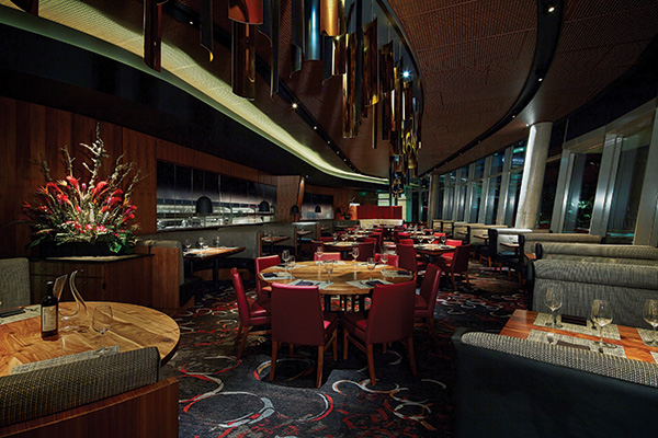 The Double Eagle’s main dining room design balances the building’s ultra-modern, angular aesthetic with gentle curves, custom lighting, and finishes that emanate warmth and comfort. A wall of black ombre glass panels provides filtered views into the kitchen.Anita Summers, a Johnson Studio designer who worked with Johnson and architect Randy Miller on the Double Eagle project, describes the space as an oddly shaped glass box with severe corners and angles. The biggest challenge, she says, was devising strategies that would leverage its unique and modern aesthetic to create a restaurant that would be bold and contemporary but also exude the luxury and comfort that Del Frisco’s guests expect. It also had to be functional to meet the company’s high-end service standards.
Job No. 1 was opening the second floor to the first. “There were very limited spaces where we could cut a hole to do that,” Summers says. “The plan evolved as the possibilities for where we could actually puncture that slab would be.”
As often seems to happen, however, a big challenge presented by a space limitation ultimately led to an innovative design solution. The need to connect the two floors to ensure a flow of energy, seamless service and equally appealing areas for guests led to the creation of a large sculptural staircase that is one of several “wow” factor design elements in the space.
Fabricated of glass, polished bronze, walnut and iron, the wide, open staircase winds up from and over the first-floor bar area. “It’s really an iconic piece, visible from outside and from both levels inside,” Martens says. “It’s visually exciting, but it also is very effective at connecting the energy between the two floors.”
The restaurant’s 8,100-square-foot main level encompasses the main dining room, bar and large kitchen, which is partially on display behind glass along one wall. The glass ensures quiet but also provides a filtered view into the kitchen: It is ombre glass, which is clear toward the bottom of the panes and gradually turns to black toward the top, providing some visual energy but blocking views of the kitchen ceiling and shelving.
The 5,600-square-foot second level includes additional dining room space, a second bar, a smaller kitchen — also visible along a wall behind ombre glass panels — and a flexible space that can be closed off for private dining or left open for general dining.
Materials, Lighting Add Warmth
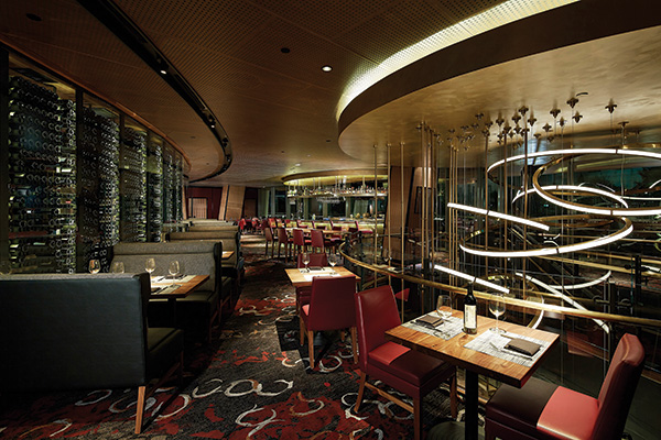 The second-floor dining room features a wine wall with more than 3,700 bottles on display as well as the top portion of the Double Eagle’s signature chandelier, which hangs in the large stairway opening to the bar below.Materials and finishes throughout were carefully selected to balance contemporary aesthetics with warmth and comfort. Walnut veneer and tabletops, brass, polished bronze, a granite bar top, warm red leather chairs and textured fabric booths deliver in that regard. Custom carpet — a bold Tuscan red-and-white organic pattern against muted charcoal — adds softness and visual interest.
So, too, does the choice of ceiling materials. The panels, walnut like the veneer used on walls and at the bar, are perforated. “That ceiling is really a unique feature,” says Martens. “It adds a lot of warmth but also contemporary sophistication to the room.”
Those ceiling panels also have great acoustical properties, according to Johnson. “They work well from a design standpoint, but they also have acoustical material on the backside of the perforations,” he says. “And, as we have probably 12 air-handling units on each floor, the panels provide easy access for maintenance.”
The design team also leaned heavily on custom lighting to add warmth, drama and a sense of connection, again focusing initially on creating communication between the two levels. To that end, a large brass chandelier — another dramatic, sculptural design element — was suspended in between the opening between the floors, visually connecting the upper-level dining room to the main-floor bar.
“We always do our own lighting because it’s such an important part of the design,” Johnson notes. “It really does shape what you see, so we try to integrate the lighting and use it as a design element.”
Summers, who led lighting design for the project, says the overall goal was to create a dark and sexy feel in the modern, glass-enclosed space. “We worked hard on the lighting because we really wanted a low level of glowing light,” she says. “With LED technology, we’re now getting good color and glow. But to get it to dim down low and produce the soft glow that we were looking for took a lot of back-and-forth work with the manufacturer.”
Lighting options were also somewhat limited by the building. With the structure already in place before the restaurant design got underway, the team couldn’t implement its preferred approach — an array of lighting washing through a space from multiple directions to create the desired effect. “A lot of big plans that we had for dramatic up-lighting weren’t going to work here,” says Miller. “We were limited here mainly to just ceilings and walls.”
In the main dining room, rather than taking a traditional approach of putting in a few chandeliers, the designers opted for a custom-designed linear fixture on the ceiling above freestanding tables positioned down the center of the room. Accenting the shape of the room, the fixture was fabricated from curved pieces of polished bronze, blackened on one side, cut in random lengths and suspended from a slot in the ceiling.
“The effect looks powerful and complicated, but it’s really not,” says Miller. “There are other recessed lights in the ceiling that spot the tables, but that linear chandelier catches light and adds sparkle. Each of the Double Eagle Steak Houses has its own unique character, and we like to make sure that the design fits both the city and the space that it’s in. For Dallas, we felt that bold and sophisticated with elements of glitz and glamour was the right approach.”
Great Views, Inside and Out
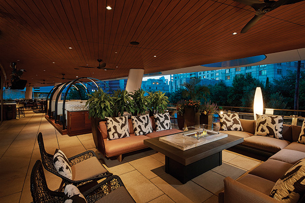 The terrace design includes a variety of seating styles to break up the 2,800-square-foot space. While each Del Frisco’s Double Eagle Steak House has its own unique look, the restaurants do share some common signature design elements. Bold, high-style custom lighting is one. Another is dramatic wine displays, and those incorporated into the new Dallas restaurant’s design are no exception.
On the main level, serving as a backdrop to the host stand and also as a visual screen from the bar area to the kitchen, stands a cylindrical, glass-enclosed wine tower holding more than 1,500 bottles. Measuring roughly 8 feet in diameter and 12 feet high, the tower features a library-style ladder that rotates around the interior to enable staff to access bottles.
Wine is also a prominent design element on the second floor. There, a curved glass interior wall fronting booth seating gives diners close-up, floor-to-ceiling views of another 3,700-plus bottles on display.
“It’s really impressive to look at, but that long wine wall also shields the view to the restroom corridor and back-of-house service area,” Summers says. “It looks great from the dining room side, but it also creates a fun experience for guests on their way to the restroom to walk behind that wall of wine.”
From the second floor, guests also have access to another big draw at the Dallas Double Eagle Steak House: a Texas-size outdoor terrace for enjoying al fresco dining and stunning city views. Measuring 2,800 square feet, the space was larger than the team desired and presented additional design challenges.
“We had asked the building owners to move the second-floor storefront out five feet or so. We could have used more space inside and less outside, but that wasn’t possible,” Summers says. “So to deal with all that space, we ended up creating a variety of different areas to break it up and create opportunities for different guest occasions. We have a lounge area with soft seating around a fire table, a bar area and traditional dining tables.”
Several dining booths, Summers adds, were positioned on a raised platform to set them apart and further break up the space. Sculptural arches over those booths accomplish that goal as well and feature integrated lighting, a creative solution devised by the team because no ceiling lights could be added to the outdoor space.
“The terrace is really amazing,” says Johnson. “Like the rest of this space, it drove the design and called for a lot of drama and outside-the-box thinking. This is one restaurant that, in virtually every respect, was very much shaped by the uniqueness of the building.”
Snapshot
- Brand: Del Frisco’s Double Eagle Steak House, Dallas
- Ownership: Del Frisco’s Restaurant Group
- Concept: Upscale steakhouse
- Opened: September 2016
- Size: 13,700 square feet on two levels, plus 2,800-square-foot outdoor patio
- Seating: 380 inside, 110 patio
- Project type: Flagship relocation, new build
- Real estate: New Class A urban office/retail tower
- Design highlights: Dramatic sculptural staircase connecting two levels, custom brass and polished bronze chandeliers, wine displays featuring 5,300 bottles, custom-designed carpet, leathered granite bar top, walnut veneer walls, perforated walnut ceiling panels, partially exposed kitchen behind ombre glass wall panels
- Build-out: Six months from start of construction
Project Team
- Del Frisco’s Restaurant Group: Bill Martens, chief development officer
- The Johnson Studio: Bill Johnson, director of design; Keith Schutz, project manager; Randy Miller, project architect; Anita Summers, lighting designer; Brittany Stratford, interior designer
- Structural Engineer: David Aucoin, PES Engineers
- MEP Engineer: John Sisk, ID Studio 4
- General Contractor: Ed Murphy and Bob Remsing, RCC Associates,
- Kitchen Designer: Cole Risinger, In Step Food Services
- Purchasing Agent: Denise Ho, Purchasing Solutions International


