A mainstay of the St. Louis fine-dining scene for decades, The Tenderloin Room came under new ownership last year when the longtime family-owned restaurant was sold to a group of well-known local restaurateurs.
That team hired V Three Studios, also of St. Louis, to refresh the space. “They really wanted to see if they could elevate and modernize the look of the space while keeping the historic beauty that is there in elements like the woodwork,” says Gabe McKee, design principal with V Three.

A major goal of the redesign was modernizing the lighting package. Previously, says McKee, The Tenderloin Room’s signature fixtures were classic crystal chandeliers. While they were elegant, they didn’t fit with the space’s updated look.
“What we were trying to do was modernize the idea of the chandelier itself. Chandeliers are a point of wealth and a prestigious lighting fixture.”
In the entryway, then, the classic chandelier was replaced by a version made with a mix of acrylic and brass tubes. This design gives the fixture a glow and has it casting dramatic shadows on the ceiling.
That wasn’t the only change to the space. To the left of the centerpiece table is the restaurant’s open kitchen. In the redesign, a pass-through was closed to better shroud the kitchen floor. The space was also given a new black marble countertop.
“On certain nights they can create a sort of a chef's table dining experience [at that counter],” McKee says. “People can pay a certain amount and have dinner there, maybe get a different menu and talk to the chef as it’s prepared.”

As in the entryway, chandeliers in the main dining area were also replaced by new signature fixtures. By swapping out showy crystal fixtures, these simple rectangular LEDs make it easier for guests to focus on the overall dining experience, McKee says.
That’s not to say the dining area doesn’t have signature elements. In this space, the fireplace is the star. Its makeover includes new tilework laid out in a mosaic style, along with a brass inlay created with metal salvaged from the restaurant’s bar during the redesign.
Brass is a signature element throughout the restaurant. Here, it can be seen in the horizontal mirrors sitting on each side of the fireplace, the wall sconces and (through color) in the sheer curtains that are used to help break up the space.
The curtains, says McKee, “provide almost an illusion of separate rooms, but it is really one big open room throughout.”

In addition to its main dining spaces, The Tenderloin Room has a long, narrow elevated section divided into two spaces, with a wine wall acting as the separator. This is a legacy piece, though one that was refreshed in the redesign.

The display was previously protected by locked doors, but those were removed, allowing the element to have its fullest impact. The designers also swapped out old lamps for new adjustable LEDs.
Other elements match what’s found elsewhere, such as the upholstered chairs with felt-like backs, sheer curtains and brass accents.

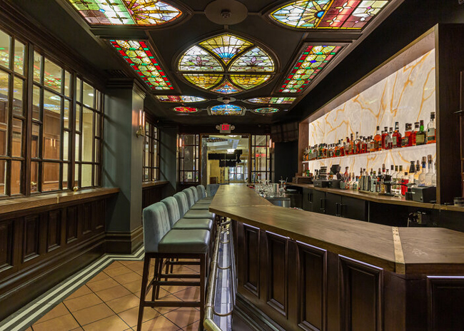
The Tenderloin Room’s bar also got a makeover in this redesign. While the stained-glass ceiling is a legacy piece, it was in need of some TLC, says McKee.
Many of the black, non-glass sections actually serve as access panels for the installation. This allowed the designers to pull out the legacy fluorescent fixtures and replace them with dimmable LED lights. These offer more control over the space’s atmosphere and also have a much longer service life. The entire piece also got a thorough cleaning. The result, says McKee, “is a night and day difference.”
Another key element of the space that changed is the back bar. This section is now made of backlit acrylic panels with wood-like veining held in a custom-made wood shroud. The bar top and back bar counter were also replaced with new oak tops. Elements like new bar stools with the felt-like upholstery and the bar top’s brass accents help connect this space with the restaurant as a whole, McKee notes.


