Joe Maddon may no longer be skipper of the Chicago Cubs, but his legacy will live long in Chicago. It was Maddon, after all, who led the oft-maligned, “loveable loser” Cubs to victory in the 2016 World Series, the team’s first championship since 1908. And it is Maddon who’s now honored at Maddon’s Post, a casual restaurant and bar that opened in the summer of 2018 in the recently renovated and expanded Wrigleyville campus.
A collaboration between Maddon, James Beard Award-winning Chef Tony Mantuano, Levy Restaurants and the Cubs ownership organization, Maddon’s Post isn’t a sports bar and it’s not a baseball-themed restaurant. Rather, through its rustic Italian and Polish menu — including fresh pasta, wood-burning-oven pizza and house-made pierogis — and its polished yet approachable design, the restaurant pays homage to Maddon’s and Mantuano’s roots and shared love of hospitality. A long-time culinary tour de force locally and internationally, Mantuano is best known for his role as chef-partner at Chicago’s iconic Spiaggia, a Michelin star winner every year since 2011. Off the field, Maddon is a partner in Ava, a successful “inspired-Italian” concept that opened in 2014 in Tampa, Fla., where he managed the Tampa Bay Devil Rays prior to signing with the Cubs.
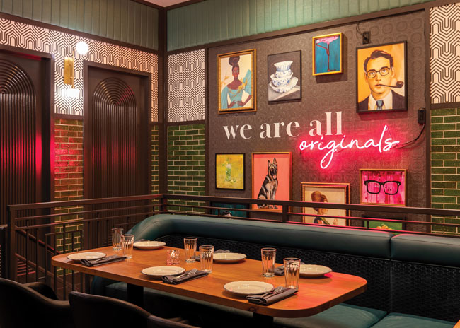
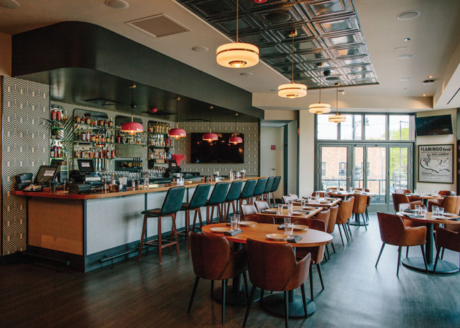 Color plays a strong role in the Flamingo Room upstairs. There, walls are clad in green tile and bold, geometric vinyl while saturated teal and pink accents add to the room’s swankier, more overtly deco vibe. Images courtesy of Matt Reeves
“Everyone knows the World Series manager side of Coach Joe, but a lot of people don’t realize there’s a very strong hospitality side to him, as well,” says Tara Zavagnin, director of operations at Maddon’s Post. “Between him and Chef Tony, the idea was very much to create a welcoming, inviting neighborhood spot that’s a natural draw during the baseball season, but that’s equally inviting, if not more so, during the off season.”
The idea, too, was to create a space where fans, locals and out-of-town visitors can feel like they get to know Joe: Joe the family man, the wine connoisseur, the classic rock enthusiast, philosopher, artist, flamingo lover and baseball manager.
Chicago-based architecture and design firm fc STUDIO was recruited to bring the vision to life and to ensure that the various investors in the restaurant were part of the process.
“We set out to combine elements of what each of the stakeholders envisioned for the space and what they thought it needed to be with what the budget would allow for,” says Rachel Crowl, partner with Julie Fisher at fc STUDIO. “But ultimately, the design had to reflect Joe’s personality and values. He’s a very unique guy, and he has a great set of design chops. He’s vocal about what he likes and was confident in where he thought the design should go. So, we took that input and tried to come up with a final design that the entire operations and ownership team could get behind.”
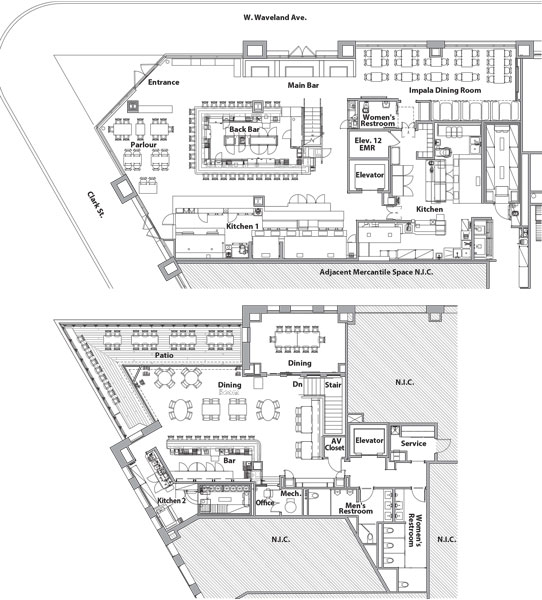
Measuring 7,440 square feet, the restaurant is one of several retail and hospitality tenants within the new Gallagher Way mixed-use development that surrounds Wrigley Field. It consists of two main buildings and a 30,000-square-foot community-oriented open-air plaza. The first building, where Maddon’s Post occupies corner ground- and second-floor space, is home to the Cubs’ front office, a selection of F&B destinations, retail tenants and the American Airlines Conference Center. The second is anchored by Hotel Zachary, a variety of upscale F&B concepts and a below-grade parking structure. The open-air plaza is a year-round destination for movies, concerts, game-day festivities and winter activities.
“We’re situated on the corner of Clark and Waveland, which is a little unique,” Zavagnin points out. “A lot of the other restaurants in the development sit parallel to or face the stadium, but our doors face away. We’re definitely part of the campus, but we open up to the neighborhood not the stadium. That fits nicely with the vision for Maddon’s Post to be a neighborhood restaurant, and it helps support the goal for this redevelopment, which in part is to make Wrigleyville a vibrant, year-round destination.”
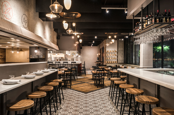
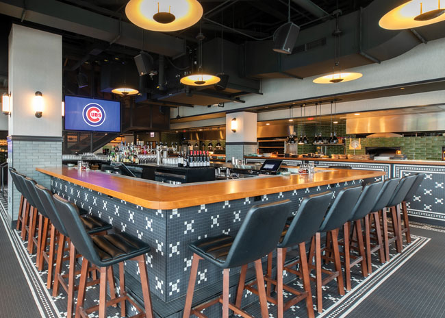 A large, central bar anchors the main level. It’s designed for comfort to attract regulars but includes generous surrounding real estate to welcome game-day crowds.
Satisfying Fans, Cultivating Regulars
fc STUDIO, which had also designed several other restaurant concepts in the development, came into the Maddon’s Post project with the basic footprint and a few structural elements — like the elevator, the stair opening, and the receiving and trash areas — already in place. No kitchen infrastructure or HVAC system had been installed, and tenants had already occupied the rest of the building.
A few must-haves informed initial design discussions. Dual-fuel kitchen equipment, wood-fired and gas-fired, was seen as essential to the concept, as was an open kitchen and a large central bar. Maddon specifically wanted an art deco aesthetic and a very personal, private dining room. Colors couldn’t be the Cubs’ team colors, nor could they be potentially seen as competitive team colors. And all finishes and materials had to be approachable and appropriate for big-volume, fast-turn game day crowds as well as comfortable and inviting for local, lingering guests on regular service days.
“Joe loves art deco and old-school places reminiscent of some in his hometown of Hazeltine, Pa.; not necessarily supper clubs, but nice places to go that might also have a little bit of kitsch and quirky personality to them,” Crowl says. “We were a bit nervous about the deco piece, particularly with needing to keep the restaurant very approachable for game day crowds and families, while staying true to the first-generation values of heritage and hard work that are central to the concept. We wanted to honor the past but also be very much in today in terms of style and finishes.”
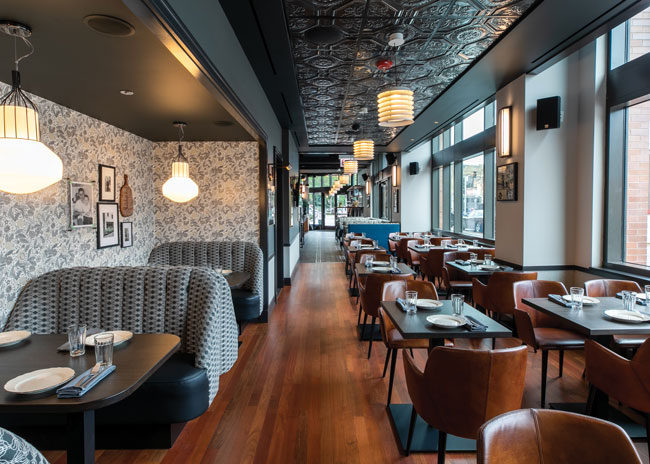 A back dining area features black-and-bone floral wallcovering and geometric-patterned upholstered booths. Pressed-tin-style ceiling tiles and an upholstered section of wall add to the room’s parlor feel.
Having two levels helped the design team cover multiple bases.
The casual, family-friendly space downstairs holds dining areas with varied seating for up to 75; a 22-seat central peninsula bar; a small retail area near the entrance; and a linear “railcar-style” open kitchen with custom wood-burning oven and wood-burning grill/smoker combination. That kitchen is supported by a small back-of-house prep kitchen and dish room tucked below the stairs.
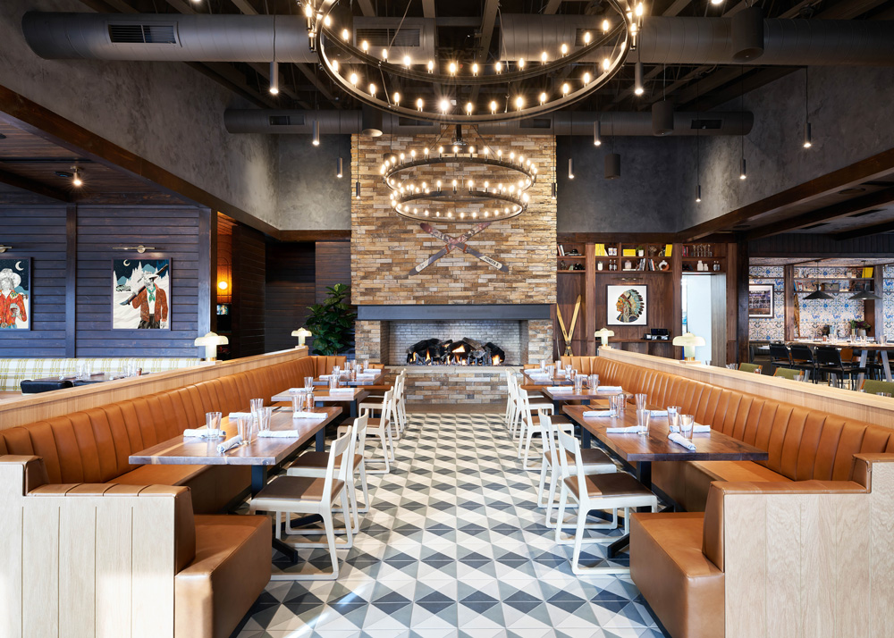
The main level’s design has subtle art deco influences but a strong focus on Maddon’s heritage and philosophies on life. Framed photos of family members and Maddon in his formative days cover the dining room walls and his memorable quotes and musings, including “Do simple better” and “We are all originals” get design play. So, too, does an enlarged, framed, “Dear Chicago” letter written by Maddon. It hangs on a wall at the far end of the bar and shares his thoughts, words of wisdom and gratitude with fans and guests.
“In selecting materials, we started with the building bones of the brand — heritage, hard work and a daring, first-generation soul. Those were our touch points and we wanted the materials to represent them, taking these old-school notes, putting a modern lens on them and adding a bit of drama here and there. We also wanted to evoke a timelessness through the materials,” Crowl says.
To that end, the team chose simple, durable materials — hardwood and mosaic ceramic tile flooring; natural American cherry wood bar and tabletops; blackened steel hardware and stair rails. Chairs and barstools have simple lines, leather upholstery and were custom designed for extra comfort to welcome guests to settle in and linger. Colors, particularly on the main floor, are primarily neutral.
“To honor that notion of simple, first-world design, we didn’t want to overcomplicate things. But at the same time, we wanted to give enough energy to the space that it had a personality,” she adds. “The mosaic tile, which also covers the bar face and half-wall below the open kitchen, is super-durable but also adds interest and a vintage feel. And we chose green glazed tile for the open kitchen walls and around the wood-burning grill and oven. Because we couldn’t mimic team colors, we landed on this jewel tone green as a feature color. It was inspired in part by Wrigley Field’s ivy-covered outfield walls and adds a lot of character.”
If the green kitchen tile adds a touch of drama, so do finishes in what Crowl describes as a “parlor-style” dining area tucked back along the building’s outer wall, away from the central bar area. Custom vinyl wallcovering there has a black-and-bone floral pattern that complements and contrasts with similar-toned geometric-patterned upholstered booths. Black, pressed-tin-style acoustic ceiling tiles and an upholstered section of wall there add to the parlor feel and help absorb sound.
Shifting the Tone
Color plays a significantly stronger role in the restaurant’s second floor, where walls are clad in jewel-tone green tile and a bold geometric-patterned vinyl. Saturated teal and pink accents add to the room’s swankier, more overtly art deco-inspired vibe.
Dubbed the Flamingo Room after a favorite haunt in Maddon’s childhood hometown, the second floor is comprised of a small bar and dining area, patio seating and a 12-seat private dining room. With total seating for 58 inside and 20 on the patio, the second floor is primarily used as a special event and private party space but can also be used for overflow general seating during the baseball season, Zavagnin notes. The restaurant’s restrooms are located on the second floor, as well.
From a design standpoint, the intent was to transition to a different experience upstairs.
“We’re weren’t trying to replicate the look and feel of the main level,” Crowl says. “Joe had so many design ideas that he wanted to hit, and there were so many aspects of his personality that we were trying to depict. The modern, deco piece was much more fully developed on the second floor. Up there, we felt we could take a deeper dive and, through the design, give guests more intimate access to Joe’s life and personality. To introduce the transition, going up the stairs we have an installation of colorful, eclectic oil paintings that represent people and things that matter to him. It’s activated with his ‘We are all originals’ quote and shot of pink neon.”
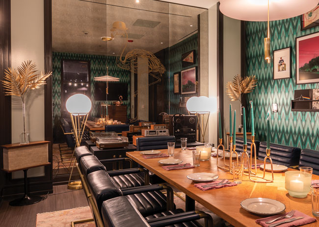
It’s in the private dining room where the “original” Maddon vibe comes through most notably.
For starters, the room is accessed by a secret door. It looks just like one of several deco-style arched panels lining the second-floor walls, but this one slides into a pocket at the touch of a button, opening into a space that feels as though it could be a room in Maddon’s home.
“Every element of the private dining room was so well thought out and different from what you’ll see anywhere else in the restaurant,” Zavagnin says. “It has a custom wood table and big, comfortable leather chairs. When Joe is in Chicago, it really is his private dining room. It also gets used a lot by players and team management, and by guests for private functions.”
Art elements in the room were personally curated and, in some cases, created by Maddon. “There are lots of story lines throughout the room and art and imagery from his life,” Crowl adds. “And you definitely get a flavor of his rock-and-roll personality. Music is very important to him, so we incorporated a vintage 8-track player, a reel-to-reel and turntable system and a collection of some of his favorite albums.”
It’s a room, Crowl notes, that’s near and dear to Maddon personally, but that, like the downstairs, is also designed to be accessible and timeless.
“We knew that no matter what happened, this restaurant would likely outlast Joe’s position with the Cubs — whether he signed with another team or retired,” she says. “That happened sooner than expected, but our intent always was to use design to help tell his story and honor his legacy. He is an incredibly magnetic person and will always be an important part of the Cubs’ history. That’s what’s celebrated here.”
Project Team
- Ownership: Private investors
- Design architect: fc STUDIO — Rachel Crowl, Julie Fisher
- Architect of record: Chipman Design
- General contractor: Clune Construction
- Kitchen design: Trimark USA, Jeff Carlin
- Engineering: Element Energy, Rob Olden
- Custom art design and procurement: Mel Muoio
Snapshot
- Location: Chicago
- Opened: June 2019
- Concept: Family-friendly, “first-generational” Italian, Polish
- Menu specialties: Pasta, pizza, pierogis
- Segment: Casual dining
- Size: 7,440 square feet
- Average check: $35 - $40
- Design highlights: Simple, durable, “first-generational” materials, mosaic tile, open kitchen with wood-burning equipment, large center bar, jewel-tone green tile, parlor-style dining area, eclectic artwork personal to Maddon, art deco-inspired Flamingo Room, hidden door to private dining room, second-level patio
Floor Plan
*Click on floor plan to view detailed image
Editor’s Note: As we went to press, we learned that Maddon's Post permanently closed its doors. We chose to run this because we think the story of the project still has value.

