 Furnishings and finishes set the stage, but it’s often the art pieces displayed that really bring restaurant interiors to life and create brand differentiation. Terry Eaton, founder and president of Austin, Texas-based Eaton Fine Art, has built a career and a thriving business on the notion that, no matter the concept, art makes the dining experience more memorable and adds the finishing touches to great designs. His consultancy works with brand leaders, designers, restaurateurs and hotel companies to develop, curate, produce and install custom art programs, whether a few pieces for a single space or a few thousand for large, multi-unit projects. Eaton shares some insights on how the process works.
At what point in a restaurant project might an art consultancy or curation firm typically get involved?
TE: We’re often brought in by the interior designer at the beginning phase of a project as part of the collaborative creative team. For restaurants that are making the investment in an art program and intend for art to be a big part of the experience, it’s important that our team be involved at an early stage to help develop and curate those special art moments, be it custom three-dimensional pieces, wall murals or other types of installations.
Are there specific cues you look for to help guide what a particular brand’s art program should be?
TE: We really immerse ourselves in what the brand stands for. It might be based on the chef’s country of origin or on craft whisky or bourbon. Whatever it is, we start by immersing ourselves in what that particular brand or that specific location wants to be. It’s important that the art be authentic to the brand, the location and the narrative. Sometimes those things are synonymous and sometimes they’re not.
How important is “local” when considering art programs for restaurants?
TE: A desire to be local is still strong and relevant, but from my perspective it’s more about brand authenticity. One brand we’re working with, for example, is going to have a similar creative dynamic wherever it is in the world because the founding chef’s home location is such a strong element of the brand. For another recent project, it was more about creating a curated feel with things collected from all over — some local, some not. We love doing that, and it’s a great way to lend authenticity and a sense of place but can also add a sense of worldliness, depending on the nature of the collection. And by creating a sense of place, I don’t mean relying on overt gestures to the location. Your restaurant might be in Austin, but that doesn’t mean you need to lean on imagery of cowboys and stars. The art should support the brand and be authentic to or evoke the spirit of the cuisine.
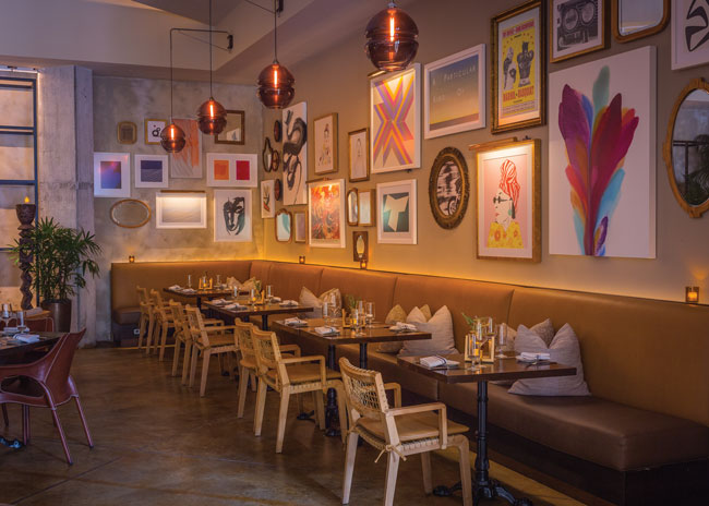 At Galley, a global cuisine and cocktail destination at the Hilton West Palm Beach, the art program has a curated feel, using local and vintage art elements as well as collected objects to create a mood and a sense of gathering.
Any examples you can share of that principle in practice?
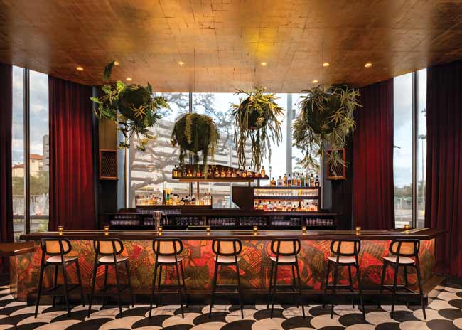
TE: Capa, an upscale tapas and steak restaurant at The Four Seasons Orlando, on which we collaborated with Puccini Group, is a great example. Being a tapas restaurant, it was all about the experience and making guests feel engaged in the environment. We commissioned an artist to curate a beautiful scene that wraps the large bar that guests walk by to get to the dining room. It’s a sort of mural that he created from more than 11,000 Spanish replica coins of two or three different colors. It looks abstract, but as you squint your eyes, you see a big, caped bullfighter and bull. It creates a sense of place and supports brand authenticity but in a very creative way.
Another example is Galley at the Hilton West Palm Beach. They recently did a design and menu refresh, and we created an art program inspired by both the global menu and the city’s growing arts district. It has a very curated feel, using art and objects that one might collect from all over, including contemporary art from local artists, vintage album covers, posters and mirrors, Hermès scarves, and a few refurbished novelties from old ships. It’s an interesting variety of things collected together to create a mood and a sense of gathering.
How much time is typically required to develop, source, deliver and install a curated art program? What should operators expect?
TE: Every project is different. One might require just a few pieces of art, while another could require a few thousand — large hotel projects, for example. So, timing can range anywhere from six months to two years from beginning to end.
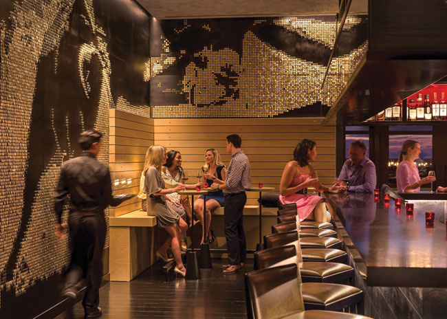 More than 11,000 Spanish replica coins were used to create a signature, concept-enhancing mural that wraps the bar area at Capa, an upscale tapas and steak restaurant in Orlando, Fla. Images courtesy of Eaton Fine Art
What’s the process like? How do you go about finding the right pieces for each project?
TE: Our team’s eyes and ears are always open and looking. As we start projects, we have a collaborative meeting to talk about where we want it to go, what might be appropriate for this brand, what suggestions or requests the owner or designer has come to us with, how we could implement those and how might we do it differently. Once we know where we’re headed, we get to work sourcing and procuring. We don’t have a big art warehouse somewhere; we look at each project as an opportunity to curate a program specific to that client and the needs of that brand narrative.
Any do’s and don’ts you can offer to help operators create effective, impactful art programs?
TE: One has to do with practicalities of placement. Restaurant environments are harsh, so you need to think about both materials and location. We’re not, for instance, going to recommend heavily textured textile pieces that are hard to keep clean. And we wouldn’t hang pieces in close proximity to active foodservice areas, in areas where someone could walk away with them or, in the case of kids, reach up and play with them.
But, beyond such practical considerations, a big takeaway is to use art as a way to make the dining experience more memorable and bring a space full circle. It’s not simply ornamentation; it should be curated and displayed in ways that enhance the ambience and support the concept and the food. Dining is theater, after all, and the art program is an important creative member of the stage set.

