Based in Miami, DIRT describes itself as a place where “clean eating and great taste coexist.” The concept, which debuted in 2015, recently made its first move outside of Florida opening a location in Arlington, Va.
Designed by Washington, D.C.-based //3877, the design is meant “to create a fresh and clean environment that really reflects the type of food that they serve, which is very health conscious and clean,” says Davic Tracz, a partner with the firm.
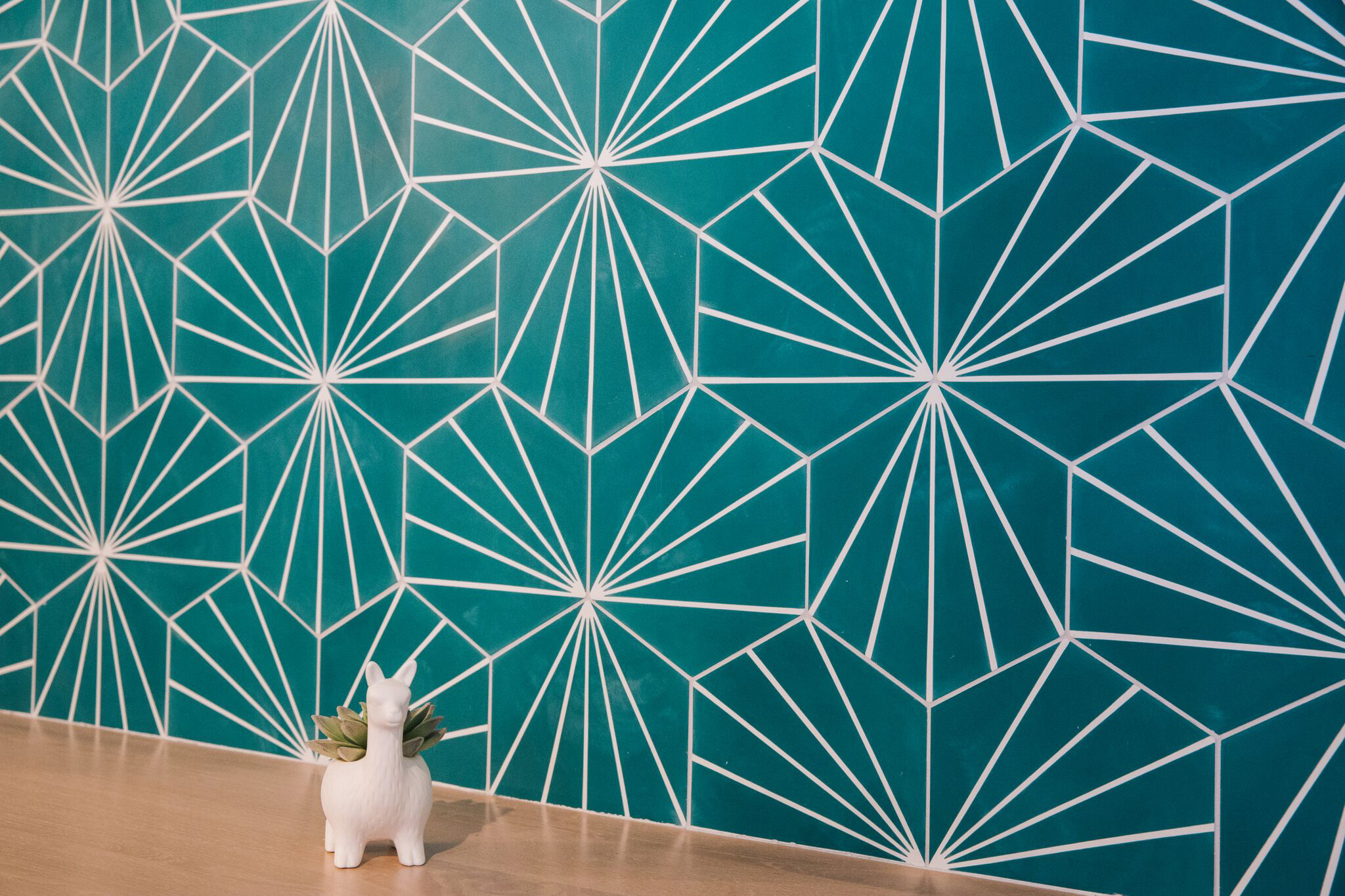
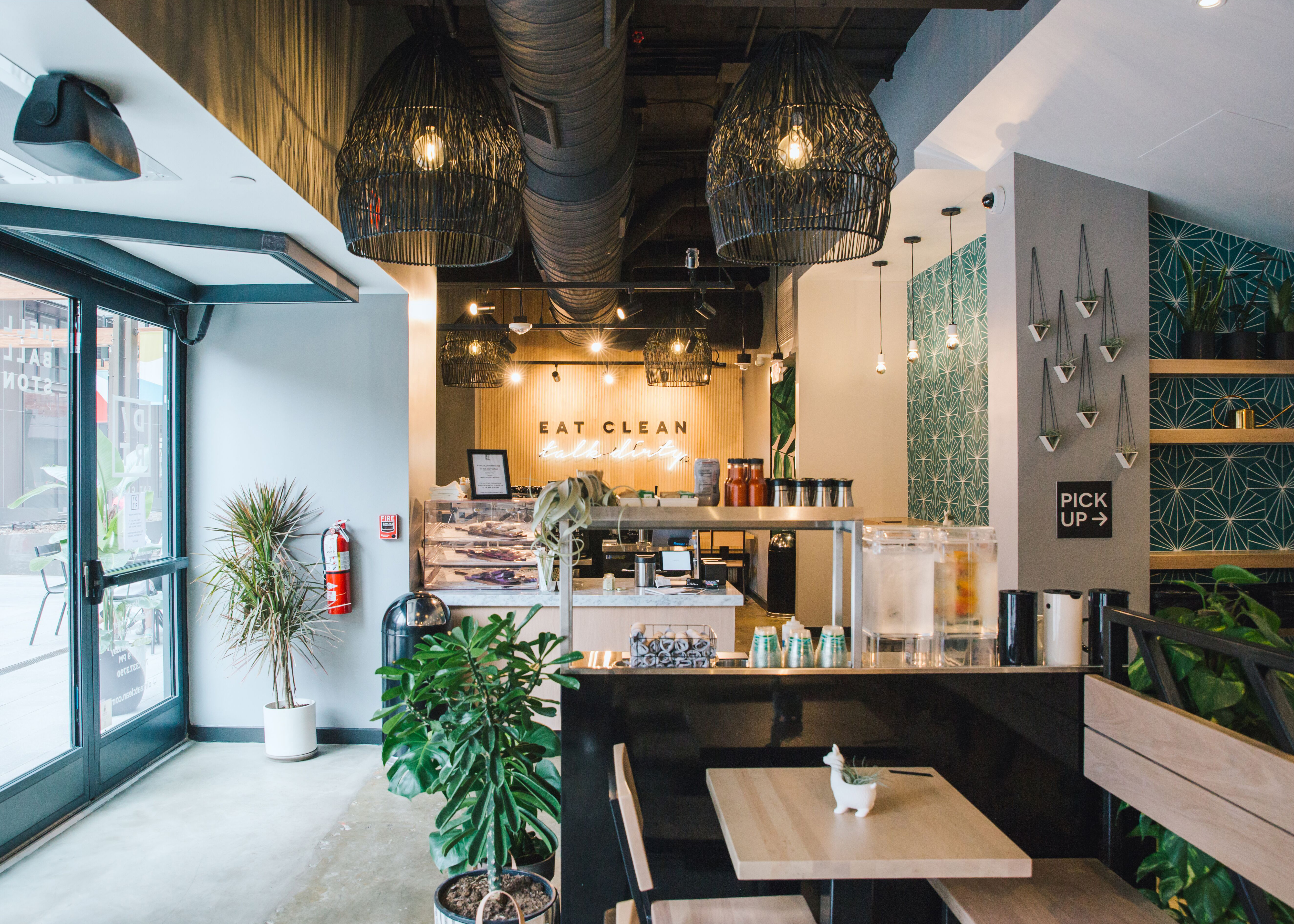
DIRT’s design reflects its Miami roots, with lots of plantings and other botanical touches, including a palm wallcovering in the hall leading to the restrooms and interlocking blue/green leaf-like tiles placed on several walls.

“The green color and the plant elements work well together throughout the space,” says Tracz. “The tile adds a little bit of texture while still being a flat material. Allowing the pattern to rotate certain ways really adds quite a bit of punch when you walk into the restaurant.”
One of the signature design elements in this location is a map that shows the locations of farms, ranches, breweries and artisan food makers that provide DIRT with ingredients and offerings.
“You can see where [the food] is coming from in relation to the restaurant and who the vendor is. It’s a little bit of a teaching moment in that sense,” says Tracz.
This map sits against a plaster wall with grays and blacks mixed together. The wall, along with the restaurant’s stained concrete floor, “helps bring a little bit of history and texture to the space.” Tracz adds.
Overhead, meanwhile, large rattan light fixtures are hung at varying heights. Not only do they add visual interest to the space but they also help pull attention from exposed ductwork and the high ceiling overhead, notes Tracz.

In addition to the main counter service, this location has a separate coffee bar. It serves to separate a large portion of the dining room from the ordering line, providing a calmer seating option to guests. It also offsets the shotgun feel the long, narrow space might otherwise have.
Notably, the coffee bar also has a walk-up window, allowing pedestrians to order coffee without coming inside. Getting this designed and approved was one of the bigger project challenges, Tracz says. “It was the engineering and getting the building management to approve exactly what it looked like. They wanted to make sure that it didn’t look like a Wendy’s drive-through window. There was a little back and forth on the styling.”
The dining area past the coffee bar features solid wood tables and chairs in a light wood. It also has its own Instagrammable elements. The most notable of these is the “Eat Clean/Talk Dirty” sign.
This sign gets plenty of play on social media. It also contributes to the restaurant’s hip, playful feel. While DIRT was designed to be very welcoming there are also elements of surprise and storytelling via design, notes Tracz.


