 Brent White Independent consultant Designer — Environments & Brand ExperiencesHot colors, hard plastic surfaces, fixed furnishings, drab dropped ceilings, bright institutional lighting — think back to just about any fast-food restaurant chain not too many years ago, and these are the design elements you’d have been likely to see. After all, the whole QSR experience was built around getting customers in and out quickly, not making them comfortable enough to hang around.
But that was then, and this is now. Spurred by dramatic changes in customer expectations and by new, share-grabbing fast-casual competitors with elevated designs and menus, QSR leaders have gotten the message: Speed and value are still critical, but design and experience matter more than ever. Brent White spent eight years as a design director of environments for San Francisco-based Tesser, working on reimages for brands including Wendy’s, Noah’s, Philz Coffee, Jersey Mike’s, Bojangles and Sonic Drive-In. He now works independently and collaboratively with Rubber & Road Creative, a San Francisco-based design group. Here, he shares his thoughts on key forces and trends impacting modern QSR restaurant design.
Functional Balance. Expectations for QSR spaces to no longer look institutional have risen greatly, in part due to competition from fast casuals. But operators and franchisees are still trapped in the need for durability, scalability and ease of maintenance. “Cost is a huge factor for this segment in particular, so you’re always trying to make it look like you spent more than you did,” White says. “Some of the biggest players are figuring out ways to balance aesthetics and functionality. McDonald’s, for instance, might have almost institutional flooring and walls, lots of 12-by-24 or 12-by-12 grid-oriented tiles, lots of laminate, but then also some nice furnishings, great lighting and ceiling treatments. And when you look at the seating, instead of the old indestructible, bolted-in, curved bucket seats, it’s now softer, more flexible and more attractive. Guests today are much more keenly aware of design. QSRs can’t get away with simply letting durability and ease of cleaning drive design and materials decisions.”
White adds that clients should be encouraged to consider net cost versus the more typical cost per square foot. “For Bojangles, we found upholstery fabrics that are amazing — stain-proof, durable, even bleach-proof,” he says. “They were also four times the cost of low-end vinyl that you see in a lot of QSRs. But if you’re doing a 20-foot banquette, you’re talking about a difference of $400 per store for seating that looks great and lasts at least four times longer.”
 Noah’s New York Bagels’ new design taps a lighter variation of the brand’s signature navy blue, pops of orange and natural woods. Image of Noah’s courtesy of Snapper Photography
Solutions: Softer seating that’s easily replaceable, greater variety of seating and table styles, upgraded fabrics and lighting, natural materials used strategically at key customer touch points, easy-to-clean “bulletproof” flooring and wall treatments
Colorways. Perhaps following the lead of fast-casual brands such as Mendocino Farms and Digg Inn, White sees QSR operators trending away from heavier, industrial, “reclaimed” looks toward lighter, brighter designs and materials. Against those backdrops, however, they’re using color in more sophisticated ways. “If a brand’s signature color is heavily red, for instance, we might not even use the PMS red that’s in their logo on the interior,” he notes. “Instead, we might use a darker, richer version of that red, use it sparingly and integrate non-brand colors as accents. QSRs used to have their true brand colors plastered everywhere, but now it’s more subtle; there’s a much more sophisticated level of application. The same goes for graphics. Consumers don’t want to feel like they’re being hit over the head with branding. Once they’re inside, they’ve already bought in and don’t need to be advertised to.”
Solutions: White or light backgrounds, limited but strategic use of color, off-brand colors for accents, colors inspired by nature, natural food colors
Our Own Devices. No surprise here, but phones and other personal devices are playing a big part in how designers are outfitting QSR spaces, in part because they change social behaviors and spatial expectations, White notes. “People are increasingly open to communal tables at QSRs, for instance,” he says. “Some clients will say that people aren’t for ready for them, and think nobody will sit at them, but if you put a strip of USB plugs down the middle, all of a sudden, people do sit there. When someone puts their headphones on or earbuds in, it’s almost like they put a physical cocoon around themselves that allows them to be comfortably closer to other people. They sit as close as they can get to the electricity and don’t mind if others are there because they’re usually plugged in, too. For operators, that creates an opportunity for higher seating capacity in less space.”
 Bojangle's design included upgraded upholstery that was more expensive than low-end vinyl but lasts four times as long. Image courtesy of Bojangle's
Solutions: Communal tables, counter seating, USB strips, furnishings with embedded outlets, easily accessible free Wi-Fi
Media Moves. The growing prevalence of guests happily dining while using devices impacts use of other media in the space, White adds. “TV monitors are still being used in QSRs, but the media seems to be shifting away from sheer broadcast to more bespoke, brand-related content,” he says. “Whether it’s social media or customer-driven or dynamic digital content that supports the brand environment and decor, more consideration is leading to more meaningful content. Music, too, is getting much more specific to the brand. Instead of just signing up for a random Muzak service, operators are investing in the ability to have a bespoke set of artists and songs that, while not branded, support the brand and the experience.”
Solutions: TVs show brand-supporting content and visuals, sophisticated sound systems with multiple smaller speakers throughout the space, more careful attention to acoustics
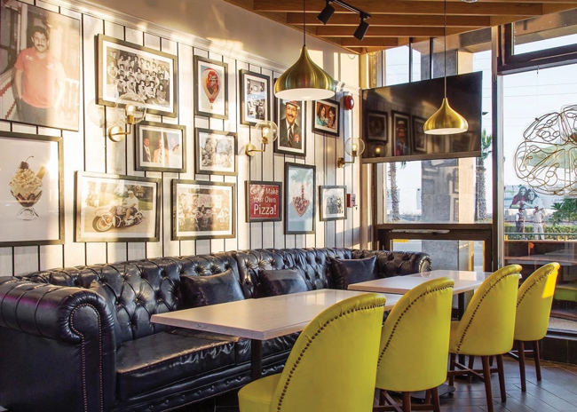
Localization. The days of fast-food chains with units that all look alike are fast coming to a close. Some element of localization is now not just a menu trend but a design trend, too. “It’s a huge challenge for QSRs, there aren’t many out there that are doing it very well,” White says. “It’s really important, but it has to be authentic. You can’t just print some standard imagery and integrate a city name, even if it’s done well. Local has to be local, and that takes management, effort and investment.”
Solutions: Use real local imagery, source local artifacts, tap local artists, go a little off the beaten path to incorporate local elements that guests will give you credit for


