Owned by husband and wife team Anjan and Emily Mitra, DOSA is a successful Indian food concept based in San Francisco. The company recently opened its first outpost in Oakland and third location overall. While the first two DOSA units are full service operations, this one, dubbed dosa by DOSA is the growing chain’s first attempt at a fast-casual service model. Designed to be a neighborhood hang out, the restaurant has several elements meant to draw people into the space while also providing Instagrammable moments, says Jeff Wheeler, project manager for Feldman Architecture, who oversaw the restaurant’s design.
 Images courtesy of Dosa
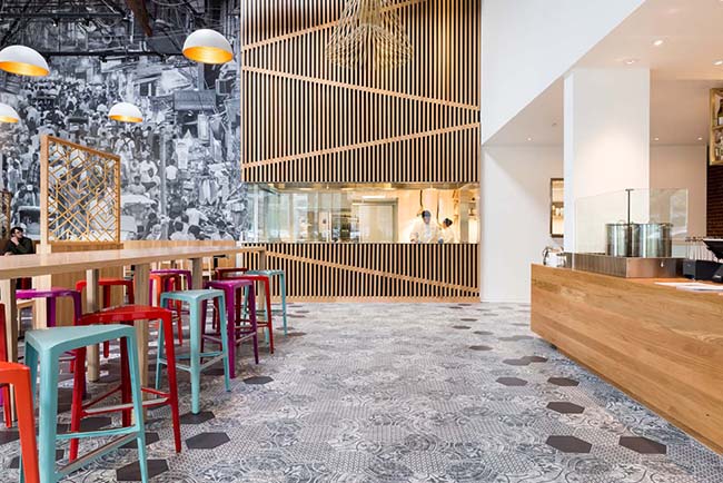
One of the restaurant’s centerpieces is its open kitchen, which is on axis with its entry door. Here, team members make the large, crepe-like pancakes that give Dosa its name.

“The dosa griddles are the things you see front and center, so people can just walk up and watch them make the dosas. One of the primary concepts was to be transparent about how they make the food and how fresh it is,” says Wheeler.
Operating in a former warehouse space with high ceilings, creating an open kitchen presented a design challenge: how to install a hood system running twenty-plus feet up that didn’t detract from the restaurant’s look and feel. The designers responded with a shroud, a series of vertical wooden slats that run above the open kitchen and hide the mechanical system behind an impressive visual element.
The restaurant’s high ceiling also required some creativity in its lighting design, notes Wheeler. The brass cage fixtures and bowl fixtures are hung from brackets attached to ceiling trusses. “The metal brackets help lower the hanging point for the fixtures. Otherwise it would be very expensive to bring them all the way from the ceiling.”

The vertical slats are carried through to the restaurant’s bar, where they’re used as the face of the bar’s seating section.
It addition to the usual beer, wine and spirits, the bar also features induction burners on display filled with house-made chai, and serves espresso and lassi, a traditional Indian yogurt drink.
As an all-day space, the designers created the bar to be bright and appealing, with white marble-look solid surface tiling and clean sight lines. “We wanted it to make a very clean and positive initial impression when you walk up to that counter,” says Wheeler. “We want the bar to be a friendly place. It was designed so you can see across and see the other people hanging out. It’s close to the windows so people walking by can see the activity inside and be drawn in.”

The restaurant’s featured seating area, says Wheeler, is the community table. The table is designed to help draw in lunch groups, particularly workers from Oakland’s emerging tech scene.
“The colored stools were an eighth-inning addition. The food is very colorful and amazingly composed. The stools are the pop of color that relate to the food. It was a fun thing to tie it all together,” Wheeler says.

The designers used several visual elements to separate the main seating area from the runway and bar. The most obvious are the metal screens that help define the space. In addition, the dining area uses bowl light fixtures and standard-height tables vs. the bar-height communal table.
The defining element of the dining area, though, is the large Mumbai street scene on the back wall that’s “meant to draw you all the way in visually. It extends the space beyond the dining room,” says Wheeler.


