 Raised in a barn built by hand in Vermont, Griz Dwight, LEED AP, AIA, principal and owner of Grizform Design Architects, has loved architecture since he was young. After studying at Williams College with a major in studio art, he moved on to graduate with his Master of Architecture from the University of Pennsylvania. He moved to Washington, D.C., in 1999 and established his firm after his first successful solo venture designing a restaurant in 2003. Since then, Dwight and his boutique studio have designed more than 150 projects, including Fiola, Estadio and Farmers Fishers Bakers restaurants as well as King Tide Fish and Shell at Portland’s Kimpton RiverPlace Hotel. Below, he details some of his favorite restaurant design trends and tips.
Rich detailing. As design trends move toward clean, contemporary and the ubiquitous midcentury modern aesthetic, detailing will be more important. How adjoining materials come together to create richness and depth will keep restaurants layered and intriguing. During the recent rustic/industrial trend, the roughness of the materials themselves added depth and texture to spaces. If designers are not careful, current design trends could yield spaces that are cold and sterile.
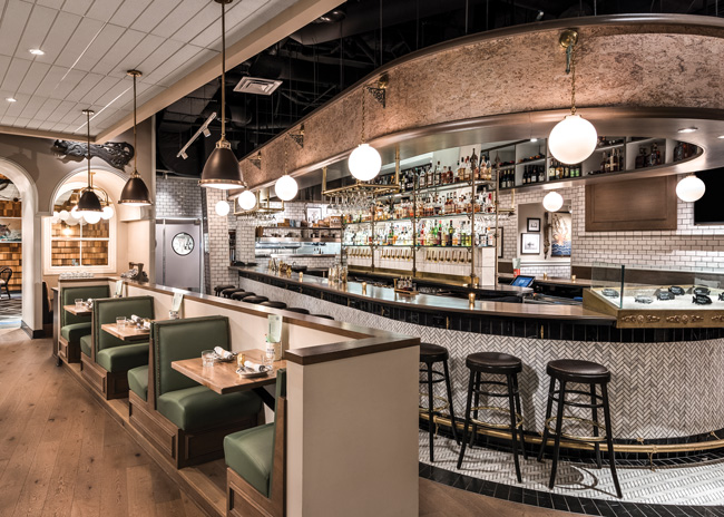
Anti-Instagram. Instagram has been great for showing off well-designed spaces, and social media has helped feed the restaurant industry. Don’t get me wrong, I like this trend, and I am not predicting the demise of Instagram. However, I think that the trend of designing moments specifically for Instagram has jumped the shark. Spaces should be designed for the people who are using them at the time that they are there. If you design it right, people will enjoy it and Instagram it. Say goodbye to places that are set up only for a photo but don’t hold up in real life. The whole point of going out to a restaurant is to experience something that you don’t get while in your house (or on your phone).
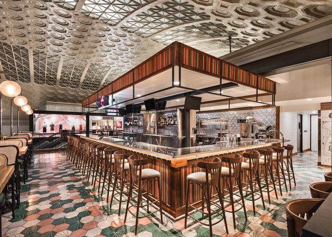
Making booze on-site. Distilleries are upping their hospitality game. No longer are you walking into an old brick and concrete building with exposed bones. Although these buildings have character and charm, these spaces are now geared toward the level of hospitality and design that you would expect in a boutique hotel bar. Distilleries have always boasted event space, but this pivot in aesthetics is bringing hosting to another level.
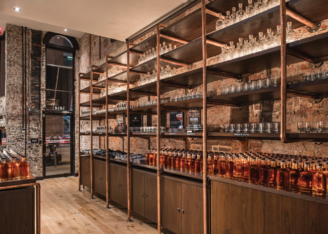 Images courtesy of GrizForm Design Architects
More tambourine. When a little bit of something works well, why not add more of it? Woods are becoming the star of the show lately. Detailed molding and paneling, parquet flooring, turned wood legs on furniture. The level of detail that you would expect to see in a residential setting is making its way into restaurants.
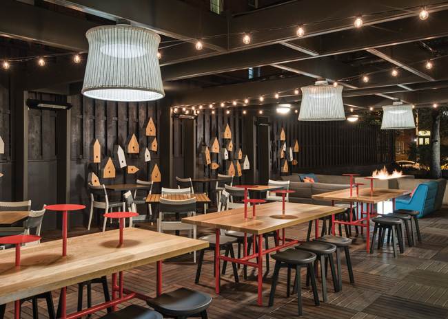
Asymmetry. I love a little asymmetry. Designers tend to be type A, and spaces often end up with symmetry and balance. Let your hair down, and put it back up in a side ponytail. Asymmetrical spaces bring a tension and dynamic quality to the design, which can help direct flow and use. Forget balance, and have fun with it.
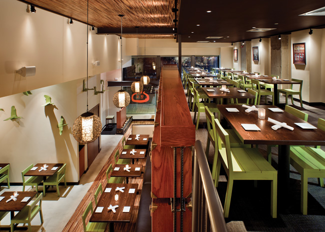
“Elevated” dining experiences. There is a see-and-be-seen aspect to going out and locating the best table in the house or the catbird seat. Multilevel spaces that provide a variety of perspectives of one space can create different versions of the best place to be. The ascension/descension into a space creates a unique sense of wonder and discovery that doesn’t happen on one level. Layer this with the current trend of developers creating 25-foot-tall interior tenant spaces, and we’ll see more mezzanine, raised levels and sunken areas.
Design does not always need to be so serious! A successful design makes people stop and wonder, and a good way to do that is to work in some unexpected moments or imagery. Salt Line’s pictures of sea monsters, Radiator’s quirky birdhouses, Founding Farmers Tysons’ mural with hidden allegorical moments have all sparked the imagination and conversation.
