Since its opening in December 2017, the Toronto expression of Chef Akira Back’s eponymous restaurant has dazzled diners with a design that, like the Japanese-Korean fusion cuisine that earned Back a Michelin star, is a study in bold and creative contrasts. Set in the new boutique Bisha Hotel & Residences in the city’s entertainment district, the restaurant is at once dark and moody, glamorous and artsy. And it is racking up stellar reviews for Toronto-based Studio Munge, which designed the hotel, its restaurant properties and, in 2012, one of Chef Back’s Las Vegas restaurants.
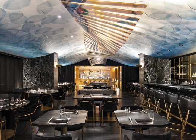 Arched and artsy, Akira Back’s feature ceiling provides the backdrop for a mobile imprinted with a watercolor painting done by the chef’s mother. Images courtesy of Maxime Brouillet
To wit: In 2018, Akira Back Toronto was named Best North American Hospitality Project by the Build 2018 Architecture Award program. It won Hotelier magazine’s Hotel Design Awards: Best Restaurant/Bar Design in the 50-200 rooms category. And it capped off the year by taking top honors in the Restaurant & Bar Design Awards as International Category Winner for Best “The Americas” Restaurant.
Not bad for a 3,000-square-foot space on a hotel’s second floor, the type of location that can severely limit a restaurant’s prospects for success, says project owner Charles Khabouth. The executive chairman of ICONINK, a Toronto-based hospitality and entertainment firm that creates and manages buzzy restaurants, hotels and festivals internationally, Khabouth initially worried about the positioning for the Bisha Hotel’s Akira Back. But Chef Back’s rising star in the global culinary scene — in addition to Toronto and Las Vegas, he has restaurants in Dubai, Singapore, Seoul, Bangkok, Beverly Hills, Dallas and other cosmopolitan hot spots — and Studio Munge’s proven design expertise helped to allay those fears.
“When I was developing the hotel, I knew that I wanted to control the F&B in the whole building and to have a variety of concepts,” Khabouth says. “Kost, which I did myself, is a three-meal-a-day operation on the rooftop. We also did a cafe and bar on the main floor. But I wanted to get a global name to add to the hotel’s presence and give it more exposure. Akira was my first choice. I’ve found his to be my favorite Japanese restaurants anywhere. He was easy to work with and brought a lot to the table, including a great staff from all over the world to help shape the kitchen and expedite the whole process.”
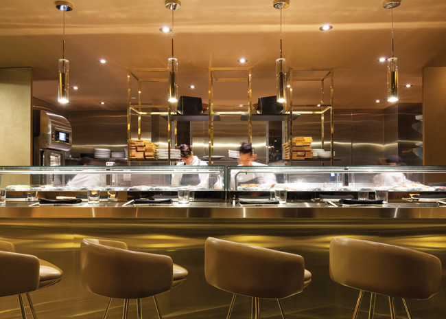 The gold-finished sushi bar along Akira Back’s back wall creates a theatrical stage for the chefs and casts its glow back into the restaurant’s dark interior.
With the chef and concept determined, the design team at Studio Munge embraced a two-fold challenge: one, to overcome the limitations of a space that requires guests to take stairs or an elevator to access the restaurant, and two, to create a unique identity for Toronto’s Akira Back, one that would represent the growing brand but express it in exciting new ways.
“During the initial ideation, we knew the type of worldly presence the client wanted to bring to Toronto, and we pushed boundaries to create something truly unique, something that would redefine what the Japanese restaurant experience looks and feels like,” says the studio’s principal, Alessandro Munge. “In a city already saturated with Asian dining options, it was crucial that Akira Back emerge with its own identity and allure. To differentiate it from other Akira Back locations, we used dramatic colors and unexpected forms, as well as unique finishes and art.”
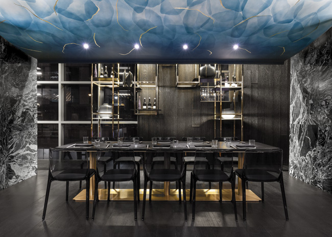 Defined by two key materials, wood and stone, with gold highlights, the dining room is a study in bold contrasts.
Negatives to Positives
As for the staircase, a bold design approach overcame that challenge.
“We knew the stairs had to be really special to get people to go up,” Khabouth says. “Nobody wants to have a restaurant on the second floor of a hotel building, but we all felt strongly that if we made it cool enough, sexy enough and interesting enough, people would take the stairs. We were right. Now, at least 70 percent of our guests do so even though the host downstairs offers to get an elevator for them because it’s this beautiful golden jewel box.”
Munge says his team set out to reimagine the challenge into an opportunity. The staircase was transformed into an immersive and Instagrammable experience with layered, shimmering gold leaf and dramatic, elliptical cove lighting — one that guests often wait in line for as a photo backdrop.
“For me, it’s always about taking the negatives of a space and turning them around into positive features,” Khabouth notes. “It’s easy to walk into an incredible space and make it look good. It’s not easy when you have certain negatives that you have to work around, but that’s typical of most projects. We accomplished what we wanted to do and made the staircase work in our favor.”
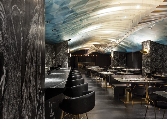
The drama continues upstairs. Inside the long, rectangular restaurant, the lighting is dim, and gold highlights shine against jet-black furnishings. Leathered black marble columns and bar surfacing add texture, and walls are clad in charcoal-black wood panels that evoke the traditional Japanese shou sugi ban technique for charring and preserving wood.
“In some projects, like this one, we don’t like to use too many materials — just one or two to define the space. Here, it’s wood and stone,” Khabouth says. “The floor is wood block. The wall coverings, while they look simple, are custom and were very expensive to produce. The company we went to had to purchase special machines that could give the wood the texture we wanted. It was all done tongue and groove and stained a certain way.”
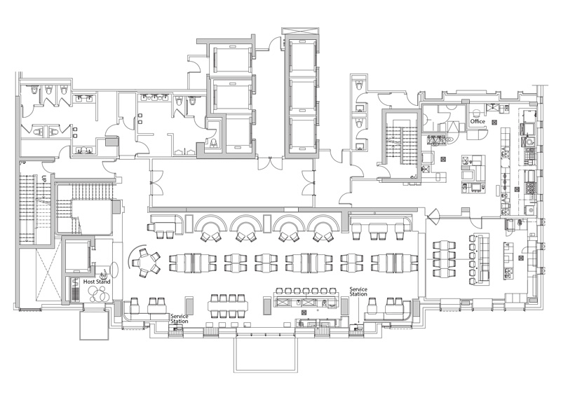
The restaurant’s seven-seat bar is positioned centrally against one wall in the dining room. Its placement there is unusual but was done very strategically, according to Khabouth. “Bars are normally toward the front of a restaurant, but we decided to put this one in the middle because the space is so long,” he says. “We wanted to use the bar to animate and add some energy to the center of the room. Keeping it centralized also made for faster, more efficient service because the servers don’t have to walk 100 feet to deliver a drink and come back.”
Another design feature used to temper the effect of the long and narrow room is its ceiling. Arched and artsy, it’s what Khabouth calls the hero of the space, creating movement and adding color to the otherwise dark and moody aesthetic.
“The ceiling’s dynamic forms and bursts of color have a profound impact on the restaurant’s overall character,” Munge adds. “Abstract petals in shades of indigo multiply across its white surface and disperse near the center to frame a custom, undulating mobile that leads to the sushi bar.” Applied on the mobile is an abstract watercolor print by Chef Back’s mother, whose artwork adds a modern and personal touch to many of his restaurants.
“It took some work to blow it up and make sure we didn’t lose the integrity of the original image,” Khabouth says. “We printed it onto a sheet of light aluminum, which was then cut into slats and very precisely hung so that it creates a wavy effect against the backdrop of the ceiling. There are probably 2,000 holes in the ceiling, and every one of them had to be done by laser. It took a team of guys on scaffolds about 10 days to hang the mobile.”
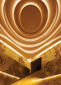 Overcoming the potential negative of a second-floor space, the staircase leading to the restaurant was elevated to an Instagram-worthy feature with shimmering gold leaf, tiered volumes and dramatic cove lighting.
Akira Back’s six-seat sushi bar, along the back wall, bookends the dining room and provides its own punch of glamour. Like the feature staircase that sets the stage for the guest experience at the front end of the restaurant, it’s wrapped in a glowing gold finish that provides for similar dramatic effect at the back end. It also creates a theatrical platform for the chefs and a special destination for diners.
“As the layered metallic sushi bar serves a fortunate few atop dazzling gold surfaces, the shine pierces through the center of the main dining room’s charcoal-black interior,” Munge says of the bar’s design. “These gold volumes along the back wall also hide the door into the main kitchen, allowing for a discreet and efficient passageway for service.”
As an operator, Khabouth emphasizes that while the restaurant’s design needed to be dramatic, bold and visually striking, first and foremost it had to hit critical marks for functionality. The bar’s position is part of that solution, but so is the kitchen’s. Adjacent to the sushi bar and cold kitchen area, the hot kitchen is separated by just a door and a glass panel.
“The hot and cold kitchens function side by side, essentially as one kitchen,” Khabouth says. “In some Japanese restaurants, the sushi counter is in one area and the main kitchen is somewhere else. That’s not a very efficient use of space and resources. We wanted to keep the kitchens here adjacent so that people and products can easily move between the two. The way we always work is to focus first on making a space function well, and then on making it look pretty — never the other way around. If you don’t do that, you’ll have problems every single day.”
Project Team
- Ownership partners: ICONINK, Akira Back
- Design: Studio Munge
- Architecture: Wallman Architects
- General Contractor: Bill Govedaris
- Art Consultants: GZ Art Co.
Snapshot
- Operation: Akira Back Toronto
- Concept: Upscale, modern Japanese-Korean fusion
- Opened: December 2017
- Location: Bisha Hotel & Residences
- Size: 3,000 square feet
- Seats: 134 dining, 7 bar, 6 sushi bar
- Project type: New build
Floor Plan
Click on image for more detail.

