 Susan DevallSusan Devall, principal of Devall Design + Home, discusses the minimal, sleek design and development process for Silva’s Fresh Eatery + Churrascaria in Santa Ana, Calif., a Brazilian-style steakhouse that opened last year. It spans 3,800 square feet and seats 80.
What was the overall design concept for the space?
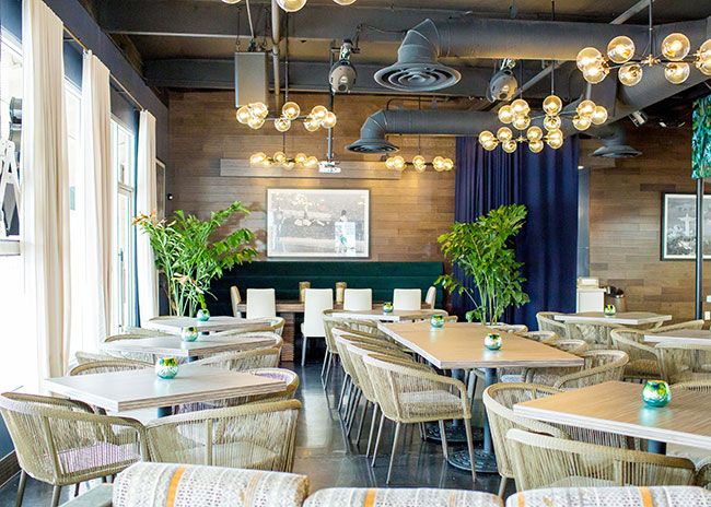
SD: We really wanted to take the traditional Brazilian steakhouse use of heavy woods and dark colors and freshen it up while retaining a sense of the region. In doing so, we opted for a mix of woods with sophisticated grain combined with fun palm leaf wallpaper in muted tones to keep things timeless.
What is the logic behind the layout of the space?
SD: Communal dining continues to trend and Brazilian food is all about fun, food and family, so we anchored the space with a large communal table and super comfortable chairs to dine and hang out. The dining room tables can stand alone or be placed together for a larger party, making it easy to book for a crowd or an intimate dinner. For the bar area, we used tall bar tables to visually separate it from the dining room.
 Images courtesy of Ashley Strong Photography
Were there any particular challenges with the development of the space?
SD: One of our challenges in the initial layout was the entrance to the space because it had no formal entry or even a separation from the dining room. We decided to create an entry “lounge" using a sofa and comfy chairs, and then, by bringing the hostess stand closer to the lounge area, we were able to establish that warmth when you enter the restaurant.

What was the color scheme you chose for the restaurant?
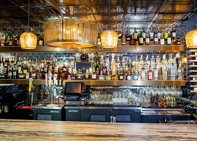
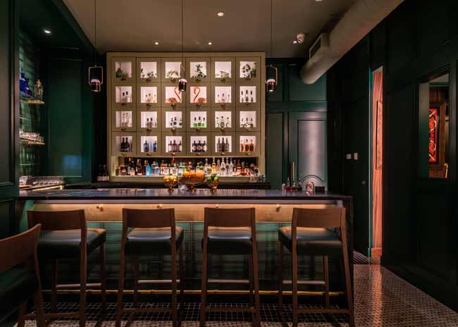
SD: We wanted to add a rich mixture of color and pattern, so we chose to wallpaper large areas seen over the kitchen and service area as well as over the lounge and bar. We chose a large tropical leaf in rich blues and dark greens because we felt those colors would work fantastically with our warm, rift-cut oak stained a lighter shade to offer the dark paper. The large bar received a full stone counter in an alabaster finish. The upholstery in the dining room and entrance lounge is slightly modern yet still earthy fabric with rich browns and camel colors, it anchors the palette of white leather bars stools and our punchy wallpaper. The furnishings are super comfortable, because we knew that this would become a hangout area for soccer games and long dinners, so we made sure to use chairs in the dining room with wide seats and soft cushions to encourage hanging out with friends and family.


