Since its founding in 1994, Not Your Average Joe's has sought through both its creative, chef-driven menu and its polished-yet-comfortable ambiance to distinguish itself from mainstream casual-dining chain restaurants.
Over the past decade the company has grown to nearly 20 units, slowly and strategically refining its concept and its operations to prepare for significant growth beyond its Boston-area home base. Its newest unit, opened in December in Warwick, R.I., represents the best of what founder Stephen Silverstein says Not Your Average Joe's brings to the table and is the fine-tuned prototype with which the company intends to grow.
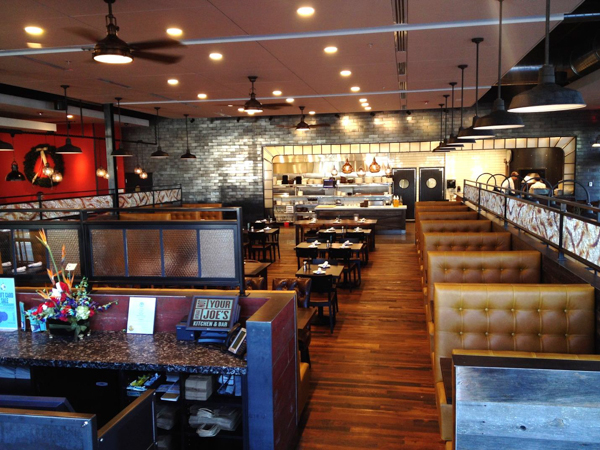
Working with David Manfredi and Elizabeth Lowrey at Elkus Manfredi Architects, the Not Your Average Joe's team fashioned a design that Marc Champagne, director of construction and facilities, says is best described as "industrial and elegant." It's a look achieved through use of earthy colors and natural materials; industrial-style lighting; stained concrete; brick and tile; and carefully curated unique finishes used to add distinctive character.

Measuring 7,000 square feet, the newly constructed restaurant is located on the site of the Warwick Mall. Being a freestanding building, it provided the opportunity to fine-tune the concept's exterior prototype as well. Like on the interior, materials such as brick, concrete, blackened steel and specialty lighting provide an industrial aesthetic, while the large illuminated signage/logo catches attention and sets the tone for an approachable yet special dining experience.
Inside, the space is open and anchored by the host station in front and exposition kitchen at the rear. "As you enter, you're immediately greeted at the host stand and you have a visual of the entire restaurant, including the kitchen," Champagne says. "The main dining room is in the center, there's a smaller dining area to the right side and the bar area is to the left."
Total seating capacity is 300, including 100 seats on an outdoor patio and roughly 40 in the bar/lounge area.
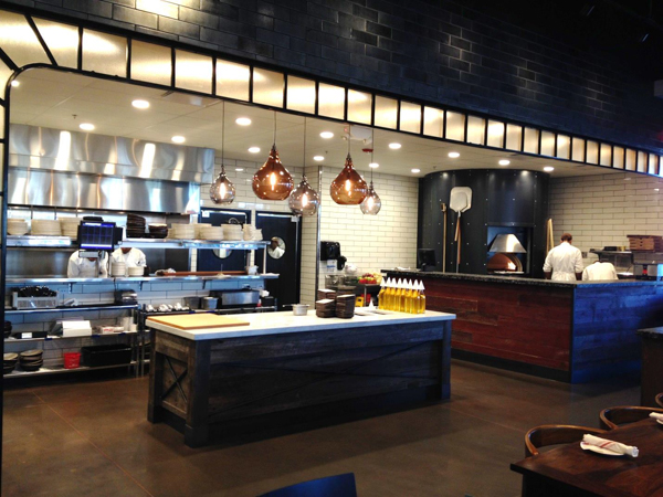
The exposition kitchen, a feature in all units, has been visually enhanced in the new prototype. Surrounded on the back wall by black ceramic tile laid in subway fashion, the kitchen is further enhanced with a dramatic illuminated proscenium arch. "The whole back wall is designed to replicate an old-time theater stage," Champagne notes. "We consider our display kitchen to be the stage."
Positioned directly in front of the kitchen and under the arch is the bread station. It's topped in white marble and finished along the sides with the same reclaimed barn-board wood used in wainscoting throughout. Dramatic globe lights hang above it. To the right of the bread station is a pizza station that includes a gas-fired display pizza oven.
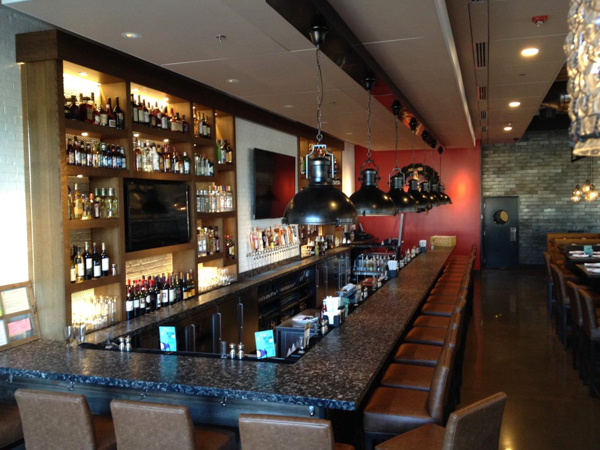
The bar area, which runs along the left side of the room, is open to the main dining room but is set off with a half wall and low screen constructed of metal framed panels. "The inserts are screens that have what looks to be burn marks on them," Champagne says. "They have a kind of cool, industrial look. We've used them in a couple of other units, but here in Warwick we gave them a bit of a different look by crumpling up the screens and then pulling them back flat so that they have a little more character."
White painted brick lines the back bar, with beer taps positioned directly in the wall. Large, flat-panel TVs help to keep guests entertained and add energy to the bar space.
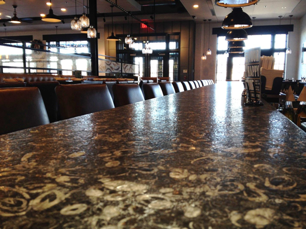
The bar itself is topped with moonstone sourced from China. "It's something that Elkus and Manfredi and Steve Silverstein came across," Champagne explains. "It has a really interesting look to it, in part because it's has fossilized shells embedded in it. It's something of a conversation piece and we train our bartenders to be able to answer questions about it."
He adds that while the polished-industrial aesthetic is proving to be a home run for the concept, controlling acoustics can be a challenge. "You can't just do an industrial warehouse look because the acoustics are going to be awful," he says. "We had to come up with a soft, relatively inconspicuous acoustical ceiling that would fit the look and feel of the brand. We found a product that works well. If we hadn't, we'd have a very loud restaurant thanks to 13-foot ceilings and so much wood, concrete and steel."
Going forward, Champagne says Not Your Average Joe's will seek a mix of both new build freestanding units and conversions of existing restaurant spaces. He anticipates opening four to five new units a year for the next few years
Snapshot: Not Your Average Joe's
Warwick, R.I.
Opened: December 2013
Ownership: Company-owned
Project type: New construction
Real estate: Freestanding, mall
Design aesthetic: Polished industrial
Size: 7,000 square feet
No. of seats: 200 inside, 100 on patio
Front of house/back of house split: 70/30
Build out: 5 to 6 months
Project Team
Stephen Silverstein, founder and CEO
Dennis Maher, vice president of development
Marc Champagne, director of construction and facilities
Architecture: Streetsense
Design: Elkus and Manfredi
GC: Cornerstone Design/Build Services
Structural engineering: Ehlert Bryan
MEP engineering: FACE Associates
Foodservice consultant: TriMark United East

