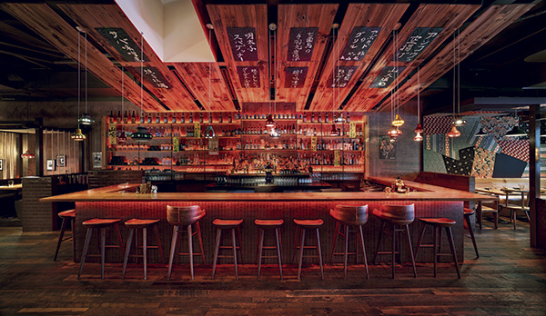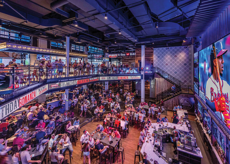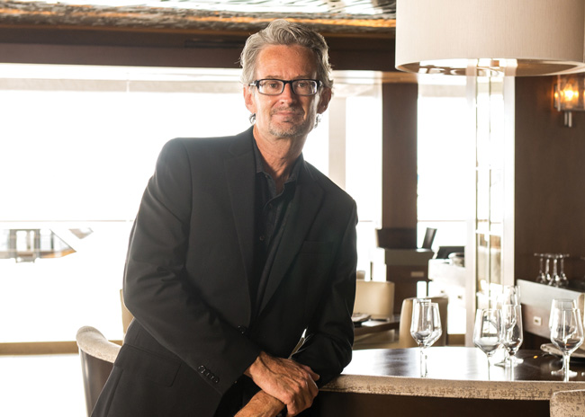
With nearly 40 years of experience, Rick McCormack has built a career in restaurant design. As president of Studio McCormack, he oversees a staff of eight. Together they have created designs for RockSugar, Yard House, BJ’s, Matchbox and Seasons 52. Prior to forming and running his own company, McCormack was head of design for the Cheesecake Factory for more than 13 years, where he was responsible for overseeing the creation of more than 150 restaurants nationwide.
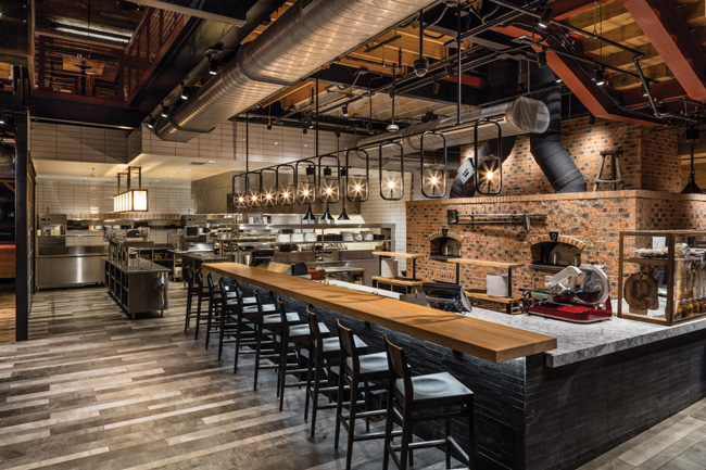
Blending Kitchen and Dining. Where once we had a solid wall separating these two areas with no hint of what was taking place in the kitchen, we now have dining flowing into the kitchen with little or no barrier between them. With the popularity of the Food Network and cooking shows along with more healthy eating habits, people have a great interest in seeing the production of their meal and experiencing the art of cooking. We designed the Matchbox restaurant in Ashworth, Va., with a chef’s table that is flanked on either side by the walk-in coolers displaying all they hold along with a window at the head of the table for an unobstructed view into the prep area. In the entry of the restaurant, a dining counter extends into the main cooking area, giving guests a front row seat to the scents, sounds and sights of the restaurant kitchen.
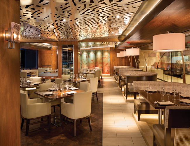
Continuity of Design. The stronger the relationship between elements in a space, the better the space is received. Taken individually, various design elements may be appealing, but when combined with other, equally well-designed items, the end result can be confusing and unpleasant. Having a common thread that runs through a space will result in a much stronger, synchronized design that will evoke a more favorable response. At the Ritz Prime Seafood in Newport Beach, Calif., we used a coral motif as a uniting theme. This motif shows up as an illuminated design in the restroom mirrors, is carved into the wood bar die, is etched into polished stainless steel on the chef’s table, is employed as an overhead metal ceiling canopy and is carved into travertine wall tiles.
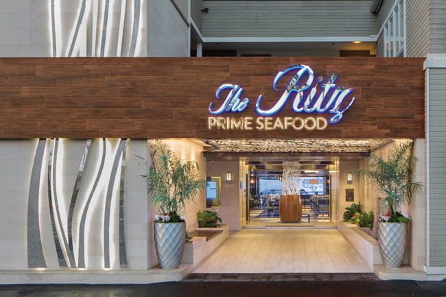
A Sense of Arrival. We give the exterior the same attention as the inside of a restaurant in order to set the mood and guests’ expectations, create anticipation, and begin the dining experience upon approach. The building facade design should give you a sense of the experience that awaits you inside even if there isn’t any kind of signage. Our exterior design of the Ritz Prime Seafood entryway began with a two-story, polished stainless-steel abstract seaweed sculpture backlit with LED lights. To that, we added a horizontal band of porcelain wood planking inspired by a seaside boardwalk. As you step inside this passageway, a stylized school of fish adorns one wall, while opposite it, a wall fountain adds the sound of falling water.
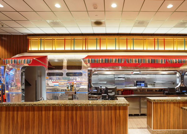
The Unexpected. Inserting an element, color, finish or furnishing that surprises and delights a guest is a very powerful design tool that can lead to great social media exposure — an Instagrammable moment. It gets people talking about the concept which, in turn, attracts new patrons. For Ruby’s Diner in San Clemente, Calif., we took an authentic Airstream trailer and repurposed it as the façade of the expo area. One entire side of the trailer was sliced off and applied to the wall between the dining area and kitchen, creating a food truck feel. Upon entering the restaurant, guests are surprised to see the trailer sitting in the background with food being served from a window in it.
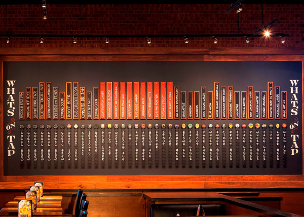
Artisanal. The typical restaurant guest today no longer strives for uniformity and a brand experience but prefers a place that offers local relevance and an authenticity that captures the essence of the surrounding cultures and neighborhoods. A wonderful way to do this is to incorporate one-of-a-kind pieces of art into a restaurant’s decor and help give it its own unique flavor. To educate the guests of the different beer on tap at BJ’s Brewhouse and Restaurant in Nanuet, N.Y., we developed a wall display that shows all the beer currently available, alcohol content, type and whether it was local or BJ’s private label. Our goal was to make this easy to understand at a quick glance while also adding a decorative element to the space.
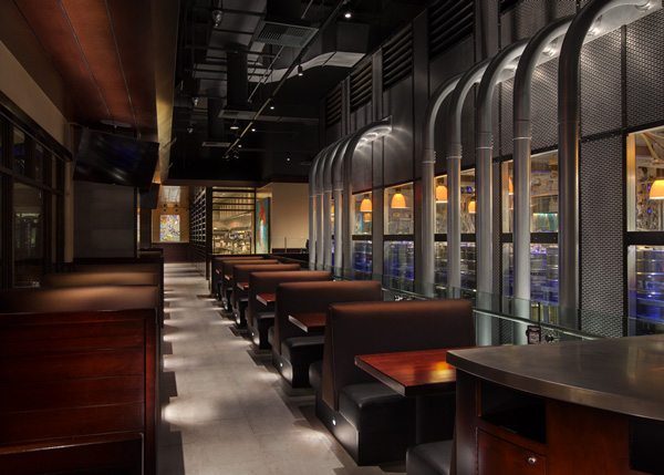
Function as Design. Making of lemonade from lemons has time and time again resulted in designs that are stronger and better received. In designing a two-story Yard House restaurant in Las Vegas we decided to feature the beer keg cooler and beer conduit runs as they have never been done before. The walk-in keg cooler surrounded with windows was placed in the center of the second-floor dining room, seemingly levitating above the first-floor bar. From this keg cooler comes metal conduits, each one holding 10 beer lines. These conduits run exposed to the beer taps at the bar below and the simple function of transporting the beer from its source to the use has become a signature statement in the restaurant.

