This New Mexico-based pizza chain has developed a new prototype to grow into a regional chain.
Plenty of restaurants say they want guests to feel like they’re at home. Few operations use their design to impart that feeling as well as New Mexico-based pizza chain Dion’s.
This 18-store concept recently began an expansion push outside its home state. As part of this initiative, the chain developed a new prototype designed to spur growth while maintaining the operation’s homey feel.
According to Kevin Koschur, associate architect with Dekker/Perich/Sabatini, which handled the architectural and interior designs for this project, the new prototype zeros in on one part of home in particular.
“They really wanted the design to feel like an extension of one’s kitchen. That was the basis for the overall interior design for the restaurant.”
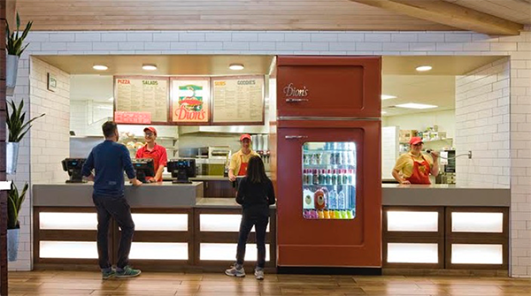
This kitchen concept is communicated most directly through the restaurant’s centerpiece design element: an upright refrigeration display with an oversized shell designed to look like a retro refrigerator.
Located at the POS counter, the piece is built into the countertop. An upright refrigerator, used to hold bottled drinks and jars of Dion’s-branded salad dressing, is rolled in from behind.
Notably, the customer-facing door of the retro refrigerator doesn’t open. Instead, everything inside is retrieved by the people behind the counter. “[Dion’s] wants that interaction,” says interior designer Kate Dimock. “It creates a sense of community and home. That’s really what their brand is all about.”
The POS counter itself also has a touch of home. Many of today’s residential kitchens have glass-fronted cabinets, says Dimock. To recall this look, the front of the counter has panels made of frosted tempered glass with LEDs. “We went back and forth whether to fill those cabinets with herbs or cans with different ingredients, but at the end of the day we wanted it to look clean and slick,” Kimmock says.
More of the kitchen feel is created through the viewing stand, a section of the restaurant where customers can watch food being made behind a large glass window. The stand used dark-toned reclaimed wood, adding warmth to the environment.
Beyond the POS and kitchen, the homey theme is carried over to the restaurant’s dining area. For flooring in this section, the chain uses carpet squares set out in a creative way. The perimeter of the area is a simple dark, monotone carpe, while the center has a brighter patterned. The result is a throw rug look.
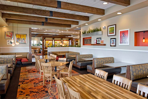
Furnishings, meanwhile, also feel like something you’d find at home. Tables are either butcher block or laminate. Booths are upholstered with fabric patterns that look like they could be on a sofa in a guest’s home.
Notably, the dining area at Dion’s is split into two sections, one larger than the other. This division eliminates the “sea of tables and chair” effect that can make a restaurant feel impersonal. It also allows the restaurant to accommodate large groups and private parties, such as a little league team’s end-of-season celebration.
To separate these sections, the design uses a large wooden piece that holds condiments, napkins and is home to booster seats and high chairs. This piece also has three two-sided panels that can hold art or promotional pieces. While the default work shows a Rube Goldberg-like contraption illustrating how the “perfect pie” is made, these images can be swapped out to showcase menu items, limited-time offerings or other promotions.
Since this prototype was developed to help Dion’s expand beyond its home state, some design elements were made to be localized. The art program is intended to showcase local artists. Even the outside of the restaurant can be customized with local materials. Stores in Colorado will have brick exteriors, while those in Texas will have a combination of stucco and local limestone, common building materials for each state.
While it would have been easy for the chain to use the same materials for every store, this touch emphasizes Dion’s commitment to comfort and familiarity.
“The old design was a 1980s grandmother’s home,” says Dimock. “This still feels like home [but] in a reimagined way.”