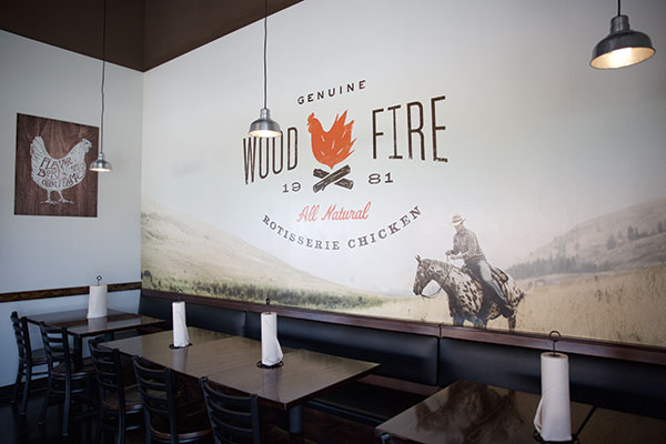
 Cowboy Chicken purchased unlimited usage rights for a photograph that is used as a mural in its new design. Photos courtesy of Cowboy Chicken
When Dallas-based Cowboy Chicken launched its franchise program in 2009, the company set a goal of growing into first a regional and then a national brand. The chain’s menu, featuring wood-fired rotisserie chicken, fit right in with the growing fast-casual sector and a burgeoning consumer desire for wholesome, authentic food.
However, by 2015, growth wasn’t quite where the company wanted it to be.
“We’ve built our business on great food, great service and clean restaurants. We recognized along the way that we had some opportunities from the brand development side,” says Sean Kennedy, Cowboy Chicken’s longtime president who was recently named CEO.
The company, then, set out to improve its branding through a process that included everything from customer surveys to brand summits. This effort culminated last May with the opening of a new location in the Houston suburb of Katy — the first Cowboy Chicken store featuring its new graphic identity and prototype design will allow the company to compete on a national level.
Building a Brand
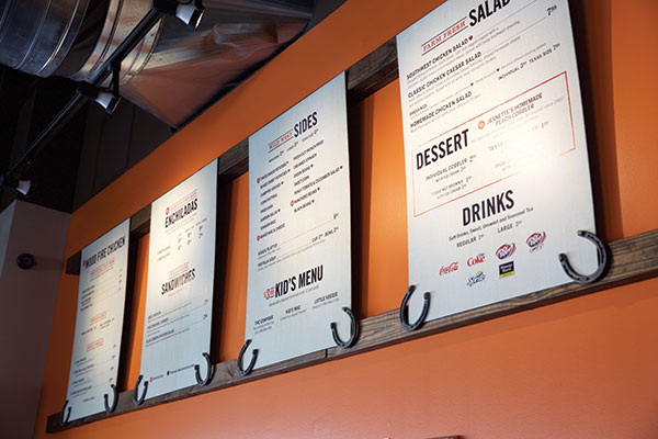 The chain moved away from tests of digital menu boards to static displays that reinforce the brand.The company began its brand refinement by hiring Kim Jensen-Pitts, founder of KJP Marketing Services, to guide the process. Developing a new look and feel wasn’t part of the initial plans.
“We started by doing what I call a two-day brand summit,” says Jensen-Pitts. “We get all the key players, the executives and some of the managers together, and we do a brand exercise trying to get at the history and culture [of the chain].”
The summit’s goal was to establish Cowboy Chicken’s “brand architecture” — essential aspects of the company, including its culture, mission and core values. It also focused on refining the chain’s key brand attributes, the customer-facing qualities, such as the food, hospitality strategy and atmosphere.
After two days of work and discussion, the concept set its brand architecture, which is structured around the quality of the food and the promise of “flavor born over an open flame,” thus emphasizing one of Cowboy Chicken’s key differentiators. The chain also recommitted to its honest, authentic attitude while shifting the aesthetic from “cowboy kitsch” to “cowboy cool.”
After establishing the brand architecture, the company polled its customers to see how well it matched these aspirations. Through email, Cowboy Chicken sought the opinion of 3,000 established customers, who were offered an incentive to reply.
“The customers came back with a resounding ‘Food’s great. Service is great. Interior design lacks a little. You guys could do better,’” says Kennedy. “We listened, and in our march to become a national brand, we felt a need to improve our interior design.”
 The first Cowboy Chicken built with the new design opened in suburban Houston in May.In truth, this need to improve the interior wasn’t a huge surprise to Kennedy or Jensen-Pitts. The chain’s dine-in business had declined over the years, according to Jensen-Pitts. While some of that was certainly due to changes in lifestyles, the look of older Cowboy Chicken stores also played a role, she says. The previous design had more or less evolved over time and lacked some unity. It also didn’t quite match the high quality of the food served.
“The concept is firmly within the fast-casual segment,” says Jensen-Pitts. “Really, it should be more positioned in polished fast casual. They have a superior product with very artisan techniques, yet the atmosphere felt very QSR spatially with the way the tables were laid out. There were wooden floors and a wooden counter, ketchup and mustard colors, and a hand-drawn logo. There just wasn’t a cohesive look and feel that would reflect how high-quality the concept really was.”
Developing a Design
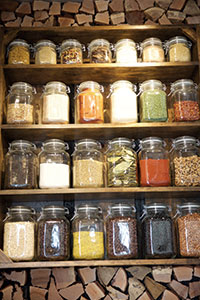 The wood wall with a spice rack emphasizes Cowboy Chicken’s authentic cooking methods.To create a more polished look, Cowboy Chicken worked with Los Angeles-based design firm Propaganda, Inc. to develop the interior design. According to Jensen-Pitts, the brand architecture was essential in that it provided clear criteria for evaluating both new and legacy design elements. “Once we had the data and the groundwork, it was easy to say what fits and what doesn’t,” she states.
Once the new design was completed, the challenge became finding the right place to build the first store with the new look.
According to Kennedy, at the time the interior design was completed, the chain did not have any corporate stores in development. There was, however, a new franchised location in Texas that was ready to go. This was the first Cowboy Chicken in the Houston area, which presented the company and the franchisee with a choice, says Kennedy. “Do we build one old prototype and all the other stores will look different, or do we build them all in Houston with the same look?”
Fortunately, the franchisee was an experienced operator. After being presented with the design plans, he understood what the company was trying to accomplish and agreed to have his store serve as the proving ground for the new look.
According to Jensen-Pitts, since there was no company-owned prototype to work from, many design and construction decisions had to be made on the fly. At the same time, since they were building a franchised location with a franchisee’s money, everyone was especially sensitive to cost. According to Kennedy, the designers, franchisee, company executives and contractors stayed in constant contact with each other throughout the build, with particular attention paid to the franchisee and his concerns and questions.
That’s the Look
 The chain’s new design features wood and neutral tones with splashes of orange, representing its wood-fired rotisserie ovens.While making decisions on the fly could lead to a disjointed look, the new Cowboy Chicken is anything but.
Entering the new store, customers encounter neutral grays and browns with pops of orange, a nod to the wood-burning rotisserie. These colors can be found in elements that reinforce the “cowboy cool” theme, such as a Howdy sign — the greeting has long been a signature of the Cowboy Chicken experience — written out in rope on a wooden plank located near the drink station.
More “cowboy cool” can be found on the brand wall, which is covered with pieces of artwork that drive home the company’s key brand messages in a modern way. These include photographs of chicken just out of the rotisserie, a picture of concept founder Phil Sanders at the oven and canvas pieces that encourage diners to “respect the fire.”
Ideally, the brand wall will occupy an uninterrupted space in each store. In this first restaurant, notes Jensen-Pitts, the brand wall is broken up by the entryway to the restrooms. This was one of the only significant design challenges presented by the restaurant’s physical space, which is part of a brand-new development.
As should be expected for a concept built around wood-burning rotisserie chicken, many design elements use wood directly or as inspiration. These include doorframes and the barrier that separates the queue from the dining area.
The restaurant also features a wall that is made up of chunks of locally sourced wood. A space has been cut in the middle of this wall for shelves holding jars of spices used on the chain’s signature rotisserie chicken. This feature, says Jensen-Pitts, drives home the authenticity of the food the restaurant serves.
While wood is a key element, the designers didn’t want to overwhelm the space with it. In fact, the new design actually minimized the use of wood in some highly visible ways. A solid surface material replaced wooden countertops in the legacy design, while hardwood floors were replaced by stained and sealed concrete. The latter change, says Jensen-Pitts, represented a major cost reduction — concrete is significantly cheaper than hardwood.
More savings came from eliminating video monitors in the dining area, which cycled images of the chain’s food along with brand messages, and replacing digital menu boards, which the chain had been experimenting with, with static boards.
Digital boards were both expensive and contrary to the chain’s brand position. “They’re just so fast-foodish,” says Jensen-Pitts. “We have a singular menu item, which is chicken. It’s not that complicated. We do a lot of great things with it. We just need a simple menu board.” Reducing costs in those areas allowed the team to put more money into other key design elements.
One of these design elements was the photo for the mural wall. The picture, taken by a photographer who specializes in western/cowboy imagery, shows a cowboy riding a horse across a hilly landscape. Cowboy Chicken bought unlimited usage rights to the photo, which is now featured prominently in the dining area. “We did a hand-stitching effect on the border and an almost basket-weave texture, giving it a 3-D look,” says Jensen-Pitts. “That was a big element that we created.”
Another centerpiece of the new design is the rotisserie oven. While it wasn’t hidden in the legacy stores, it wasn’t showcased, either. It now faces the dining area and is surrounded by a brick facade. A high-temperature sliding window provides a look inside. Recognizing the appeal of this drama — and of seats near a wood-burning oven during the colder months of the year — the chain has placed a bar and barstools just in front of the rotisserie.
Cowboy Chicken creates a “dinner and a show” experience by having team members load and unload chickens through the rotisserie’s sliding window, in full view of guests. “The [staff member has] his heavy-duty gloves on. He opens the sliding door, takes the spit out, places it on the cart and rolls it back to the kitchen to cut it up. There’s something about when you see the chicken coming off the spit. It’s glistening and beautiful,” says Jensen-Pitts.
A National Platform
While Cowboy Chicken’s brand identity has now been translated into design, more changes to the concept’s look and feel are almost certain. According to Kennedy, the concept’s lighting package will probably be redesigned in the near future to help bring the space to life, both on the inside and out.
The chain will also experiment with its furnishings. While it added booth and banquette seating in this new design, it will also explore the expanded use of community tables, which have already been rolled out in a handful of stores.
Another likely change, says Jensen-Pitts, will involve reworking the concept’s patio. Right now, the chain uses basic picnic tables. The concept is considering more comfortable seating as well as an awning or umbrellas. “That’s obviously going to be an increased expense for the franchisees,” she says, “but I think it will pay off with a lot more people hanging out on the patio, which expands your dollars per square foot.”
Any enhancements, though, will only add to an already successful redesign. Since the rollout of this first restaurant in May, several more Cowboy Chicken stores have opened with the new look — both brand-new and refurbished. The numbers for the new stores are extremely impressive, with guest counts 30 percent higher in new stores compared with legacy stores in the same market.
That sort of statistic, combined with solid feedback from customers old and new, has the company convinced it now has the final piece it needs to become a national brand, says Kennedy. “Before, we were focused on food and service. Now, we’ve got a ‘cowboy cool’ vibe to us,” he explains. “This is the interior package and design that puts us on a national platform to compete with any other brand out there.”
Project Snapshot
- Headquarters: Dallas
- Franchise owner: Sean Kennedy
- Concept: Wood-fired rotisserie chicken
- Segment: Fast casual
- Average check: $17.35
- Locations: Texas, Nebraska, Louisiana, Alabama
- Units: 21
- Opened: First store in 1981; new design in May 2016
- Size: 2,500-2,800 square feet
- Real estate: Retail endcap, inline
- Design highlights: New interior design elements are an eclectic collection of brand-relevant illustrations, photographs, and 3-D artwork reproduced on materials like metal, wood, rope, canvas and aged paper that create a welcoming, warm and rustic brand experience. The new concept brings the new authentic “cowboy cool” brand strategy to life, along with a contemporary, stylish new logo that communicates the modern appeal of the brand’s flavorful, fresh and healthy menu offerings.
- Build-out time: 13 weeks
- Project lead: Chris Mastin, director of franchise operations, Cowboy Chicken
- Architect: Greg Landry, Landry Architects, Richardson, Texas
- Kitchen supplier: Best Restaurant Equipment and Design, Columbus, Ohio
- Interior design: Propaganda, Inc.


