Fast-casual has been the “it” segment in foodservice for a few years now. With so many restaurants in this one space, it’s no surprise that some emerging concepts continue to find ways to appeal to customers that more established fast-casual restaurants may miss. One of these is Super Chix, a Dallas-based operation that describes itself as “a classed up chicken joint.”
The concept actually has its roots in Yum! Brands, where it was started in the company’s emerging brands division by Nick Ouimet. Ouimet had such confidence in the brand that he ended up buying Super Chix from Yum! and striking out on his own.
Super Chix’s chicken focus (emphasized by the cracked egg-shell wall facades) makes it unusual in the fast-casual segment. But Ouimet and the team at Dallas-based Studio 11 Design have created a space that fills what they see as a gap in the fast-casual marketplace.
 “Fast-casual places are traditionally places for lunch. They really are,” said Ouimet. “What we’re trying to do is create a menu, a space, an experience that is ‘Come on down for dinner, have a beer or a glass of wine, the kids can go back and play.”
The concept’s third location marks the first Super Chix location with a design that appeals to families at dinner as well as working people at lunch, while avoiding a fast food look. The chain’s previous space was handled by another designer and tended more toward the QSR segment.
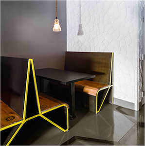
The design transformation starts with the color palette, which features a gray base with accents of a signature yellow that appear on signage and furniture. In some cases this furniture is custom made. The booths, for example, feature wood and metal construction. The “A” shape end of the booths will likely be a signature touch for Super Chix going forward, added Studio 11 principal Kellie Sirna.
The chairs, meanwhile, were ordered from a catalog. To give them a custom look at a low price point, the legs were taken off and painted the chain’s signature yellow.
The concept also used design to emphasize the quality of the food served by Super Chix, which, said Ouimet, is “absurd. We had Yum! money [when we developed the menu].”
Emphasizing this part is an open kitchen, which allows customers to culinary staff prepare menu items. This aspect of the design allows the chain to showcase its frozen custard machines, which make the sweet treats using proprietary recipes. Clearly visible from the POS station, these machines provide customers with a gentle visual cue to add dessert to their meals right at the time of ordering.
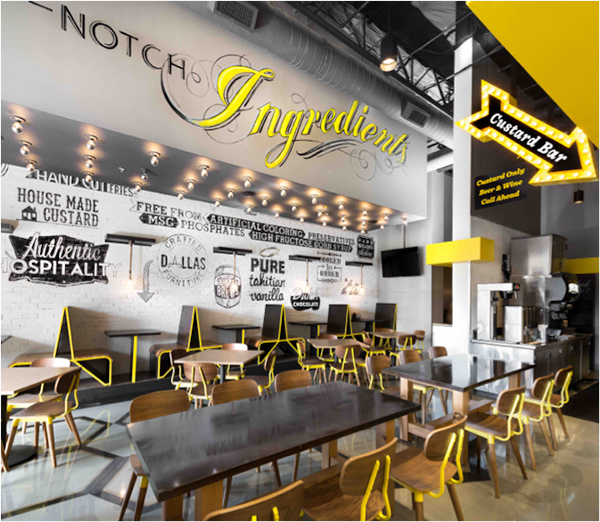
Another design element that helps emphasize Super Chix’ food quality is a mural wall that tells the chain’s story with phrases like “hand breaded chicken,” “free from artificial coloring,” and “pure Tahitian vanilla.” The mural, said Sirna, was initially designed by Lou Verne by Studio 11 Design, then blown up and placed on a gray brick veneer using transfer paper. Some parts of the mural were then lightly sanded or scored, giving it a slightly aged look.
While Super Chix’s furnishings and food quality certainly help broaden the chain’s appeal, the concept has another element that is a clear pitch to the family dinner crowd: a small outdoor play area for children. The play area features yellow-painted plywood construction and has chalkboards on the walls for little ones to draw on.
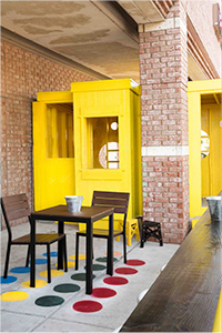 Initially the designers put the play area in place when they realized a small space needed filling. The play area’s popularity, however, has Ouimet seeing it as a permanent element of Super Chix’s design.
In fact, Super Chix will continue to tweak design details as more stores open, and the overall look positions the concept where it belongs. “We’re much sharper on where we want to be, where we want to locate our stores,” said Ouimet. “[We know] what our interior looks like, what our exterior looks like, and how it all is going to work together to get this sort of premium fine casual sort of experience.”


