Why have restaurant-market hybrids become such a rising trend? It’s simple math, really. When well designed, the whole becomes greater than the sum of its parts. Restaurants that incorporate one or more retail food sections enjoy several advantages. However, guiding customers through the experience requires design elements such as traffic patterns, materials and finishes.
These mixed-format restaurants cater to sit-down guests in a dining room area; additionally, the market component facilitates take-home and takeout and satisfies grab-and-go appetites. Some also offer retail gift boxes, cookbooks, videos and kitchen equipment. All these components can be positive revenue streams. Not only that, but visually appetizing market displays — a sort of live menu — seize the interest of passersby and draw in prospective customers. Plus, logoed packaging in shoppers’ hands and homes can help market awareness of the restaurant brand.
 The counters at Bottega Americano feature Carrara marble. Customers can sit at the counter and watch culinary staff prepare their orders.These multipurpose concepts come in all shapes and sizes. “The restaurant-market is an interesting concept that is rolling its way through various design product types,” says David Tracz, cofounder of Studio3877, which designed the first Carluccio’s Italian Café and Market in the U.S.
“Retail markets inside restaurants is definitely a trend for certain kinds of restaurants, especially those that combine fine dining with takeout service or catering,” says Thomas Schoos, principal of Thomas Schoos Design. His team worked on Bottega Americano, a food hall that recreates a European-style outdoor market.
The restaurant-market idea has strong consumer appeal, according to research by the National Restaurant Association. In a recent National Household Survey, 48 percent of adults said they would buy fresh, uncooked food items from restaurants. Among bellwether Millennials that inclination jumped to 64 percent. Restaurants are beginning to see the potential there,
according to the NRA; among casual-dining operators, 46 percent believe sales of packaged food items will become more popular, while 24 percent think freshly prepared food sales are on the rise.
From a design standpoint, operators need to weigh some key considerations. Markets have to be a drawing card. Operators also need to balance the components in terms of square footage depending upon the business model. The setup has to guide customers through the multiple dining and consumption options, manage traffic flow and draw distinctions between formats and spaces, all the while unifying all the parts under one roof.
Bottega Americano, San Diego, Calif.
Inspired by the outdoor markets typical in plazas throughout Europe, the multipurpose Bottega Americano offers guests Italian fare in a food hall setup that includes a fine-dining restaurant, a takeout deli, a retail shop and catering venues.
 The columns at Bottega Americano are clad in rough-hewn wood, and the bar area features multiple seating options, including high-top tables.“Bottega Americano has been very successful; everyone loves the mixture of elements. The retail space only adds to the atmosphere of the restaurant, while maximizing opportunities for sales,” says designer Thomas Schoos of the West Hollywood, Calif.-based firm Thomas Schoos Design.
The décor combines old-world elements with modern industrial efficiency, reflecting the mix of Italian and American influences in the cuisine. Several walls feature large murals with black-and-white photographs of Italy in the 1950s and ’60s, making the connection with Italian style explicit. Counters and tabletops feature Carrara marble. To warm the atmosphere, natural elements such as rough-hewn logs surround the support columns, suggesting stacks of firewood. Dozens of pendant light fixtures fill the space, adding visual intrigue in the form of baskets, geometric shapes or teardrops.
The Italian-themed food hall was set up to satisfy every possible culinary need a customer might have throughout the day, says the designer. Instead of a central kitchen, multiple food bars surround guests. Options feature items like pasta, seafood, pizza, meats, cheeses and desserts. For breakfast, guests can grab coffee and pastries from the dessert counter and sit in the casual dining area or outside on the patio. A large dining room serves lunch and dinner, or customers can grab a seat at one of the several bars where they can watch the culinary staff prepare their orders. In addition, a large bar includes high-top tables for after-work gatherings or after-dinner drinks.
“If designed well, the retail area can be an inviting calling card for the restaurant, a sort of preview,” Schoos says. Fresh meats hanging behind the counter and piles of cheeses in the display case whet the appetite and set the mood.
Selling more product increases the revenue stream, which can increase profits if the operation properly balances the extra costs of staffing and production, explains Schoos. For instance, if the retail side’s meals to go are the same as those available for service inside the restaurant, the operation can minimize costs by combining the production for both. The operation can also choose to sell sauces served on dishes in the restaurant as retail products, and many of the raw ingredients culinary staff use in preparing the restaurant’s cuisine can be branded and marketed as well. These practices introduce efficiencies that result from combining sourcing and production costs. Also, having retail items available allows for sales at all times of day rather than just during typical meal times.
 Signature tiles create rectangular sections that appear like area rugs thrown onto the wood floor. The tiles lead guests into the main dining room of the restaurant.Schoos Design also branded the restaurant, including the logo and the signature graphic, which appears on floor tiles, above the pizza oven, on uniforms and on menus. The design interweaves images of produce and cooking utensils into an intricate pattern referencing both modern cooking and old-world ornamentation.
The distinctive logo also appears on the packaged foods for takeout. “Branded packages of condiments and sauces on the shelves establish a vibe that reinforces the Bottega brand as well,” Schoos adds. Those take-home products extend awareness of the restaurant brand far beyond its walls, which can attract new customers. “So the branding and marketing benefits are at least as important as the immediate sales inside the restaurant.”
From a design standpoint, the multipurpose space has to be easy for guests to navigate and have ample room to move around. Traffic from retail shoppers does not inhibit the flow of diners to and from the dining room; conversely, crowds waiting for a table do not block shoppers’ access. Multiple payment areas reduce the wait and congestion. At Bottega Americano, dine-in guests can ask their waiters for items to go, or they may order items at a counter or purchase packaged items in the store and pick them all up in one place as they leave. Several alternative means of access and egress also help dissipate crowding.
In the Bottega complex, several techniques keep a visual unity between the restaurant and retail areas. For example, the restaurant’s logo graphic appears on floor tiles. Instead of covering the entire floor, the signature tiles create rectangular sections that appear like area rugs thrown onto the wood floor. The angled positioning of the retail space’s “area rug” leads guests into the main dining room of the restaurant. Also, the distinctive legs of the display tables in the retail shop resemble the legs of the sharing tables in the dining room. Overhead, a collection of hanging light fixtures leads from the retail area into the rest of the restaurant as well. Sight lines were kept open so that customers can see over the display cabinets into the larger restaurant beyond as a way of drawing guests into the dining room and bar.
Carluccio’s, Alexandria, Va.
“Blending of purchasing and dining into one concept is kind of cool; it can be a great strategy,” says David Tracz, cofounder of Washington, D.C.-based Studio3877. “There is a certain viability of dining in a restaurant, and then, on the way out, being able to purchase some of the components of that meal to recreate at home — especially with the way food culture is going these days.”
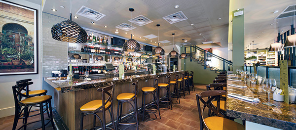
 Carluccio’s bar and restaurant areas feature a warm and inviting brown stone.Tracz and his Studio3877 team collaborated with the U.K. architecture, hospitality and branding firm DesignLSM to open an American version of Carluccio’s last summer in Old Town Alexandria, Va. The U.K.-based Carluccio’s Italian Market and Café boasts more than 100 units worldwide, but this was the chain’s U.S. debut. It plans to open other Carluccio’s locations.
Carluccio’s blends a Milanese ambiance with a modern approach to dining that stays true to its Italian roots. Guests can dine in the 150-seat restaurant or enjoy a drink at the marble-clad main bar. Customers can grab coffee and pastries or shop for gourmet Italian foods to take home in the bustling market area that fronts this establishment.
A synergy connects the market and the restaurant. “The first thing people see as they walk down King Street is the market component,” Tracz says. “From a visual standpoint, the market is intriguing, more exciting than just a regular restaurant; it has more color and punch.” The display of fresh and packaged foods provides an inviting indication of the quality of the restaurant’s menu.
The market is strategically placed, like a museum gift shop; guests have to walk through the market on the way into Carluccio’s restaurant and on the way out. “From a design standpoint, you always want to force people to pass through the retail section entering and exiting the restaurant,” Tracz explains.
This strategy can lead to at least two impulse-purchase opportunities. It may inspire dining guests to pick up some fresh pasta and a jar of that sauce they enjoyed in the restaurant or maybe that take-home dessert they didn’t have room for but still wanted. Merchandise on display in Carluccio’s includes packaged goods like specialty oils and vinegars, pastas and sauces, cookies and chocolate, breads and freshly prepared foods. Customers can also choose ready-to-go picnic hampers and gift boxes. Appreciative diners can also buy one of the dozen or so cookbooks authored by the restaurant chain’s founder, Antonio Carluccio, as well as instructional videos and kitchen tools.
The space requirements for a restaurant-market hybrid depend upon the individual operation, says the designer. In Carluccio’s case, the restaurant takes up slightly more than two-thirds of the square footage; the retail market consumes the remaining one-third of the space. “That’s a good balance,” Tracz says. “It is still clearly a restaurant, but people also understand that they can grab a cappuccino or a package of pasta, pay and walk right out.”
 Carluccio’s restaurant seats 150 people and features several different seating styles.Because the operation needs to allow enough space for customers to grab-and-go, browse the provisions and to congregate or enter the restaurant proper, Carluccio’s features wider aisles than those in a standard grocery, says Tracz. In general, the aisles should measure six to eight feet for good clearance and traffic flow.
The design should include indicators to guide guests through the concept and clearly identify each section. Shelving and refrigerated display cases are clear indicators of the market area. For example, the market area features brighter and more directional lighting that focuses on the goods for sale. As customers work their way into the restaurant, the lighting grows dimmer, less focused, more ambient. The retail area features white Carrara marble, a nice contrast with brown stone in the bar and counters. The color scheme changes, from muted green in the market to muted yellow in the dining room. “The colors are similar in tone but different enough to convey the change in space,” says Tracz.
Even though adding a market component increases the square footage costs, the retail space offers payback. Many of the package items have a long shelf life, and there is plenty of cross-utilization of fresh food items between the restaurant menu and the retail area. The kitchen also uses the market’s cooler as extra refrigeration. “Plus,” says Tracz, “the big bonus is that the market has created a lot more traffic overall.”


