After a slow decade, this casual-dining chain is betting that elements of its most successful period can help revive its fortunes.
Any business that’s been around for 40 years is going to have some ups and downs. On The Border, a casual Tex-Mex chain with more than 125 restaurants in 31 states and Asia, included.
During the 2010s, the chain faced some challenges. It’s total store count shrank, the last new store opening was several years ago and it didn’t sign a single new franchisee during the decade.
So, while plenty of leadership teams are tasked with turning around struggling concepts, the group that took the helm in mid 2020 has a steeper hill to climb than most.
“We wanted to get the brand itself turned around, get new development turned around and especially get our franchise growth turned around and get that growing again,” says Mike Wood, the company’s chief real estate officer.
For On The Border, the new leadership understood that this meant they needed to shake up the concept, both to grab customer attention and give potential franchise partners something to get excited about.
 The new floorplan provides some separation between the dining room and bar, giving families a place where they feel comfortable. Images courtesy of On The Border
Mining the Past
Knowing you need to change and knowing what that change should look like are two separate concerns. On The Border began with an examination of the brand’s history.
In doing so, leadership found that the chain’s time of greatest success was in its earlier days, says Wood.
 The chain found the muralist it used decades ago to recreate images embodying its Rio Grande border spirit.“[On The Border] had never been better than its original life cycle. It became the overriding theme of everything we are doing. We’re getting back to our bolder food, our customer interaction the way we used to do it, our menu the way it used to be. That drove down to what the building is going to look like and feel like, and that was to get to what was a pretty cool place that you wanted to be at on Friday and Saturday night.”
The defining feature of that era, says Chief Marketing Officer Edithann Ramey, is boldness in both menu and design.
About 80% of the chain’s menu offerings have changed in some way. This includes tweaks to existing menu items along with a reintroduction of On The Border classic menu items.
“We are bringing back all these menu items we used to have when we first opened up. That really felt bold. Chile rellenos, ribs, things we kind of let go and now we are bringing back,” Ramey says.
 While the chain moved away from multi-colored chairs, it kept splashes of color to keep the energy up.
Adobe Inspired
In design terms, the chain first returned to its origins with a redesign of an existing On The Border restaurant in Alpharetta, Ga, which opened with the new look this spring.
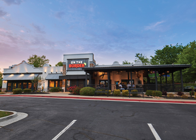
According to Wood, the what’s-old-is-new-again look meant embracing the chain’s border concept with an adobe building-inspired design. This is perhaps most evident in the chain’s new exterior.
According to Wood, one of the most important goals of the redesign was increasing the curb appeal. Previous versions featured stonework and gray tones. “They’re very beautiful buildings, but they started to blend in with other buildings and blend in with the elements around them.”
The new design features a white adobe look. While this isn’t part of the chain’s design history, it fits in with the company’s overarching Rio Grande border concept.
The color was just one shift, though. The redesigned exterior also includes new signage, a new exterior lighting package and new landscaping that’s pared back, increasing the visibility of the structure itself.
These changes are getting attention from passersby based on customer feedback, says Wood. “One of the common themes that we are hearing is, ‘I drove by you guys for three years and kind of forgot you were there. I see you now. You are super bright. I see you when I’m coming down the road.’”
 Spanish-inspired tile set the stage for a revamped bar set-up and improved entertainment package designed to make the restaurant a place to hang out.The new exterior look also includes a revived art element. Decades ago, On The Border restaurants featured murals in muted sand and rust tones and depicted scenes like cowboys or cowgirls cooking over an open fire.
The design team dug through the company archives and identified the muralist — still working in his early 70s — and hired him to design a mural for the Alpharetta restaurant. New pieces in the legacy style grace one side of the building’s exterior and serve as art elements on the interior.
Once guests actually enter they find a new floorplan as well.
More recent restaurants, says Wood, drifted toward a “bowling alley” feel with no distinction between areas that could offer different experiences to guests. Customer feedback indicated this left some people out. Families with children and older diners reported they didn’t have a place that felt separate from the louder, more active bar area.
To solve this issue, On The Border once again turned to its roots. Matching the design approach of the early stores, the new design splits the space into three sections: a bar, a cafe and a dining room.
The dining room, located on one side of the building, is the calmest space. It is, Wood says, the most welcoming to families and larger groups coming in for a meal or celebration.
The bar, on the other side of the building, offers TVs, bar seating and plenty of energy.
The cafe is the middle point between the two, both literally and from a customer experience standpoint. It’s designed to be a good place for a meal, a drink, a conversation with your dining partners and some family-friendly energy.
In the cafe, “you’re still a little bit part of the bar, and that’s the point. When I go with my 6-year-old that’s where I like to sit, because I can still see the game on the TV, see what’s going on, but I’m with my 6-year-old,” says Wood.
In this new design, the bar itself is a renewed point of emphasis. This space, then, underwent the most extensive redesign.
As an existing store, the changes weren’t structural. Instead, they focused on finishes and furnishings. First, there was the bar back and bar face, which were both upgraded with a new tile. This patterned finish is reminiscent of floral tile patterns popular in Spanish design.
Along with this came a reorganization of the bar back area. First, much of the liquor display was moved from the center to the end of the bar area, toward the side wall. The shift means the bottles don’t cover the patterned tile, allowing it to make a stronger impression on guests.
At the same time, the beer taps and margarita machines were moved from the far end to more central spots. According to Wood, their previous locations were designed for quick service of the dining room. In keeping with On The Border’s renewed focus on the bar, the move is intended to improve service in the bar itself.
In addition to taps and tile, the design team took steps to make the bar a better place to just hang out. First, there were the bar stools and chairs, which went from hard to soft seating. This investment in comfort is an important part of On The Border’s new approach. “For my part, I think comfort is big,” Wood says. “For chairs and tables, some brands might give up a little bit on the budget, but we’ve invested a little more heavily there.”
Upholstered chairs alone won’t keep people in the restaurant, though. For that, the chain invested in an upgraded entertainment package. This includes a total of eight televisions throughout the restaurant, six of which are in the bar and two of which measure at least 80 inches.
“When you’re in the bar, you can see the game no matter where you’re sitting, you’re going to be part of the action, but you’re going to be comfortable,” Wood states.
 With new landscaping and bright white adobe-inspired finish, On The Border’s new exterior is designed to stand out.
Dinner Time
Like the bar, the changes in the cafe and dining areas focused on finishes and furnishings.
The color scheme of the restaurant has shifted though, starting with the walls, which have moved to brighter, adobe-inspired tones.
At the same time, the company didn’t want the space to feel too bright, so it shifted the look of its furnishings. In legacy stores, says Wood, chairs are multi-colored. A table might not have two identical seats. That approach would be simply too much color in the new design.
“We’ve gone with a slightly more moderate tone for the finishes to offset the white colors we’re going with. We’re using the darker woods, leathers, and metal buttons outlining the upholstery,” he says. The seats, he adds, align with the chain’s renewed commitment to comfort, offering barrel backs with upholstered seats.
On The Border didn’t want to completely abandon pops of color, though. In selected spots — a chair here, a door or window frame there — guests can find splashes of green and yellow.
Carryover Elements
Some elements of On The Border’s look and feel aren’t changing with the new design. Stained concrete floors and open ceilings have been used for years and will continue to be specified going forward.
Other featured spots that will stay, at least for the time being, include a fireplace in the dining area and a pass-through window in the cafe that shows off either the fajita grill or the tortilla making station.
“You can see the smoke and everything coming off the grill as the fajitas are being cooked. We want the action of the kitchen a bit. The heritage of the company is a mesquite grill, so that’s why that’s there,” says Wood.
Another, even more essential element being kept is the restaurant’s patio. With its new strategy, the patio is an area of intense focus for On The Border. The upgrades in the Alpharetta restaurant include new outdoor furniture and the addition of two televisions, increasing the space’s hang-out value.
The company also relocated the patio’s server station, shifting it from a central space to a spot in the corner. The station still serves its function, says Wood, but doesn’t disrupt the patio’s flow or vibe.
While it’s only been operational for a few months, On The Border is happy with this new design and is rolling it out in a second store, located in New Jersey. This look is still in testing, though, Wood stressed. The chain will evaluate the performance of these first restaurants and decide how to move forward.
While sales are the ultimate measurement, the company will also listen to feedback from its operators and will track brand perception pre- and post-redesign once a few more reimaged stores are open.
At some point down the road it will also likely do customer intercepts, says Ramey. “That’s when we get into the nitty gritty of what do they notice, what is worth making a change on. Sometimes they’ll say, ‘I didn’t even notice you had that tile.’”
The chain is also considering deeper changes than the redesign, Wood stresses. Legacy restaurants are usually sized at around 6,000 to 7,000 square feet and 225 seats, give or take. New restaurants are planned for 4,800 to 5,300 square feet and 190 seats at most.
The blurring of the lines between casual and fast casual could open up new possibilities for the brand as well. “We’re definitely thinking about at some point in the near future testing some even smaller units, 2,800 to 3,500 square feet. We’re toying with the common theme of having a drive-thru or not.”
However this new design fares, and whichever direction the chain decides to go, it’s now year-old leadership team can point to some early successes. The work they’ve done so far has resulted in three new franchisees and the planned opening of the first new franchised location in years, set for this summer in South Padre Island, Texas.
In addition, the chain is working on locking down additional sites for opening in the first half of next year and identifying legacy locations that are good fits for an expanded patio.
In total, then, the past year-plus has been filled with plenty of activity and, for the first time in a while, there are clear signs of growth and revitalization for On The Border. If the chain can sustain this momentum, the down 2010s will cycle back up to prosperous 2020s.

Snapshot
Project lead: Keith Wheaton, Vice President of Construction
Architect: ID Studio 4, Irving, Texas
Murals: John R. Thomasson, Lubbock, Texas
Kitchen supplier: ChainLink Services, Fort Worth, Texas
Kitchen design: C4Ward Architecture, Nashville, Tenn.
Opened: April 26, 2021
Size: 6,500 square feet
Real estate: Free-standing casual dining
Build-out time: 30-Days
Design highlights: Inspired by On The Border’s heritage. Adobe whites offset by natural wood tones with a splash of Spanish flair; murals and art that hearken back to early iterations; bar and patio upgrades inspired by authentic Spanish tiles, comfortable seating, lively music and plenty of screens to watch the big games


