A well-thought-out and flexible application of lighting, materials and other design elements can help restaurants seamlessly serve guests from one daypart to the next, thus maximizing revenue opportunities for a single location.
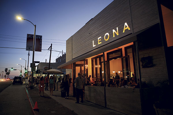
As the owner of LEONA restaurant in Venice Beach, Calif., Breegan Jane Vallas wanted to create a sexy, beachy and comfortable venue that caters to diners morning, noon and night. However, one of her biggest challenges was making the venue transform into a different space from day to evening without sacrificing the restaurant’s overall design.
The area’s beach vibe was both a creative opportunity and a challenge for Vallas, who relied on color and texture to keep the restaurant true to its nature during different times of day. For Vallas and others, making restaurants stylistically relevant and approachable during multiple dayparts often plays an important part in a concept’s design aesthetic, albeit one that’s sometimes not easy to deliver.
“It was our exact challenge, and I think we were able to handle it very well,” Vallas says. “The restaurant is comfortable at brunch and sexy at dinner.”
To get started, Vallas chose the restaurant’s interior color palette and decided on a warm cream tone in order to create an airy and open feel reminiscent of Havana, Cuba. The idea was to play off natural daylight during the day and, with the help of dimmed lighting, tone it down for a softer, sexier ambiance during the evening hours.
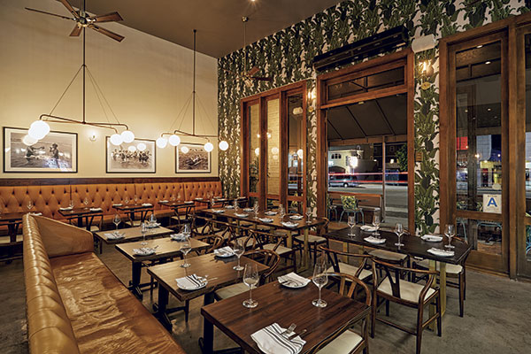 While windows line almost all of one side of LEONA, the restaurant does not get much crosslight, so the team uses dimmable lights to create a specific ambiance during each daypart.
“We also added a lot of texture,” Vallas says. “Textures can take up reflections or add a whole different feel. We had a brick wall. All of our tabletops are dark brown and chair frames are dark brown. Palm tree features and wood trim are very dark colors. When everything is set for night, those tones read more than the white.”
When the restaurant first opened, it offered only dinner service and slowly rolled out brunch and lunch until all dayparts were being properly serviced. “For us as a business, we have been very strategic in the unveiling of each entity on its own,” Vallas says. “You know what changed for us was requests for seating. During brunch, everyone wants to sit outside. Everything in our patio, from the bright teal chairs to outdoor colors, reads brunch, and you can tell everyone gravitates toward that area first, and that’s what fills up first. And it’s the opposite at dinner. You can see the difference in where customers sit in the restaurant first.”
The design of the various spaces for different dayparts was on purpose. “When it’s a beautiful California day, you know you want to be outside, and you know your customers want to eat outside. We were able to prepare ourselves for the neighborhood wants,” Vallas says. “We have been happy with the outcome and trying to think of ways to adjust to what the customer has needed. It is something we are constantly doing.”
For evening service, LEONA uses pre-set tables because they make the space more approachable. Dimmable lighting helps LEONA set the right tone during every daypart. “We use the dimmable lights during the day, and we have windows that line almost one whole side of the restaurant but not a lot of other crosslight. We keep the lights closest to the actual kitchen area very bright because they are in the darker parts of the restaurant. Usually, I will throw them on just for the light glow. We are constantly switching and dimming and adjusting the light based on the day — and also depending on the customer,” Vallas says.
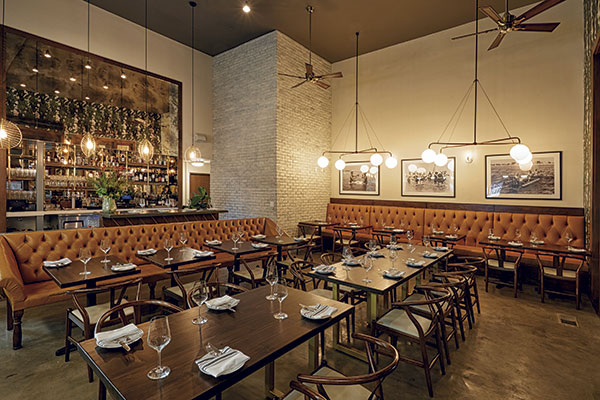 For evening service, LEONA uses pre-set tables because they make the space more approachable.
For those concepts already serving one or two dayparts and wanting to expand their hours of operation, color palette and lighting will go a long way to characterize the space.
Brooke Taylor, director of interiors with Arcsine, advises operators to analyze their current design elements and determine how playing with elements such as lighting and color palette could be successful. “Always remember: Consider a lighter color palette if offering breakfast or daytime service, and ensure that lighting is adjustable to create a more intimate setting at night,” Taylor says. “Color palette and lighting are the key elements for a successful day-to-night transition. Breakfast often ends up being the driver — most color palettes will feel appropriate in the evening if the light levels are low and moody, but not all color palettes work for a breakfast atmosphere.”
Colors need to be on the lighter side and offer a sense of freshness, ideally in conjunction with natural light, Taylor adds. “Otherwise, you run the risk of guests feeling like they’re having coffee and pancakes in a bar. Conversely, you want to ensure that your space isn’t overlit in the evening so as to offer an intimate dinner or bar setting.”
Durable and Good-Looking
For the owners of Poogan’s Smokehouse in Charleston, S.C., durability was a key factor in deciding how to design for multiple dayparts. Poogan’s was formerly a restaurant space and wine bar that closed in 2015. The space was renovated to make room for the smokehouse, which opened in November.
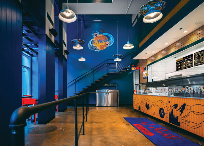
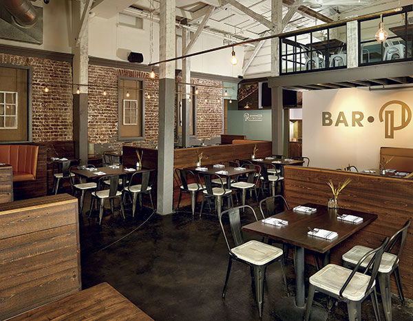 In converting a former wine bar into Poogan’s Smokehouse, the design team leveraged lighting of all kinds to brighten up the space.
In order to design the space to be a durable yet pleasing environment, the owners continued with the motif already on display. “We did not hold back on durability on the remodel for Poogan’s Smokehouse, but we also had the luxury of being in an old exposed-brick warehouse with stained concrete floors. It was pretty much indestructible already,” says managing partner Bradley Ball. “Our goal in the design was to continue with that motif but add softer, brighter elements that made it feel less ‘hard’ to our guests, all the while making sure that it could withstand the wear and tear that comes with a high-volume concept. For example, picking out the right fabric for the banquettes was very important.”
To craft a design that withstood the various times of day, Bell says the team brightened up the space and focused on lighting to help with the daypart transitions. “We learned a lot from our first concept, Social Restaurant + Wine Bar, which was in the space for the previous nine years. It was only open at night, so we made it this dark and cozy space, but on those long, summer days where the sun doesn’t go down until 9 p.m., it created an unbalanced vibe,” he recalls. “For Poogan’s Smokehouse, we really brightened up the space and put much more emphasis on the lighting in the redesign. As far as I’m concerned, you can never have too much lighting: track, fixtures, wall, table, etc. — all on dimmers, of course.”
Designing for durability and high-volume traffic is a necessity for restaurant brands looking to keep their hospitality spaces fresh. Therefore, it’s important that operators and designers review materials that sustain lots of wear.
“Leather and zinc can be great options. As long as they are treated well at the beginning, they will wear to a worn but comfortable finish. It is when you try to use something too fancy or fussy where the space can suffer over time,” says David Tracz, co-founder and principal of //3877, a Washington, D.C.-based architecture and design firm.
“If the space has sharp corners and pristine white furniture, they will age and they may not look so good when they do. So understanding how things wear and testing their durability and aging will help you know what to expect,” Tracz says. “Understand how the daylight will make the space feel bright and exciting, but if it’s a dark lounge, that may not be the right intent.”
Understanding daylight and how it paints a canvas across a restaurant represents an important component, especially when a restaurant offers outdoor seating. Marc Rose and Med Abrous, co-founders and designers of Los Angeles Echo Park eatery Winsome went so far as to conduct a sun study before opening their breakfast- and lunch-only location in February 2016.
The sun study was conducted to determine how much sunlight poured onto the patio during breakfast and lunch — and came back with startling results. “We were trying to learn exactly where the sun is ahead of time, and what we learned is that we’re lucky. Our space has beautiful light all day long but very limited direct sunlight,” Rose says. “So we didn’t need staff to move things on the patio throughout the day.”
The pair has plans to add dinner to the space with a design that makes it a neighborhood staple that is both approachable and aspirational. The duo sat in every seat in the restaurant to put themselves in their customers’ shoes and evaluated the design based on what each potential customer would experience.
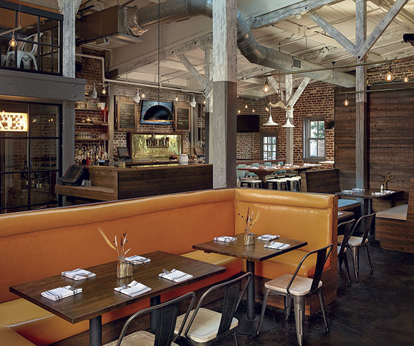 Poogan’s Smokehouse resides in an old exposed-brick warehouse with stained concrete floors, which makes the facility naturally durable.
“We have a wood bar top because it was something that was important to us and it was a natural material. We chose light and bright tiles because it created an interesting backdrop of textures,” Abrous says. “It’s one of those things people don’t necessarily notice, but when you layer these finishes and fixtures and colors and organic materials and mix them together, people don’t notice everything as a piecemeal, but they know they are feeling something comfortable. We wanted to achieve a sense of permanence with our design.”
Once Winsome adds the element of dinner, the breakfast coffee mugs won’t be seen on the tables, and neither will the salt and pepper shakers. Those three elements will be placed on the table beforehand solely for breakfast and lunch.
“The other big part in regard to the transition is going to be lighting, and we will really adjust the levels of the light,” Abrous says. “We created a lot of different layers of lighting in the space that accentuate the finishes in different ways. Really making something comfortable at night has a lot to do with the lighting, and control settings are a big part of that. Lighting is, by far, the most important thing, experientially, for a customer.”
Prior to opening, Rose and Abrous knew they would eventually add the dinner daypart to their operation and considered how it would look during the evening hours. However, they focused on the various zones of the restaurant rather than which daypart they would be serving. They then tailored their design elements to work around specific seating areas.
“With our space, we wanted people to come here up to three times a day, not three times a month. So, we tried to pay attention not just to the time of day but also to how guests can have a different dining experience day to day,” Rose says.
Experts Weigh In
Design experts shares their thoughts on designing restaurant spaces for multiple dayparts.
Brooke Taylor, Director of Interiors, Arcsine
How do you design something that’s durable but still looks good throughout the day?
Manufacturers have been pushing to develop products that marry aesthetics with
durability, making it much easier to achieve a fantastic-looking project that also performs. Now, you can find laminates, tile, luxury vinyl flooring and countertop materials that resemble materials typically not sturdy enough for the demands of a restaurant. They are even available in light colors and still offer durability and easy maintenance.
How does design impact labor and ensure operators are getting the most from their staff?
Careful planning of the layout is the foundation of a successful project. We strive to balance density of tables with efficient circulation and strategic location of server stations.
Bradley Bell, Managing Partner, Poogan’s Smokehouse
For concepts that already serve one or two dayparts, how can they best expand their hours of operation, and what design considerations should they take into account?
Adding a second, third or even fourth meal to an operation means storage space and
refrigeration are key. Even if all those meals have overlapping ingredients, you will need that much more product to handle those additional services. Plus, you have to start considering coffee service for breakfast, increased alcohol service for dinner and late night, etc. I’ve seen a lot of breakfast/lunch concepts really struggle with that transition for dinner service because they have never accounted for all the extras, and vice versa.
David Tracz, Co-Founder and Principal, //3877
How do you design something that looks good in the morning all the way through to the evening?
Color and dark light choices can really affect how the space is perceived during the daytime. We’ve renovated a restaurant that was designed with heavy notes of black and red. They wanted to serve brunch, and that dark, ominous feel just didn’t fit with the bright and bubbly brunch crowd. By the same token, we also renovated a nightclub that was designed with white plastic panels and white paint everywhere. They were concerned that the space never really got dark — hard to think about dancing in a nightclub that never really gets dark. To resolve this, we worked with the owners to completely redesign the overall palette to be darker and more interesting. So what we’ve learned from those two projects is that the design has to balance. If you are running from day to night, you need to understand that the material and color palette you choose will need to work together with the day lighting and the night lighting.
How does traffic ebb and flow impact design?
I think the key here is making sure things are intuitive and placement of constantly needed things are easy to put away and easy to get to. Cleaning supplies and table setups all need to be quick to get to. You want to make it easy on staff so they work hard for you.
For those restaurants that already serve one or two dayparts but want to expand their hours of operation, what design considerations should they take into account?
I would really recommend that they understand what that added service need will be; how many people will you need to add so you don’t push your staff too far. Equipment could be an issue, but that could depend on the added food offering. Lastly, I would look at the current design palette, making sure it is balanced — it doesn’t have too much dark and not too much light. You will also want to be able to better control your lighting. The space will need to be able to help build a mood. The morning will want to be airy and bright, the afternoon will want to be a darker and a little moody, while the evening will want warmth and comfort.

