Johnny Rockets has long been known for its 50s diner look complete with jukeboxes, dancing servers dressed in the decade’s familiar soda fountain uniforms and its original burgers and shakes. The chain now plans to roll out a a brand refresh that will leverage Johnny Rockets’ rich heritage while adding design flexibility and new visual imagery that will appeal to today’s consumers.
In developing this brand refresh, The Johnny Rockets team worked closely with the branding and design firm WD Partners to better understand the needs and wants of consumers and how best to position the brand. The chain wanted to build in some additional design flexibility to give Johnny Rockets the ability to remodel, build and open new restaurants with smaller footprints and in non-traditional venues. With this program, the chain also strives to cater to the changing habits of a variety of target audiences including millennials and Hispanics.
Known as Johnny Rockets 2.0, key elements of this initiative include a new logo, modern restaurant design, remixes of classic music and pop music of today, new uniforms for servers and cooks and redesigned to-go packaging.
The new design uses rich, warm wood planking and white brick veneer throughout the restaurant.
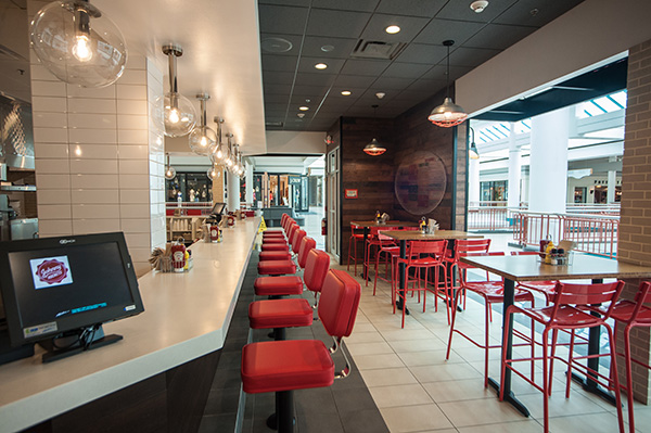
The lighting is a mix of contemporary and industrial glass globe pendants with caged pendants and an accent of red color.
The furniture includes both upholstered booth seating and tables and chairs with warm grey tones, wood detailing and a splash of red.
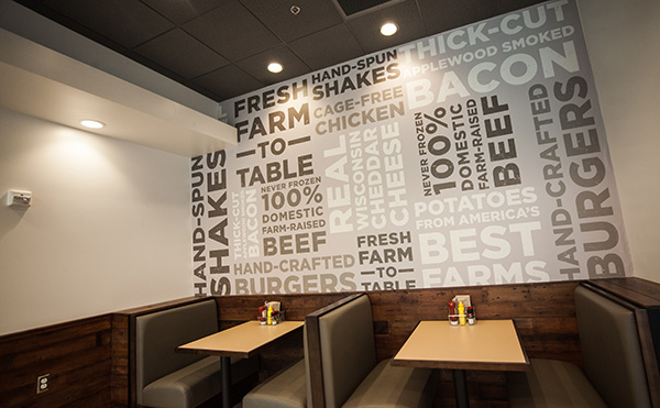
“Special consideration was given to the seating in the redesign. We wanted to maintain some of the elements of the classic diner including counter seating,” said James Walker, Johnny Rockets’ president of operations and development. “We’ve updated the seating so that everything is not fixed in place and added areas where friends and family can eat together at communal tables. Different size groups can now be accommodated with the new design as tables and chairs can easily be moved.”
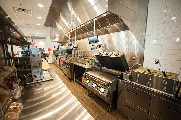
The open kitchen has white wall tiles and stainless steel wall panels.
The walls feature freshness cues such as “fresh never frozen 100% domestic farm-raised beef” and “fresh, farm to table”. Sayings on the wall include – “you can’t change the truth, but a great burger can change you” and “to make by hand is to create perfection.”
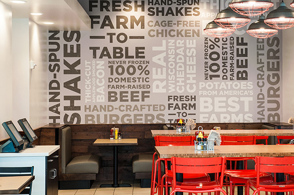
Guests can choose between table service and ordering kiosks and Servers now wear black or dark denim jeans with white oxford shirts for servers, while managers don dark chalk striped shirts.
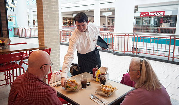
Johnny Rockets’ rollout of this refresh coincides with the chain’s 30-year anniversary. The first restaurant with the full refresh is a corporate unit in Destiny USA Mall in Syracuse, N.Y. The company plans to phase in the refresh in its existing corporate restaurants, both domestic and international, by the end of the year. “New corporate and franchise restaurants will have the new logo and design, and existing franchise locations will phase in the new elements in the next year,” Walker added. “Over the next five months, we will have fifteen new restaurants debuting with the new logo and design. Restaurants in new international markets will have the new design and logo as well.”
The new design will also be part of Johnny Rockets Drive-thru and Express locations. In June, the first Drive-thru is scheduled to open in Mooresville, N.C. and an Express will open in Tucson, Ariz., in July.

