E Squared Hospitality (E2), the New York City–based group behind such beefy full-service brands as BLT Steak, BLT Prime and BLT Burger, last summer added a fresh new face to its portfolio — one that takes the company in a couple of new directions. The company’s first fast-casual venture, by CHLOE., opened in August near the New York University (NYU) campus. It’s also 100 percent vegan — from the burgers to the fabric on the banquette. What’s more, the concept is the result of a unique collaboration with its namesake chef, Chloe Coscarelli, author of several vegan cookbooks and 2010 winner of the Food Network’s Cupcake Wars reality cooking series.
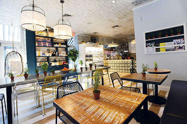 Distressed reclaimed wood tables front the banquette on the long interior wall, while floor-to-ceiling windows, the concept’s signature swing chairs and merchandising displays sit opposite.Coscarelli conceived the idea for the concept and sought out E2 to help make it happen. “Fate was on our side,” she says. “One day, I Googled ‘best hospitality company in New York City’ and came across ESquared. I contacted them about the potential of working together on a vegan fast-casual concept. They invited me in for a meeting, I met Samantha [Wasser] and we hit it off. She had also been thinking about doing some kind of fast-casual concept, so they were headed down that road anyway. I just brought the vegan component to the table.”
Wasser, E2’s creative director and co-partner with Coscarelli in by CHLOE., says selling E2’s CEO Jimmy Haber on the idea of a vegan restaurant took some doing. “He had no real concept of what vegan was. When we did some initial tastings of Chloe’s food, it was the first time he’d experienced vegan cuisine, and he was happily surprised,” Wasser says. “But he was really concerned that the concept would only appeal to a small segment of the population. Our goal from the start, however, was not just to target vegans. We wanted to do it in a way that’s mainstream and approachable versus trying to preach to anyone or promote a vegan lifestyle. As it turns out, vegans make up less than 20 percent of our customer base.”
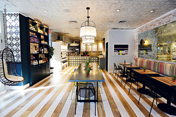 Setting out to create a fast-casual brand with full-service ambiance, the team transformed what had been a vacant, grease-fire-damaged space into an open, airy restaurant with residential design touches that lend style and comfort. The concept’s flagship unit, at the corner of Bleecker and MacDougal streets in Greenwich Village, measures just 1,000 square feet and seats 30. But its instant success, generating 800 to 1,000 tickets on an average day since opening, has the team already in growth mode. Wasser says a second New York unit will open this spring and a third by late summer. More will follow.
Distinctly Different by Design
While by CHLOE.’s menu is unique for the fast-casual segment — vegan, but also consisting of more chef-created dishes than typical assembly-line fare — so, too, is its design. Wasser’s vision was to create a restaurant that blends fast-casual service with full-service ambiance. Working with Dolores Suarez and Caroline Grant of New York–based Dekar Design, the team turned what had been a vacant, grease-fire-damaged space into a fresh, airy, casual restaurant with residential design touches that lend both style and comfort.
Large windows front two sides of the long and rectangular corner restaurant. Like many New York buildings of its period, this location has landmark status. That fact complicated its renovation, which would include a full façade facelift and complete gutting of the interior.
“It was a very lengthy process involving a public hearing to get everything approved,” Wasser notes. “The biggest issue was handicap accessibility. There’s a step up in front, and we wanted to install a ramp on the side that would allow for handicapped customers as well as strollers, etc. We managed to get it approved, but it just took time and a lot of work.”
The exposed brick and floor-to-ceiling windows help create a casual, comfortable yet modern effect. Key design features include painted and pickled striped reclaimed wood flooring, a colorful fabric banquette, antiqued mirrors, custom-designed tile wall and counter accents, a weathered zinc-topped communal table and a pair of egg-shaped swing chairs.
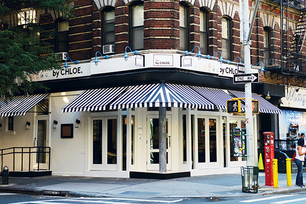 By CHLOE.’s flagship store sits on a corner location in Greenwich Village. It was selected in part for its close proximity to New York University, which provides a strong and steady student and Millennial clientele base for the vegan fast-casual.“Those chairs are definitely a signature feature, and one of my favorites,” Wasser says. “Our CEO walked in the day we opened and said they’d be the first thing that would have to go. We were so busy, and he thought we’d need that space for more tables and chairs. But now that’s the only place he sits. And when we started discussing the design of our other locations, one of the first things he wanted to know was where the swing chairs are going to go.”
by CHLOE. does brisk business all day, and, in part because of its small size, takeout accounts for a significant percentage of its sales. But E2 and Coscarelli didn’t want its fast-casual operational format to define its ambiance — or for its ambiance to be static.
“As we discussed initial design ideas, we all agreed on the fact that we wanted it to feel open and airy, and to sort of transport you to a different place than the location around you. This is a very busy and vibrant area, with lots of bars and a lot going on late into the night. But when you walk into by CHLOE., it feels peaceful,” Wasser says. “We wanted the design to highlight the food and for it to fit with Chloe’s personality. And we wanted it to be as appealing at night as it is during the day. With a lot of fast-casual concepts, you can go in at 10 a.m. or 10 p.m. and they feel exactly the same. So we approached it like we would at one of our full-service restaurants. The lights dim gradually throughout the day; the music gets gradually louder. We have a beer and wine license, and we feature a special cocktail each month. It all makes it feel like someplace you can go to on a date or with your girlfriends for a quick, healthy meal but still feel like you’re in a nice environment.”
Taking a residential approach to the design also helps to accomplish that objective. Accessories like the communal table and the colorful banquette were particularly important aspects of the design in this regard, according to Suarez.
Lighting, too, was critical. “One of our biggest points in approaching the design of commercial projects is that we don’t use the same lighting in every area,” Suarez says. “We try to divide the space as you would in your own home. Even in a small space, every area should have its own feel.”
To that end, the team chose custom, egg-shaped pendants over Moroccan tile-topped rounds in the front along the window walls. “They’re paper-based and black and white, which are CHLOE.’s brand colors,” Suarez says. “We thought the fact that they’re egg shaped was a nice play. It’s a vegan restaurant and they don’t use eggs, so it’s a little quirky touch.”
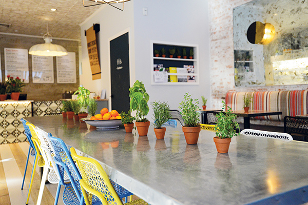 The restaurant’s centerpiece, an antiqued zinc-topped communal table, seats 12 and is a popular mingling spot. Mesh metal chairs add pops of color and help to promote an open, airy feel.Large, iron-framed lights hang over the communal table, anchoring the center of the space while at the same time lending a soft, airy feel thanks to mesh shades. Modern sconces softened with antique bronze finish provide mood lighting above the banquette and pendants while oversized, slightly retro white metal shades define the back ordering counter and bakery display area.
Washable, fruit-filled baskets atop the grab-and-go merchandiser and potted herbs add pops of color throughout and reinforce fresh and healthy brand messaging. “We wanted it to feel a little like you could be in your grandma’s kitchen,” Suarez says. “It’s a vegan restaurant, so we also wanted to appeal to that natural feeling that you’re putting great things into your body, it feels good, it’s organic, it’s homegrown. The look had to express those characteristics.”
Vegan Sourcing Challenge
The appearance also had to fit Coscarelli’s mandate that no aspect of the restaurant, from food to furniture to finishes, contain animal products. For the design team, that meant investigating every material under consideration to determine its components — often going back to the drawing board when selections didn’t pass the test.
“That was a new challenge for us. It meant we could use no leather, no wool,” Suarez says. “Leather is an obvious example, but wool isn’t. You don’t really think about that when you’re sourcing fabrics. We ended up finding a great vintage hemp textile for the banquette, and the bench is covered in vinyl. The mesh shades on the center lights are also hemp.”
Wasser took responsibility for ensuring that Coscarelli’s principles were protected during the design process. Like Dekar, it was her first vegan restaurant project, and she agrees it was a learning process.
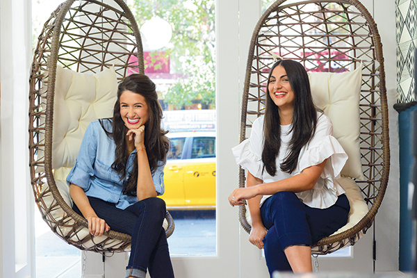 Chef Chloe Coscarelli (left) and Samantha Wasser, ESquared Hospitality creative director“We had to consider even the small details of every product,” she says. “The first fabric they brought in for the banquette was great — we fell in love with the colors — but when we looked at it more closely, we realized it contained wool. Another example was the swing chairs. Dekar brought those in for us to look at, and I loved them but noticed that part of the hanging strap was leather. They were so apologetic and couldn’t believe they didn’t think of that and were able to source a different option. So for all of us, it was about getting into the mind-set and being more conscious in order to keep in line with the brand.”
“You do have to learn to be a detective,” Coscarelli adds. “Whether it’s food-related or design-related, you always have to be on your toes to make sure no animal products are crossing your work. This was a dream team to work with — they really cared about making that happen.”
Project Team
- Corporate: ESquared Hospitality
- Co-partners: Chloe Coscarelli,
Samantha Wasser - Design: Dolores Suarez and Caroline Grant, Dekar Design
- Graphics: Paperwhite Studio
- Snapshot
- Location: Greenwich Village,
New York City - Concept: Vegan fast-casual
- Dayparts: Lunch and dinner daily (until 10 or 11 p.m.); extra brunch menu Saturday and Sunday, 10 a.m. – 4 p.m.
- Size: 1,000 sq. ft./30 seats
- Design highlights: Custom lighting and tile accents, reclaimed wood, exposed brick, antique mirrors, residential-style seating and accessories, all vegan materials
- Build out: Three months
- Website: bychefchloe.com
Building Insights: Samantha Wasser, Chloe Coscarelli
Real Estate: A big reason we chose this site is its close proximity to NYU. Vegan food options were lacking in the area, and we thought our concept would speak really well to Millennials and students who want to eat healthy food but also want to indulge. While we were looking, the problem was that everything we could afford was very small and on a side street with low visibility. When our broker finally brought us to this corner spot, we immediately saw the potential to make a mark in this area and knew we’d found our site. (SW)
Footprint: If we had known what the success would be, we would have gotten a larger space, but we had no idea what the reception would be, so we were cautious. We’d rather have a smaller location that’s crowded than a larger space that feels empty. For future locations, we’re definitely looking for larger spaces that can accommodate the number of people who want to eat in and enjoy the ambiance. (SW)
Black & White: We use a lot of color inside but went with black and white as our brand colors in part because we were looking toward the future. If we chose one main color for our logo, by the time we get to store No. 10, we might be really sick of it. Black and white is timeless. We also felt that picking one color would make it feel more like a typical fast-casual restaurant, where they tend to pick a color and use it for everything. (CC)
Format: We wanted to keep a focused menu, especially because we’re presenting a cuisine that might be very different for a lot of customers. Many fast-casual concepts leave all of the decisions to the guest, but we took a different path and craft all of our items with what the chef recommends. It’s a limited menu, but there are many different ways to play with it, which makes it work for multiple dayparts. (CC)


