By paying attention to the details, Nekter Juice Bar uses a series of well-thought-out design choices to reinforce the chain’s brand position of providing a menu of freshly prepared, better- for- you menu items and encourages customers to live a healthier lifestyle.
When the leaders of an emerging restaurant chain say they aim to be the Starbucks of their sector, what exactly do they mean?
In the case of Nekter Juice Bar, president and CEO Steve Schulze means that his concept can grow to hundreds of stores by becoming a key part of customers’ lifestyles.
This can happen for Nekter, Schulze said, by serving healthful juices and smoothies in a comfortable environment that might also inspire consumers to eat better and be active outside the store. Many other juice and smoothie chains fall short of this mark, he added.
Through design, many of these concepts position their offerings as treats, with images of smoothie cups and popsicle colors dominating these stores’ logos and interiors. Their furnishings, meanwhile, often consist of little more than a couple of small laminate tables with some basic chairs, making them less than welcoming, he added.
Nekter has gone in the opposite direction with a new prototype store that emphasizes the wholesome nature of its offerings, encourages healthy living while (like Starbucks) inviting customers to stay and enjoy their drinks.
Nekter’s commitment to healthy living becomes visible even before customers enter the store. Then new design places mantras and motivational sayings, such as “Eat Fresh, Drink Fresh” on the exterior windows using vinyl lettering. This helps customers understand the concept as soon as they see it, said Schulze. “We wanted to be able to tell a story but we didn’t want to clutter the windows up with pictures of smoothies or juices or even vegetables.”
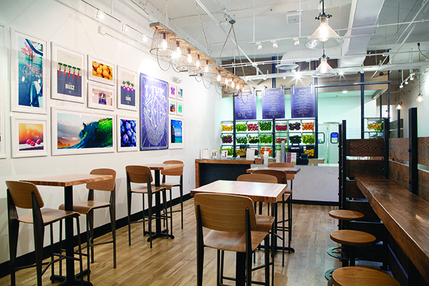
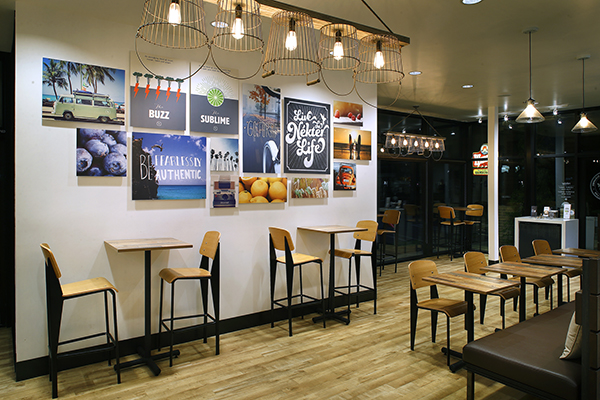
The art wall, one of the chain’s signature design elements, provides additional motivation. This white wall features framed mantras and sayings, along with tips on the benefits of juicing and healthy living, as well as images of outdoor areas nearby, such as mountains, or beaches.

A few pictures and sayings won’t make a store part of a lifestyle, of course. Through its other design choices, Nekter emphasizes its commitment to healthy and natural, encouraging its customers to do the same. Take the chain’s color palette, for example. Instead of going with bright, artificial-seeming colors, Nekter uses earthy, subtle tones, including white walls, gray accents, and honey wood laminate flooring.
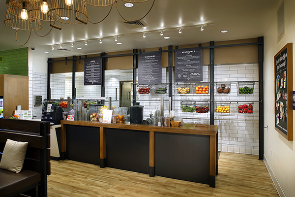
These colors not only reflect nature, they quite literally let the juices and their ingredients stand out. Just to the side of the POS station, wire racks on Nekter’s front counter hold fresh fruits and vegetables are held in wire racks on Nekter’s front counter. A grab-and go refrigerator stocked with fresh cold-pressed juices provides additional pops of color that showcase Nekter’s offerings.
“What we really pride ourselves on is the freshness of what we provide, the fresh fruits and vegetables. Rather than letting the colors of the walls dictate what we want to do, we wanted the stars of the show to be the fruits and vegetables,” said Schulze.

Becoming part of people’s daily routines takes more than just some bright colors, of course. Following the Starbuck’s approach, the chain has upgraded the furnishings in the new prototype. By installing more sophisticated and comfortable furnishings, the chain welcomes customers who want to stay, sip on a drink and even pull out a laptop and work.
These furnishings include butcher block tables with the chain’s logo stamped into them, community benches and, most importantly, soft seating, typically in the form of a cushioned bench or oversized chairs. “Seating affects volume,” said Schulze. “It was important to put in soft seating, put in community seating...in which people feel they could be in a community, if you will.”
The tables and chairs, Schulze added, also play an important role in directing customer traffic. While the previous store had a pony wall that dictated how people queue, that sort of artificial, top-down approach just didn’t make sense for Nekter, said Schulze. Now, it uses table and chair placement to create natural walkways.
“We felt queuing people in a line like a herd was not what we wanted to do. What we really wanted was a neighborhood-centric model,” he added.
This sort of communal approach, combined with a comfortable atmosphere and an emphasis on juice and smoothies as part of a healthy lifestyle - and not just a treat - has helped Nekter position itself as a different kind of juice bar, said Schulze. Similar to how Starbuck’s reinvented the coffee sector, “our goal was to reinvent the juice space, which we’ve done a nice job doing.”


