When Nathan Andrew of New York-based The Department of Interiors took on the job of converting an existing restaurant and bar space into the comfortably stylish Pounds & Ounces, he and owner Etai Cinader knew a large communal table had to be part of the plan.
The restaurant, after all, would be a neighborhood gathering spot and its large storefront windows were ideal for showcasing the table and the energy within the restaurant. But he was insistent that the table be unique — no reclaimed wood, no filament bulbs hanging overhead. What he ended up with is a distinctive design feature that, like the rest of Pounds & Ounces' interior, creatively marries retro and modern. He recently shared the backstory of the 26-foot, 40-seat illuminated work of art.
rd+d: Pounds & Ounces' communal table is unique in many ways. Where did you start in the design process?
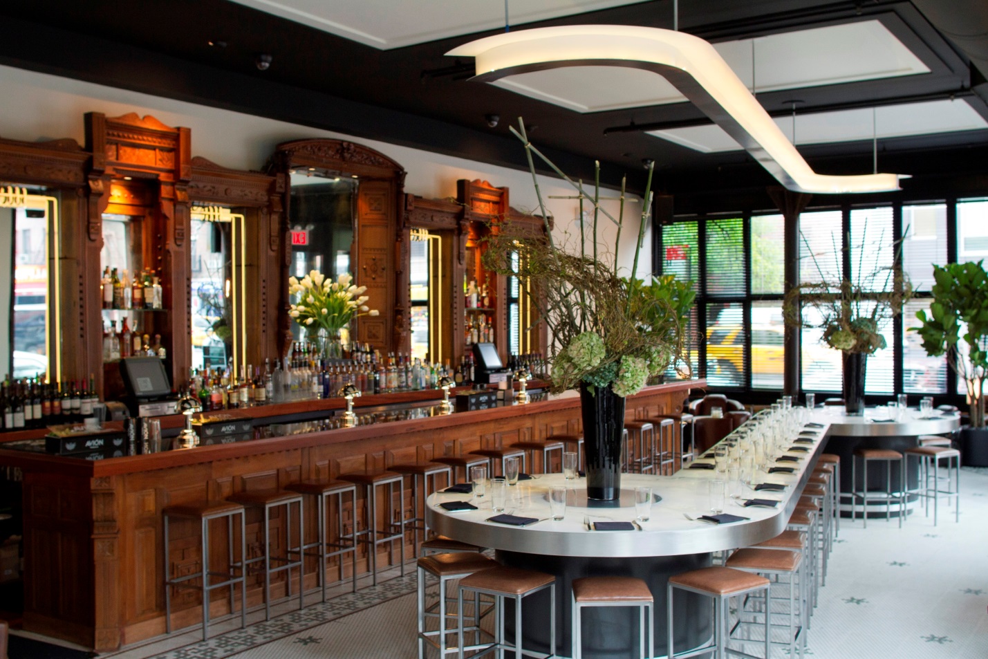
NA: I really felt that, in general, this space should look like an art deco restaurant because the bones of the building lend themselves perfectly to that. We were talking about a communal table that would be great for drinking but also for dining so we started by considering the height. I find it's difficult to eat at bar height but also didn't want it to be dining table height because of its location by the bar – that can be really uncomfortable for diners, who are likely to get elbowed in the head. So I took a residential approach, landing on a kitchen-counter height of 36 inches. Everyone likes to eat at the counter at home, so I figured that would work.
rd+d: The restaurant has a beautiful old wooden bar, but you steered clear of the ubiquitous reclaimed wood for the communal table. What drove the choice of materials?
NA: I can understand why it's used so much — it's readily available and affordable — but I'm really tired of reclaimed wood and think it's inappropriate for a lot of New York City restaurants. I love the popularity of alabaster during the 20s, 30s and 40s and found a great composite material that mimics alabaster, so decided to use that to create a showpiece communal table. We couldn't use real alabaster because it's quite soft and maintenance would be an issue. This is a man-made material that's durable and easy on dishes – it can be really hard on dishware if you're serving on a stone table. It's an ivory color, translucent with pearls and creams and it has smoky ribbons of brown and gray throughout. It's really beautiful, especially when lit up at night. It just glows.
rd+d: Its shape is also unique.
NA: We knew it had to be a long table, both for the space and the intended purpose, but didn't want just a plain, straight table. In my research, I found a beautiful pendant by Jean Despres, a famous art deco designer in the 1930s. Its shape suggested a P and an O and I thought that idea would be great for the Pounds & Ounces table. The end of the table sort of turns in to a P and then reflects that same shape on the opposite end, almost like a musical note. It's 26 feet long and is suspended on two pedestal bases on ether end. Each of the round P sections is approximately 5 feet in diameter, which is a nice size for more intimate dining parties and for showcasing floral arrangements.
rd+d: How was the table fabricated?
NA: Our fabricator built a metal stainless steel structural frame and a "racetrack" of LED lights was installed all around this skeleton to illuminate the table from within. Large sections of the alabaster composite material were then installed on top of the lights, flush with the top of the frame. All of the electrical transformers, dimmers, etc., are contained within those pedestals. Those, too, are made from stainless steel frames but we covered them in black, ebonized wood veneer inlaid with a few bands of stainless steel rings to dress tem up. Even the bottom of the table is beautiful. It's all stainless steel within counter-sunk screws all around. I always maintain that when we make furniture it should be beautiful from every angle.
rd+d: Was installation a challenge?
NA: It was delivered in an 18-foot trailer and we basically had to shut down the street out front. But the only assemblage we had to do on-site was electrifying it, making sure that the electrical in the floor came up and fed the table properly. Other than that, we basically slid it off the truck and into the restaurant all in one piece.
rd+d: And it has since become a signature feature.
NA: It's a staple of the restaurant. It was important to have a great communal table. This location is unique in New York because it has huge windows on both the front and the side of the building, so when we were conceiving the table we realized that people walking by could see everything inside. At night, you can see the entire shape of that glowing alabaster table and the huge flower arrangements even from across the street. It really draws people in.


