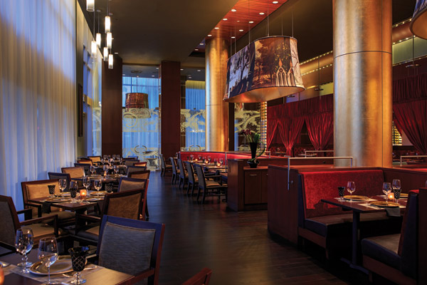
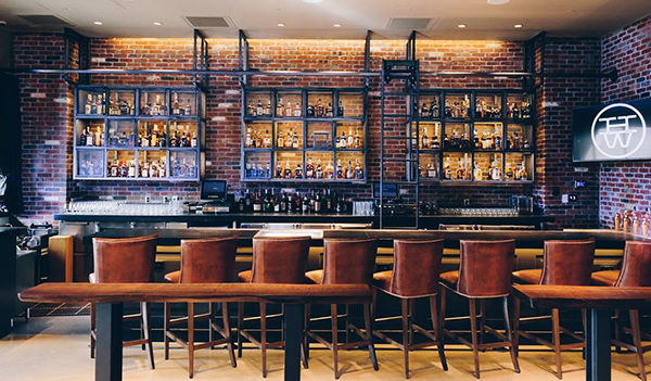
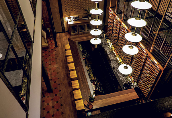
Advancements in lighting design and technology make it easier for restaurant operators to think outside the box. Once-standard fixtures are giving way to design-integral expressions ranging from industrial-looking, repurposed fixtures to fantastic, custom artistic expressions that take statement lighting and its place in restaurant design to a whole new level.
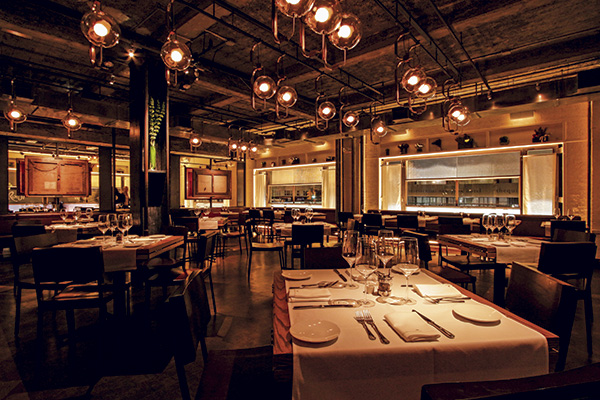 Paul Gregory designed the lighting at Quality Italian to fill the space with a soft, ambient glow that makes people look good. Photo by Ryan FischerAt the same time, practical but no less fantastic advancements in technology — particularly with regard to LEDs — present restaurants with completely new opportunities to integrate environmentally friendly lighting schemes that look great and reduce long-term overhead costs.
Hunt & Fish Club in New York City, a $5 million, 9,000-square-foot upscale steakhouse run by founders Eytan Sugarman, Nelson Braff and Anthony Scaramucci, represents one operation in which the artistic possibilities of restaurant lighting shine brightly. Designed by artist Roy Nachum with his wife Maia Nachum, director of SoHo-based firm Studio Iyor, Hunt & Fish Club’s various custom-designed light fixtures were literally built as art installations.
The restaurant separates into five rooms, each designed around a color and each offering distinct experiences for diners. Each main area features uniquely designed lighting. In the White Room, for instance, a 40-by-20-foot installation fashioned from chrome rods and 2,500 bulbs reflects against a charcoal mirrored ceiling.
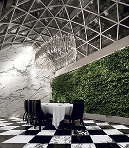 Named for its living green wall, the Green Room at Hunt & Fish Club features an oval-shaped light fixture that hangs from the ceiling. “The idea was to create something unexpected and surreal. The reflective surface of the ceiling and the reflective quality of the materials allows observers to become part of the installation, seeing their own reflections in between an infinite number of iridescent lights,” explains Roy Nachum. “Conversely the floor lighting, sconce lights and oval fixture hanging from the skylight in the Green Room [so named for its living green wall] all use the same materials, but take on different forms.”
Downstairs in the Blue Room, the ceiling serves as a light installation, composed of geometric slabs of charcoal mirror and lightbulbs arranged in the shape of a compass rose. Similarly, viewers are transported into the installation where their reflections become part of the incandescent form.
“We wanted to create an intelligent space, which feels new yet timeless and monumental,” Roy Nachum says of the Hunt & Fish Club’s overall design. “The light installations created for the space have no scheme. However, they are all similarly composed of reflective materials and light, each in a unique form. It’s obvious to say that lighting creates the atmosphere, but we look beyond purpose and function, to its beauty and form. Each fixture is an art installation, both aesthetic and interactive.”
While Hunt & Fish Club represents an extreme example of lighting meets art, design experts, architects and restaurant operators all agree that lighting is essential for creating the kind of dining environment people want to be a part of. That’s true for fine-dining establishments as well as more casual settings.
“It’s really about the atmosphere you’re trying to create. There are lots of reasons why people go to a restaurant for the first time, whether its buzz, its newness or press. But getting people to go back is the key,” notes Paul Gregory, president of Focus Lighting Inc., a New York-based lighting design firm. “You never get a second chance to make a first impression.”
Flexible Functionality
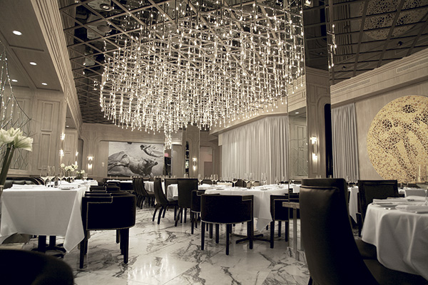 Hunt & Fish Club’s White Room features a 40-by-20-foot installation, fashioned from chrome rods and 2,500 bulbs, that reflects against a charcoal mirrored ceiling. Photos courtesy of Studio Iyor.When it comes to lighting, restaurants in the United States appear to lead the way in terms of technology and trends, with the exception of Europe, according to Nick Albert, director of Illuminate, the lighting and consultancy division of international hospitality and design firm HBA. “Regions such as the Middle East or Asia seem to be following U.S. trends in a couple of ways,” he says. One of the biggest, he says, is the rustic and retro approach, which he calls “lumberjack chic,” adding, “It’s interesting from a design standpoint because lighting is technology ... It’s an interesting juxtaposition.”
When Crushed Red owner Chris LaRocca was looking to build his Boulder, Colo.-inspired restaurant in Missouri, the goal was to design something that was smart, edgy and comfortable. The fast-casual artisan pizza and salad restaurant’s interior features wood floors and an exposed wood ceiling while Mason jar pendant lights hang as chandeliers throughout the dining room. The decor ties in to LaRocca’s vision and the latest trend of rustic elegance.
“The lighting is key to creating that experience,” LaRocca says. “In talking about having a restaurant with this Boulder feel, we wanted the lighting to provide a certain glow. Everything has to look good.” LaRocca also is making the switch to LED lights, which he’s now able to find in colors and sizes that fit his needs. They’ll ultimately provide his restaurants with 35,000 hours of uninterrupted illumination.
“We’re at a moment in lighting where the sea change is due to LED technology, but it’s such a large shift and so pervasive that developing new iterations of that technology is moving fast,” says Albert. “It’s similar to the processor revolution in personal computing in the 1990s. LED is at that point.”
While LED lights launched with only one or two utilitarian color hues — harsh and not well suited to illuminating food or people — that’s no longer the case. Designers and operators now find more attractive, cost-saving options available by the day.
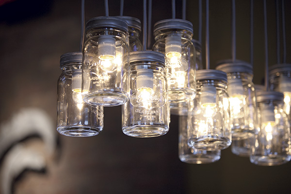 The interior at Crushed Red, a fast-casual artisan pizza and salad restaurant, features wood floors and an exposed wood ceiling with Mason jar pendant lights hanging as chandeliers throughout the dining room.“What we’re currently seeing is really a quality of white light, of light that’s warm. It’s similar to the traditional method of using candles, and anything that approaches the warmth of firelight is going to be successful,” Albert says. “Also, the white LEDs have gotten better at displaying color. For example, the look of food under LEDs is now more authentic and natural. Because of that, LEDs now have a place in these types of environments. They move beyond the functionality of contrast and allow us to add a certain amount of dynamism to spaces.”
In regard to incoming technology, Albert believes the days are numbered for traditional light switches in favor of digital and mobile app controls. He adds, however, that some fail-safes will be necessary for restaurants that solely rely on controlling lighting elements through an app or other digital platform. That’s particularly true for complicated installations.
For example, Fireman Hospitality Group’s new Florian Café, Trattoria, Bar in New York City installed five different lighting presets in each of the restaurant’s five dining areas. The lights in each room operate on separate dimmer systems and change throughout the day to complement both the external elements and dayparts. An overhead system was brought in from Paris; a local chandelier was purchased in New York; and other, more industrial, fixtures were bought off the shelf.
Because Florian’s large floor-to-ceiling windows face Park Avenue, natural daylight plays a big role in the restaurant’s front dining area, though the windows are tinted to keep too much of the outside light from infiltrating the space. The lighting presets also help convey the appropriate mood for each time of day.
“It’s warm in the morning, and we work our way down to a moody, lounge atmosphere in the late evening,” says David Korins, a Broadway production designer who worked on Florian’s decor. “It has a very specific visual narrative because people do feel different in each part of the restaurant.”
With each element of Florian’s lighting in place, Korins was able to pull together a theme for each room based on the type of ambiance the owners were looking to create. Florian does use some LED lights, although the company spent a lot of time and money to retrofit what they had to be LED compatible and get the right amber glow. The idea, overall, was to create a dramatic space that has old-world charm and makes people feel and look great.
“You want people to feel sexy and look really good, whether in the dining room or in the restroom. Even if it’s a subconscious thing,” Korins says. Thanks in part to the strategic lighting employed at Florian, “people feel the place is theatrical and warming and that it has a story.”
Looks Good, Saves Money
Many technological advancements in lighting are being highlighted as a way to save operators money.
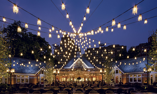 At Tavern on the Green, 500 LED chandelier bulbs strung together give the appearance of a tent’s roof over the outdoor courtyard. The increased use of digital platforms and apps to turn certain dining room lights up and down gives operators great control, which can help trim energy costs. But the switch to LEDs represents the biggest opportunity to save. “Our first conversation with any client is to use LED technology as much as possible, but you do have to make a commitment to it,” Albert notes. “There is a higher cost at the entry point than with some other technologies, but the installation is less expensive than what it would have been 5 or 10 years ago.”
In spite of the initial cost to change out some of their lighting fixtures for LED-compatible alternatives, Korins says the cost savings at Florian could be huge. Other operators are beginning to see the light as well, and the savings go far beyond energy.
“Little by little, we are switching over because there is an energy-cost savings, but also a maintenance one,” says Amber Moshakos, president of LM Restaurants, operator of 9 restaurant concepts including the 25-unit Carolina Ale House. “Our buildings are big, and not having to get on a ladder or lift to change lightbulbs is a huge savings for us. It’s great to know we’re doing something to help the environment as well.”
Carolina Ale House also looks to maximize natural light, a concept some refer to as daylighting, to reduce lighting costs. Its flagship location in Raleigh, N.C., for instance, features a retractable roof in order to enable rooftop dining and open up the restaurant with more natural light.
“We want open, airy and natural lighting, but at the same time we have to balance it with our televisions,” Moshakos says. “It’s a delicate play because we have to match the lighting coming through the windows. Lighting is one of those things in this business that’s all about the detailing.”
The Trick is in the Details
Getting the detailing right is a central theme that weaves design and technology together.
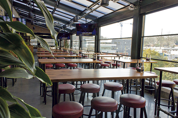 To reduce lighting costs, Carolina Ale House employs a concept known as daylighting, which looks to maximize the amount of natural light that enters a restaurant. Paul Gregory and his team helped to do the lighting redesign of New York City’s Tavern on the Green, located in Central Park. In the outdoor courtyard, a new design was necessary due to the city’s removal of several London plane trees, which had been wrapped in thousands of twinkling lights. To keep the nature element in place, Gregory and his team strung together 500 LED chandelier bulbs to make it appear as if the roof of a tent is over the outdoor courtyard.
“We needed to create something that was the centerpiece — beautiful and better than what was there before,” he says. “We were trying to create a memorable image. If we can create an emotion in the diner, the memory is stronger.”
While the Tavern on the Green provides a naturally theatrical setting in which to feature such creative lighting systems, Gregory advises restaurant operators to view their own locations in the same way — namely as a stage where light can bounce off tables to create the kind of atmosphere each restaurant operator wants to convey.
“We analyze all of the impressions a restaurant can make, and then we add the task of sitting at a table and looking at the person across from us,” Gregory says. “In theater, you make the performer of the show look beautiful, and that’s the same kind of thing you do with someone at the table. The person should be more important than the surroundings. It’s lighting a person as if they are an actor on a stage, and that’s the key to real success.”
“Lighting, at its best, is something you don’t explicitly notice. It adds to the environment and creates a mood and ambiance that is pleasant,” Albert adds. “The only way you get there is by really close collaboration with the entire design team. It’s about the dance between the different design disciplines all moving toward the same goal.”

