Reid’s Fine Foods has been a Charlotte, N.C., destination for fresh meats, deli, wine, gourmet and specialty food for more than 90 years, growing to four locations since current owners, the Coker family, purchased the business in 2010. Reid’s now also has a younger sibling, Salted Melon Market & Eatery, an all-day coffee bar/cafe, wine bar, restaurant and specialty foods market that opened in July 2022 in Charlotte's South End neighborhood. It’s a distinct new brand that leverages the family’s gourmet retail experience while leaning into foodservice with an eye toward a younger demographic.
Located on the ground floor of the city’s new 25-story Lowes Global Technology Center, working home to some 2,000 tech associates, Salted Melon is the passion project of Thomas Coker, who with his father, Tom Coker, owns Reid’s. “We’ve seen success with the Reid’s market concept and thought we’d take some of that expertise and experience to create a new concept, one that’s more modern, a little easier to operate — without the butcher shop elements, for instance — and focused on a younger demographic,” Thomas Coker says. “Salted Melon is positioned as a fresh, health-focused, casually elevated market and eatery that meets consumers’ needs at multiple points throughout their day. We want to be a place where patrons can get coffee in the morning, come back for a quick and healthful fast-casual or grab-and-go lunch, and then again at night, to pick up a bottle of wine or to meet friends for cocktails or a full-service dining experience.”
 Colorful light fixtures hung at varying heights above the front lounge area helps to create a playful vibe. Image courtesy of Chris Edwards
Coker notes that the family had eyed the Lowes site for a Reid’s Fine Foods location before Salted Melon began to take shape. As concept development progressed, however, the new brand seemed a perfect fit for the up-and-coming South End district. “I live about a block away, so we’re very familiar with the area,” Coker says. “When we decided to pursue a new concept, it made sense to do it in this location. There are lot of offices in the area, new residential construction, food, beverage and retail. There’s a lot going on with work traffic throughout the week and people out and about enjoying the area at night and on weekends.”
Starting from a cold dark shell, the 7,000-square-foot, high-ceilinged space was transformed into a light, bright, colorful restaurant-market hybrid with the help of Charlotte-based design firm Barrie Benson Design and The Plaid Penguin, a hospitality-focused branding firm. The design team worked to create multiple experiences within the large, open space and to ensure the space works well from morning to night.
“We had several directives from Thomas Coker,” notes Barrie Benson, principal at Barrie Benson Design. “He wanted Salted Melon to be a counter-service restaurant alongside a market during the day, but in the evening, it would also function as an inviting and cozy full-service restaurant. We needed to create these varied guest experiences while keeping a cohesive look and feel throughout. It also needed to appeal to a young-professional/young-family demographic.”
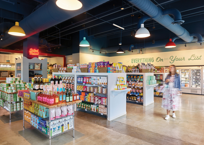
Guests at Salted Melon can peruse the retail market area, which comprises roughly 1,500 square feet, for specialty foods and drinks, gifts and freshly prepared grab-and-go items. Beyond the market, guests approach a counter where fresh bakery goods are on display and orders can be placed from the all-day menu of coffees and teas, breakfast items, salads, sandwiches, wraps and bowls. A signature feature here is also bone broth, which is highlighted with neon “Broth Bar” signage behind the counter. The broth is served with optional add-ins, including ginger juice, chili oil, roasted garlic puree, turmeric and lemongrass coconut milk.
 The kitchen was left partially visible in the main dining area behind a bookcase divider styled with products, accessories and greenery. Image curtesy of The Plaid Penguin
“We own a bone broth brand that we make in our commissary kitchen, which serves Reid’s and Salted Melon,” says Coker. “We figured out how to keg it and bring it to our stores, where it’s served hot out of draft dispensers. It’s a unique offering for us and has been very well received.”
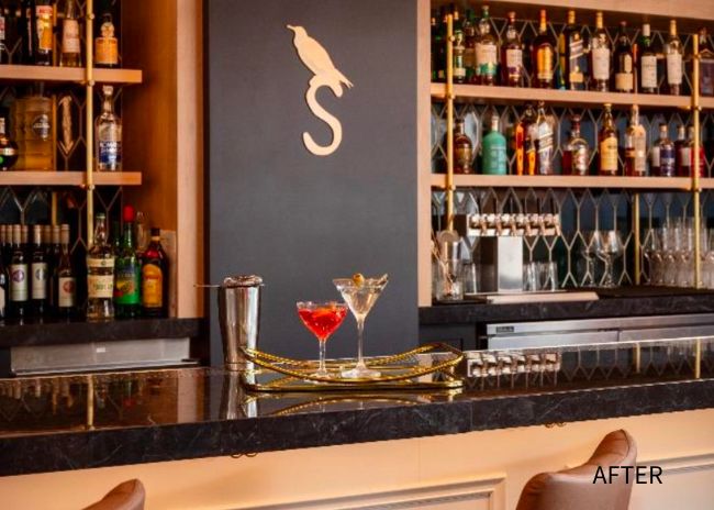
Counter-service customers choosing to dine-in have a variety of seating options on the opposite side of the space. A lounge area at the front corner along a wall of windows offers sofa-style and bench-style window seats as well as communal tables. Farther back, the main dining area, which transitions to full-service mode for dinner and weekend brunch service, is anchored by a 16-seat bar, across from which are three high-top tables in the center and banquette seating along the wall. Beyond the bar area, the main dining room offers additional banquette and loose table seating, with a full wall of windows on one side and partial visibility into the kitchen on the other through an accessory- and greenery-filled residential-style bookcase wall.
Creating Zones, Adding Warmth
 Beyond the market, guests approach a counter where fresh baked goods are displayed and orders can be placed from the all-day menu of coffees and teas, breakfast items, salads, sandwiches, wraps and signature bone broth. Image courtesy of Chris Edwards“The biggest challenge was figuring out how to create transitions in this big, open, industrial-type space with a lot of windows,” notes Avery Parcell, senior designer at Barrie Benson Design and project lead. “What architectural elements and finishes could we use to help move guests through the space and delineate the various areas without building walls? We ended up relying on colors — working collaboratively with The Plaid Penguin team to support the branding — seating styles and some custom casegoods to do so.”
Color drives the Salted Melon aesthetic. Referencing Italian architect and designer Ettore Sottsass’ style for inspiration, a combination of three main hues sets the tone of the space and plays on the brand name. A light minty blue, used extensively on walls in both tile and paint finishes, as well as in furniture accents, serves as a neutral color that helps keep the space light and bright. The tile, Parcell notes, was an early material decision and drove much of the overall color scheme.
“We found this really beautiful tile that worked with the budget. It has an almost handmade feel. It’s light, but also has varying shades of blue within it,” Parcell says. “We used it to anchor and provide consistency throughout the space, but also to add some uniqueness. We didn’t want to just paint all the walls, and we knew we weren’t going to be able to wallpaper everything because of budget restrictions, so we used the tile to help us tie everything together.”
A darker blue, used in furniture accents as well as on the ceiling, helps bring the scale of the space down while disguising exposed ceiling ductwork and plumbing. The darker blue also provides a backdrop against which a pop-art-style, brand-supporting painting commissioned for the space stars on the dining room’s back wall.
Finally, a rich melon orange is used strategically throughout and adds warmth and vibrancy while also playing a key role in defining zones. “We used I-beams painted in that melon-orange color to help delineate key areas — around and over the bar, framing walls behind dining room banquettes, and framing the order counter, for example,” Parcell says. “And while the colors overall are bright, they also feel comfortable and warm when mixed with the neutrals in the rest of the space. We chose a durable, saddle-colored faux leather for the upholstery and a natural, white oak for tabletops and chairs that’s light, but also has warmth to it. For budget reasons, we needed to keep the simple concrete slab floor, but we gave it a warm stain.”
Parcell adds that in addition to creating the various zones, a key challenge was ensuring that the desired ambiance transitions successfully from market, coffee, lunch and gathering spot during the day to an inviting full-service restaurant at night. Here, lighting plays a key role. “We had a lot of fun with lighting. Over the front lounge area, for instance, we wanted to create a playful moment and really make that area significant, in part because it’s at the front corner of the building and everyone walking or driving by sees into it from different angles,” says Parcell. “The fixtures there weren’t crazy-expensive; we just got creative with the colors and the heights to create something a little unexpected. We also used different lighting styles as another way to delineate the different zones, from contemporary wall sconces over the banquette across from the bar to globe lights over the bar. And we have everything on dimmers so that the lighting can be adjusted for maximum effect throughout the day and night. At night, it feels warm and cozy and looks really inviting, even though it’s a very large, open space.”
 The front part of the large, open space along an expansive wall of windows is dedicated to the retail market and lounge seating area. Images courtesy of Chris Edwards
Planning for Growth
For Coker, the design devised for this flagship Salted Melon holds the keys to what he sees as strong opportunities to continue to grow and refine the brand. Now open for two years, he’s tweaked a few things operationally, but says the look, feel and branding are right on target. The biggest learning, he adds, has been on the full-service restaurant side of things.
“Originally, I wanted to just have one menu, offering the all-day menu as a full-service option at night, as well,” he says. “We’ve always offered the full-service experience, with servers, a host, wine and cocktail lists, etc., but found it didn’t work to just change the service style. We needed to elevate the dinner menu to better fit the experience at night. So, we created a separate menu featuring creative shareable plates and dinner entrees such as steak frites with tarragon herb butter and salmon risotto. And we have a separate full-service menu for weekend brunch.”
While offering both retail and foodservice elements is central to the Salted Melon concept, foodservice is its primary revenue stream. Coker says roughly 20% of total sales comes from the market side of the business, and another 10% from the bar. “The core of the concept is really the fast-casual side of things, with lunch and breakfast making up about 80% of our foodservice sales,” he notes. “Roughly 15% of sales is off premises, not including catering. We’re leaning into this model and are comfortable growing the brand as primarily a healthful, elevated fast-casual concept.”
Customers seem comfortable with the model and the menu, as well. Salted Melon was recently voted best new restaurant in North Carolina by the readers of “Southern Living” magazine, helping fuel Coker’s plan to develop more units in Charlotte and beyond. “They’ll be smaller — 2,500 to 3,000 square feet versus the flagship’s 7,000 square feet — and really focused on the healthy fast-casual offerings,” he notes. “But the look and feel will be consistent. The design and branding teams were able to take what was probably a somewhat vague vision for Salted Melon and help us put it together beautifully, both for this first unit and as a brand we can grow with.”
 The main brand colors of light blue, dark blue and orange are bright, but also comfortable and warm against natural-wood furnishings and stained concrete flooring.
Project Team
- Ownership: Reid’s Fine Foods (Tom Coker Sr., Thomas Coker)
- Design: Barrie Benson Design (Barrie Benson, principal; Avery Parcell, senior designer)
- Branding: The Plaid Penguin
- Equipment supplier: Thomas Restaurant Equipment
- General contractor: Level Construction
- Functional lighting support: Team Lighting
- Custom painting: Catherine Rex
Snapshot
- Concept: Elevated all-day eatery and specialty market
- Location: Charlotte, N.C.
- Opened: July 2022
- Project type: New build
- Size: 7,000 square feet
- Restaurant seating: 125, plus 25-seat lounge
- Foodservice sales: 70% of total
- Average per-person foodservice check: $19, counter service; $27 full-service brunch/dinner
- Project duration: 1 year from initial design development to opening


