A few years ago Captain D’s found itself in a developing conundrum.
The chain, says Vice President of Real Estate Phil Russo, has always done well in urban markets, with a particular strength in densely populated areas.
At the same time, it was having a harder time building in these areas. The cost of real estate was spiking, nearly pricing Captain D’s out of some hotter markets, Russo says. Compounding the problem was a lack of ¾-acre lots a traditional Captain D’s restaurant needs.
“Urban markets, generally speaking, don’t have large lots available. Everything is very small in urban markets. We needed a solution to take on some smaller parcels in specific markets. We wouldn’t use it everywhere but specifically in an urban-type area we would want to consider something smaller,” says Russo.
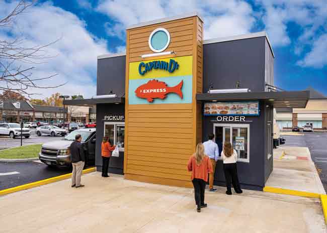
In response, prior to the pandemic, the chain began developing an Express model. Though interrupted, their work finally came to fruition last year with the opening of the first Captain D’s Express in Atlanta, followed by additional openings in Columbus, Ohio and suburban St. Louis. This restaurant, featuring a drive-thru and walk-up window but no dining room, measures 900 square feet and can be built on just ½ an acre parcel.
 Walk-up guests place their orders and pick up their food at separate windows. The pick-up windows for walk-up and drive through are next to each other, allowing them to be served by a single employee. Images courtesy of Captain D’s
Design Difference
In some important ways, designing an express unit is simpler than the chain’s standard restaurant with a dining room and drive-thru, says Larry Jones, Captain D’s vice president of construction.
Though requirements can change based on local zoning, Express units often do not need public restrooms. In addition, the HVAC requirements for Express restaurants are simpler since there’s only one space that needs to be conditioned. The calculations (and the equipment package) for air handling, heating and cooling are much simpler than what’s required for traditional restaurants.
This does not mean designing an express location is easy, Jones stressed. To start, 900 square feet is smaller than Captain D’s traditional back of the house. “It wasn’t as simple as just lopping off the dining room. We really had to figure out how to make everything fit in a 900-square-foot building,” says Jones.
There was also the issue of the building’s shape. Captain D’s increased its degree of difficulty by designing a prototype that could utilize a shipping container and/or modular construction, Jones says.
“We haven’t tried one yet, but I wanted to prepare for that because I was seeing a lot of exploration into those aspects of construction and what it could do to speed up construction times.”
Kitchen Changes
Some of the work that enabled this smaller model took place a few years before, Jones acknowledges. Instead of being part of a drive-thru-only push, these efforts were focused on getting smaller and more efficient in general.
 The chain put a spin on its existing logo by adding “Express” to the fish silhouette. In standard stores, the fish has the year of Captain D’s founding.The chain, for instance, reworked its back of the house to use more vertical space. This included increasing the walk-in cooler/freezer height by 1 foot. As a result, Captain D’s added an additional shelf, which yielded several more linear feet of storage in a smaller footprint.
Captain D’s also went vertical in its production area, most notably with the fryers, Jones says.
“We worked with [a fryer manufacturer] to develop countertop electric fryers that are commercial grade and could handle a heavy frying kitchen. That allowed us to put refrigeration beneath those fryers rather than having to flank the fryers or put the refrigeration behind [the team member working the fryer station]. That allowed us to shrink our footprint considerably. With the efficiencies we gained with those fryers relative to gas fryers, for example, we were able to reduce our ventilation hood length. It all started working together. Once we cracked the code on the cooking platform, we were able to look at everything else.”
While those earlier changes were brought into this new prototype, additional changes were specific to the Express design.
Many involved aligning a new workflow and smaller footprint with a streamlined Express menu. In general, the Express menu emphasizes drive-thru-friendly offerings like sandwiches and family meals while eliminating offerings that are harder to eat on the go.
One notable change involved the order assembly station, dubbed the “Captain’s Table” by the chain. In dine-in locations, it is two-sided, with one side sending food to the dining room and the other to the drive-thru. For Express restaurants, there’s one exit point for orders, so the station needs only one side. This change eliminated the need for a walkway and helped shrink the kitchen. In addition, some sides like corn on the cob and baked potatoes were also taken off the Express unit menu, allowing for a reduction in hot holding capacity.
 Countertop electric fryers have allowed Captain D’s to leverage its vertical space and shrink its footprint.These new stores also got smaller by eliminating some equipment. The fryer count has been reduced by one. According to Jones, the chain achieved this by reworking its hush puppies so they could be cooked at the same temperature as other items, eliminating the need for a dedicated fryer.
“We began the [hush puppy] initiative for the Express unit as part of value engineering and getting the prototype smaller. It proved to be so successful that it will roll out to the rest of the organization,” says Jones.
Off the menu entirely are grilled seafood items like blackened tilapia, grilled shrimp and grilled white fish. Such fork-and-knife meals simply aren’t drive-thru friendly.
Captain D’s is leaving the door open to adding the grilled items back onto the drive-thru menu in the future, though. According to Jones, there’s available space on a lowboy refrigerated unit to add a conveyor electric grill to the Express kitchen. If market demographics warrant adding grilled items to the drive-thru menu, Captain D’s will put the unit in place and just plug it in.
“Our culinary team has reverse engineered all our grilled products to cook at one of two chain speeds. We have proprietary pans the proteins cook on relative to what kind of finish we want on them,” says Jones.
Flexible Approaches
Building an Express unit also involved thinking through how orders are taken and how Captain D’s wants to interact with Express customers. Because of the tight spaces and particulars of different pieces of land, the team developed three different approaches.
One design uses two separate windows and can only be implemented if the building is deep enough on the plot of land that cars can queue without disrupting street traffic. Guests place their orders directly with an employee at a window on the right side of the building, then drive around to the left side to pick up their food.
“When we can do it we really like that approach because it helps to maintain that guest to employee contact,” says Jones.
The other two designs use more traditional drive-thrus with backlit menu boards and intercoms. One design has a single lane/ordering point, and the other has two.
In addition to the drive-thru ordering process, this new design also has windows for walk-up guests. In some municipalities, no traffic can pass in front of this window, says Jones, impacting how the building and parking spaces are situated on the parcel of land.
After placing their order at the walk-up ordering window, guests move to a pick-up window. This is adjacent to the drive-thru pickup window, creating a single destination for every order.
Walk-up customers can then leave with their food or, in some locations, enjoy their meals on-site thanks to epoxy-coated outdoor tables and chairs.

A Little Bit Different
Even with all the attention paid to operational requirements, how customers perceive these Express units got a lot of attention from the design team.
A key goal, Jones says, was making the buildings clearly identifiable as Captain D’s but also distinguish them from the traditional stores with dining rooms. This was a matter of managing guest expectations. “We wanted to make sure we’re authentic to the customer so if they see this location, they’re going to recognize that it’s a little bit different.”
On the most direct level, the signage for express stores differs from standard restaurants. Both feature the restaurant’s name above the silhouette of a smiling fish. In traditional restaurants, “Est. 1969” is in the silhouette. In drive-thru locations, those words have been replaced by the word “Express.”
The general look and feel of the restaurant’s exterior has been tweaked as well. In terms of similarities, most of the building’s exterior is done in the restaurant’s existing Coastal design scheme, with cream walls and awnings with stripes of beachy reds, greens and blues.
There are some major differences in the Express units, however. One is the addition of a permanent awning at the front that wraps around two corners of the structure. This not only distinguishes Express locations from dine-in restaurants, it also provides a small bit of shelter for walk-up customers.
The front also has a different color scheme compared to express locations. Much of this area is painted a dark gray that at traditional locations is limited to exterior wainscotting. While the change is unmistakable, Captain D’s is likely to refine this look going forward. “I think we’re going to tone that back a little bit, Jones says. “We want it to look different but still familiar.”
The building’s front also has the restaurant’s lone tower element, which is home to the modified logo signage. This piece separates the order and pick-up windows for walk-up guests.
While the tower is not new to Captain D’s — full-sized restaurants have two such features — Jones is using the early Express locations to experiment with a prefabricated version that features backlit signage instead of the chain’s standard front lit.
Jones initially thought of the prefab tower as a cost-saver, but his thinking on that element is evolving. “It really became a differentiator [from full-size locations], because we are building it as a sign element. We’re still trying to determine if there is a cost or value benefit to it. I’m not going to say it’s less expensive, but it may be quicker to build and a good brand differentiator that gives us an opportunity to refresh and express our visual elements differently. We’re still sorting that out,” he says.

Dollars…and Business Sense
With only a handful of Express locations open to date, Captain D’s is still refining the design. In addition to tweaking colors and evaluating the tower, the chain has also moved away from tile flooring in the kitchen in favor of a durable quartz epoxy. The Captain D’s team has also adjusted the kitchen equipment layout based on operator feedback.
Overall, though, “we got it about 90% out of the box,” says Jones. The numbers bear this out, he adds. Even with the different business model of an Express unit — no dine-in, a smaller menu — sales at these smaller format restaurants are comparable to traditional Captain D’s locations, per Jones.
Despite this success, Jones advises other concepts to carefully consider their own Express-style plans. While such units cost less, both in terms of land and construction, cost can’t be the only driver of the decision. With its strength in urban markets, the Express model is succeeding because it has a solid business justification and strategy on top of the cost savings.
“Understand what you want to sell because you can’t be all things in an Express unit,” says Jones. “Understand the market you are going into and why that market is conducive to an Express and not to a dining room. What’s driving that decision besides wanting less cost? It’s really a different presentation to the consumer. When you do that there needs to be compelling business drivers other than ‘I want to save money on the building.’”
Project Team
- Project lead: Larry Jones, Captain D’s Vice President of Construction
- Architect: John Odom, JSO Services
- Kitchen supplier: Dykes Foodservice Solutions
- Kitchen design: A collaboration among the architect, kitchen supplier and Captain D’s
Snapshot
- Chain HQ: Nashville, Tenn.
- Concept owner: Centre Partners
- Concept: QSR seafood concept
- Location of new prototype: First locations opened in Atlanta in 2022, followed by locations in Columbus, Ohio, and suburban St. Louis
- Opened: First location opened in 2022
- Size: Roughly 900 square feet
- Real estate: Initial locations are free-standing. In-line with endcap under consideration
- Design highlights: Multiple drive-thru formats, including double-lane drive-thru and ordering at a window; walk-up order and pick-up windows. Permanent awning around front of the building. Redesigned kitchen that uses vertical space to shrink the building’s footprint.
- Build-out time:120-day goal


