 As it turns out, magazines and restaurants have a fair amount in common. Ideally, they are both gathering places where people with similar interests come together to share their thoughts and ideas. In a restaurant, that takes place over food and drink and leads to a memorable shared experience. Magazines don’t have the advantage of tasting good. However, they do have the ability to spread the shared experience over a wider swath including to many more like-minded people.
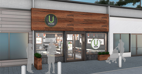
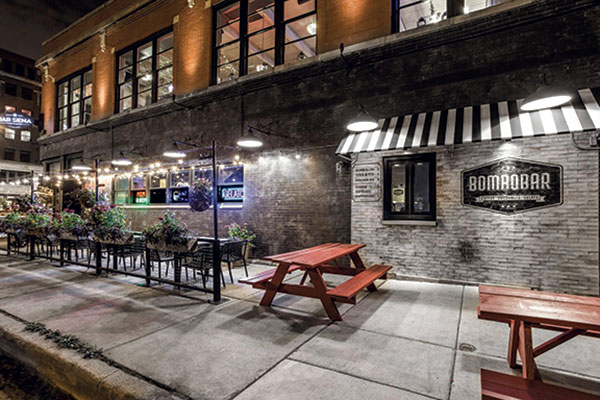
Not unlike a good restaurant, magazines need to have a certain amount of curb appeal. When we envisioned restaurant development + design eleven years ago, we imagined a trade publication that one might pick up from a retail magazine rack: something beautiful to look at that draws readers in with gorgeous examples of the stories that we are covering.
Entering our twelfth year, I am so proud of the results. Creative Director and Production Manager Anne LoCascio and Art and Production Assistant and Full Stack Developer Eric Uhl have truly earned their incredibly long titles. Through the years they have continuously brought to life the vision of a design magazine worthy of our readers’ time and attention.
Like the restaurants written about by Amanda Baltazar in this issue, “How to Boost Curb Appeal” (page 52), Anne and Eric, along with Editor-in-Chief Rebecca Kilbreath, determined that it was time to undergo a refresh. As great as this issue of rd+d looks, we will unveil a new look and feel to the magazine in 2024 in our continual efforts to keep rd+d on point and relevant to our audience.
We love your feedback, so tell us what you like and what you don’t like. We are listening, and we care!
All the best,
Maureen
Design
Curb Appeal
- Design
- Maureen Slocum


