In an Instagram world where a few posts can catapult a restaurant’s popularity, restaurateurs worry about far more than food and service. The goal is to create a mood and vibe to give guests not just a meal but an experience. Well-chosen elements including tableware, signs, artwork, staff uniforms, and menus that enhance memorable designs and encourage social media posts and repeat visits alike.
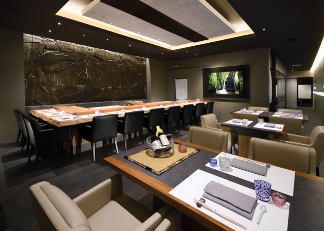
 Luxury table settings at Hiroshi set the tone for a memorable 10-course meal. Images courtesy of JJ Jumoc-CasasAt Hiroshi, a Japanese appointment-only restaurant in Los Gatos, Calif., Silicon Valley high rollers reach for hand-carved Kiriko water glasses to slake their thirst. The blue and white tumblers with distinctive patterns cost $1,000 each. They pair with chopstick holders designed by famed artist Kuroki Kuniak, washi paper, and high-end cutlery to create a luxurious, distinctly Japanese environment.
But dining table elements can add brand distinction on a modest budget, too. Guests at Famous Toastery pour warm, pure maple syrup from a $15 miniature glass milk bottle over their flapjacks. The syrup container supports the brand’s traditional farmhouse vibe and complements the decor which includes a large old-fashioned clock and warm wood-toned furniture. The combination of elements delivers an elevated, cozy experience.
Many design details throughout a space help establish a brand’s identity. “Details add authenticity, meaning and humanity to an environment, sometimes in a subliminal way to evoke any number of emotional responses,” says Alexandra Milkovich, associate and senior interior designer, HBG Design. The effect could evoke authenticity, liveliness or serenity, a sense of seriousness or whimsy, a farm-to-table theme or urbane sophistication — you name it.
At the OAK Room and Bar at the Oaklawn Racing Casino Resort in Hot Springs, Ark., the vibe is refinement within a specific time — the early 1900s. Antique-inspired globe pendant lights, sculptures of jockeys on horses, historical photos of the track, and custom furnishings featuring high-quality fabrics support “an air of private club nostalgia,” says Landon Shockey, senior interior designer, HBG Design.
The OAK Room’s artisanal pottery elevates all menu selections. The venue’s wide-ranging menu, including a few traditionally down-home Southern dishes, get ritzy presentations on the dinnerware. “The plating coordinates well with the uniquely crafted menu selections,” Shockey says.
“Every element should be used as an opportunity to reinforce the spirit of the restaurant and be a representation of the chef’s vision and menu,” says Beatrice Girelli, co-founder and design director, Indidesign. “With tableware especially, we have a real opportunity to set the tone of the venue and use each vessel as a vehicle to share its ethos.”
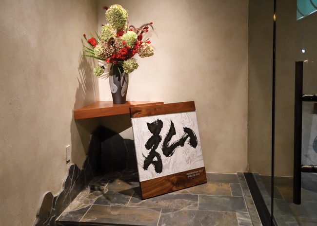
 Hiroshi’s modestly sized front sign reinforces a private, exclusive atmosphere. At Hiroshi, the variety of dinnerware makes each item on the venue’s multi-course meal special. “We have over 100 different types and styles of plates for everything from sushi plates to lacquer bowls in many different colors,” says Kevin Biggerstaff, Hiroshi’s general manager. Servers present as many as 10 courses on imported handmade pottery. Each offering gets a different plate style, enhancing this uncommon experience.
Plates can make strong brand statements when customized. Custom wall art at Flex Mussels, a New York City seafood establishment, inspired a plate design that plays into a storytelling theme. Wall murals exude a playful, marine setting with cartoonish sea horses, mermaids, ocean waves and seascapes. One of these figures made its way onto plates. “An image of a girl on the beach reveals itself when you are having your last bite of your crudo,” says Sarah Bulmer, lead tabletop specialist, Singer Equipment Company.
Like tableware, signage and staff uniforms can support a vibe. At Hiroshi, they reflect privacy and exclusivity. The venue’s front sign, composed of small, understated white lettering and logo, can easily escape the notice of pedestrians strolling by. That’s fine by the clientele who includes top technology executives and venture capitalists. They prefer a secluded hangout. “They like to come here for conversations that they don’t want their colleagues to hear,” says Biggerstaff. “Some really big deals that I can’t talk about have gone down here.”
Hiroshi’s uniform style also deflects attention from servers, Biggerstaff says. As staff make frequent trips to the dining table, their plain black outfits blend into the background. Less distracted by servers, guests more easily focus on their high-stakes conversations.
Famous Toastery’s uniforms, on the other hand, make a bold brand statement. The backs of servers’ burgundy golf shirts read “I bleed syrup,” conveying folksy charm and whimsy.
 Menus typically distinguish a brand with logos and distinctive typefaces, but they can do more. Famous Toastery’s bill of fare emphasizes a commitment to attentive, friendly service. The motto: “Where every server is your server,” gets prominent positioning in the top margin just below the brand’s logo. Encouraging guests to flag down any server when they need something is a point worth emphasizing, says Mike Sebazco, the 27-unit chain’s president. “There’s nothing more frustrating than when somebody forgets to bring you your ketchup,” he says.
Customized tabletops can add brand distinction. Undergoing a rebranding, Famous Toastery is investigating options to embed dining tabletops with images of locally inspired symbols. At North Carolina locations, dogwood, the state flower, and Muscadine grape, the state fruit, may be applied to tables. Imagery at Kansas locations would feature the state flower, the sunflower. “They’ll have to be interesting, but not overstated,” Sebazco says. Tabletop imagery, along with wallpaper, artwork, and other decor will distinguish sites by location. “We are saying we are proud to be part of the community,” Sebazco says.
Tabletop material itself echoes a theme at Point Seven Restaurant and Lounge, a recently opened New York City seafood establishment. Composite tabletops around the bar and raw bar play into oceanic decor. “They have a marble iridescent quality that resembles fish scales,” Bulmer says. Composed of recycled plastic trash recovered from the ocean, the material supports an ecological ethos reflected in Point Seven’s name. The moniker refers to the fact that 70% of the Earth is composed of water.
Any object can convey brand personality, says Scout Driscoll, founder and CEO, DesignScout, a branding agency. At Benjyehuda, a falafel and shawarma shop in Chicago, takeout bags, wallpaper, menu boards, staff uniforms — even stickers on to-go lids — all embrace the brand’s 1980s punk-themed culture. Black and white logos and fonts were inspired by subculture icons of the era — crudely sewn patches on punk jackets, photocopied concert flyers, and “Parental Advisory: Explicit Language” stickers on CDs.
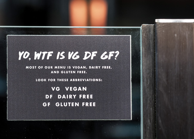
 A sign on the makeline reads: “Yo WTF, VG, DF, GF?” followed by definitions of the abbreviations—”vegan, dairy free, gluten free.” This street lingo signage strikes the perfect tone for Benjyehuda's counterculture image.A sign on the makeline reads: “Yo WTF, VG, DF, GF?” followed by definitions of the abbreviations—”vegan, dairy free, gluten free.” This street lingo signage strikes the perfect tone for Benjyehuda’s counterculture image. It burnishes the brand while serving the basic purpose of explaining dietary terms.
“They could have easily slapped a piece of paper up that simply said ‘we’ve got gluten-free stuff,’” Driscoll says. Instead, the irreverent sign bolsters the brand’s photogenic flair. “That’s the difference between walking into a place and thinking it’s a mom-and-pop and walking into a store and saying, ‘How many units do you have?’” Driscoll says.
Tableware Gets Bolder
Hotels tend to set a tableware design tone that restaurants and the rest of the hospitality industry follow, says Sarah Bulmer, lead tabletop specialist, Singer Equipment Company. Historically, hotels have been conservative with tableware choices.
“Oftentimes, there’s one collection,” Bulmer says. “One spec. There’s a plain white presentation. It works.” That approach has changed recently. Hotels get more creative with dinnerware, and restaurants are following suit.
“I see a more thoughtful approach to procurement, in general,” Bulmer says. “There’s a lot of flexibility these days in mixing and matching.” One trend is the combination of rustic stoneware with fine porcelain. Something as basic as bread service can be boosted using stoneware plates or platters, Bulmer says.
In glassware, sheer rim stemware and cocktail glasses are hot. This style of glassware has a smooth, laser-cut edge with no visible bump. “They really are so beautiful, and when you hold one in your hand, it justifies paying $25 for a cocktail,” Bulmer says.
Cocktail glasses and stemware provide opportunities to get creative with the feel as well as the look. “You can go with etched and textured or something supersheer and simple,” says Bulmer. The former stand out to the touch as well as sight, while the latter feel smooth and blend into the background.
Fine glassware can be presented as works of art. At Hiroshi, a lighted shelf displaying hand-crafted sake glasses creates a thin strip of visual interest along one wall. These show glasses stay put in the display throughout the evening so that servers aren’t reaching over guests’ shoulders for them. The working glasses are housed over the bar.


