Pizza Hut recently reinvented itself by looking backward. The chain decided it was time to return to what had made it iconic in the 1980s: The logo, font, packaging, Tiffany-style lamps, red booths, Pac-Man video games, and distinctive sloped red roofs all reappeared. At the same time, Pizza Hut looked forward, introducing new menu offerings and merchandise, and even using its delivery boxes to provide consumers with a Pac-Man augmented reality game as part of its “newstalgia” campaign that drove home its retro offerings.
 Images courtesy of Black Bear DinerNostalgia is a strong emotional driver for American consumers who often see previous decades through rose-tinted glasses. Even the 1990s are viewed as nostalgic by Millennials, but for older generations it’s the ’80s, the ’70s, or decades that came long before that.
“The ’90s are certainly the era that is most in focus right now,” says Mike Kostyo, associate director and trendologist at market research firm Datassential, Chicago. “Millennials are easily the most nostalgic generation, with 77% of them saying they would purchase a favorite nostalgic food or beverage. There is also interest in ‘80s nostalgia, which has some overlap for the Millennial generation, has media properties we still have access to, and is partly driven by the popularity of [the Netflix show] Stranger Things.”
Other restaurant chains are adding touches of nostalgia, hearkening back to their earlier days. Happy Joe’s Pizza & Ice Cream is following Pizza Hut’s lead and emphasizing nostalgia by calling back to its first stores that date to the early 1970s in its new store design. The Davenport, Iowa-based chain, which has 40 stores, is bringing back elements such as black and white movie posters, neon and canned lights, and a train that runs around the restaurant on a ledge.
But the concept is balancing nostalgia with contemporary elements, says Tom Sacco, chief happiness officer, CEO and president. “We don’t want today’s families to think it’s where their grandparents would take them.”

Jersey Mike’s Subs, which opened its first location in Point Pleasant, N.J., in 1956, now features a Point Pleasant mural in each store, “showing where we started, our roots,” says Caroline Jones, senior vice president, Jersey Mike’s Franchise Systems. Photos of the Jersey Shore are also featured in stores and extend the vibe.
And Black Bear Diner stays true to its roots by retaining the old school diner feel, which includes lots of counter seating, jukeboxes (updated to be digital) and each restaurant designed to evoke the feeling of a cabin in the woods.
Black Bear tries to make modern changes less obvious, says Anita Adams, CEO of the Redding, Calif.-based chain. “We try to keep technology to a minimum to keep that old school feel. We interject technology where it’s appropriate. The guests can pay at the table if they’re tech-forward, but we don’t want to disrupt the guest experience.”
Another change that’s been added to the restaurants to keep them relevant without disturbing the nostalgic feel is a pickup window for online and third-party delivery orders. The concept didn’t want pickups disturbing in-house guests, so they created a vestibule area instead. This is clearly marked with a wooden sign — another warm and simple throwback element.
The Full Monty
 Images courtesy of Hungry EyesDesigners are incorporating nostalgia into restaurants in a variety of ways. Some are going whole-hog, so patrons feel they’ve stepped back into yesteryear. Others are adding throwback touches, balancing them with modern elements so restaurants don’t feel dated.
Put Mason Hereford into the “whole hog” category of nostalgia. Even though he was born too late to really experience the decade himself, Hereford opened Hungry Eyes in New Orleans this spring, and created the design around the era that gave birth to the song “Hungry Eyes” by Eric Carmen, from the “Dirty Dancing” movie soundtrack. The soundtrack has sold 32 million copies worldwide and is one of the best-selling albums of all time. Oddly enough, though released in 1987, “Dirty Dancing” itself capitalized on nostalgia for the early 1960s.
“We set out to open a spot that was playful, and it seemed like the ‘80s decade and the nightlife of the ‘80s was all too perfect for the interior,” says the owner and executive chef Hereford.
 At Hungry Eyes in New Orleans, Owner and Executive Chef Mason Hereford wanted a 1980’s aesthetic. The pink neon swirled mirror was once part of a dresser. The space is adorned with artwork and knickknacks from the era. Images courtesy of Hungry Eyes
Entering Hungry Eyes is to step back in time, centered around a mirror — originally from a dresser — in the back bar with a pink neon swirl. Mirrored tile continues the 1980’s feel at the base of the bar, while a black and white checkered piece of artwork adorned with more neon decorates the lounge area.
 Shelving behind the bar contains knickknacks from the ’80s, from vases to ornaments standing in front of backlit blinds. Bar stools feature alligator patterns; there are posters from Jazz Fest and Mardi Gras dating back 40 years; Patrick Nagel art; jaguar statuettes; Art Deco table lamps; and postmodern chairs and lounge furniture.
The bathrooms feature black and white checkered tiles, a mirrored ceiling and a neon replica of an Ettore Sottsass mirror. The exterior of the bathroom is encased in pink tile.
But it’s a fine line to walk between being too much and just right, Hereford says. “We didn’t want it to look like a theme park, but instead a moody, sexy, nighttime place. We wanted something more sensual.”
For the lighting, beyond the neon, Hereford included vintage Parisian Holophane globe streetlights, which he took up a notch with colored bulbs and other lights reminiscent of the 1980s, such as a calla lily-type arrangement that sits on top of a cabinet. Remote controls allow staff to change the colors in the lights depending on the mood they’re shooting for.
Israel, 1970s
Branja in Miami is stepping back one decade further, into the 1970s, but more specifically into the 1970s of Tel Aviv, Israel.
 Branja in Miami evokes both a time and a place, Tel Aviv, Israel, in the 1970s, by utilizing patterns and colors that call back about 50 years. Images courtesy of Branja“I really didn’t want to be too high tech,” says Tom Aviv, co-owner and executive chef, who opened the restaurant this spring. “I wanted something vintage-y and not brand new; a little more rough, and the ‘70s was what I wanted.”
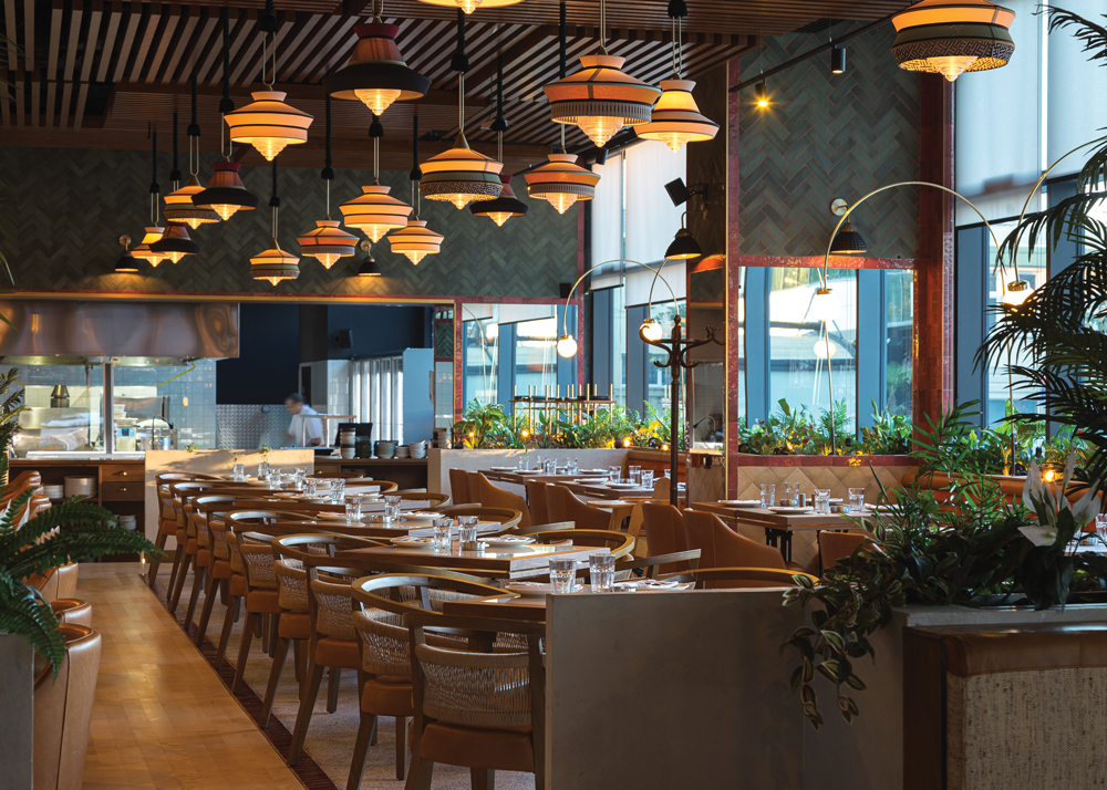
Aviv focused largely on colors — lots of pastels, orange, brown, light brown, and olive green — and patterns that callback 50 years or so. Branja is designed to evoke Tel Aviv’s iconic indoor-outdoor train station structures.
Patterns are celebrated on chair backs, on handmade floor tiles, on wallpaper and carpet tiles, on plates and even in its logo. “It’s a lot of different patterns, but the one on the floor is our main one [and] there are shapes that throw you to the ’70s,” says Aviv.

Adding to the 1970s feel is a stained-glass roof over the terrace. “When the sun comes through it changes the colors of the environment, and it almost feels like you’ve put a ’70s filter on it,” Aviv says.
 There are also some authentic vintage pieces. Aviv renovated some benches he found in a synagogue, cutting them to fit the space and replacing the original fabrics with outdoor upholstery material. They were also stained to enhance their Star of David engravings. These form one side of the booths and bring a synagogue element “without the heavy religious feel,” says Aviv.
Taking things down a notch, some seating in the outdoor area is simply upside-down plastic milk carts. “It was really common in Israel to sit that way,” Aviv says. “We are fine dining, so we couldn’t use that in the restaurant but outside it works with nice cushions.”
Also outside are murals created by Tel Aviv painter Paul Curran depicting retro art vignettes that represent the city’s neighborhoods and bustling markets.
Hollywood’s Golden Age
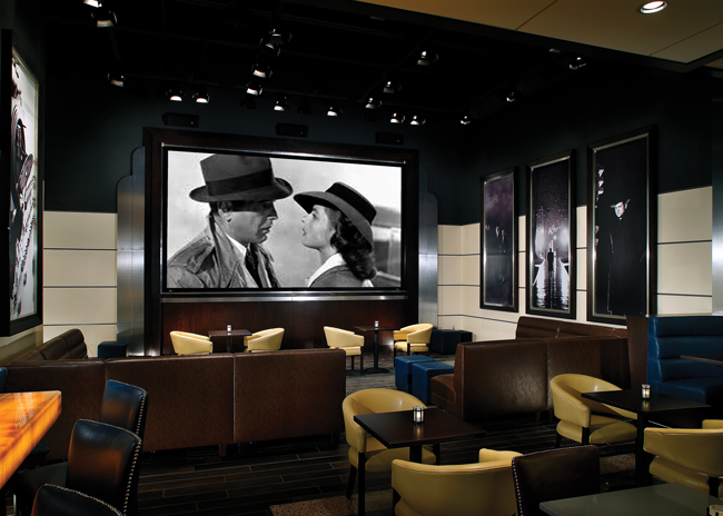
Take Five Lounge, located within Marcus Theaters in Madison, Wis., features Art Deco design elements of the 1930s and ’40s. It’s immediately obvious to guests that this is a restaurant with an old-time movie theme meant to launch visitors into a world from 80 years ago.
Frank Cavanaugh, principal, Aria Group, Oak Park, Ill., was part of the team that worked on this design. The lounge is anchored by a large flat screen TV playing old movies, and on the walls are graphic photo stills from classic movies.
In the back bar, curved columns have an Art Deco shape and each one features color-changing LED lights with laser cut painted steel plates with an Art Deco design. “It’s slow changing so the character of the bar alters through the day,” Cavanaugh says. The bar has a back-lit onyx bar top. “We used LED rope lights in the void just under the onyx slab stone top,” he points out.
 Take Five Lounge, located within Marcus Theaters in Madison, Wisconsin, pays homage to Hollywood’s Golden Age with Art Deco design elements and other 1940s-era flourishes. Images courtesy of A. G. Photography Inc.
Art Deco-style light fixtures are used throughout. “Decorative pendants and table lights were selected because of their scale and Art Deco style,” says Cavanaugh. “The pendants push light down to the booth tabletops and glow as interesting objects.” There’s also a custom circular light pendant in the ceiling circle cove, and the cove is also lit, he says. “The intent was to provide ambient light in this area and integrate it into ceiling architecture in keeping with an Art Deco vocabulary.”
The curved blue leather of the booths evokes the 1940s. And, behind the booths, opposite the bar, the wall panels are also reminiscent of Art Deco style. “We modulated the wall into panels with reveal moldings to give it that panelized machine look,” explains Cavanaugh. “That has a contemporary quality but when it’s folded together it feels like an Art Deco space.”

The owners, says Cavanaugh, “wanted to create an environment that’s a bit more interesting and has a bit more standing power than a movie theater. Their goal was to create spaces where people can come and spend some extended periods of time.”
Designing like this is almost theatrical, he says, “because you’re recalling a time and a discipline that had its place in time. It’s comforting and people identify with different things. We wanted to have a Deco sensibility without too much detailing; we tried to have some restraint.”
Design elements in retro-inspired spaces don’t have to be perfect to the time period, because, ultimately, nostalgia is evoking feelings, not creating
time capsules.


