Opened last fall by Seth Glassman and chef Vic Casanova, whose Gusto earned Esquire’s best new restaurant honors in 2012, Pistola is a modern Italian steakhouse in the heart of Los Angeles’ West Third Street.
The project involved converting what had been a popular, warmly rustic restaurant and wine bar, A.O.C., into the duo’s vision of a sleek, New York-style steakhouse with a subtle “Rat Pack” vibe. To accomplish the conversion, they brought on L.A.-based designer Cliff Fong and his team at Matt Blacke Inc.
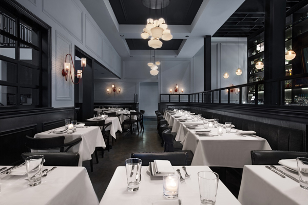
Both Fong and Casanova hail from Brooklyn, N.Y., and had a design vision for Pistola that would deliver a “substantial, masculine feel, almost like a modern, sexy hangout if there were still ‘wise guys’ or the Rat Pack around,” says Fong. “Something more like you might see on the East Coast than is typical of Los Angeles.”
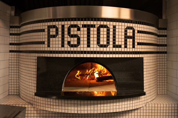 An existing wood-burning oven was repositioned and refaced with penny tile and granite as a signature branding element visible from some areas of the front of the house.
Fong describes Casanova’s approach to the cuisine at Pistola as “creative and intricate but detached from its fussiness. It’s real food that’s innovative and interesting, and it seemed to make sense to interpret the restaurant’s environment in the same way,” he says. “It’s a substantial, but also has elegance, lightness and sense of detachment so that nothing feels overdone or flamboyant.”
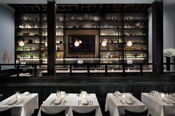 The back bar features ceiling-high shelves filled with a mix of liquor bottles and antiques. Carrera marble tops the bar and a large center mirror hides the flat-screen TV behind.
Stripped down during the demolition, the two-level interior was given some industrial elements, such as steel framed windows and glass dividers that provide separation between the bar and main dining room, skylights and exposed ceiling beams. Fong chose a palate of black for high contrast and lower tones of greys and smoky colors. “The original building was pretty nondescript. It could have been anything, but we added some slightly industrial elements and tried to create the appearance of having carved some luxury out of something that might have been a loft space or a warehouse or manufacturing facility,” he says. “There’s a lot of contrast. We have soft, black mohair banquettes, wood finished with textural contrast and a light sheen that contrasts nicely with some of the raw, industrial elements in the space. Overall, there’s a lot of hot and cold, light and dark, masculine and luxurious.”
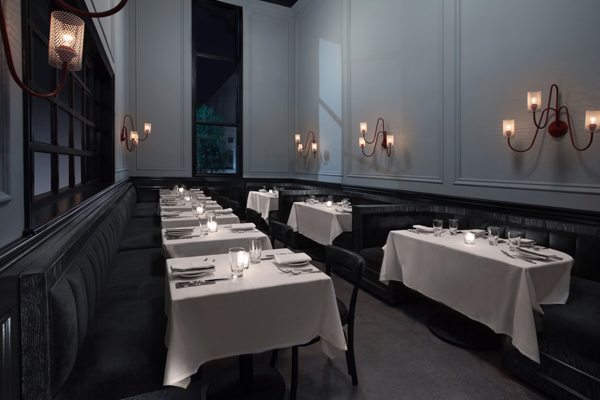
With seating for 120, Pistola has two dining areas on the main level – the main dining room in front and dining tables that are incorporated into the bar area at the rear of the space. A smaller dining area on the second level (shown above) features two rows of banquettes and has a wall of windows that overlooks the main dining room. All light fixtures in the restaurant were custom-made, and include wall sconces, pendants and chandeliers made from vintage 1940s bistro glass.
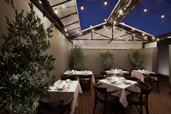
Pistola’s upper level connects to an intimate rooftop patio with brick flooring, olive trees, strings of lights and a retractable roof.


