Seeking to offer a richer customer experience, venerable ice cream chain Baskin-Robbins has introduced a new store design called Moments.
“We want to offer a relevant, premium experience. We are known for our premium ice cream, and we really wanted to step up the guest experience inside the store,” says George Begovich, director of development for Baskin-Robbins U.S.
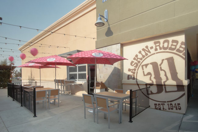
The “premium experience” starts on the exterior of Moments locations, with a new outdoor seating area. Instead of having a few basic tables and chairs, Baskin-Robbins went with an elevated look. The tables and chairs are made of recycled plastic with wood and metal frames. Recognizing that ice cream is most popular in the warmer months, the chain offers shade for outdoor diners thanks to umbrellas in Baskin-Robbins’ signature colors.
Where possible, the chain is also adding a retro Baskin-Robbins logo on the exterior, emphasizing its history and heritage, says Begovich.
Much of the design work for the Moments store focuses on the ordering experience, with design decisions being based on customer research.
“We looked at providing more choice for our customers. One of the things that came back from the intercepts is that people like to customize their products, so we created new stations,” Begovich says.
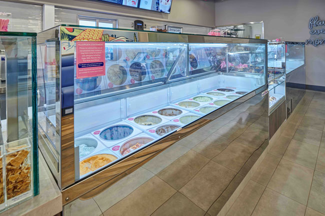
Essentially, Baskin-Robbins has deployed the co-creation model so popular among fast-casual chains. When customers place an order, they now start at the carrier station, where they select the bowl or cone of their choice. They then walk down the line to pick their ice cream, followed by their topping from a new station offering a variety of options.
To highlight these offerings, the chain is using dipping cabinets with an elevated look. “They are really designed to look like miniature jewelry cases. They highlight the premium products. They have the mirror finished and the box glass look and really present well,” says Begovich.
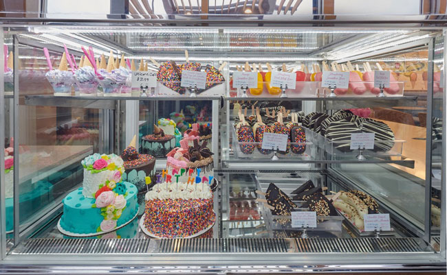
In addition, the chain has a new refrigerated display case for novelty items, like dipped frozen bananas, fruit bars and ice cream cakes. This is the first display customers see when they enter the moments store, highlighting that a trip to Baskin-Robbins can be a special occasion.
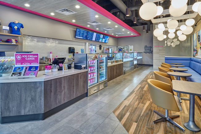
The overall aesthetic of the new Baskin-Robbins design is more elevated than previous stores. Flooring in some stores is stained concrete, while others use two types of porcelain tile that distinguish seating from ordering areas.
The overall color palette is also more muted than the previous iteration, with more browns, grays and tans alongside splashes of the brand’s traditional pink and blue color scheme.
“We didn't get rid of [pink and blue] totally. Those are our heritage colors, but we wanted to tone it down a little bit from our previous design,” says Begovich.
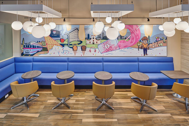
A new banquette seating area features one of the main splashes of blue. Paired with laminate tables and a tan upholstered swivel chair, these have become the most popular seats in the restaurant.
“What we are trying to do is create a place where people can come in, sit down and enjoy a special moment with friends and family. The comfortable seating really adds to the ambience. When a store is busy that’s the first thing that fills up,” Begovich says.
The banquette itself sits against a new design element, a localized mural that reflects the community of each store. The brightly colored mural contributes to the restaurant’s sense of fun, while also serving as a social media opportunity.

