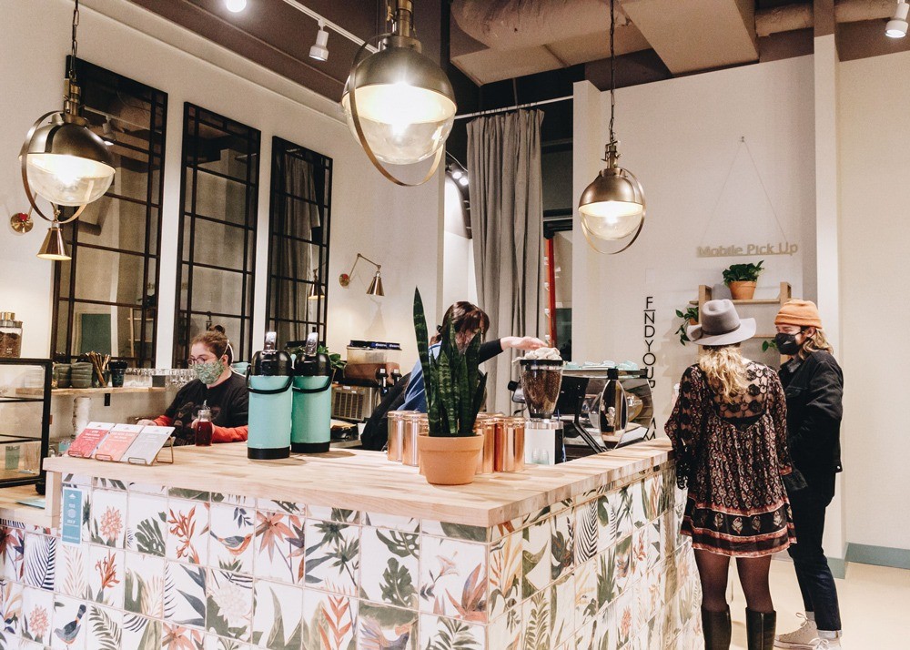
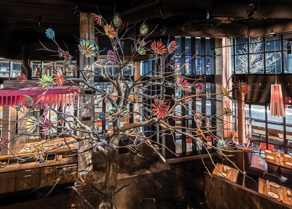
There are seven locations of Summit Coffee and they are all designed very differently, “not because it’s easy, but because it’s the only real way to bring a brand to life in a new neighborhood,” says Brian Helfrich, CEO of the Davidson, N.C.-based concept.
What Helfrich, and his wife Tyler Helfrich, the chain’s chief designer, are aiming for, is having coffee shops that feel authentic. Each one reflects the personality of its franchisee, of the building and the neighborhood it’s in — and of the guests who frequent it.
Authenticity is key to a restaurant having a soul, and it can’t be faked.


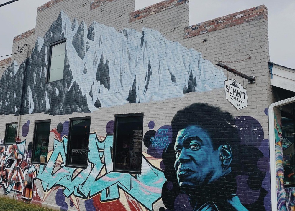
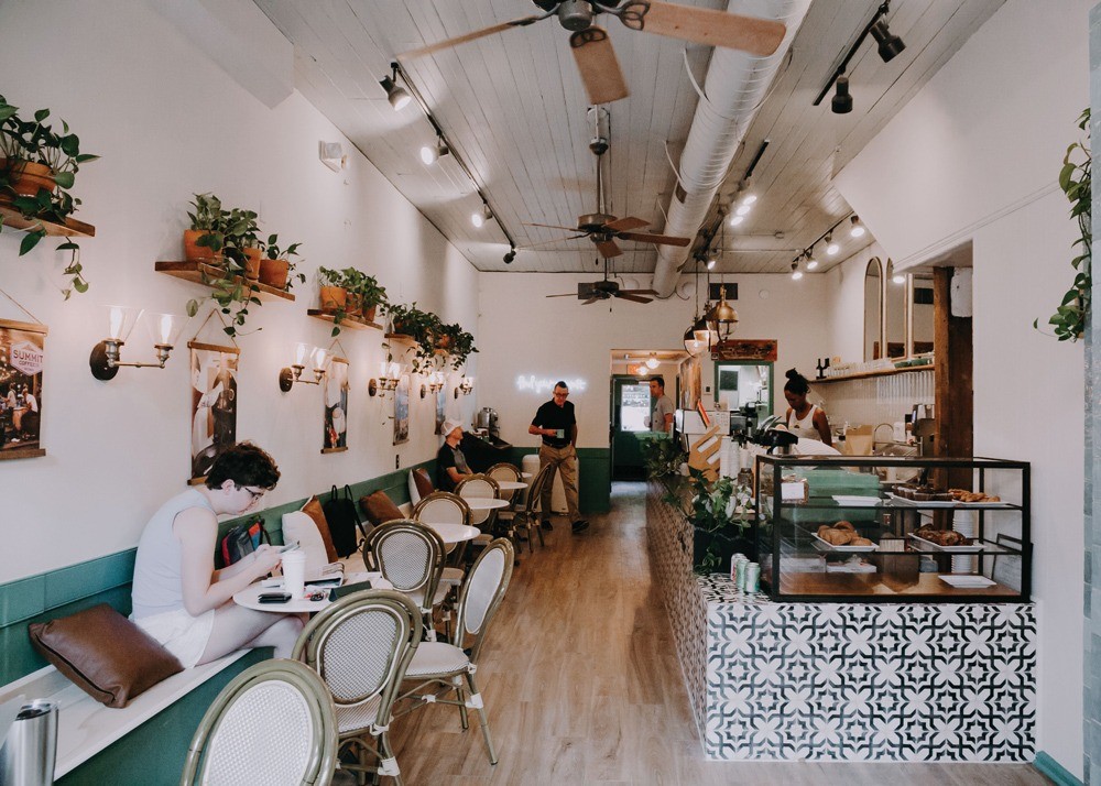
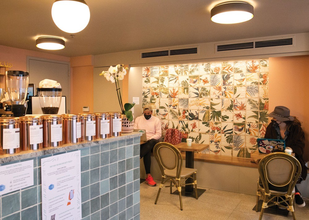
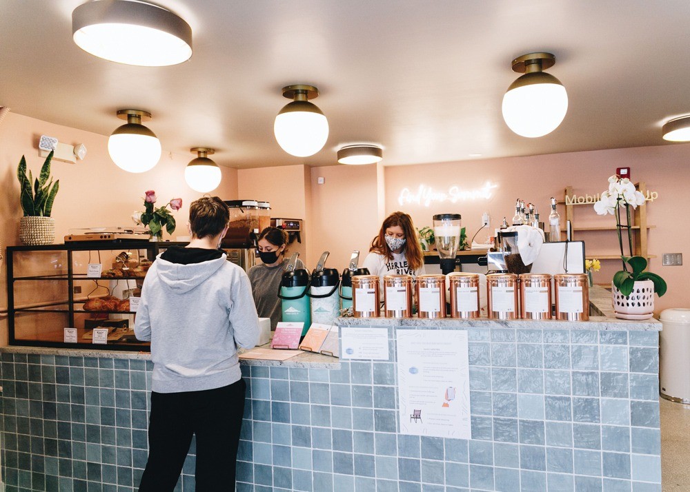
Each Summit Coffee location is unique to the area and the history of the building in which it resides. Images courtesy of Summit Coffee
“Authentic is about digging deep and not just taking the first answer,” explains David Shove-Brown, co-founder of Washington D.C.-based architecture and design firm //3877, which specializes in hospitality design. “Authenticity is subtle. It’s understanding the story and the culture and the meaning behind the dining experience.”
When designing a new Summit location, the Helfriches research the community, its history and the building’s past.
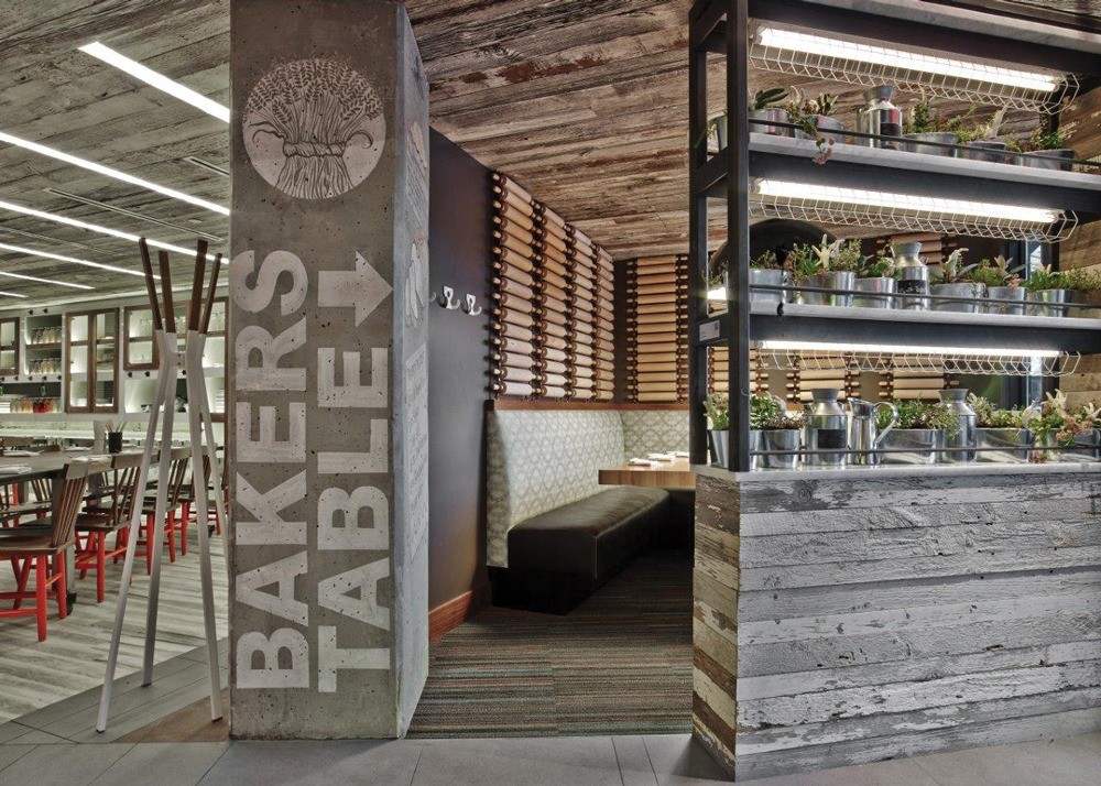
Each Summit has similarities to the others, such as the colors, the connection to nature, the openness and elements of surprise and fun. Summit has five franchised locations and two company stores and expects to reach around 16 stores by the end of the year.
“I want every person to feel like a Summit is their Summit,” Helfrich points out. It’s much harder work, but it’s worth it, he says. “We’re doing this to make really impactful cafes.”
To bring authenticity to each store, Helfrich seeks franchisees who are engaged in the community who have a true idea of what they want to bring to their Summit. He wants to reflect their passions along with the local feel.
The franchisee of the Summit in Mooresville, N.C., which opens this spring, is passionate about the 1960s and music. So, the location will feature vinyl album cover wall art; a custom built-in bench with a wavy surface covered in a channel back cushion with a vertical pattern of tufts — a very 1960s-era design element. The bar-front tile will be hexagonal in teal and aqua, and the floors will be a warmer wood look, as opposed to the usual white floors.
The Asheville, N.C., store has a more rustic feel to fit the outdoorsy local community. “We brought in a lot of woods — a mix of farm and factory — sharp looking metallic industrial, and we have a wood bar front instead of tile,” points out Helfrich. “It has tons of natural light and character.” This location, he adds, “is a little grungier,” featuring a lot of nature and even some intentional graffiti to fit the neighborhood.
It’s important to not go too far with authenticity, however, Helfrich says. “We want people to come in and notice two or three elements that really surprise them. If there are too many design elements, it can be overwhelming.”


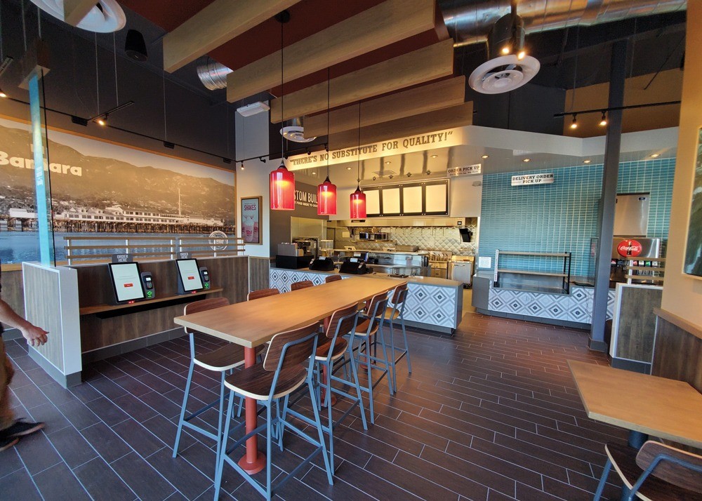
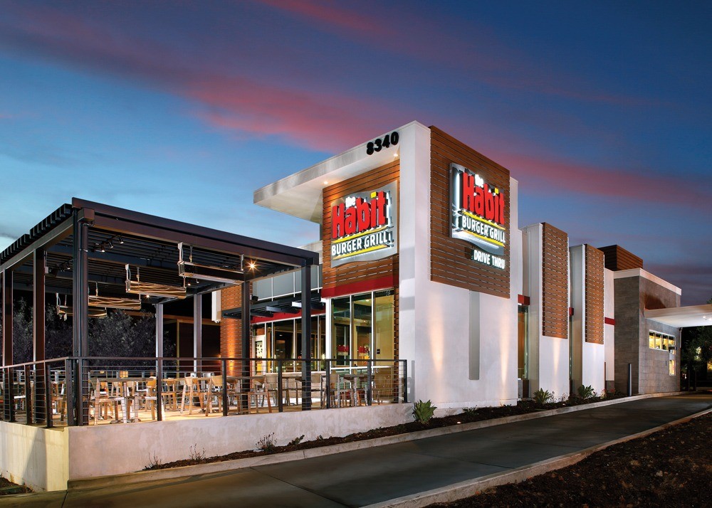
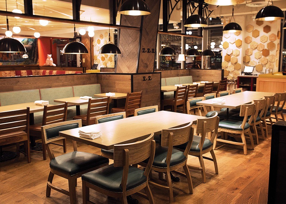
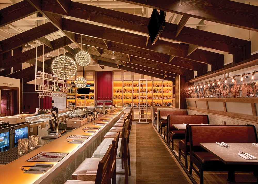
Each Habit Burger location expresses the vibe of a quick trip to Barbara, Calif., the chain’s headquarters. Images courtesy of Habit Burger
California Dreamin’
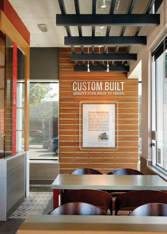
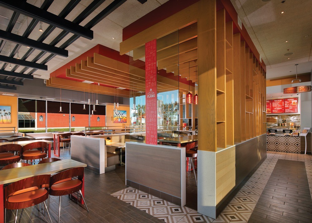
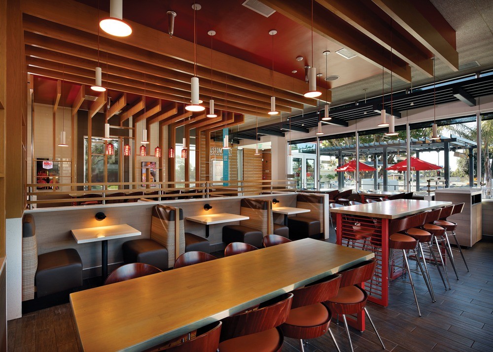
The Habit Burger Grill, a fast-casual chain headquartered in Irvine, Calif., aims for authenticity through the theme of each of its more than 300 restaurants.
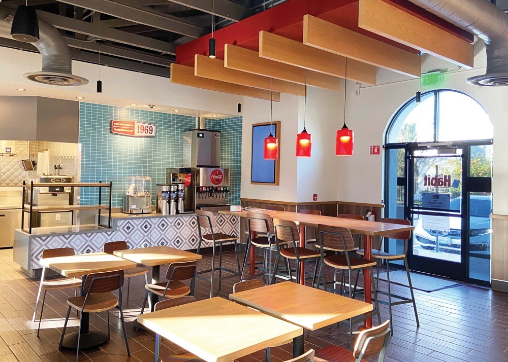
The concept opened its first restaurant in 1969 in Santa Barbara, Calif., and works to capture that city’s vibe in each location. “That place of origin has always been at the center, not only of how the restaurant looks but also how we relate to the guest,” says Iwona Alter, Habit’s chief brand officer.
To replicate the feeling of the Santa Barbara location authentically, Habit Burger first defined the Santa Barbara spirit. It’s a popular place as a vacation spot, a place to exhale “and have that sunny state of mind,” Alter says. “People associate California with sunshine and beaches and good weather.” Plus, she says, the city is “cool and understated, chic and sophisticated.”
Santa Barbara also has a great culinary culture. “It’s about quality and freshness, and we convey that in our restaurants through the open kitchens,” Alter says. There are also digital menu boards with food images and brand statements about the food originating from the land and sea.
Alter captures the carefree Santa Barbara life with pictures of skateboarding, cycling and surfing, and brand statements like “It’s Not the Same Without the Flame.”
Alter is bringing in nature, too, largely through replicating bird of paradise flowers, which are prolific in Santa Barbara, featuring them as an accent, in packaging or in the graphics,” she says. “We want to have that sense of vibrancy in terms of representing Santa Barbara.”
Habit Burgers’ interiors also have a Santa Barbara feel. Alter is inspired by the Spanish style from that city and features a lot of tiles and white tones along with clay roof colors. “It’s not overt but evokes Santa Barbara,” Alter says. “More overtly, we do have a mural that speaks to Santa Barbara, where we say, ‘Born in Santa Barbara in 1969,’” An iconic image of the pier or the coastline with that tagline is in each location.


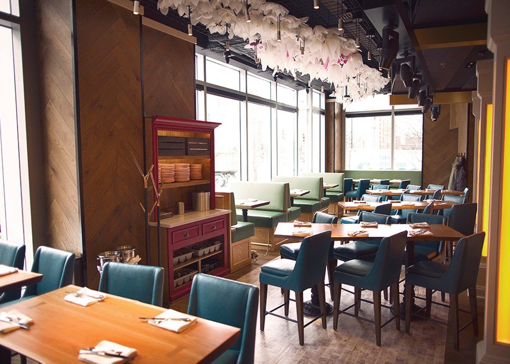
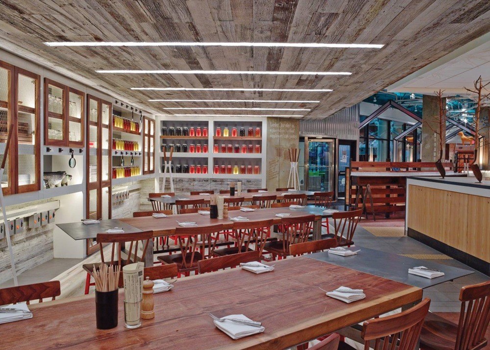
At Founding Farmers, the team studies the location of new restaurants and incorporates the history of the place into the design. Images courtesy of Eric Laignel
Looking Back and Forward
The website for Farmers Restaurant Group states, “Everything Matters. Nothing is too small.” And that’s how the Kensington, Md.-based company approaches the design of its restaurants.
The company has restaurants in D.C., Virginia, Maryland and Pennsylvania, each with its own authentic design and feel. “We are intentionally trying to not be a chain,” says Dan Simons, co-owner, Farmers Restaurant Group. “Even though we use the Founding Farmers name, we’re not trying to replicate the experiences.”
A lack of authenticity is a too-common problem, Simons points out. “I walk into restaurants and don’t feel anything,” he says. To avoid that, when Farmers opens a new restaurant, it digs in deep. The company’s logo has two Fs — one looking back to history and one looking forward to the future. “We study the location and take the best lessons and ideas and do it in our own contemporary, future-looking way.”
Simons looks back as far as makes sense; he looks at what happened on that ground, in that neighborhood. “I read and I study, and every time we’ve found inspiration that’s unique to a location,” he says.
The next step is thinking about what a location should look like “and instead of just picking what’s beautiful or what’s contemporary we look at what we’ve written down. This is our ‘why,’” says Simons. This dictates every decision from whether a location should have carpets or hardwood floors to which natural elements should be incorporated.
“I want to tell a story and try to connect with the diner,” says Simons. “And we want people to leave with either a little or a lot of a heightened awareness that family farmers are a thing.”
There’s also a theme running through each Farmers restaurant location: Farmers Fishers Bakers is inspired by the waterways; Founding Farmers Tysons is designed after a classic American farmhouse.
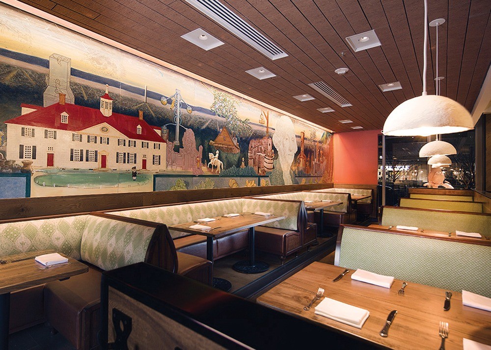
Farmers & Distillers opened in 2016 in Washington, D.C., and gives multiple nods to the first president through its design. These include the rich colors inspired by Washington’s Mount Vernon home, and creative director Leah Browning Frankl found detailed records of paints, rugs and other interior elements. There’s even a custom rug in the restaurant that’s inspired by one in the parlor at Mount Vernon.
Nothing has been overlooked. The shape of the bar ceiling is inspired by Washington’s own farming innovation — a 16-sided barn, turned on its side and sliced; sconces in the private dining room, created from historic serving platter molds; and a wall covering that’s a modern take on a baroque wall covering.
There’s also a mural that’s the focal piece of the restaurant, which can be seen from almost every seat. The painting shows the history of distilling but through the eyes of George Washington. These small touchpoints, says Browning Frankl, “allow us to have a much deeper connection with guests.”
It’s not only about what’s key to authenticity in restaurants, but what’s not, says //3877’s Shove-Brown. This includes features like flags in Mexican restaurants or fishing nets in seafood locations, which are cliche, he points out, and tend to be superficial.
Shove-Brown points to the subtlety in two restaurants he’s worked on. Nighthawk Pizza, which opened in March, in Arlington, Va., features giant stripes painted and accented with lighting through the ceiling. One line goes from the kitchen to the chef’s first restaurant. One goes from the center to Shove-Brown’s office; the third goes from the brewery to the main brewery. “For most guests, the stripes will be cool, funky decor,” he points out. “There will be some folks that want to know more and will ask [and] that will hopefully provoke questions and conversation.”
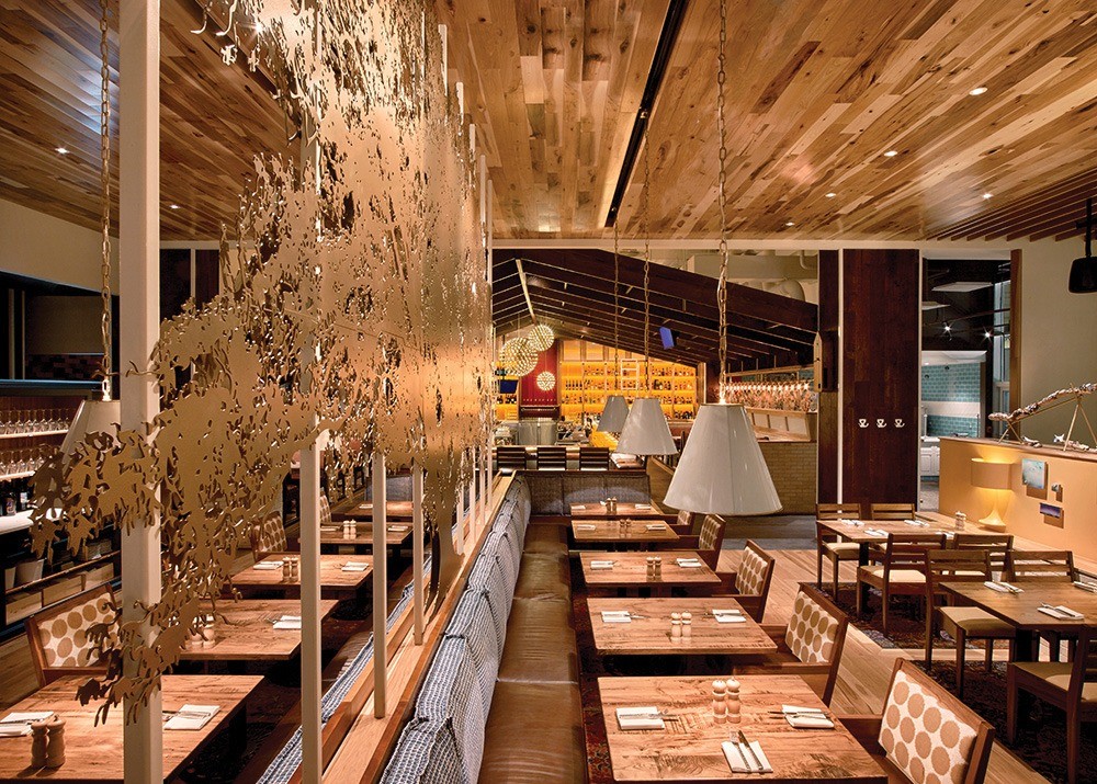
Shove-Brown also worked on Mi Vida at the Wharf in Washington, D.C., whose design tells the life of a day in Mexico City, the story of chef Roberto growing up and developing his own food style. Having these details, some of which look good and some of which dig a little deeper, gives customers a full experience, he says. They might notice nothing on their first visit, but the restaurant might gain more meaning every time they visit. And if it’s done well, he says, “it can be a nice surprise for people.”


At Mi Vida at the Wharf in Washington, D.C., the design tells the story of Chef Roberto growing up and developing his own food style. Images courtesy of Rey Lopez


