With customers more confined to their cars over the past year, the exterior design of restaurants, always important, has become even more so.
“The restaurant space is so competitive that you’ve got to hook people as they’re driving by and give them an idea of what they can expect,” says Natalie Anderson Liu, vice president of brand at fast-casual concept Mooyah.
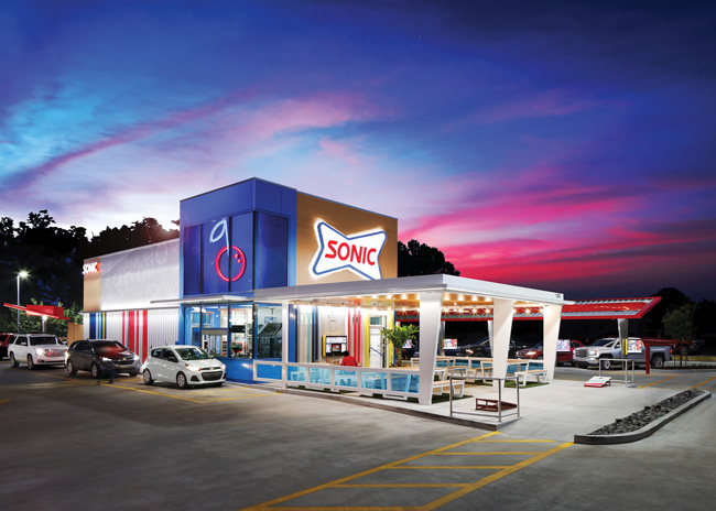
Exterior design is so important that it was the focus of Sonic’s new Delight design, which features larger stalls in which to park and eat, drive-thrus, and an increased focus on lighting. The first Delight store opened last summer in Tahlequah, Okla., a couple of hours from the brand’s headquarters in Oklahoma City. It features a covered outdoor patio, where guests can dine under string lights and enjoy lawn games.
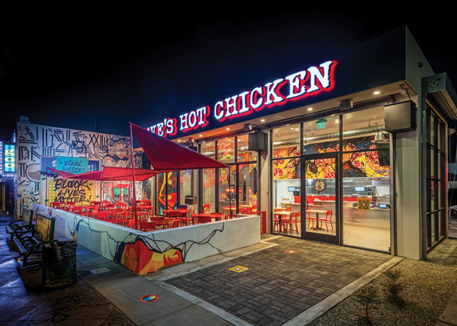 While each design is unique, Dave's Hot Chicken incorporates graffiti as part of it's branding. Image courtesy of Dave's Hot Chicken
Lighting in Focus
In terms of getting your restaurant noticed by passersby — especially those in cars — lighting is key. This includes both the exterior lighting package and letting the interior of the restaurant be as visible as possible in the evening “to create that day/night transition,” says Vincent Celano, principal and founder, Celano Design Studio in New York City. “The peekaboo effect with the lights gives a glimpse into a restaurant and can create a warm, cozy, approachable space.”
He recommends layers of lighting outside: an ambient glow over the entire exterior, decorative feature lighting “to create a moment to support that design or murals,” and functional lighting so customers can see each other, their food, wayfinding signs and so forth. Ideally, says Celano, “you’d have all three to create that experience.”
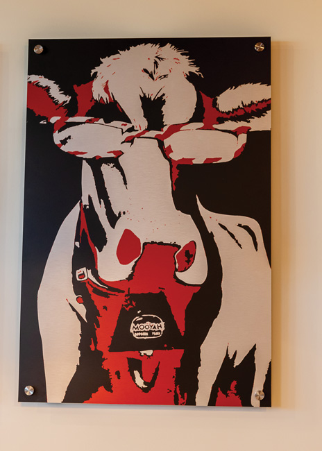 Mooyah's "seriously fun" brand identity that includes bold colors is incorporated throughout the design. Image courtesy of MooyahOver the past year, 86-unit Plano, Texas-based Mooyah has launched a new prototype that it’s using for all new stores as well as retrofits for some existing locations. One of the standout elements is a red LED light strip along the top perimeter of the building, making Mooyah “a beacon in the night,” says Anderson Liu.
It’s really important to be visible at night, Anderson Liu says, perhaps more so than during the day. “We want to make sure we pop and that we’re exciting and fun. The brand recognition is critically important. We want every Mooyah to have these elements, and that’s working its way into the reimage program. It’s critical people see them out of the corner of their eye and know it’s Mooyah.”
Lighting was also important for other reasons, Anderson Liu says. “We want it to feel light and bright and safe and attractive and highlight some of those key elements like our red metal.”
As part of a recent upscaling of its look, Roy Rogers of Frederick, Md., is also using LED lights for its exteriors, including red feature lights — a signature color — to highlight the building towers and match other design elements, like signage.
The first restaurant the chain opened with the new design cost $30,000 due to expensive exterior materials for its towers, the exterior lights, and some interior design elements. In subsequent builds, the chain switched to using the LED lights as just an accent to light up the towers instead of the entire roofline, saving $2,400, and “it still has the same impact,” says Executive Vice President Jeremy Biser. “It’s very recognizable.”
Roy Rogers also updated the lights in its parking lots to LED. “They’re so much brighter, which creates a much bolder look and feel to the store at night.”
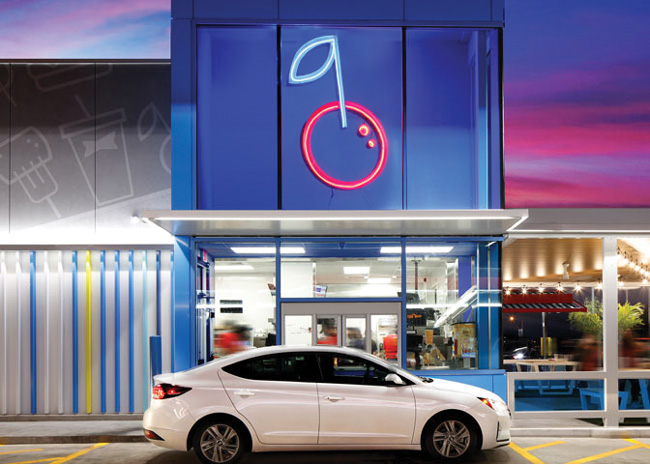
And LED was the choice made by 3,500-unit Sonic for its new prototype that launched last summer. “With all the advances in LED lighting and LED strip lighting, we’ve come up with a package with low use of electricity with a lot of pop and a lot of color,” says Jim Cannon, senior vice president of design and construction at parent company Inspire Brands. “Customers can find you and feel safe on the lot because it’s so well lit.”
 Sonic's new prototype was part of an overall brand identity update. It features bold color stripes along an exterior wall. Image courtesy of Sonic
Creative with Color
Another important element of exterior design is color, which can speak volumes about a brand’s personality and can also be instantly recognizable.
With its new exteriors, Roy Rogers changed its color palette slightly, switching from white to a warmer off-white with yellow and wood accents around the rooflines. It retained its signature red barn-style roof but altered the red slightly to match the interior design palette and marketing materials. “We also added some black to the awnings to modernize the restaurants,” says Biser. And some exterior signage has a black background. “We didn’t revolutionize the color palette but evolved it and modernized it,” he adds. Through its remodel, Roy Rogers wanted to show it was a cut above while ensuring costs remain reasonable, Biser says.
New Sonic restaurants feature a lot of color in their exteriors. The brand is retaining its iconic blue tower with a large, brightly lit cherry near the top, “which was designed to make the drive-in pop from the street while highlighting the drive-thru as a feature of the design,” says Cannon.
It was also important to keep costs in check. “To maximize value for our franchisees, we shortened the blue tower while ensuring it still stands out from the rest of the building to bring visibility to the drive-thru,” Cannon says. “We also switched up some of the materials and the structure of the tower, including traditional framing and a blue composite aluminum product that still has a striking blue color for visibility but with a more conventional construction for lower cost.”
The full redesign also features colorful vertical stripes outside. These were a part of the early 2020 brand relaunch and can be seen throughout Sonic brand elements, including marketing materials. Sonic has also value-engineered these. “They are lenticular and add a lot of dimension to the building and a lot of color,” says Cannon. To keep costs down, he’s come up with a version of these that are shorter “but still give pop and color.”
 Sonic's new prototype was part of an overall brand identity update. It features bold color stripes along an exterior wall. Image courtesy of Sonic
Branding Overhaul
Arguably the most important thing the exterior of your restaurant should communicate is who you are, either through signage featuring your name, or, more subtly, and usually additionally, through your brand colors, logos and maybe motto.
In Mooyah’s new prototype, more key interior design elements make their way outside, “which gives a cohesive experience and the idea of fun,” says Anderson Liu. Red corrugated metal that’s featured inside has been brought to the exterior, starting near the drive-thru menu boards and wrapping around to the pay and pickup window, “engaging and entertaining guests along the journey,” she points out. “We want them to be immediately drawn with that pop of red to let them know where to start their guest journey.” The brand’s “seriously fun” black-on-red doodles, which are featured on everything from inside walls to cups, bags, restrooms and marketing materials, are also featured on the drive-thrus.
Mooyah’s logo is emblazed across the top part of the restaurants, etched onto the windows and on side and back walls. “Signage is key,” says Anderson Liu. “There should never be a point where people wonder what business we’re in. The outlined logos on the windows are fun and unexpected, but they also provide more branding opportunities, especially if landlords limit our signage square footage.”
Roy Rogers hoped to communicate much more clearly to guests passing by “who we are and what we serve,” Biser says. “We needed to address brand relevance.” So the company added additional messaging about its core menu platforms into the exterior signage on the building itself, including black signs with white words proclaiming “Roast Beef,” “Burgers” and “Chicken” on its pylon and building exteriors. Remodeled stores see about a 10% lift in sales, he notes.
However, Roy Rogers has had to figure out how to keep costs in check. The first two remodels cost 15% to 20% higher than targeted but the concept managed to reduce costs for future locations by using a composite siding instead of stone for half the height of the towers. “That not only got the cost down, but it also looks a little more modern,” Biser says. “The stone is a nice accent but when you use too much of it it feels too heavy, feels too much like a full-service restaurant.”
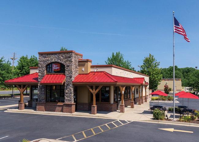 Roy Rogers upgraded its drive-thru to include better lighting and an awning that offers rain protection for drivers in cars. Image courtesy of Roy Rogers
Drive-Thru Dynamics
Drive-thrus have received a lot of attention in the past year, and that’s not expected to abate. Later this year, Mooyah will launch its first drive-thru, a year earlier than anticipated, bringing to life the brand’s “seriously fun” personality while focusing on efficiency.
The drive-thru design includes a three-panel digital board “which allows us to spread out our menu and show more photos, which really speeds up ordering times,” Anderson Liu says.
Mooyah also wanted to give customers better wayfinding. “I never want people to have to circle the building a couple of times. We wanted to make sure the entrance to the drive-thru is very well marked so we’re doing that with lighted signage that helps show customers where to go.” The brand is using three-dimensional icons all on the same line of sight to make navigating a Mooyah easy. “They look cool and have a really important purpose,” says Anderson Liu. “They’re our proprietary way to help with the guest journey.”
The black-on-red doodle is featured in the drive-thru between the ordering and pickup spots. “It’s where [guests] might be waiting and they can have fun picking out different elements,” says Anderson Liu. “There are a lot of cool things going on there; the mix of materials from metal to brick to tile keeps things modern, fresh and fun.”
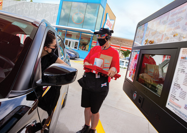 Image courtesy of SonicRoy Rogers had added large awnings over its drive-thru windows to protect drivers against rain. Now there’s a larger flat roof that covers more of the vehicle, and it’s lit from below so it’s brighter than before to make it very clear there’s a drive-thru.
“We looked at this from both a design and functionality perspective,” Biser points out, adding that wayfinding was important, too. “We looked at every lane and made sure we had the right markings and that they extended back far enough so people wouldn’t get concerned about where to get into line.” The brand also added instructional signage in the drive-thru lane including things like “Please have your payment ready” to keep lines moving faster. The changes to the drive-thru, Biser points out, have, on average, shaved around 50 seconds off each customer’s time.
The goal for Sonic’s drive-thru redesign, says Cannon, was to make it “intuitive and simple and as clean as possible for the guest to get on the lot and find the entrance to the drive-thru with the right radiuses and curves.”
In many locations the brand is adding second menu boards to drive-thrus for multiple order points to speed up service even more. In locations where there are two order points, the two lanes meld into one for pickup.
A novel introduction is the “hop out door,” designed for customers with small orders and located close to the pickup window so employees can service cars one or two behind the person picking up should they have a simpler order, says Cannon.
Sonic’s redesign is so extensive the brand has also come out with what it calls a “reskin,” which includes elements of the remodel but not the full package. This includes color, signage, directional signage in the drive-thru and adding elements of the blue towers to guide customers driving in. “It brings lots of pop, lots of color, lots of lighting,” says Cannon.
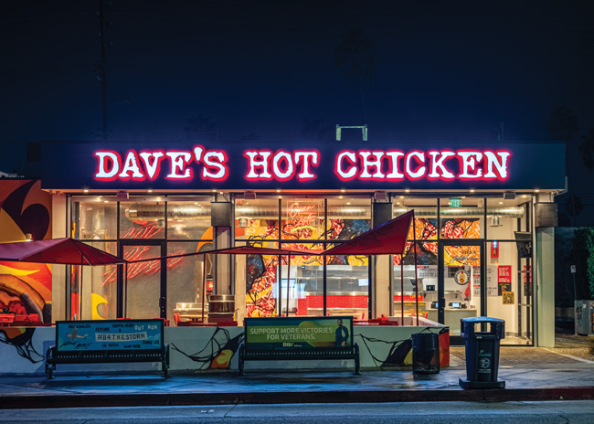 Image courtesy of Dave's Hot Chicken
Breaking the Mold
While most chain restaurants aim to have every unit look almost identical, Dave’s Hot Chicken is dancing to the beat of its own drum. Every location of this 13-unit chain is unique, inside and out.
The first Dave’s Hot Chicken store opened in Los Angeles in January 2018 and the concept now has units in states including Texas, Colorado and Oregon.
“We take some local inspiration and try to marry that with parking lot design and urban design,” says Tiffany Vassos, vice president of design and construction. The company works with graffiti artists to come up with a unique design for each location. “Each one is very different but a couple of pieces of the design have a similar feel,” she says.
“The restaurants all have the same mother but a different father,” adds Co-Founder Arman Oganesyan. But, he says, while they’re all different, there is a similar feel since the graffiti is all done by the same company “and that’s how we keep the stores looking the same but different,” Oganesyan explains. “We want to be recognizable but for each to stand on its own.”
It’s important that each restaurant feature a lot of red, which is also in the concept’s logo. And each has to feature the same signage including its round chicken logo where possible “so you can see it from far away for that red glow,” Oganesyan says. Many of the stores also follow a theme with the building looking as though it’s on fire and cracking open.
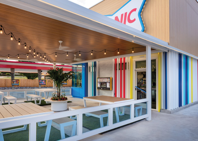 Image courtesy of SonicDave’s Hot Chicken opened its first drive-thrus in Dallas and Las Vegas this spring. These also feature graffiti wherever possible but otherwise the drive-thrus will be kept fairly simple, Oganesyan says. “We don’t have to make every single thing creative at once or it can be overkill. We try to get as creative as possible without overdoing it. We still want to remember it’s a restaurant and people are there for the food.”
Some stores also feature outside seating with red chairs, tables and handrails. “Red is becoming part of our iconic coloring,” says Vassos. “You can see it from so far away and some of these exterior elements make it a beacon, and you’re very drawn to it.”
The lighting strategy likewise varies from location to location. “If we have an exterior mural, we typically install up-lighting to showcase the artwork, or we use rope lighting to highlight the shape of the building,” says Vassos. “One extremely important aspect of our design is the red glow we get from our signage. It’s striking.” And of course, she adds, it’s important to be able to see the restaurants at night.
It’s important to Dave’s that its design continues to evolve. “We aim to create a unique experience at every location and keep the design interesting. We also like to incorporate local elements to draw in the local clientele,” says Vassos.